Breeze theme evolution
Open, WishlistPublic

Description

The Breeze theme is great. But... it can be greater!

Over the years VDG has accumulated a rough list of changes we'd like to make to evolve the Breeze theme into the year 2019 and beyond. The goal is not to fundamentally change what Breeze is, but rather to improve on it and modernize it, while also learning from our peers, as applicable.

Here's the proposed list of changes:

  • Turn off window borders by default: T8707
  • Define a window "Tools Area" that consists of the titlebar, menubar, and toolbar (or any combination thereof). This area has a line at the bottom that visually separates it from the content area below, and its background is a darker shade of gray than the typical window color: T10201
  • The Tools Area's background becomes lighter or desaturated for inactive windows: T10201
  • Window shadows become slightly smaller for inactive windows: https://bugs.kde.org/show_bug.cgi?id=393238
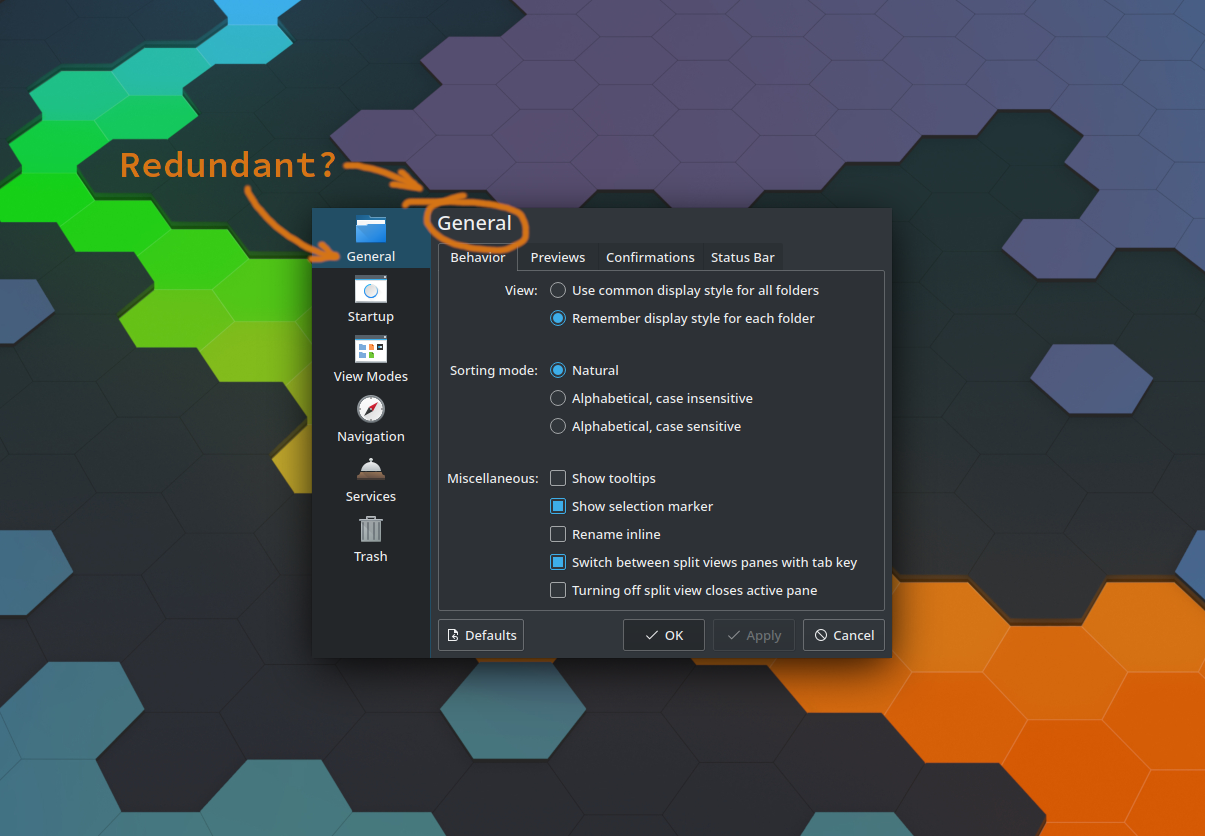
  • Make settings windows' left category sidebars have a white background and a single-pixel separator between them and the content view: D20908
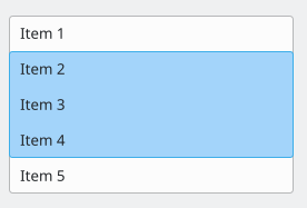
  • Update the look of UI controls (buttons, menu items, checkboxes, radio buttons, sliders: T13451
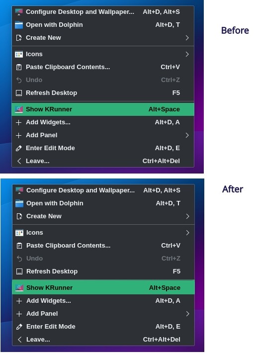
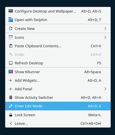
  • Redesign elements of Plasma desktop including applets T14526
  • In apps, separate views from one another with with single-pixel lines rather than putting everything in its own frame: T11661
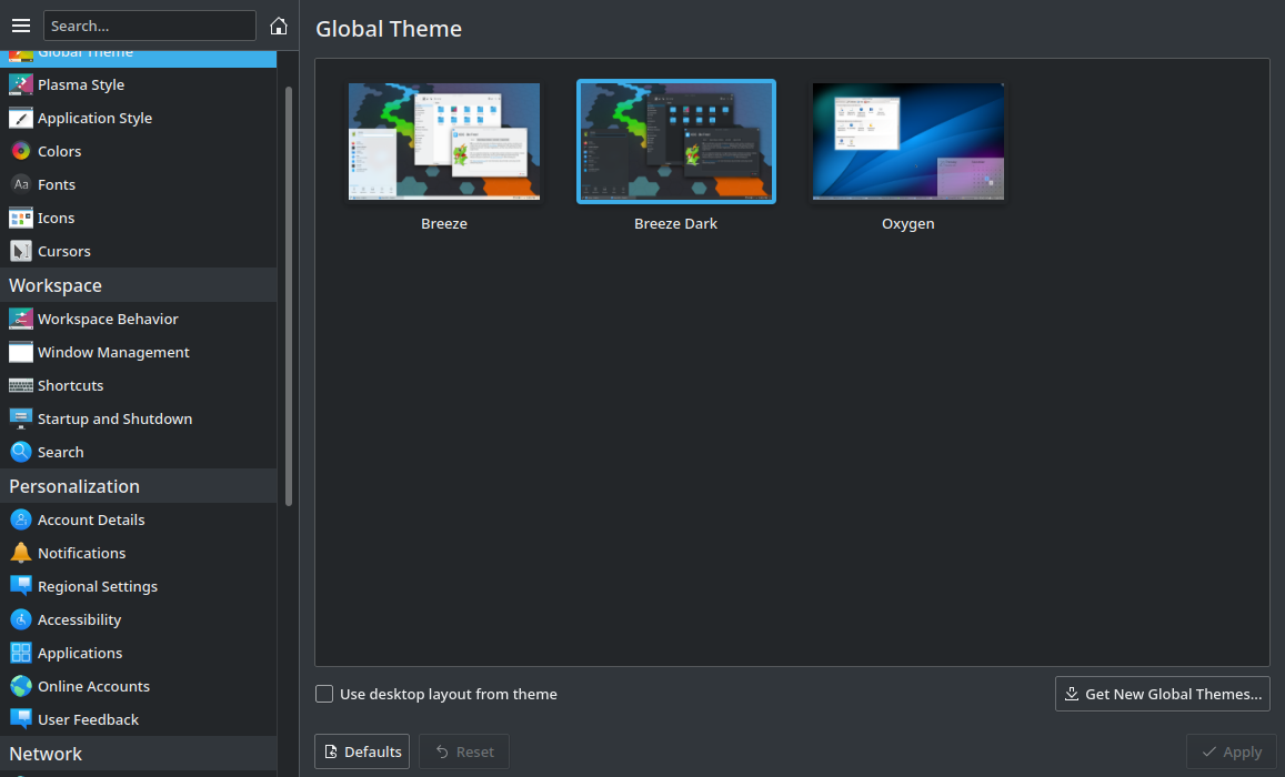
  • Use all colorful icons for settings windows' categories - In progress: T10165
  • Use colorful icons for small-sized places, devices, and mime type icons - under discussion: T10870
  • Redesign/tweak some of our applications: T12420

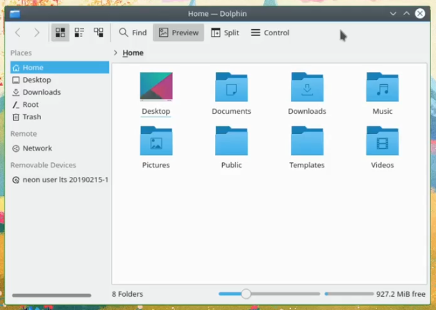
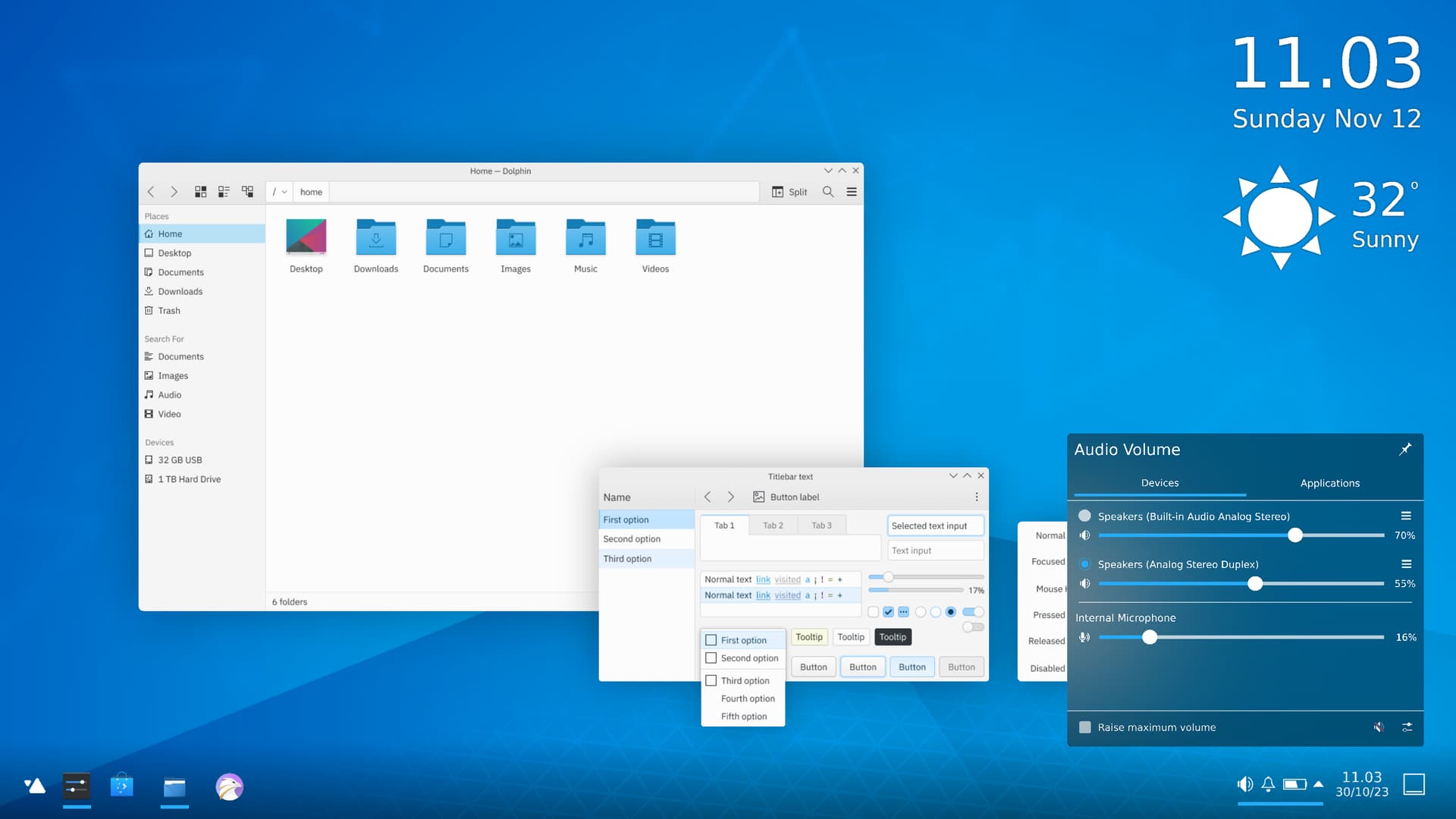
Dolphin main window:


@2.5x F9413403

Here's how the widgets would look:
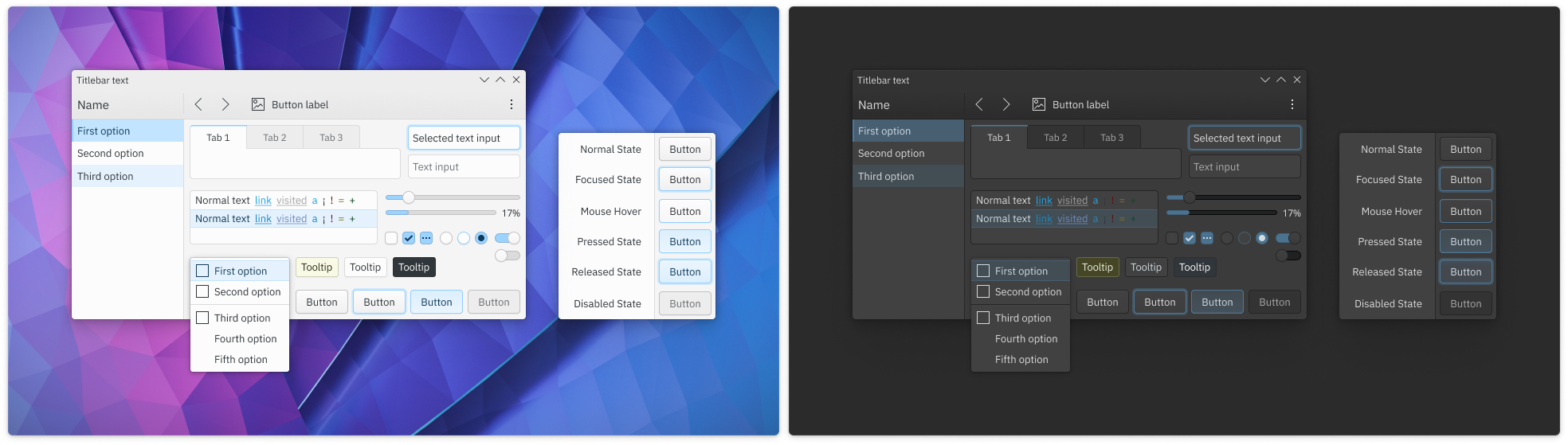

@2.5x F9360697


Note that as a part of this effort, I have explicitly not added as a goal rounding the bottom corners of the windows when No Borders is in use. This idea is controversial and has the slight, but real potential to interfere with applications that put interactive elements in the bottom corners. It needs more discussion if we want to do it. In the meantime, people who want to accomplish this can use https://github.com/alex47/KDE-Rounded-Corners.

Details

Differential Revisions
D24706: [RFC] Change button style

Related Objects

StatusAssignedTask
OpenNone
Resolvedngraham
Resolvedngraham
OpenNone
Openngraham
Resolvedngraham
Resolvedngraham
Openndavis
Openndavis
Openndavis
Openngraham
Openngraham
OpenNone
Resolvedngraham
Openniccolove
Resolvedngraham
OpenNone
OpenNone
Resolvedngraham
Openngraham
Openngraham
Wontfixndavis
Openngraham
Resolvedngraham
Resolvedndavis
OpenNone
Opencblack
Resolvedngraham
Resolvedndavis
OpenNone
OpenNone
Opensharvey
OpenNone
OpenNone
Resolvedmikeljohnson
Resolvedniccolove
Resolvedngraham
Resolvedngraham
Resolvedngraham
Resolvedmikeljohnson
Openngraham
There are a very large number of changes, so older changes are hidden. Show Older Changes
ndavis added a comment.EditedSep 19 2020, 6:09 PM
In T10891#239685, @clel wrote:

I am wondering, is there some central point where the overall breeze theme "design philosophy" is documented? Or where that can be discussed? Since I think it makes sense to have some broader overall guidelines in order to make consistent decisions about the design of specific UI elements.

It's hard to get a big picture on the original plans for Breeze and I'm not sure if there ever was a solidified big picture with lots of detail. The original authors have moved on, there's no central place to look and the documents @davidre linked above weren't written by them. You'll probably find some things on the KDE forums (https://forum.kde.org/viewforum.php?f=285, we don't really use this anymore), some things on the blogs of the original designers, maybe some things on the KDE wiki and maybe other places too.

At this point, I'm not sure it really matters since we're trying to move on to something somewhat different. We're trying to keep familiar bits that we like, but we're also redefining what breeze is. Of course, that also means we're redefining what we should be consistent with while also trying to improve consistency. Sounds a bit mad, but it's work that has to be done.

As for where to define the reasoning behind the new UI component designs or other new parts of Breeze, I suppose you'll find them in the tasks attached to this task. I suspect that a lot of things will be justified after we've mostly settled on a design because waiting for something to be nailed down in words on a task often isn't effective for iteration or getting things done quickly. If there's something you want to say, I'd suggest saying it here or in VDG chat. We can move it into a subtask if one exists or if the discussion gets a lot more involved.

Also, there are some things that you might think of as being related to Breeze (e.g., the styling of Kirigami components), but they aren't supposed to be breeze and should be style agnostic. For instance, they should look like Material Design when using the Material Qt Quick Controls 2 style or like UWP when using the Universal QQC2 style.

clel added a comment.Sep 21 2020, 1:52 PM

It's hard to get a big picture on the original plans for Breeze and I'm not sure if there ever was a solidified big picture with lots of detail. The original authors have moved on, there's no central place to look and the documents @davidre linked above weren't written by them. You'll probably find some things on the KDE forums (https://forum.kde.org/viewforum.php?f=285, we don't really use this anymore), some things on the blogs of the original designers, maybe some things on the KDE wiki and maybe other places too.

I had a short look, seems there was something on the HIG pages: https://forum.kde.org/viewtopic.php?f=285&t=120376&sid=aa6c43acdcb2874b2f1d99e3b4072646 now at https://hig.kde.org/index.html. There are at least some guidelines and also color schemes for example: https://hig.kde.org/style/color/default.html.

At this point, I'm not sure it really matters since we're trying to move on to something somewhat different. We're trying to keep familiar bits that we like, but we're also redefining what breeze is. Of course, that also means we're redefining what we should be consistent with while also trying to improve consistency. Sounds a bit mad, but it's work that has to be done.

I am not that much interested in the old guidelines. Rather since now things get changed, I thought some central place where the general decisions are documented or that can be referenced to make consistent decisions during the process might be helpful.

As for where to define the reasoning behind the new UI component designs or other new parts of Breeze, I suppose you'll find them in the tasks attached to this task. I suspect that a lot of things will be justified after we've mostly settled on a design because waiting for something to be nailed down in words on a task often isn't effective for iteration or getting things done quickly. If there's something you want to say, I'd suggest saying it here or in VDG chat. We can move it into a subtask if one exists or if the discussion gets a lot more involved.

That might be correct. I just had the feeling that the subtasks here might have the tendency to not be consistent with each other or that it has not been decided on a general design goal, yet, while at the same time already discussing about details. From my POV a sensible approach would be to first discuss the broader goal (flat, simplistic, skeumorphic, round, soft, etc.) and from that to go ahead and implement things. And if on the way some decision turns out to be bad or needs discussion one can go back and change that in the overall "meta" design documentation. However that might be a bit too much or not really sensible for moving forward.

Also, there are some things that you might think of as being related to Breeze (e.g., the styling of Kirigami components), but they aren't supposed to be breeze and should be style agnostic. For instance, they should look like Material Design when using the Material Qt Quick Controls 2 style or like UWP when using the Universal QQC2 style.

Also a good point.

ngraham updated the task description. (Show Details)Sep 24 2020, 11:09 PM

Would love to do some more work on this area but slightly struggling to understand which tasks don't already have merge requests (here or over on invent) or design questions needing resolution.

Can anyone clear up which tasks are still in need of help? :)

clel added a comment.Sep 27 2020, 1:45 PM

I don't have the overview over all tasks. Best would be to check yourself I guess. Most tasks still seem to be in need of help.

clel added a comment.Sep 27 2020, 2:00 PM

I created a new subtask to keep track of the overall design approach for the future Breeze theme now.

Would love to do some more work on this area but slightly struggling to understand which tasks don't already have merge requests (here or over on invent) or design questions needing resolution.

Can anyone clear up which tasks are still in need of help? :)

I had started on focus and selection rectangles last year, but I never got the patch into a state I was happy with.
One of the things I failed to complete was having one outline for a whole multiple item selection. Not sure if this is even possible in QStyle without doing awful things and I don't know QStyle that well. What I mean is something like this:

ngraham updated the task description. (Show Details)Sep 28 2020, 4:32 PM
debnath added a subscriber: debnath.EditedOct 3 2020, 7:07 AM

I have a suggestion for the Breeze Evolution UI refresh.

I feel like the Title/Header on each category is redundant, since it is already visible to the user through the highlighted category on the left sidebar. Any thoughts?

@debnath I agree, but I don't remember the reason why previous attempts to get rid of the title were stopped. Maybe if we pushed again it would be successful.

I proposed removing it by default in KPageWidget IIRC but people raised plausible concerns.

https://phabricator.kde.org/D22884

Someone else could re-investigate.

clel added a comment.Oct 5 2020, 6:12 PM

I just had a short look on how others do it to get some inspiration. It seems to be pretty common to also have the selected option as title (or in the window titlebar):

Having that at least in some place (maybe we also already have it in the window title bar) might also be "needed" in certain cases where the selected list item is not visible (either because it is scrolled out of view or maybe it hides on small window sizes / low res screens).

So in general I am voting for keeping it in some way, there might be limited room for visual improvement, though.

@ngraham That (https://phabricator.kde.org/D22884) looks so much cleaner!

I feel as long as the left side-bar is not scrollable, the title can be removed, since the items in the non-scrollable sidebar is always visible.

@clel The example images all seem to have scrollable sidebar. But the UI element in question doesn't seem to have scrollable sidebar. The KDE equivalent to the images from other platforms would be the system settings page (where I agree, it makes sense to keep the title):

As I understand, the titlebar is not only providing information what page we are currently on, but also the path to the given option. Since Plasma has a lot of options and layers which we don't have access to from the same point, it's good to know that the visible UI is a sub-layer of the other option. Also, not all themes make it clear which option is marked, so even with the first tier window it's good to have some title above.
So all in all, I'm for having titlebar.

clel added a comment.Oct 6 2020, 3:41 PM

@clel The example images all seem to have scrollable sidebar. But the UI element in question doesn't seem to have scrollable sidebar. The KDE equivalent to the images from other platforms would be the system settings page (where I agree, it makes sense to keep the title):

Ah, so you were only talking about those specific ones. I wonder, is it true that it won't be scrollable (even on small window sizes or small resolution screens)? Also one might argue that it also makes sense to keep it there for consistency.

andy added a subscriber: andy.Oct 8 2020, 4:24 AM

Just want to voice my excitement for one aspect of this mockup -- the change to the "close" button in the titlebar (aka the "X" button) to make it not bright red!!

I've always been a bit annoyed by how that button has super high contrast to everything else in the screen. Maybe it makes sense to turn red when you mouseover, but having it bright red all the time, when all the other colors are muted, is so much visual noise.

It's a very tiny detail but a huge improvement IMO!

The button being red for active windows is actually a usability thing: it's an additional visual clue to help you locate the active window at a glance. Before this initiative, there was one way to tell which window was active (at least with the standard Breeze theme) but it was very obvious: the titlebar was dark when the window was active, and light when inactive. With the changes here, the dark-to-light transition for inactive windows becomes more subtle, and hence, not as easy to see at a glance. That's why we added two additional differences to help people out: the red close button color for the active window, and window shadows become smaller for inactive windows.

If you hate the red close button, you can of course turn it off in the Breeze theme window decoration settings. :)

manueljlin updated the task description. (Show Details)Oct 11 2020, 9:41 AM
mthw removed a subscriber: mthw.Nov 10 2020, 1:08 PM
ngraham updated the task description. (Show Details)
ngraham updated the task description. (Show Details)Dec 4 2020, 3:07 AM

Looks good. The main things I would suggest however are:

  1. Highlight the whole button on hover instead of drawing a glowing outline. This is a stronger visual cue than an outline, and it doesn't rely on adding any distracting lines and colors.
  1. Change the color scheme to a warmer, earthier palette. Ofc this is a very big ask given that the icons and a bunch of other stuff would have to be recolored, but the current color scheme is just frigid in my opinion. It absolutely requires "night light" :)
ndavis added a comment.EditedJan 13 2021, 2:58 AM

Looks good. The main things I would suggest however are:

  1. Highlight the whole button on hover instead of drawing a glowing outline. This is a stronger visual cue than an outline, and it doesn't rely on adding any distracting lines and colors.

We plan to kind of, but not exactly do this. The button will have a gradient that disappears on hover and the outline will also be there. A full highlight just for hover would be overkill.

  1. Change the color scheme to a warmer, earthier palette. Ofc this is a very big ask given that the icons and a bunch of other stuff would have to be recolored, but the current color scheme is just frigid in my opinion. It absolutely requires "night light" :)

We're not going to do this.

BTW, there is no evidence that blue light from LCD screens is worse for your eyes than any other kind of light produced by LCD screens with the same level of brightness. There is evidence that staring at a bright screen for many hours every day causes eye strain and so does not blinking often enough. The only real solution to the issue with circadian rhythms is to stop using your devices 1-2 hours before bed.

Filtering blue light from your screen reduces the overall brightness. One could also just reduce the screen brightness instead of reducing the amount of blue, allowing for better color accuracy and less eye strain (provided the lighting in the room is at a similar level). In the sRGB colorspace, pure blue is actually darker than pure red or pure green, so reducing blue has slightly less of an impact on overall brightness than reducing red or green would.

jenskj added a subscriber: jenskj.Jan 17 2021, 9:31 PM

One thing to note is that the final product will be using the 5.21 colorscheme instead of the one shown in the mocks

vkhatab added a comment.EditedJan 25 2021, 3:13 PM

BTW, there is no evidence that blue light from LCD screens is worse for your eyes than any other kind of light produced by LCD screens with the same level of brightness.

(Please don't feel the obligation to respond to this - I don't wish to divert the discussion here by sparking a debate out of left field. I just want to clarify my opinion.)

I never said the breeze color scheme literally damages your cornea. What I meant was that it wasn't pleasant to look at by virtue of appearing too cold and synthetic. With regard to physical eye damage, an "unpleasant" color scheme is probably healthier if anything, since it encourages you look away from the screen.

Whether this constitutes anything more than a subjective option is open to debate. However, it seems hard to deny that the main highlight color on the which the rest of the color scheme rests, and especially in combination with generous use of colored outlines, is more like something out of the movie TRON than anything you might normally observe in the world of physical objects, perhaps with the exception of light refracted through ice. And it the former that humans were mostly used to before the advent of screens. Similar observations apply to to Google's choice of bright pink for Fuchsia OS and to all other "catchy" hi-lighter colors, as well as to KDE's default wallpapers, which you can compare to GNOME's

"Breeze blue's" other problem is that also looks pretty dated - it was the same color used by Android a a decade ago: back then it was regarded as having a fresh hi tech vibe, but today it looks rather cheesy. This kind aesthetic generally doesn't age well - just as a gaming laptop with RGB doesn't hold up to a classic thinkpad.

I would point to Gnome's current and previous "Adwaita" color palettes as an example of more "natural" color choices that I believe will continue to hold up very well.

baran removed a subscriber: baran.Jan 26 2021, 11:44 AM

Can we remove empty space before and after separator?
I think it would look prettier that way.

Can we remove empty space before and after separator?
I think it would look prettier that way.

already done

davidedmundson removed ngraham as the assignee of this task.Mar 27 2021, 2:27 PM
mikeljohnson updated the task description. (Show Details)May 6 2021, 4:44 PM

I have a suggestion for Breeze Evolution. The icons-only taskbar could have an updated, cleaner design:

https://phabricator.kde.org/T14498

Also, the separators could have a gradient in the top and in the bottom:

Hmm, that seems a bit too Oxygen-ish IMO.

ngraham updated the task description. (Show Details)May 28 2021, 3:40 PM
mikeljohnson updated the task description. (Show Details)May 28 2021, 5:14 PM
mikeljohnson updated the task description. (Show Details)
mikeljohnson updated the task description. (Show Details)May 28 2021, 6:56 PM
ngraham updated the task description. (Show Details)Jun 8 2021, 4:38 PM
endlesswaterfall added a comment.EditedJun 9 2021, 4:34 PM

One thing that it looks weird is the pressed state of buttons: they show a gradient effect, but the normal state doesn't have it (or it has, but it's really subtle). I think the button should have a very subtle dark background with a inner shadow.

The gradient seems to show up of nowhere:


I'm using the latest unstable Neon (neon-unstable-20210609-1412)

ngraham added a comment.EditedJun 9 2021, 8:51 PM

Please report bugs/complaints/proposals for changes to the new widget style to https://invent.kde.org/plasma/breeze/-/issues/

piomiq added a subscriber: piomiq.EditedJun 14 2021, 12:51 PM

Have you ever wonder about not disappearing popup menu after choosing option ?

I mean situation when in popup menu are placed options type 'check box'. In this case I need to click several time to set all needed options. I mean I need every time open popup menu and click into proper option (check box) to have checked all options, because after first click popup menu disappears.
Notice please that there is no issue if popup menu disappears in case we have 'radio button', but not useful if we need to check radio button + check box or couple check boxes. This action needs a lot of clicking.

I will report this idea as feature in bug tracker.
[Bug 438614]

This is a behavior provided by the upstream QMenu component and it's not something we can override in any KDE code. You would need to report it to the Qt people.

Also note that this Phab task is more about design and not intended to be used to report bugs. :)

One weird thing is that when hovering a buttons, the gradients is flipped vertically (or the gradient goes away, it's hard to tell).

This looks amazing @ngraham !
Is it scheduled for implementation some time after Plasma 6? Like in Plasma 6.1 or whenever?
Is it being worked on?

Big parts of it have already been implemented. Here is a screenshot that shows what Dolphin looked like when this task was started.

The software we are currently releasing is already closer to the design goal than to where we started. And yes, it is still being worked on. See Carl's recent blog post for example: https://carlschwan.eu/2023/08/29/frameless-view-with-qtwidgets/

dikasp added a subscriber: dikasp.EditedNov 14 2023, 7:38 AM

greetings.

as a long fan KDE user, i would like to share my ideas and be a part of next evolution of KDE desktop.

while I'm not very skilled at coding, I had some degree of design sense and would like to invite KDE design gurus here to assess my humble design concept of evolving KDE desktop ecosystem into a new wholly unique experience.

kde discuss brainstrom page >>

if there is something that the dev like to adopt, i love to do the groundwork and defining the complete concept that can be easily followed and applicable later.

possibility of implementation would likely requires very long time but i think it can be made into a separate project and building it little by little at a slow pace.

thanks for your consideration.