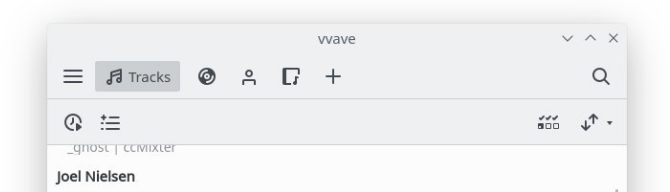
KDE software has a lot of different visual styles for sidebars, many ably illustrated in T11093: Improve Consistency across the Board:
Let's unify these to have the following characteristics:
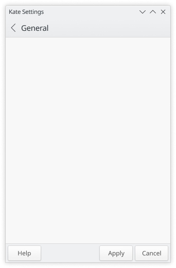
- White background (with default breeze color scheme; obviously it should follow the color scheme
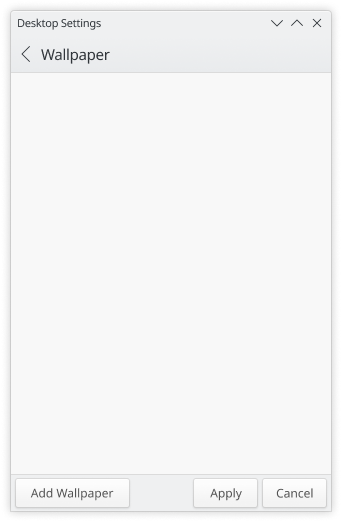
- Full width and height; top touches titlebar/tools area, bottom touches bottom window edge or status bar, left side touches left window edge, etc.
- Single-pixel vertical line separates the sidebar from the content area on the right
- When icons are large, they should be colorful: T10165: Large category icons should all be colorful
[please not that the following is a proposal]
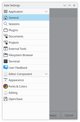
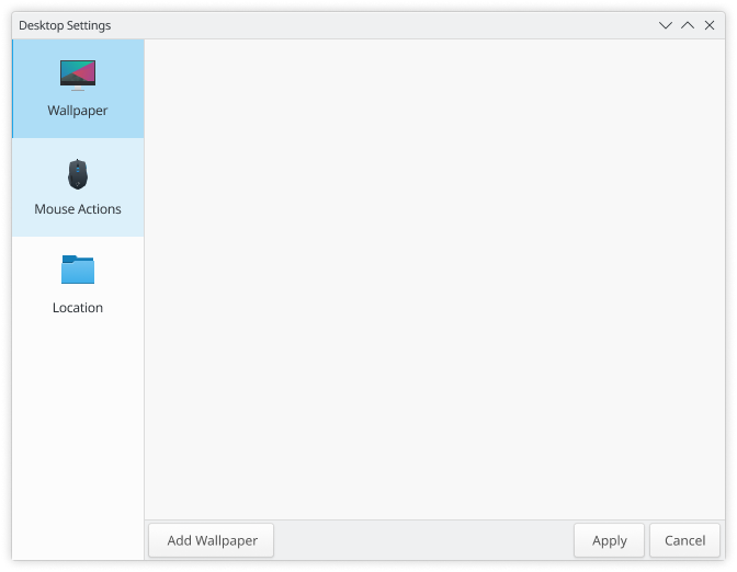
Furthermore, these three kinds of sidebars should be preferred when used to navigate application content:
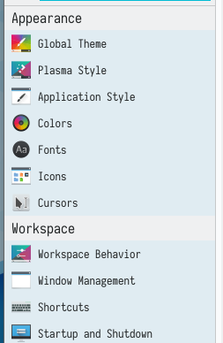
- Lists should be used when there are many possible views that would not fit when using a big icon.
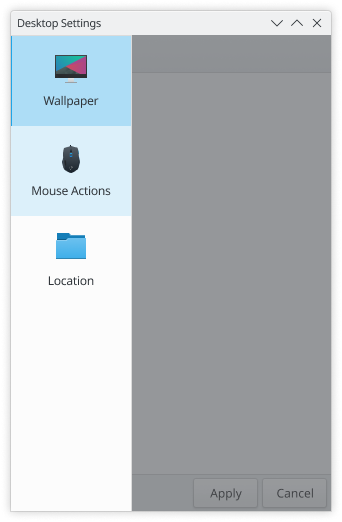
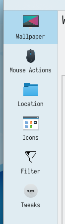
- Big Squares should be used when there are a limited number of possible views that usually fit the window heigh using big icons.
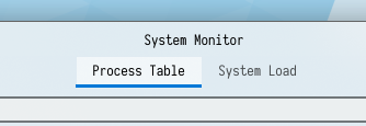
- Tabs should only be used on application views that are user-editable (eg: when it's possible to open a new tab or close another).
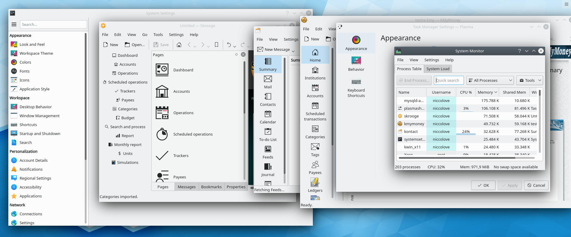
Thus, the following applications could need to be changed:
| Application | Current state | Desired state |
| Heaptrack | Tabs | List |
| Kalgebra | Tabs | Big squares |
| Kbruch | Toolbar buttons | Big squares |
| SymbolEditor | Tabs | Big Squares |
| Kontact | Toolbar buttons | Big squares |
| Ktorrent | Toolbar buttons | Big squares |
| Kaffeine | Toolbar buttons | Big squares |
| Skrooge | List in panel | Big squares |
| Kwalletmanager | Tabs | Big squares |
| Kmymoney | ? | Big squares |
| KColorSchemeEditor | Tabs | Big squares |
| Edit Window-Specific Settings | Tabs | Big squares |