Goal:
Design an accent color system and related components for the Plasma desktop and reiterate on the Appearance/Colors UX.
Motivation:
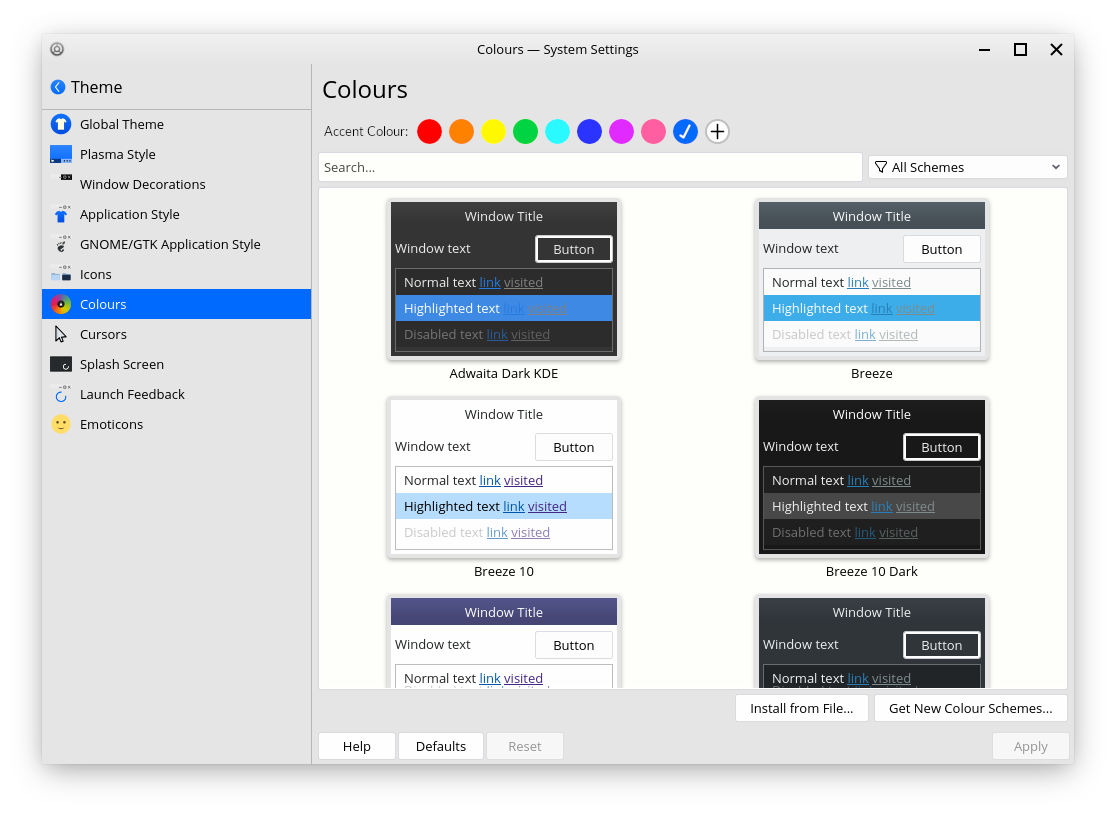
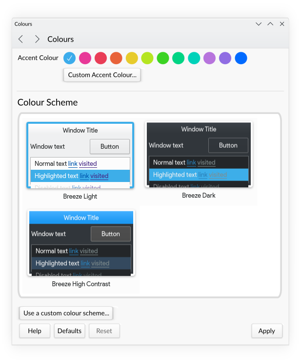
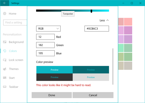
While Plasma makes it possible to change the color scheme, it's not presented in the most accessible way. Especially compared to how easy some other OSes make it to easily change the accent color.
Prior Art:
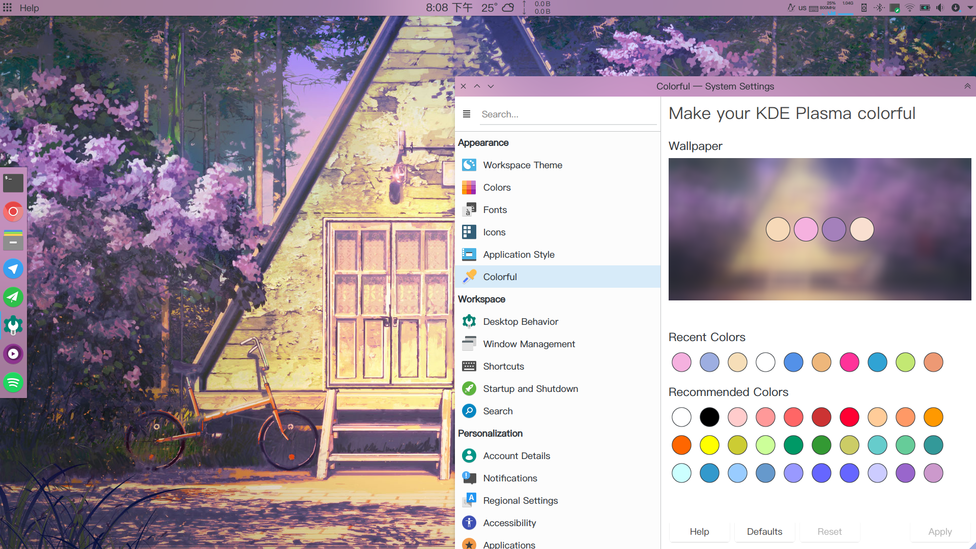
kcm-colorful:
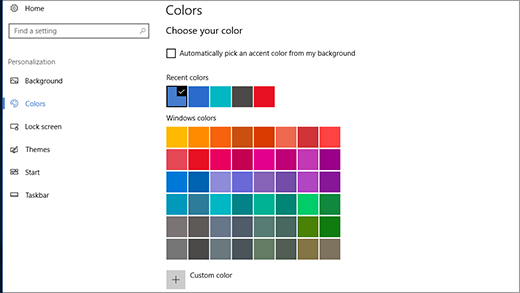


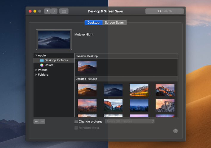
OSX:

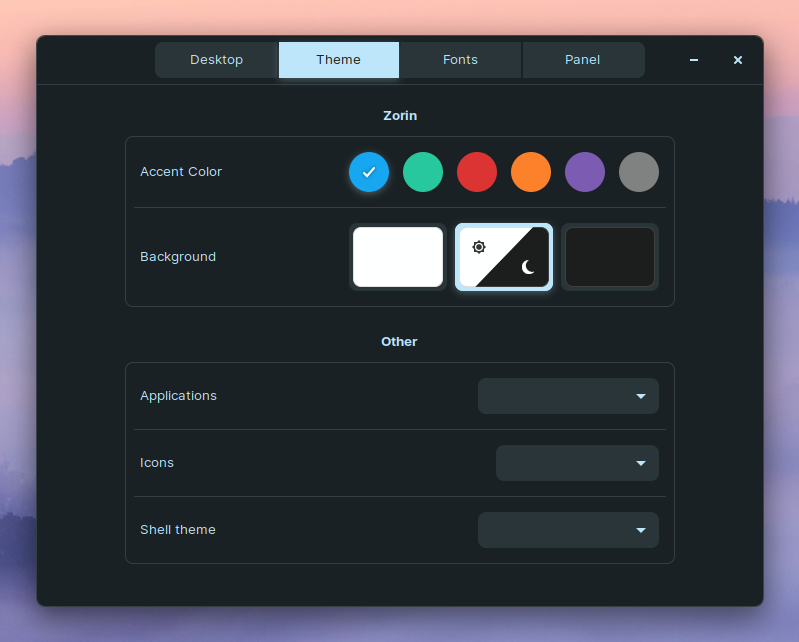

@Zren explained how AlphaBlack Control could be adapted in this comment:
Worth looking into:
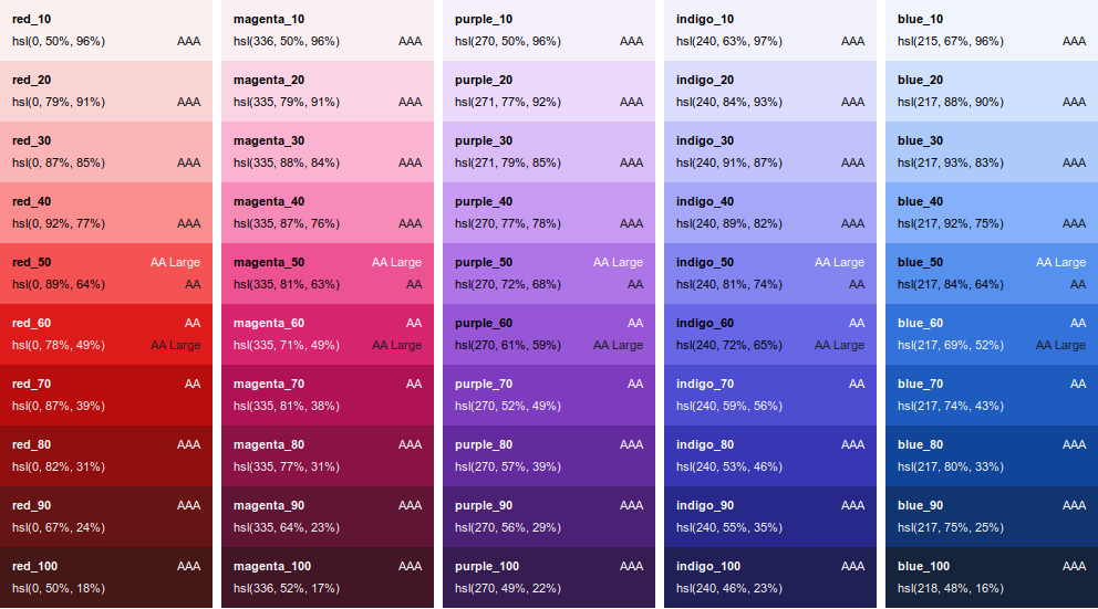
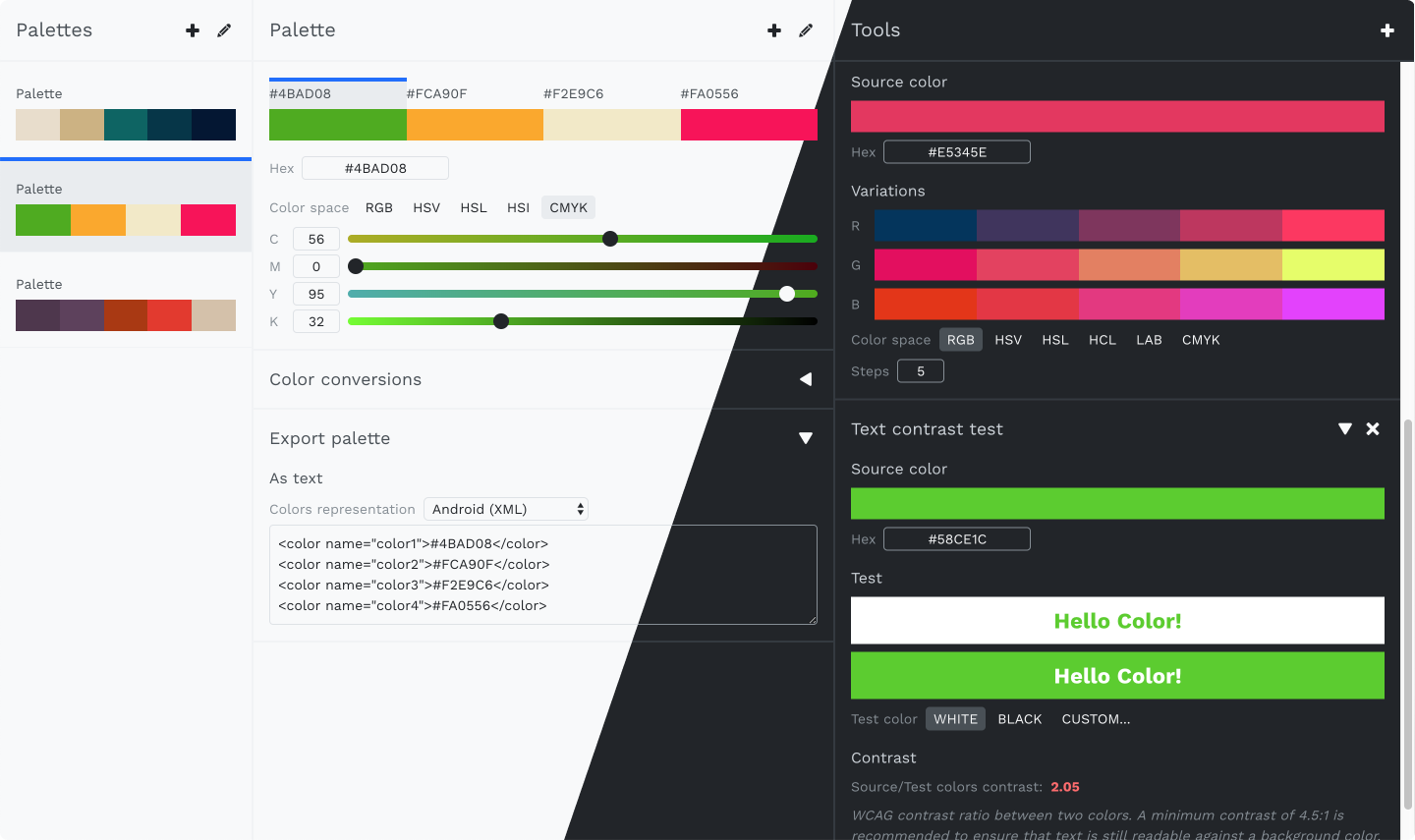
This article Designing Systematic Colors (and comment) explores some of the challenges with generating related colors. I'll include an example of some color ramps which are generated from one color each, along with some information about the colors including their accessibility ratings according to the WCAG standard.
There is also this implementation of the algorithm based on the aforementioned article:

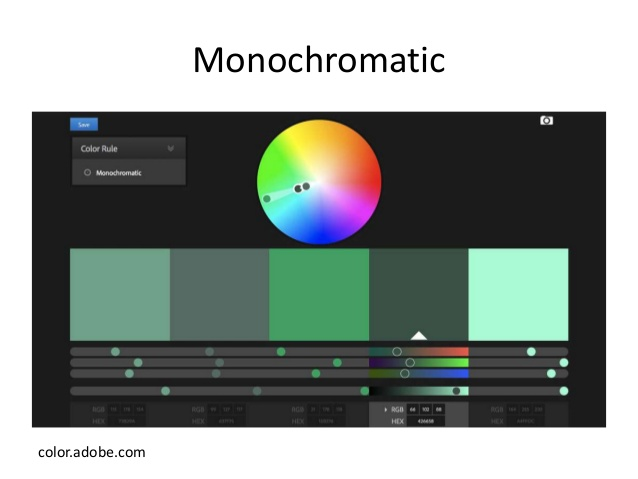
Also interesting is Adobe Color:
and IRIX Web Tools / Iris:
We've been discussing this in some recent tasks (T10046, T8755) so I thought I would just open up the discussion.