Improve visual appeal for KUrlNavigator when in Breadcrumbs mode
Open, Needs TriagePublic

Description

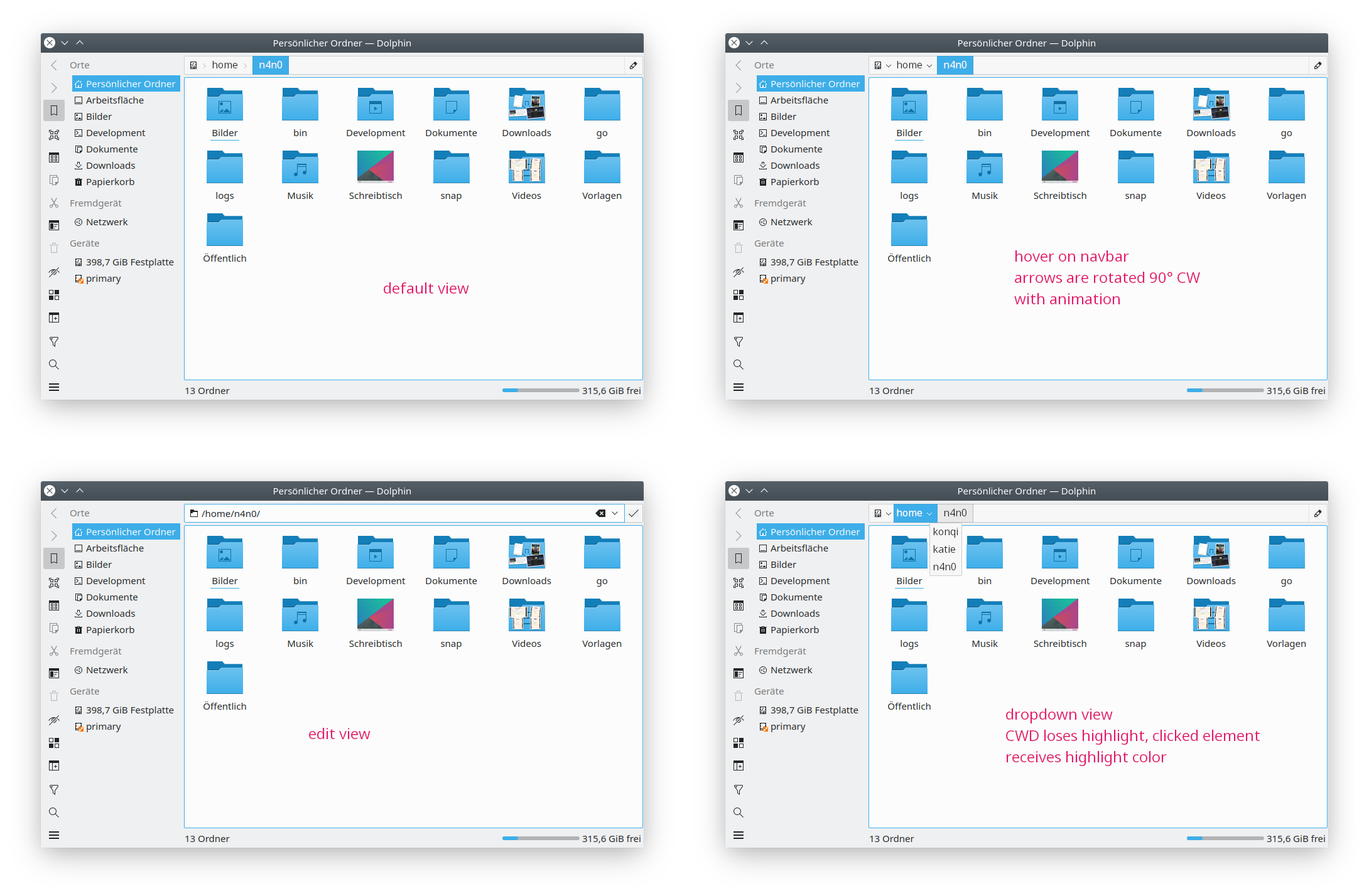
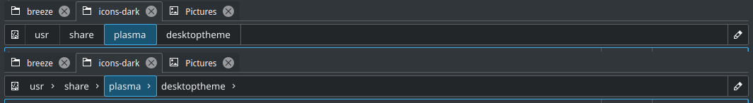
Right now, the KURLNavigator's breadcrumbs bar has a muddy, indistinct visual appearance:

It's hard to tell that it's actually a clickable part of the UI. When you hover over elements of it, the hover effects look so slight, that again, it's hard to tell what it's interactive. We currently have a problem in Dolphin where people ask for the "Up" button to be added to the default toolbar despire the fact that the URL Navigator provides this functionality already. However people don't seem to want to use it for this or even know that it can be used this way, and I think the visual appearance is the problem

I propose a bold visual redesign that corrects these issues by aligning it with the Breeze style, giving it visual presence, and providing a better mapping of appearance to functionality:

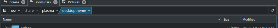
You can see the following elements:

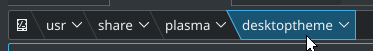
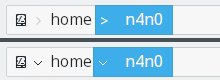
  • Each part of the path looks like a clickable button
  • Current directory highlighted using a pressed appearance rather than bold text, which we try to avoid
  • Clickable downward-pointing arrows help the user understand that there are drop-down menus
  • Show the current disk's icon rather than "/"
  • Visible "edit" button on the right to enter URL entry mode, to help people realize that there actually is a URL entry mode

I personally disagree with this change as it is proposed, specifically:
• "indistinct visual appearance": I believe it's not indistinct, but light, in spirit with Breeze. The proposed look, in contrast, looks visually heavy and bloated to me.
• "bold visual redesign": sounds a bit contrasting with the actual change that removes bold and makes finding out what directory a user is in "muddy". From my observations, few people actually keep the filesystem hierarchy in mind when navigating directories, deriving current location from the fact that its name comes with reduced contrast is not obvious.
• "Clickable downward-pointing arrows help the user understand that there are drop-down menus": combining right-pointing and downwards-pointing arrows next to each other does not convey anything to an average user, it makes the UI hard to follow visually and gives me KDevelop shivers.

I do not say that the current look is perfect though; using disk and edit icons I think is nice. But attempts to emulate font weight by reducing contrast and to explain available functions by <^>v maybe need another thought...

mglb added a subscriber: mglb.Sep 15 2019, 6:25 PM

It's hard to tell that it's actually a clickable part of the UI. When you hover over elements of it, the hover effects look so slight, that again, it's hard to tell what it's interactive.

Same looking (i.e. simple label > simple label > ...) breadcrumbs are almost everywhere (almost all content-oriented websites, google drive, dropbox, etc). People already know it and are able to use it, so it seems to be OK. I think we should identify whats wrong with this one.

We currently have a problem in Dolphin where people ask for the "Up" button to be added to the default toolbar despire the fact that the URL Navigator provides this functionality already. However people don't seem to want to use it for this or even know that it can be used this way, and I think the visual appearance is the problem

I think the reason is different. "Up" button is always in the same place and looks always the same. Parent folder on breadcrumb changes its horizontal position and text, so you need to first find it.

  • Visible "edit" button on the right to enter URL entry mode, to help people realize that there actually is a URL entry mode

In future it could be nice to have history as drop down list. What about putting the edit icon on the right of last element?

baberts added a subscriber: baberts.

I really like the idea behind this task (I agree that buttons should look clickable), and I like the redesign as well, except that I believe it is a bit too bold. The strong lines and text conflict because your focus cannot rest on any particular element. When looking at this image, I feel like I am being pulled in many different directions. The proper place of focus is on the path of course, and luckily I think that de-emphasizing the background elements will allow you to accomplish both primary goals. This can be done many ways, but here is one example (ignore any text blur, I mocked it up very quickly in gimp).

The lines and current directory background are faded, while the path and edit button retain their intensity.


Isn't it cleaner to just have straight lines?

Various other people have also said they'd prefer straight lines. I kind of like the pointy lines as I think it helps to reinforce the point that this is a directional progression. However I won't push hard, and straight lines would be okay too.

Making the current folder look less visually intense makes sense, +1 on that.

ndavis added a subscriber: ndavis.Nov 20 2019, 10:45 PM

We should probably use straight lines. Alignment and getting proportions right is just too messy with the arrow points.

mglb added a comment.EditedNov 20 2019, 10:45 PM


Isn't it cleaner to just have straight lines?

Looks more like random buttons (bookmarks or something like this) than ordered hierarchy/path.

Anyway, do we really need to change it to add more lines/boxes? The stated reason ("hard to tell that it's actually a clickable part of the UI") doesn't even seems true - unless world's best UX people are wrong and their designs on most popular websites are not intuitive.

ndavis added a comment.EditedNov 20 2019, 11:16 PM

Here's another mockup:


Rounded end:

The Windows version:

The blue box at the end is a button focus highlight (T11124)

mglb added a comment.Nov 20 2019, 11:22 PM

What does this arrow-down near desktoptheme do?

In T11662#209138, @mglb wrote:

What does this arrow-down near desktoptheme do?

Same as the arrow-right in the current breadcrumb. It lets you select nearby folders.

joricke added a subscriber: joricke.EditedNov 21 2019, 8:38 AM

The biggest problem that I see with the breadcrumbs receiving a new coat of paint with pointy or slanted lines would be the fact that it's a UI element that doesn't exist in vanilla KDE anywhere else in that form. At least I can't think of where it shows up, but please correct me if that is wrong. Taking Gestalt theory into consideration, this might be bad UX as it exposes users to new elements that are unique to that one location.

The breadcrumbs are fine as they are now, but need better differentiation from the rest of the interface to stand out as a control element rather than info text like the content we have in the status bar (of which some is also clickable). The box-with-straight-lines approach as proposed by @pedrogomes1698 is the right direction to keep consistency within KDE's UI. I'd like to make some small adjustments to push the understanding that those are not drop down buttons, but rather signify something else:

Since the last entry is not interactive we remove the icon from that, other icons are behaving like they are currently doing in Dolphin and present a arrow head pointed right, expressing a connection between the elements.

The question that comes up now is whether or not the navigator should turn into edit mode when clicking on the directory names and root icon, or if that'd trigger the "change directory" action and editing is only possible with either Ctrl+L or by clicking the dedicated edit button.

Alternative idea to de-clutter the entire bar is to remove the seperator lines on parent directories:

Edit:

In T11662#209134, @mglb wrote:

The stated reason ("hard to tell that it's actually a clickable part of the UI") doesn't even seems true - unless world's best UX people are wrong and their designs on most popular websites are not intuitive.

The issue in Dolphin is that the KUrlNavigator breadcrumbs look exactly the same as the info presented in the status bar. You can't click on the file/directory info on the left of the status bar, why then can you click on the navigator? Purely from a design point of view it's not logical. And yes, I'm making the same argument for the "places" sidebar, but that issue is well addressed in the breeze evolution discussion.

krzyzowiec added a comment.EditedNov 21 2019, 9:26 PM
In T11662#209134, @mglb wrote:

Anyway, do we really need to change it to add more lines/boxes? The stated reason ("hard to tell that it's actually a clickable part of the UI") doesn't even seems true - unless world's best UX people are wrong and their designs on most popular websites are not intuitive.

This is context-dependent. People have different expectations for websites than they do for native apps.

Part of the issue is how faint the existing indicator is for Dolphin. The highlight on mouseover is so light that you might not even see it. Compare it to the strength of the highlight for menu bar hovering. You could copy the style used for Dolphin's controls, but that's not a great answer. If you pay attention to KSysguard, which I think looks very attractive, you'll notice that it has several different styles of indicator for buttons.

  1. the menu bar highlight on mouseover
  2. the tabs
  3. the standard buttons like end process
  4. boxed lines for the sorting categories

That variety is nice. The places sidebar in Dolphin looks good and already has its own style. The breadcrumbs could be different. (you might ask why the places sidebar isn't also problematic, but it includes a persistently active highlight on the root path that hints the area is clickable, and the mouseover highlight is stronger)

Edit:

Alternative idea to de-clutter the entire bar is to remove the seperator lines on parent directories:

I think if you wanted to go ultra minimal or conservative, that's not a bad suggestion at all. Indicating the current directory like that would be very suggestive to a user. Would it look good with only one directory though?

mglb added a comment.Nov 22 2019, 12:16 AM

The biggest problem that I see with the breadcrumbs receiving a new coat of paint with pointy or slanted lines would be the fact that it's a UI element that doesn't exist in vanilla KDE anywhere else in that form. At least I can't think of where it shows up, but please correct me if that is wrong. Taking Gestalt theory into consideration, this might be bad UX as it exposes users to new elements that are unique to that one location.

That's why it should not look exactly the same as something other - it is different control. With big advantages as a concept, limited to this use case.

I'd like to make some small adjustments to push the understanding that those are not drop down buttons, but rather signify something else (...)
Since the last entry is not interactive we remove the icon from that

But they are (as subcontrol) drop down buttons/combo boxes - you click it, select element from a list, and this element is displayed on the label. Selected directory is listed below. You just placed the arrow on the left of the label, like it is done in current implementation (not saying this is bad).

The question that comes up now is whether or not the navigator should turn into edit mode when clicking on the directory names and root icon, or if that'd trigger the "change directory" action and

That's the point of breadcrumb - to allow single click to navigate.

editing is only possible with either Ctrl+L or by clicking the dedicated edit button.

... or empty space (like now), which makes things easier.

In T11662#209134, @mglb wrote:

The stated reason ("hard to tell that it's actually a clickable part of the UI") doesn't even seems true - unless world's best UX people are wrong and their designs on most popular websites are not intuitive.

The issue in Dolphin is that the KUrlNavigator breadcrumbs look exactly the same as the info presented in the status bar. You can't click on the file/directory info on the left of the status bar, why then can you click on the navigator? Purely from a design point of view it's not logical. And yes, I'm making the same argument for the "places" sidebar, but that issue is well addressed in the breeze evolution discussion.

You can click same looking text in menu bar though (when visible, but it is by default in many applications with status bar), which is better reference, as it is nearby, in top "clickable things" area. That's good point overall, but can be also solved by changing statusbar text style.

In T11662#209134, @mglb wrote:

Anyway, do we really need to change it to add more lines/boxes? The stated reason ("hard to tell that it's actually a clickable part of the UI") doesn't even seems true - unless world's best UX people are wrong and their designs on most popular websites are not intuitive.

This is context-dependent. People have different expectations for websites than they do for native apps.

As websites I meant web apps (e.g. google drive, dropbox). Do they? I've never saw bigger differences in patterns or different recommendations. Except integration/following system guidelines, but the guidelines are created here.

Part of the issue is how faint the existing indicator is for Dolphin. The highlight on mouseover is so light that you might not even see it.

+1 here

In T11662#209294, @mglb wrote:

As websites I meant web apps (e.g. google drive, dropbox). Do they? I've never saw bigger differences in patterns or different recommendations. Except integration/following system guidelines, but the guidelines are created here.

Oh ok now I'm confused. You meant some sort of webview-type integration with KDE? I'd have to see it to know for sure, but for the web in general, people are used to the idea that many standalone pieces of text may actually be clickable URLs that are simply not underlined. Take for example the common case of the name of the site being at the top of the page and acting as an anchor to the main page. (Youtube does this with their logo in the top left, and it's a pretty standard convention for websites/webapps)

For a native application, I never see this. You expect a more defined button there, or at least a symbol. Text is usually reserved for labels rather than anything interactive.

In T11662#209294, @mglb wrote:

That's why it should not look exactly the same as something other - it is different control. With big advantages as a concept, limited to this use case.

Well yes, maybe I didn't make myself clear enough; while it has to look different to signal that it's a different control element, it still should look same-ish to existing control elements. I'd even argue that no matter how you'd style the navigator, users would probably understand that it's a breadcrumb thing after being subject to those in a lot of web applications but still, gotta get it _right_ to make it look like it "belongs".

But they are (as subcontrol) drop down buttons/combo boxes - you click it, select element from a list, and this element is displayed on the label. Selected directory is listed below. You just placed the arrow on the left of the label, like it is done in current implementation (not saying this is bad).

Then maybe have them rotate 90° CW on hover of the navigation bar? That'd generate the visual aesthetic of actually connected crumbs, while instantly making users understand that they can click the arrows. I think that'd actually be a nice and subtle touch.

That's the point of breadcrumb - to allow single click to navigate.

The current implementation uses the tiny arrow to trigger the "change directory" drop down menu while clicking the text part will trigger the edit mode. My question was targeted to whether this should be kept, or if the trigger for the dropdown would be widened to include the text part as well.

... or empty space (like now), which makes things easier.

Obviously this as well.

ndavis added a comment.EditedNov 22 2019, 7:14 AM

That's the point of breadcrumb - to allow single click to navigate.

The current implementation uses the tiny arrow to trigger the "change directory" drop down menu while clicking the text part will trigger the edit mode. My question was targeted to whether this should be kept, or if the trigger for the dropdown would be widened to include the text part as well.

Actually, it's the blank area to the right of the text and the arrows that triggers the edit mode. When you click the text, Dolphin switches to the directory in the label.

My opinion is that all of the current behavior should be kept because it's very efficient and most dolphin users won't want to change their already efficient workflow. The 3 biggest flaws are in the appearance:

  1. The buttons don't look like buttons. Not even flat toolbuttons.
  2. The highlight and hover effects are faint, inconsistent with most other highlight/hover effects and not very attractive.
  3. It's unusual that arrows affect the text to the right of them when normally text related to an arrow button that opens a dropdown menu is to the left of the arrow button.
    • Simply changing the arrow to affect the text to the right is not enough, because this will confuse existing users. That is why my mockups and the mockup in the task summary use down arrows so that there will be no confusion about how these controls work.

I played with the margins on the original mockup style a bit:


Played with the strength of the inner arrow separators a bit too:

Actually, it's the blank area to the right of the text and the arrows that triggers the edit mode. When you click the text, Dolphin switches to the directory in the label.

You're right, my mistake.

It's unusual that arrows affect the text to the right of them when normally text related to an arrow button that opens a dropdown menu is to the left of the arrow button.

Reading this I said to myself "he's right you know?" and then went to check how macOS and Windows were handling these cases only to find out this:

macOS only let's you double click a directory in their path bar, opening that directory in your current active Finder window. They provide small arrows for the breadcrumb view but they have no functional use aside from being there and looking pretty. Also the pathbar sits out of view at the bottom of the Finder window and is afaik not enabled by default.

Windows however has exactly the same behavior that Dolphin has whereas you click the arrow and the dropdown will affect the entry right to the item you clicked on. The rightmost item will show an arrow as long as there are sub-directories in the CWD to move to. Once you hit a "dead end", there will be no further arrow rendered.

I thought this was quite interesting and I'm sure both operating systems have alternatives that power users would more likely switch to which probably have different behavior and display.

And to come back to my mockup-edit, here's how it _could_ look in current Dolphin:

I see how you were thinking of rotate on hover now and I agree that it would be effective for showing both hierarchy and the control for switching to nearby folders. It still has the problem of having arrows to the left of the labels they affect though.

Windows may do it that way, but I don't find it intuitive have the order of UI elements changed. It's subjective, but I can't be the only one who needs to mentally pause and decide which arrow to click because the order is backwards. The highlight effect is also part of what confuses me. It highlights the arrow and the folder containing the following folder that the arrow will affect instead of the arrow and the folder affected by the arrow. The connection between the arrow button and what it affects isn't clear.

Windows may do it that way, but I don't find it intuitive have the order of UI elements changed.

Absolute agreement on that part.

In terms of confusing behaviour, how about highlighting would work like this:

Windows may do it that way, but I don't find it intuitive have the order of UI elements changed.

Absolute agreement on that part.

In terms of confusing behaviour, how about highlighting would work like this:

It's an improvement for intuitiveness, but it sticks out as visually inconsistent with drop down menu buttons.

Here's a mockup with straight lines:

it sticks out as visually inconsistent with drop down menu buttons.

I agree.

That's shaping up really nicely!

What about smaller indicators though?

Taking up my idea from earlier with the rotating: the indicators could be small when facing right, and on hover they animate rotate enlarge to how they are in your mockup.

I'm not convinced that we need arrows pointing to the right between the separating lines, even if they rotate to down arrows on hover. With touch screens, they won't rotate at all unless clicked anyway. The original mockup design, while not as clean looking, made it perfectly clear what the hierarchy was and the non-rotating down arrows make it clear that a menu exists there. Even just straight lines as separators with no arrows is good enough for GNOME's Nautilus file browser because most people read from left to right (Qt can reverse the layout for RTL languages). The names in the breadcrumb match the folder names, so the hierarchy should still be pretty clear.

In that case I prefer "no lines but arrows". It looks cleaner and less crowded:

With the "no arrows but lines" approach it becomes hard to get the "change folder" function the arrows provide right now in a visually pleasing, non "CS master does design" kind of way as the arrows would have to appear on hover which would change the padding of the content towards the border of the box (i.e. the right lines) so either the size of the entry doesn't change and the arrow gets crammed in there, or the size changes to adjust for the new arrow, or the arrow doesn't appear at all and the function is either lost or has to be remapped to appear in the right-click context menu.

I like the bottom one Joricke did, I think it's pretty solid.

mglb added a comment.Nov 23 2019, 9:12 PM
  • Don't do straight vertical separators + arrow down - it looks like favorites list or something, not ordered hierarchy.
  • > doesn't make sense when placed after directory name - it means something like "next directory is...", and clicking it should modify directory on the right of the arrow.
  • Don't highlight arrow and label like it is a single thing - it is not. Clicking label has different action than clicking arrow.
  • Don't make last item (current directory) clickable/highlightable - clicking it does nothing.

Move arrows to the left on second one and it's perfect :) And get rid of separator near edit icon - whole empty area works as "edit" button, not only that part. I think the icon is not even needed.

In T11662#210483, @mglb wrote:

Move arrows to the left on second one and it's perfect :)

Agreed. Very nice.

And get rid of separator near edit icon - whole empty area works as "edit" button, not only that part. I think the icon is not even needed.

The idea behind the edit button was to expose the location edit mode. Right now the dual-mode nature is sort of confusing, as it's easy to accidentally enter location edit mode and get stuck there. I was thinking that adding a checkable button with the edit icon would make the current mode more comprehensible, easier to toggle between, and easier to see the current mode.

So more like this then?

The idea behind the edit button was to expose the location edit mode. Right now the dual-mode nature is sort of confusing, as it's easy to accidentally enter location edit mode and get stuck there. I was thinking that adding a checkable button with the edit icon would make the current mode more comprehensible, easier to toggle between, and easier to see the current mode.

I'm very much in favor of having a dedicated button to enter edit mode. Not only will this remove my personal frustration of accidentally clicking that area and turning on edit mode, it would also lead to a much more consistent and clean interface when switching between the two modes. From an earlier mockup I did, this could be how that'd end up looking:

Yep, looks pretty good to me. Personally I'd still prefer a more obviously buttonlike or clickable appearance for the breadcrumbs mode, but that's iterable in subsequent mockups.

mglb added a comment.Nov 25 2019, 6:43 PM

I'm very much in favor of having a dedicated button to enter edit mode.

So it either should be outside frame, like the checkmark button, or don't use separator.

The separator is out of place, because:

  • the edit icon is inside "line input" frame - like editable combo box's arrow, "save" icon in Dolphin's search, "clear" button - which don't use separator.
  • mentioned icons work only when you click the icon. The edit icon works when you click anywhere (in empty area). So if anything, other icons are more separator-worthy.

Right now the dual-mode nature is sort of confusing, as it's easy to accidentally enter location edit mode and get stuck there.

Why not exit "temporary" edit mode (the one activated by clicking empty area) when focus is lost? For anyone who wants to keep it longer, there's option in menu, context menu, and F6. If someone needs always visible clickable switch for that, they can add toggle button to a toolbar. If we manage to convert location bar itself into toolbar, it would allow users to put the toggle where checkmark button is currently.

So it either should be outside frame, like the checkmark button

It already is though. The navbar in my mockup is what is known as an "input group", which is a regular UI element that can consist of an arbitrary amount of buttons, labels and input fields. A prominent example of this for web UI would be Bootstrap: https://getbootstrap.com/docs/4.1/components/input-group/
Generally such groups are used to visually signal that the individual items interact with each other within that group. I hope my crude mockup makes clear what I try to explain:

Arguably, it makes more sense to have it styled like this, as the "clear" button for example which is inside the input field frame directly modifies the input, whereas the edit/apply button does not.

"save" icon in Dolphin's search

I'm for moving that icon into it's own button though, since it doesn't affect the text like I explained above.

Why not exit "temporary" edit mode (the one activated by clicking empty area) when focus is lost?

That's the current behavior though, isn't it? As soon as the user clicks somewhere else and focus is shifted, the edit mode is exited. Some people (me included) find that a bit annoying which is why the change is considered, I think.

mglb added a comment.Nov 26 2019, 3:57 AM

I understand, but I was referring to following mockup, where the button has input field background, so I perceive it as in-field icon like "clear" with separator :)

Connected button outside is technically OK, but... not in Breeze style. So either we change it everywhere, or add little spacing between input field and button. Right now you can't even draw this connection nicely using QStyle.

Why not exit "temporary" edit mode (the one activated by clicking empty area) when focus is lost?

That's the current behavior though, isn't it? As soon as the user clicks somewhere else and focus is shifted, the edit mode is exited. Some people (me included) find that a bit annoying which is why the change is considered, I think.

It is not. You exit "edit mode" by clicking checkmark, or through menu, context menu, enter, F6, optional button on a toolbar. Probably you can also use checkmark in settings window.

I'm very much in favor of having a dedicated button to enter edit mode. Not only will this remove my personal frustration of accidentally clicking that area and turning on edit mode, it would also lead to a much more consistent and clean interface when switching between the two modes.

I'm not sure I follow. You want to get rid of "click empty area to edit"?

In T11662#211545, @mglb wrote:

I understand, but I was referring to following mockup, where the button has input field background, so I perceive it as in-field icon like "clear" with separator :)

Connected button outside is technically OK, but... not in Breeze style. So either we change it everywhere, or add little spacing between input field and button. Right now you can't even draw this connection nicely using QStyle.

Most of the styling on that widget is custom right now, so it wouldn't be any worse if we kept it custom. Even then, I don't think it would be impossible to draw a flat pushbutton/autoraise toolbutton in that spot with a vertical line in the left side of the frame area.

mglb added a comment.Nov 26 2019, 4:32 AM
In T11662#211545, @mglb wrote:

I understand, but I was referring to following mockup, where the button has input field background, so I perceive it as in-field icon like "clear" with separator :)

Connected button outside is technically OK, but... not in Breeze style. So either we change it everywhere, or add little spacing between input field and button. Right now you can't even draw this connection nicely using QStyle.

Most of the styling on that widget is custom right now, so it wouldn't be any worse if we kept it custom.

The "custom" part don't have other versions in KDE, while "input field with button" is pretty common.

So either we change it everywhere

Consistency on the desktop is a big goal of KDE and therefore I agree, if changes like these make it into Dolphin, other parts where similar elements appear should be re-evaluated as well.

Right now you can't even draw this connection nicely using QStyle.

What do you mean? Qt accepts CSS to style elements so I'm pretty sure it's possible to draw some very nice custom elements with Qt. In fact, Electronic Arts is using Qt for their Origin game launcher and store but it looks nothing like the regular Qt widgets because they customized everything.

It is not.

You are correct, my mistake. So yes, a behavior like that would be nice to have.

You want to get rid of "click empty area to edit"?

Personally I'd love that, but it's not necessary if the entire navbar is seperated from every other part of the window in a much clearer way, like what we're currently discussing with the mockups. This would provide enough visual aid to drastically reduce misclicks.

mglb added a comment.Nov 26 2019, 9:15 PM

Right now you can't even draw this connection nicely using QStyle.

What do you mean? Qt accepts CSS to style elements so I'm pretty sure it's possible to draw some very nice custom elements with Qt.

You should draw a widget using QStyle in order to make it look reasonably with other styles (like oxygen or whatever people are using). QStyle is a thing from like 2004 and offers functions for drawing primitives like button or input field frame or background, some numbers like margins, functions for calculating where button's icon should be, etc. It is pretty simple (its features, not implementation) and made with standard Qt controls in mind. To make it worse, styles creators don't implement all theoretical constructs, focusing on how whole controls look instead and using hacks to make some nice results. Example problems I had:

  • I wanted to style floating search bar in Konsole like floating toolbar. Good luck - some popular styles (Fusion?) check if widget you are drawing on is a window. If not - it won't draw floating toolbar look.
  • Same search bar - I wanted to use Push Button as background, and margin-less input field to avoid double gray border from button and input. Something exactly like your input field + button, but button part was wider and not focusable. Looks great in Breeze and Fusion! But... button frame in Oxygen has internal (i.e. not possible to query as a number) margin, like 3px, so I ended up with input field 6px higher than button part.

The way to make your solution portable would be to:

  • Use line edit frame/background for breadcrumb/line edit, and regular tool button for checkmark/edit button. It will look unconnected.
  • Detect such pattern (input + tool buttons) globally in Breeze style implementation and draw it connected. This is a thing for separate task.

You should draw a widget using QStyle in order to make it look reasonably with other styles

Well yes, I was merely saying the margins and paddings could be adjusted without breaking a sweat or visual compatibility.

joricke removed a subscriber: joricke.Apr 17 2020, 5:11 AM

Here's another mockup:


Rounded end:

The Windows version:

The blue box at the end is a button focus highlight (T11124)

I reallly like the this, especially the second one. A separate version for Windows is pretty cool to have I think. Rounded edges are fine!
Will it land in Plasma 6?

Will it land in Plasma 6?

Nobody has started working on implementing this yet AFAIK, so I think it is unlikely that this will be done for the Plasma 6 release. However, this could land quite suddenly, if someone shows up with the necessary patches. A KDE contributor recently also mentioned that they are interested in working on this. However, that person is interested in working on a lot of things, so I don't think it is likely that they will prioritise this one.