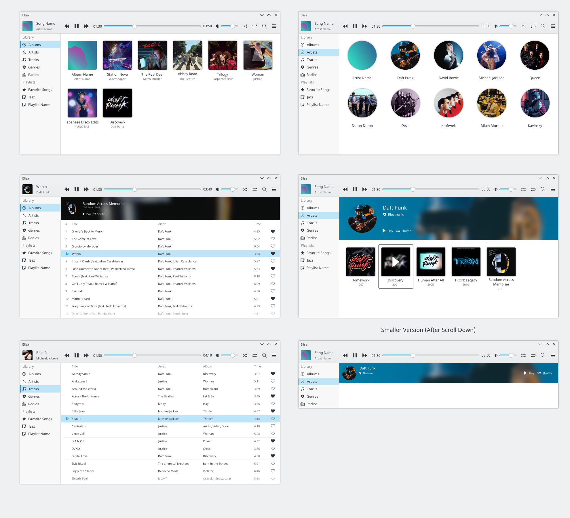
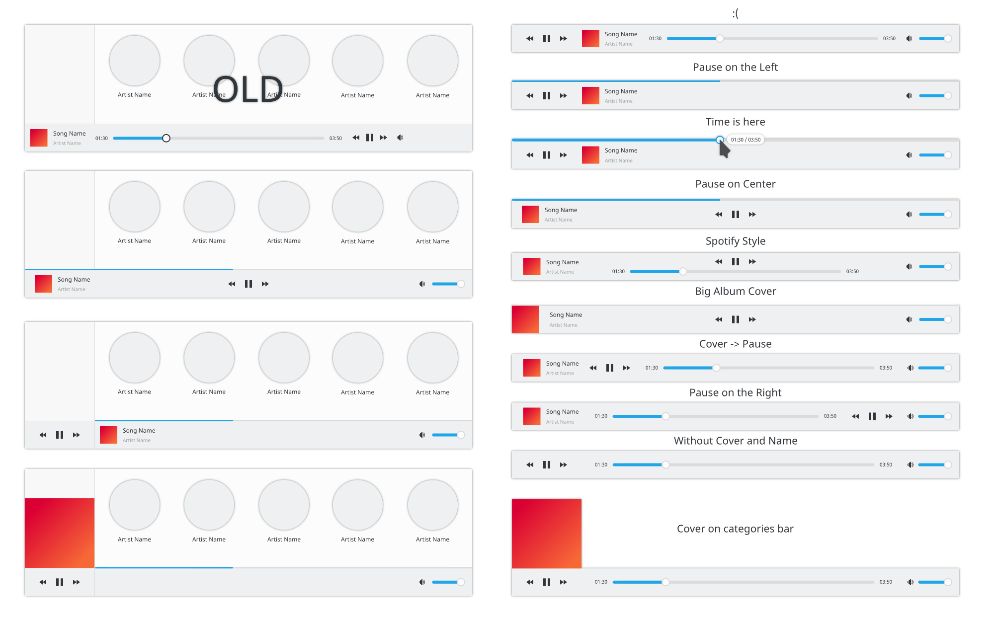
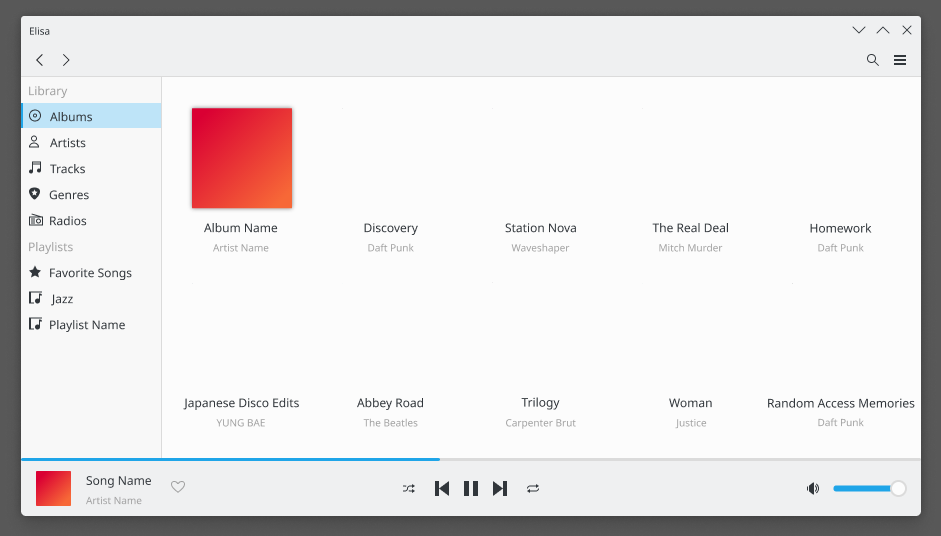
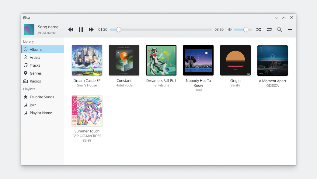
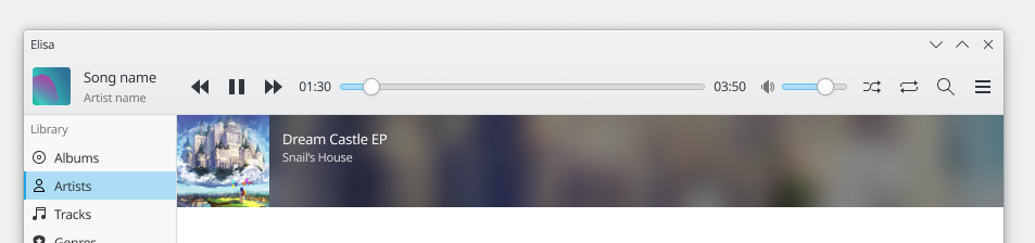
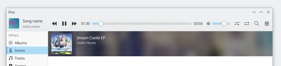
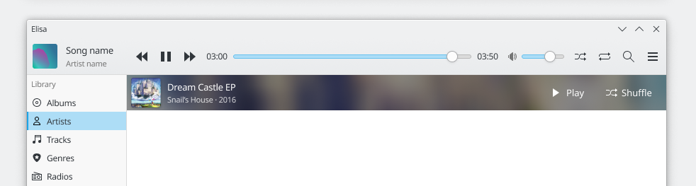
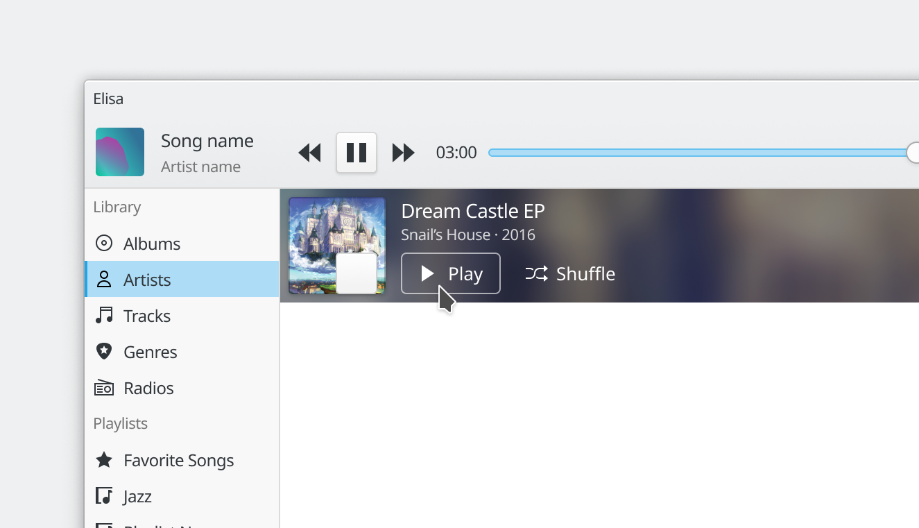
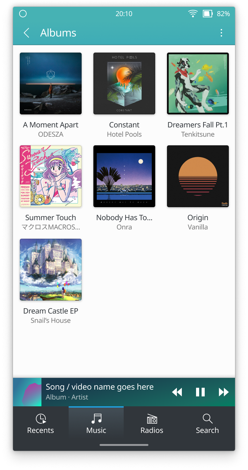
Hi, I was inspired by @manueljlin mockups, and i decided try to make UI redesign for Elisa, it looks very different from current Elisa UI, but it could be as part of Plasma 6 with new Breeze style.
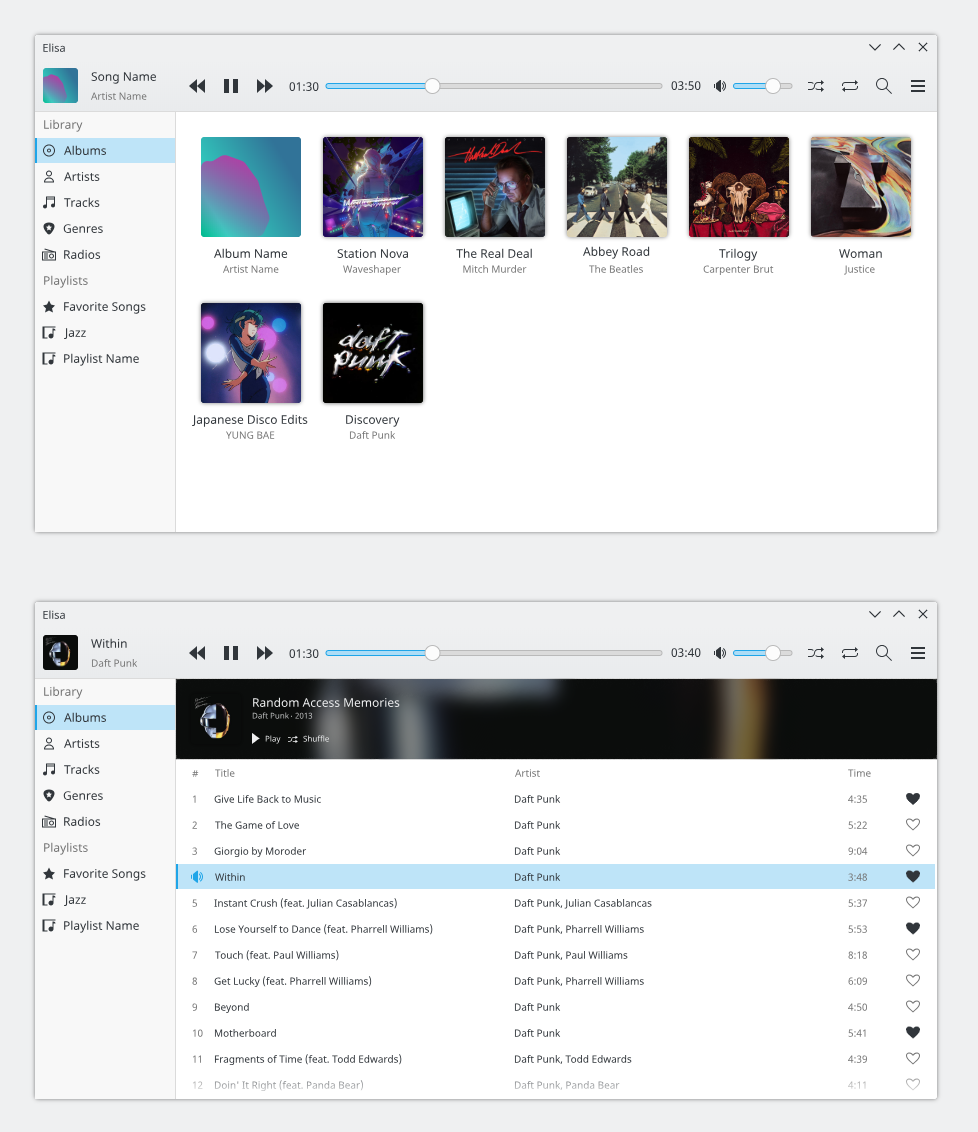
- I tried to simplify interface.
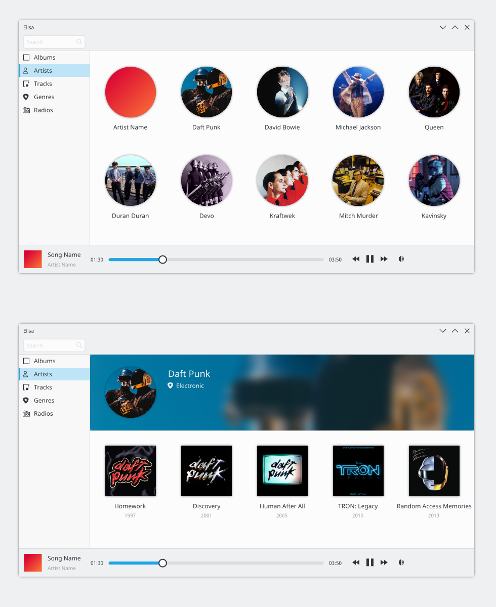
- Categories bar now like in Dolphin and have new highlight effect T11124
- Timeline has moved to down.
1x:
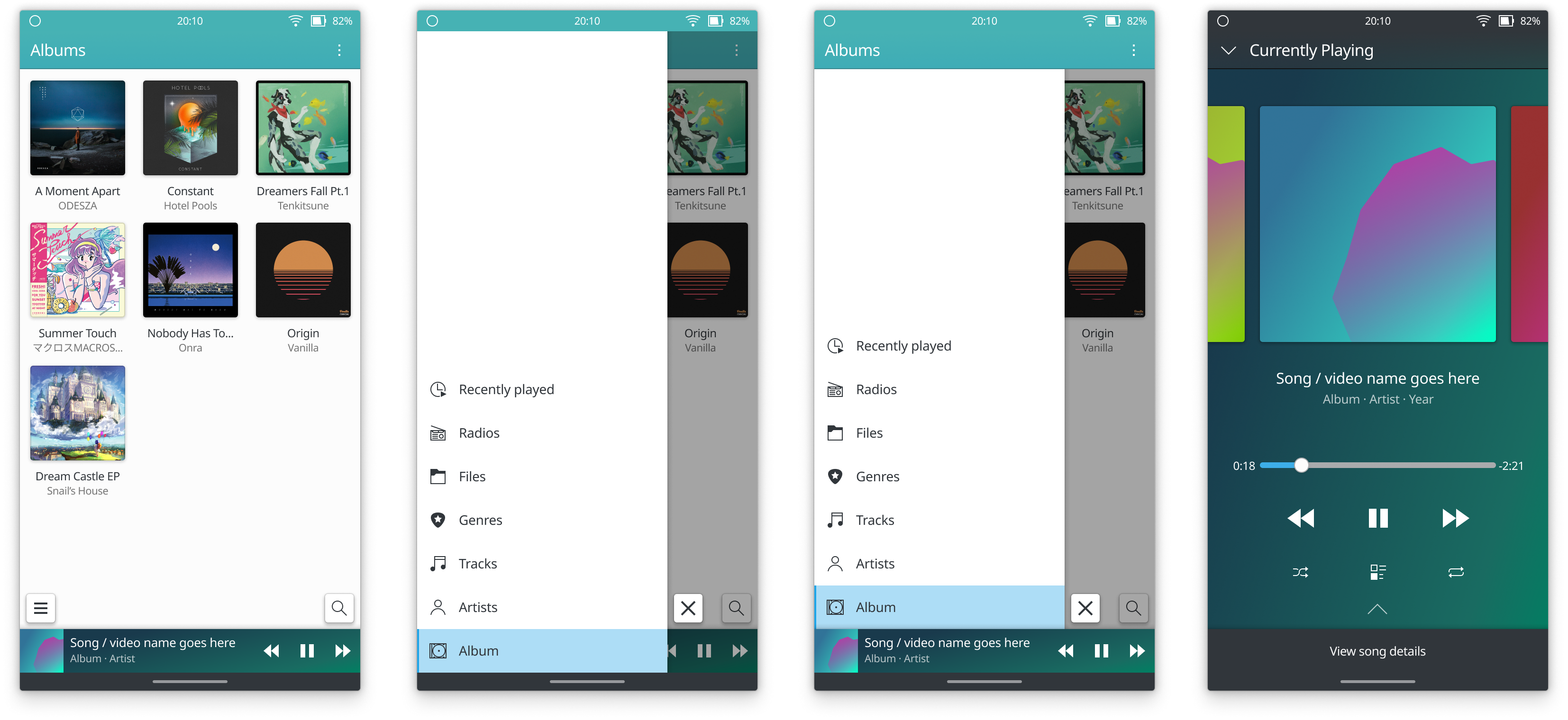
4x:
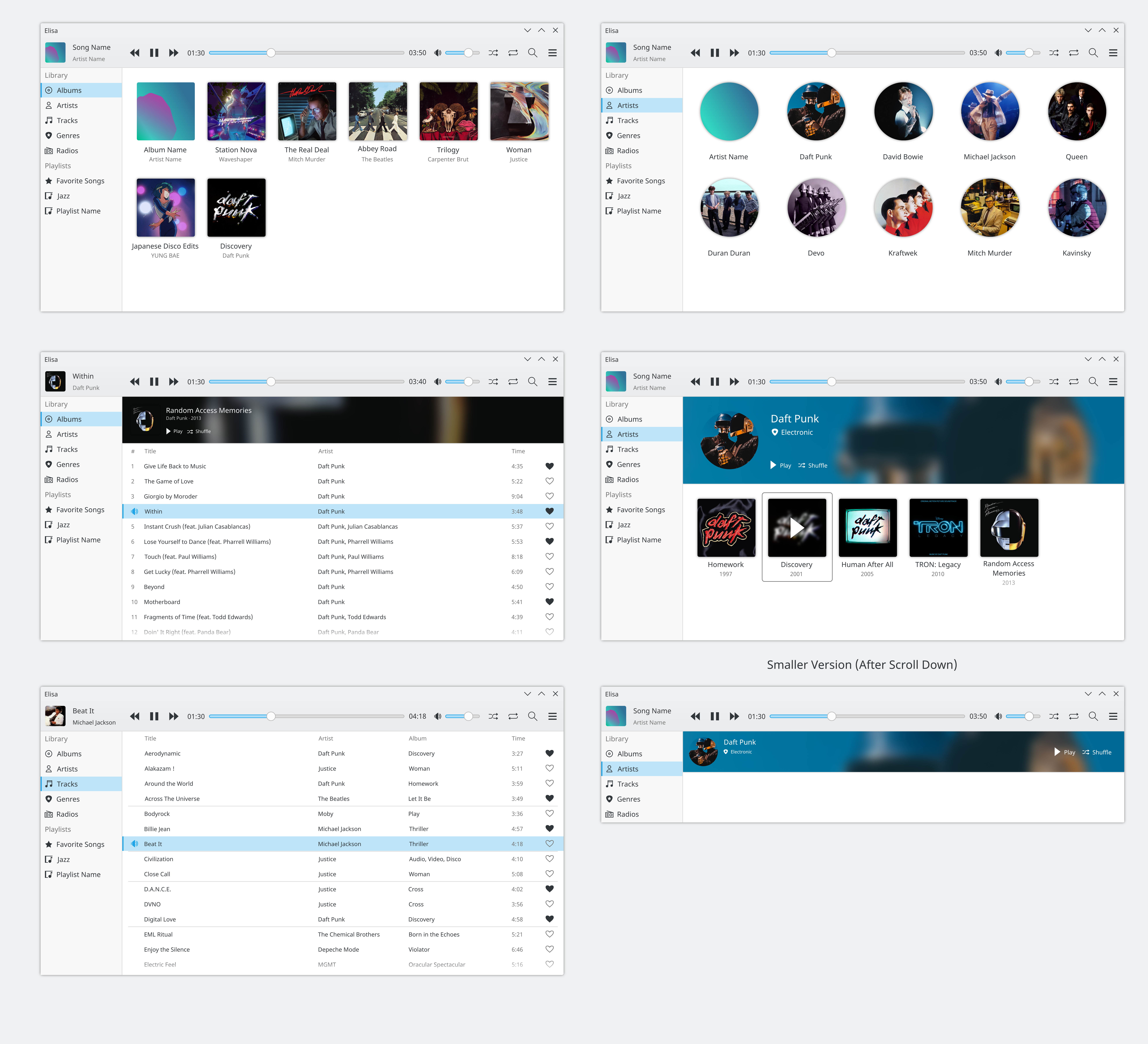
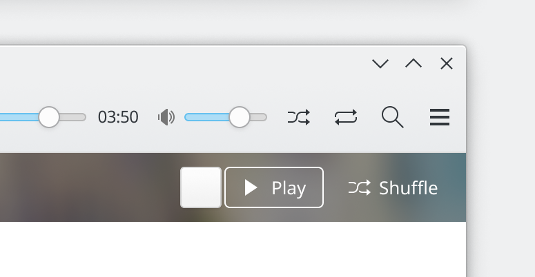
If you want to improve mockup, here a SVG.
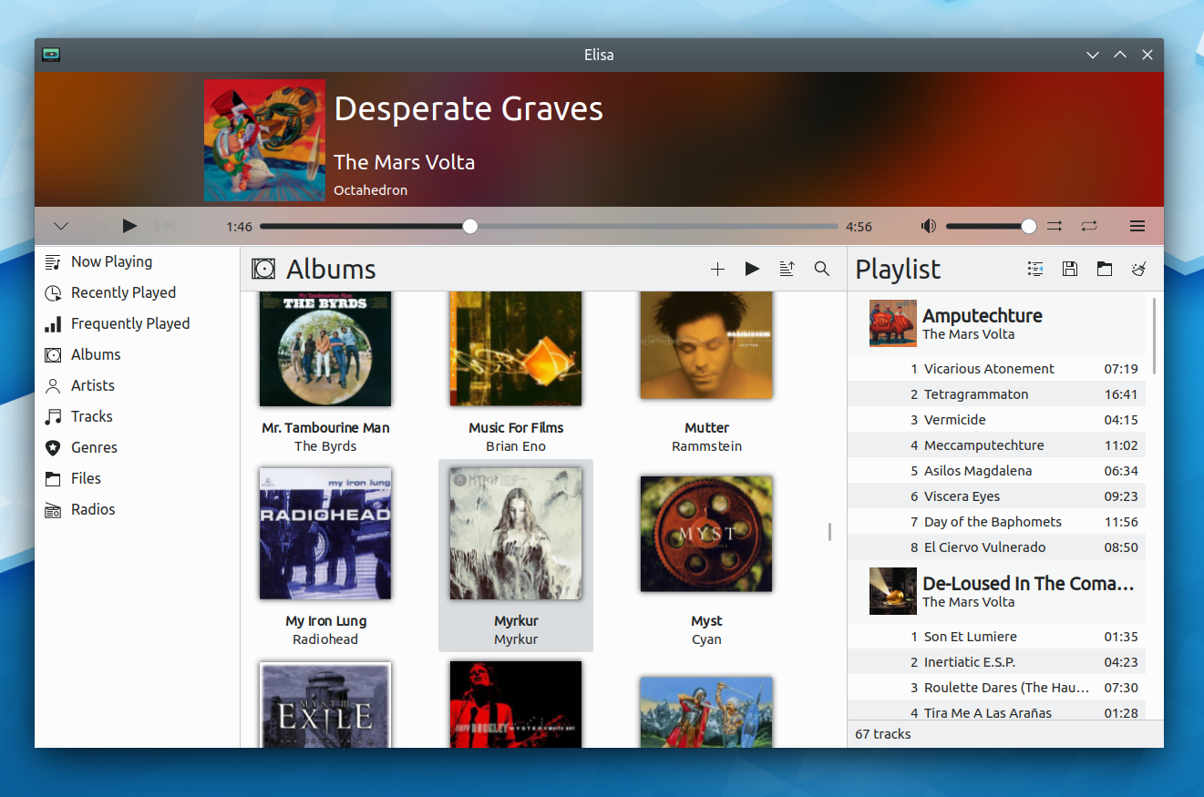
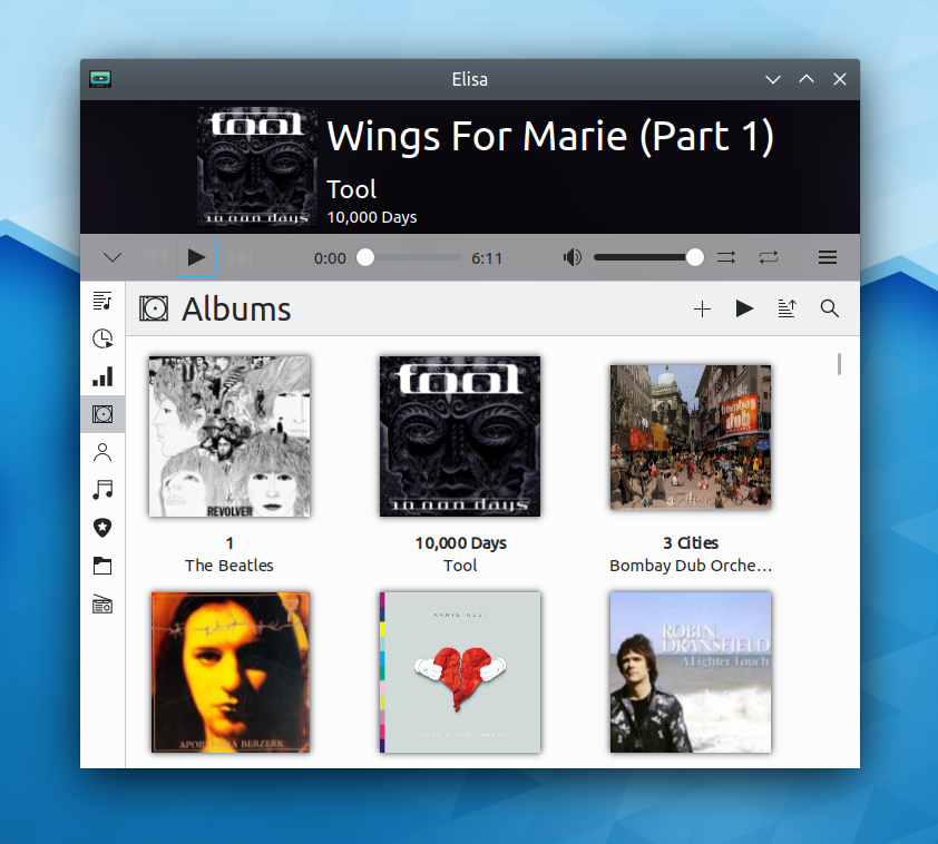
For comparison, screenshot of current Elisa:


