Unify how Breeze communicates checked/current/selected states
Open, Needs TriagePublic

Description

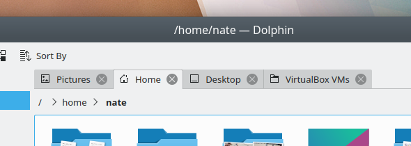
Sometimes the checked/selected item is communicated using color:

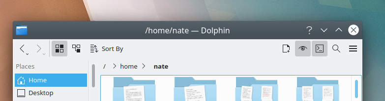
Other times it is communicated using a darkened background:

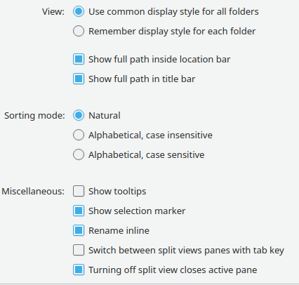
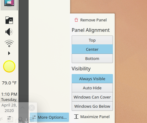
Other times is communicated using a non-darkened background:


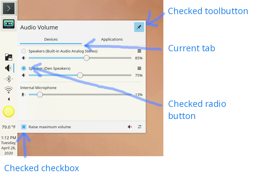
The Plasma theme is better about this, and always uses color:

We should probably move towards the same kind of consistency in the Breeze widget theme

Details

Differential Revisions
D29264: New tabs for Breeze
ndavis added a subscriber: ndavis.Apr 29 2020, 6:07 PM

I don't think it makes sense to connect all of these completely. These are skeuomorphic controls, so think about how these controls would behave IRL.

  • A toggleable button that you push in may have a smaller shadow when pushed. It may become shadowed if pushed in far enough. It may light up if it contains an LED.
  • The state of a checkbox is mostly determined by the kind of symbol it contains.
  • A page with a tab has more light on it if you've brought it to the front.

Most of the inconsistency that I think we should deal with is in how the focus state is shown or in the differences between the Plasma theme and the QStyle.

With that said, we could use View Background for checkbox/radiobutton and selected tab backgrounds. Sunken buttons should use the Button Alternate Background, which could be the same color as view background.

  • A potential issue with using View Background for selected tab backgrounds is that sometimes tabs do not contain list views or put a margin around them.
  • A potential issue with using the same color as View Background for Button Alternate Background is that it may seem odd to use a lighter color for the checked state in the light version of the Breeze color scheme.
    • There is not a great deal of contrast between button alt background and button background in the color scheme that I posted in D28317. I'll have to fix that by making the button background color darker or by making the alt background color much darker. Probably the latter.

I hear what you're saying, but I feel like using color to communicate these states helps accomplish the desired unification between QStyle and Plasma style, improves consistency overall, and is more consistent with @manueljlin's beautiful mockups.

I agree that there are other inconsistencies i.e. using the window background instead of the view background for unchecked checkboxes and radio buttons. I think that would be a nice improvement because right now if you change the button background, it somewhat oddly does not affect checkboxes and radio buttons. In my mind the purpose of doing this would be to draw attention to interactive controls and distinguish them from non-interactive elements, but it on;y works if everything conforms to that.