User Details
- User Since
- Apr 9 2019, 9:23 AM (262 w, 3 d)
- Availability
- Available
Sep 25 2023
Will it land in Plasma 6?
Sep 18 2023
Big parts of it have already been implemented. Here is a screenshot that shows what Dolphin looked like when this task was started.
Aug 3 2023
I don't mind at all! Go ahead if you think it is good enough.
Do you have a higher res version of that screencast, Felix?
Aug 2 2023
Added two points directly to the task description. Hope that is alright. Feel free to remove them if that was the wrong workflow.
Dec 8 2022
Discussion moved to https://invent.kde.org/system/dolphin/-/issues/36.
Oct 20 2022
Jun 20 2022
I am a bit confused by this "Human-Centered KDE" goal.
May 19 2022
| Wallpaper | Vote |
| Dark Flow | -1 |
| Safe Landing | +2 |
| Blue Ocean | +1 |
| Hearth v.2 | +1 |
| Liquid Glass | 0 |
| Unnamed | 0 |
| No New Wallpaper | 0 |
May 18 2022
@felixernst, remember how you told me that the EU's privacy situation isn't as bad as I thought? Look at how quickly things can change...
Mar 29 2022
Also, let me cross-link some related mockups by @aronkvh: https://phabricator.kde.org/T14933
Another note: There is a quite nice but less pretty KDE time tracking application already called KTimeTracker (https://invent.kde.org/pim/ktimetracker). If you would add your nice UI to it as an alternative (and maybe new default) view mode, you'd get your work immediately in front of a bunch of users and you wouldn't need to worry about your work getting lost once you stop working on Produktive.
Mar 18 2022
I am continuing work on this feature here: https://invent.kde.org/graphics/spectacle/-/merge_requests/129 (My code is loosely based on Leon's. I wasn't able to help with pushing this MR over the finish line back then but I always wanted to see this actually get merged.)
Feb 28 2022
Clearly, the EFF believes that they have yet to build up the necessary pretenses for using their worst backdoors whenever they want, and we are still some way from reaching the level of 1984. I assume they did their due diligence here, and their claim of hope is not false. But if we don't fight to preserve it, it may disappear forever.
Feb 27 2022
The US law is the opposite of a line of defense.
It could be a lot worse!
Feb 19 2022
Look, there's next to no trustworthy hardware left without Intel ME, AMD PSP, etc.
How do you think?
Nov 16 2021
Switching to alternate decent layouts can be interesting even for users that have never used the operating systems the layout is based on. It might simply be better suited for their individual computer usage. There is a reason there are a lot of popular tutorials on how to accomplish such changes.
Oct 26 2021
:P
Oct 25 2021
Seems like this discussion moved to gitlab: https://invent.kde.org/plasma/plasma-desktop/-/issues/24
Oct 5 2021
Good idea to open a phab task about this.
Aug 28 2021
Hello! Thank you for your contribution. Developement has been moved to https://invent.kde.org/. Please create a merge request there instead (https://community.kde.org/Get_Involved/development#Submit_a_Merge_Request) or this will likely not be seen by the right people.
Aug 2 2021
Jul 14 2021
Jul 11 2021
Alright, while I disagree with the way this task was presented and its conclusion I don't really disagree with all the examples given:
Let's not confuse different things. In some ways you are misinterpreting your own sources.
May 12 2021
Neither Claudius nor my mockups found enough agreement so far with Méven having a contrasting suggestion to put the actions below the information panel (https://phabricator.kde.org/M178#4431). There aren't enough other voices in general here for us to come to a conclusion. We would need better mockups or more people supporting one idea here I think for this task to move forward.
Mar 13 2021
Mar 7 2021
Because hover-only buttons are not discoverable enough I think we need some visible hint that something changes when they are hovered. The exception to this are actions which we are explicitly fine with if they are never found by the user which would make me question their existence in the first place.
Feb 21 2021
I made a proof of concept of an expandable tooltip based on a lot of feedback from this discussion. I think this would be a fine way to provide context help. It allows us to provide it in many of the typical circumstances: https://invent.kde.org/frameworks/kxmlgui/-/merge_requests/45
Feb 20 2021
Vielen Dank, dass sie sich um die Übersetzungen, insbesondere die der Hilfstexte, kümmern.
Feb 10 2021
Feb 2 2021
Jan 23 2021
Yes, that bug report only wants the question mark size to be adjusted.
Jan 19 2021
this project is like a dream come true compared to pretty much any other available desktop UI. :D
But have I understood correctly that your suggestion can switch between both a hamburger menu, a toolbar and/or a menubar?
For suggestions and wishes there is a bit of a blurry line between filing a bug report and starting a discussion here.
What you are writing might be better suited as a bug report to Kirigami but I am not certain. In any case I'll answer here because you are talking about a topic I am currently working on.
Jan 18 2021
I assume you would want this panel to be off by default?
Why would you assume that ?
Jan 17 2021
use a panel instead
Jan 9 2021
(I kind of was but these plans always get postponed when I spot something I deem more important to work on. Right now it is in the "maybe eventually perhaps I might get to it" category. It would have been higher up if I had gotten more positive feedback but even then not within two month.)
Jan 7 2021
I don't think there is a point in voting because anyone can already voice their opinion here if they want to. The person implementing this will also spend more time on this than either of us did so they don't necessarily have to be confronted with final decisions anyway especially because sometimes new aspects or problems are discovered while working on it. I am fine with working on other things for now.
Jan 3 2021
I basically thought that because these options would only show up on selection of items that it might be interesting to have them floating indicating the non-permanent state of them.
Dec 23 2020
Action buttons are in close proximity to unrelated info text there
Dec 22 2020
- Currently those action areas seem to be applied more widely (at least judging from what was recently added to Konsole), so this seems like a good thing to introduce. Making it contextual is even better I guess.
Dec 21 2020
I don't see a way to add the area as a proper panel that won't be problematic. Do you have a clear picture in mind how that could work?
Dec 20 2020
That's great! Very much like what I was envisioning.
The idea of a contextual action area seems very promising to me. I think we need to make sure though that the area is hidden most of the time. Otherwise users who are happy with Dolphin's current UI will be bothered by the "unnecessary" addition. We need to make sure that we can have the area enabled by default or its use for non-expert users will be close to zero.
Oct 5 2020
Sep 14 2020
Okay, thanks. I think I understand all the properties now.
Sep 4 2020
Just a little addition: If the documentation property exists we could use it instead of the description. This way we wouldn't have to worry about making sure they are in perfectly match with the other one. And then the descriptions still have a purpose, because inline help is still a TODO(while not the priority and there are other issues that have to be sorted out first).
Sep 3 2020
Sounds good 👍
Danke für die Blumen :]
But there is a help page that is actually useful: https://userbase.kde.org/Plasma/KrunnerThat one is completely outdated, unfortunately :/
Sep 2 2020
Firstly: I think this is quite an important thing to solve. IMO most users would be interested in knowing at least the general purpose features of KRunner (like calculation, unit conversion, time zones, window switching) but will only learn about them if they are observant enough and find them by chance.
Aug 3 2020
Did you have any problems with software used? (BigBlueButton and Greenroom)
Jul 28 2020
The tweaked design in the mockup looks great.
Jul 14 2020
I think the rule is that things that are interactive give feedback on hover. The pointy finger cursor is the weakest form of such feedback because it doesn't communicate the size of the click target or what will happen on click.
I don't think we need the pointy finger cursor but should instead give proper hover feedback and this is AFAIK already what we are aiming for.
Jun 30 2020
In (Re-)Add tooltips using a contextual help button I am proposing a way how we could be replacing "What's This"-help in system settings with contextual help buttons in the future. I believe this is a right way forward for settings pages specifically because those pages' main task (aside from organisation of settings) is to communicate the effects of settings which is why buttons to display tooltips seem sensible to me here.
Jun 29 2020
You are certainly picturing a more demanding and nitpicky user than I am but those do exist. I wonder where those expectations you mention would be coming from but I agree that if an apple® fan installs Plasma with the preconception it can be made to be exactly like macOS they'll be in for a reality check. I don't really think the existence of a "Cupertino/Pear/Raincoat" theme would worsen that problem though. That's what I meant when I said "I don't think users actually expect that unless we market it as such."
Anyways, going with "some layouts using existing plasma stuff" is alright as well even though this feels like we would be needlessly limiting us from offering layouts that are tried and tested.
Jun 28 2020
Jun 26 2020
I can't quite remember if that was discussed before but I think we want all highlight effects on the panel to be the same in the long run. That would really help with the overall user experience imo. I don't think the first one would really work for task managers or at least some design work is necessary to make it work. Aside from the panel highlight aspect I don't really have an opinion on this but I encourage you to make a patch if you think it is an improvement. :^)
Jun 14 2020
Jun 13 2020
Jun 1 2020
I guess waiting for approval didn't go anywhere. I'll continue work on this soon then and I'll move it to invent.kde.org.
May 30 2020
a relatively tiny clock
https://en.wikipedia.org/wiki/Date_and_time_representation_by_country#Time
May 16 2020
This sounds good to me overall. I am not that familiar with the technicalities of the different scaling methods (which seems to be quite a difficult subject) so I can't comment too much on this. To me it looks like proposal 3, 5 and 6 depend on proposal 4 e.g. the 135% scale factor in proposal 5 should normally be avoided AFAIK.
May 9 2020
I think good tooltips and good UI should be enough.
So "1) Focus on comprehensive tooltips" it is?
+1 to this change.
Having the exact same panel and buttons on the left instead of at the bottom is a change that IMO even the most computer-illiterate Windows user should have no major trouble adapting to. Anyone else can change the panel position if they want to. In any case I can't picture a scenario in which it would stop someone from getting work done so I wouldn't be too worried about changing this default.
May 6 2020
I can see why you would think that those three would fit a bit better to Behavior. Concerning "switch between split view panes with tab key" I would prioritise keeping all three split view settings together and therefore not move it to Behavior.
Perhaps it could be a sub/page tab of Behavior called "Main window" or something.
I wouldn't be opposed to that but I don't think putting these two/three settings in their own tab in Behavior would overall be an improvement. Firstly it is difficult to find a common tab label for them that is descriptive. Secondly I do think they have enough connection to Interface to be there i.e. "rename inline" changes the Interface for renaming, "show tooltip" is a purely visual change.
I created a task.
Behavior (new top level page)
- Folders & Tabs
Show on startup: (X) Folders, tabs, and window state from last time (from Startup)
                 ( ) [Select start folder location]                 (from Startup)
Opening folders: [X] Open new folders in tabs                       (from Startup, I couldn't figure out what was meant by "new folders"
                                                                    without searching online. Maybe "Prefer tabs to new windows".)
                 [ ] Open archives as folder                        (from _Navigation_)
                 [ ] Open folders during drag operations            (from _Navigation_)
May 5 2020
Alright. Seems like at best Filelight could make use of Dolphin's calculated sizes and even that is probably not worth the trouble. I was just thinking that Filelight was quite fast to calculate the recursive sizes of all folders on my SSD and if Dolphin just had this data this task would be done but that was apparently too naive a thought.
Would it make sense for this to share a directory size counting algorithm with Filelight?
May 4 2020
Apr 29 2020
Yes, feel free to edit the mockups in this thread at any time. Older versions are kept in the history anyways.
Apr 28 2020
Not so elegant with Numlock for one layout
Apr 27 2020
First of all: It's always great to see a new contributor! Welcome! :)
The keyboard KCM redesign is triaged to be high priority for a while now so a new mockup like this might give someone the inspiration they need to do it.
Here is some feedback on the placement of settings:
Apr 22 2020
Sure, take your time. :) An in-depth code review might not be necessary at the moment because the current implementation will change quite a bit if/when I implement meven's suggestion of having a DolphinUrlNavigator in the toolbar have direct control over the view. I am mainly looking for approval that you would be alright with me working on having the location in the toolbar as an option at all. And maybe you also have a strong opinion on the general approach for this.
Apr 17 2020
That's the kind of solution I was hoping for. With this idea I can see all KDE applications be it Dolphin, Marble, KDevelop or Okular use the same component although I know that that might seem like too much to ask for. There might still be some decision making necessary for specific applications to figure out which interface appearance would be best but as long as we would be using one component in the background all the groundwork would be done to facilitate easy switching between complete solutions if the situation calls for it.
I hope this idea will also work nicely on a technical level.
Apr 16 2020
Well, I guess that's one way to look at it. ^^ But I already feel like I was a bit bold when I created this patch and ignored Angelaccio's concerns so I wouldn't really want to put more pressure on him by continuing work on this. If I was hungry for more work right now I would be contributing towards the consistency goal.
Apr 15 2020
I'll have the icon removed for my next diff. Méven already told me the one-liner to remove it above.
Mar 30 2020
Anyway, I still think that the UX is more annoying and less informative at a glance than using the array of buttons.
Well, the problem is that we can't expect users to be able to identify window types by their icons. Maybe if we had icons as recognisable as for the desktop, the normal and the dialog window for all of them it would be alright but even then users might still want to hover over some of the other icons to be sure they selected the right one(s). This is especially difficult because some of the window types can seem similar like Dialog and Utility or Dock, Toolbar, Torn-Off Menu and Standalone Menubar.
There really needs to be a list with the actual names of the window types somewhere IMO. And while I don't think this ComboBox will win any design awards I do think it works well enough. There might still be a better way of doing this though.
I really like how easily the window type condition can be read when only one type is selected. I hope that covers the vast majority of use cases.
Mar 29 2020
Another way of solving this is to display what is selected as the text of the ComboBox like "'Normal Window' selected" or "5 selected". Here is roughly how this can be done: https://stackoverflow.com/questions/47575880/qcombobox-set-title-text-regardless-of-items (if you copy any code from this the file would need to be GPL 3 as part of a CC-BY-SA 4.0 one-way conversion AFAIK)
Mar 9 2020
I didn't know this idiom but I did feel the cold water. ^^ Thank you for reconsidering.
Feb 28 2020
I strongly disagree with the space conern. In many configurations putting the UrlNavigator into the toolbar actually increases the space available for the path. As an example in the following screenshots the information panel is open and the UrlNavigator in the toolbar therefore only has ~14 px (< 3%) less space.
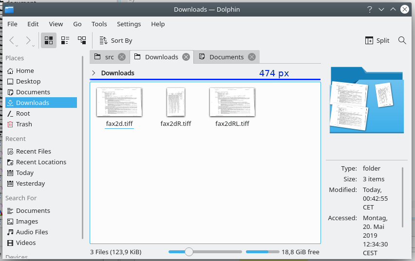
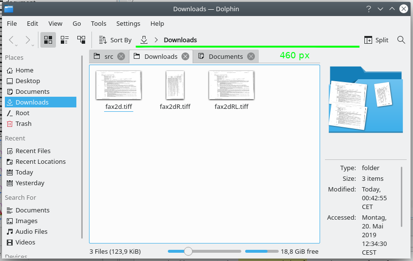
Keep in mind that when split view mode is enabled the two UrlNavigators currently only get half of this space. Also keep in mind that the space in the toolbar can be greatly increased by removing unwanted buttons from there.
Furthermore this change mainly increases the available space of the view area.