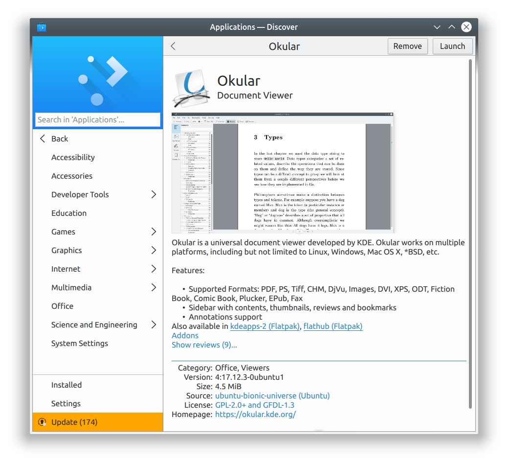
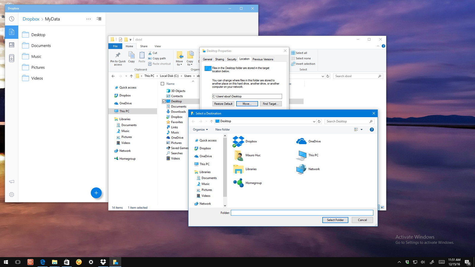
By default, KWin draws a thin border around all windows (this is user-controllable in System Settings → Application Style → Window Decorations → Border Size).
The border's color is the window background color from the theme, and there is no line separating it from the rest of the window content.
This border causes some aesthetic issues. In particular, when a window has content right up against its own natural edge that is very different in color from the border that KWin draws, the result is somewhat awkward:
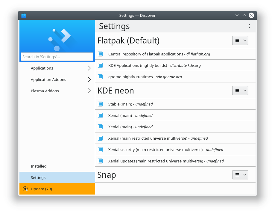
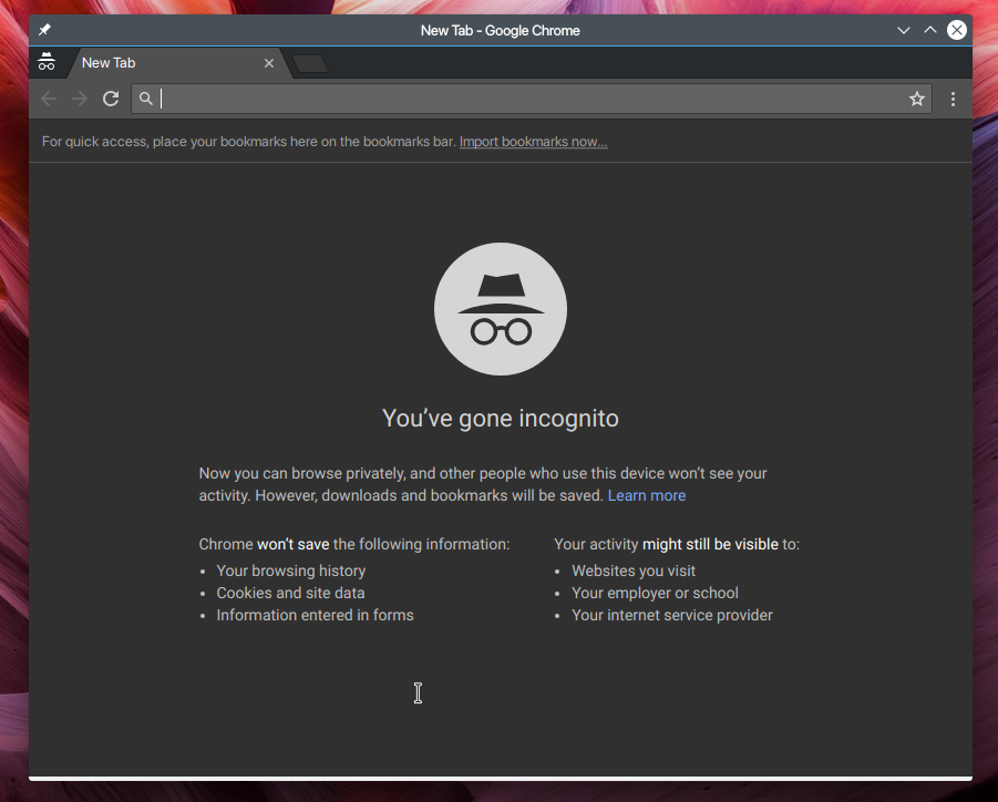
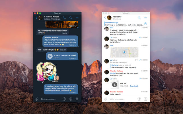
In other cases, when the color discrepancy is small, the result is less noticeable but nonetheless causes perceived visual glitches: lines don't touch the edge of the window, toolbars and lists abruptly end, background colors change with no visual separation between them, etc:


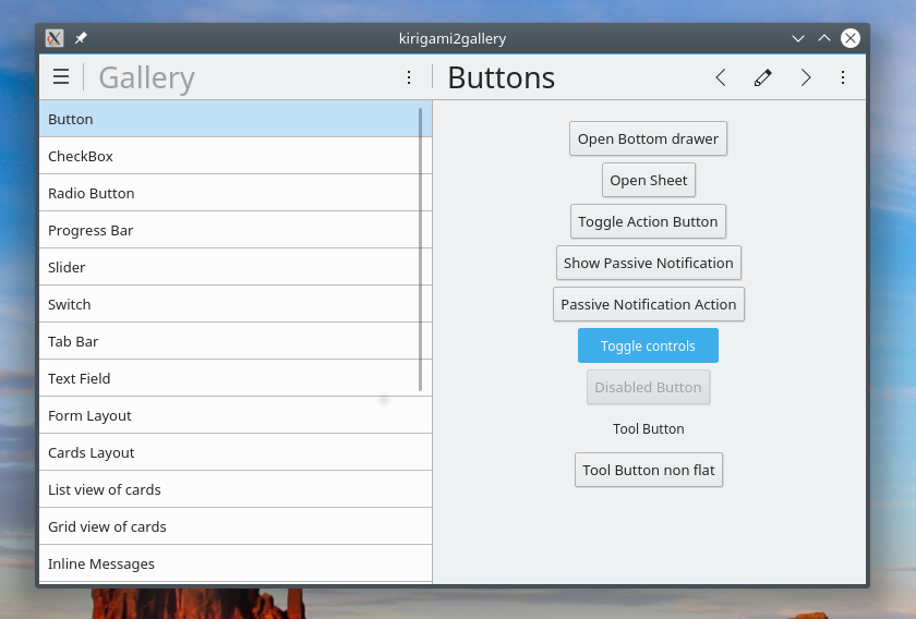
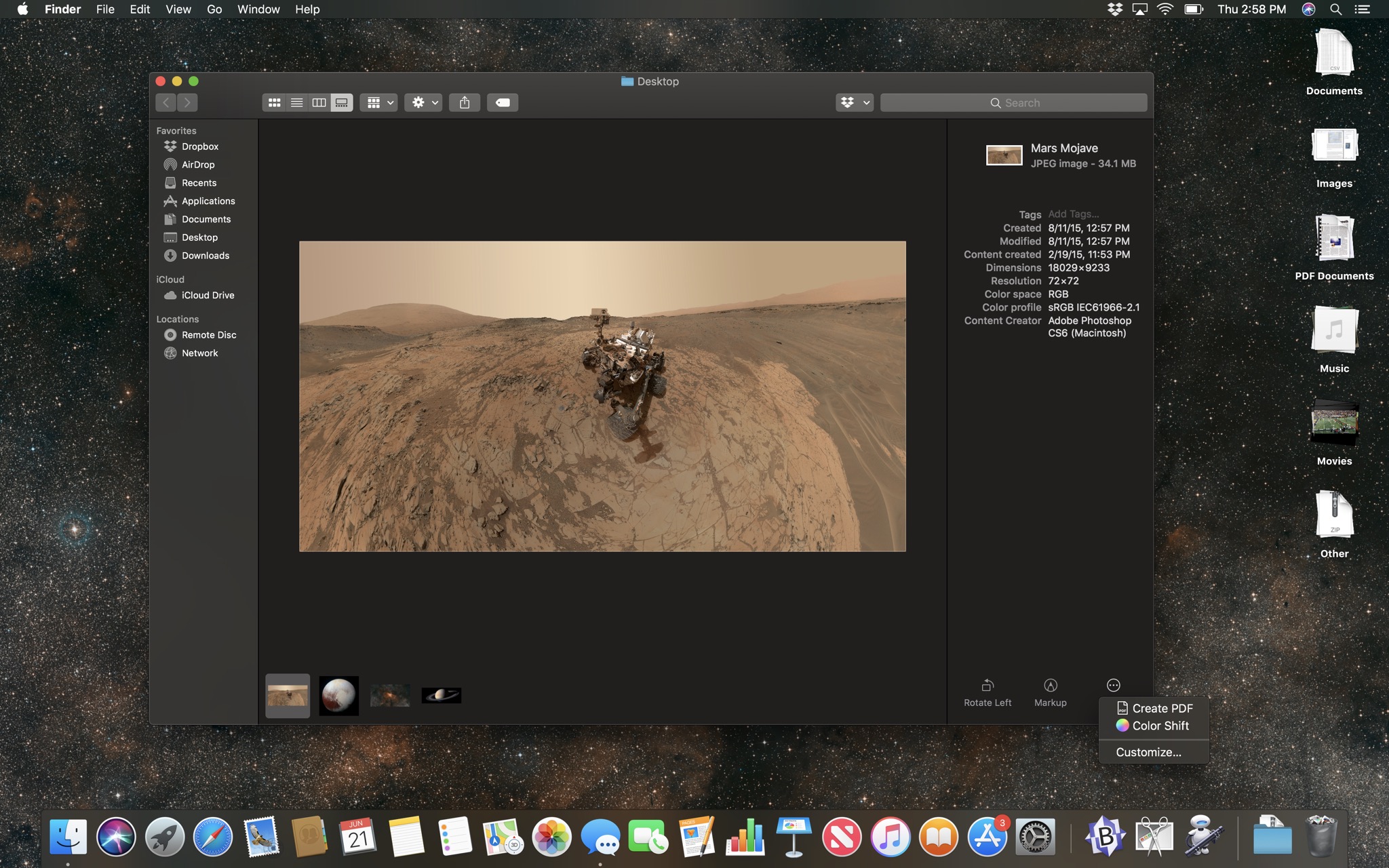
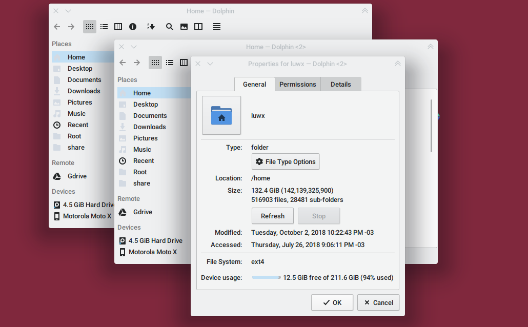
In other cases, the additional KWin-drawn border causes a "double border" effect where elements are twice as far away from the window's edge than they should be:
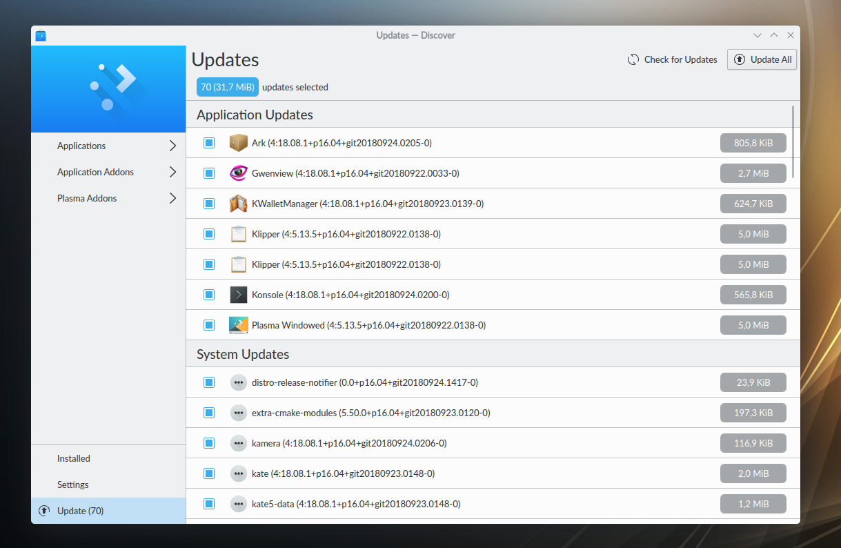
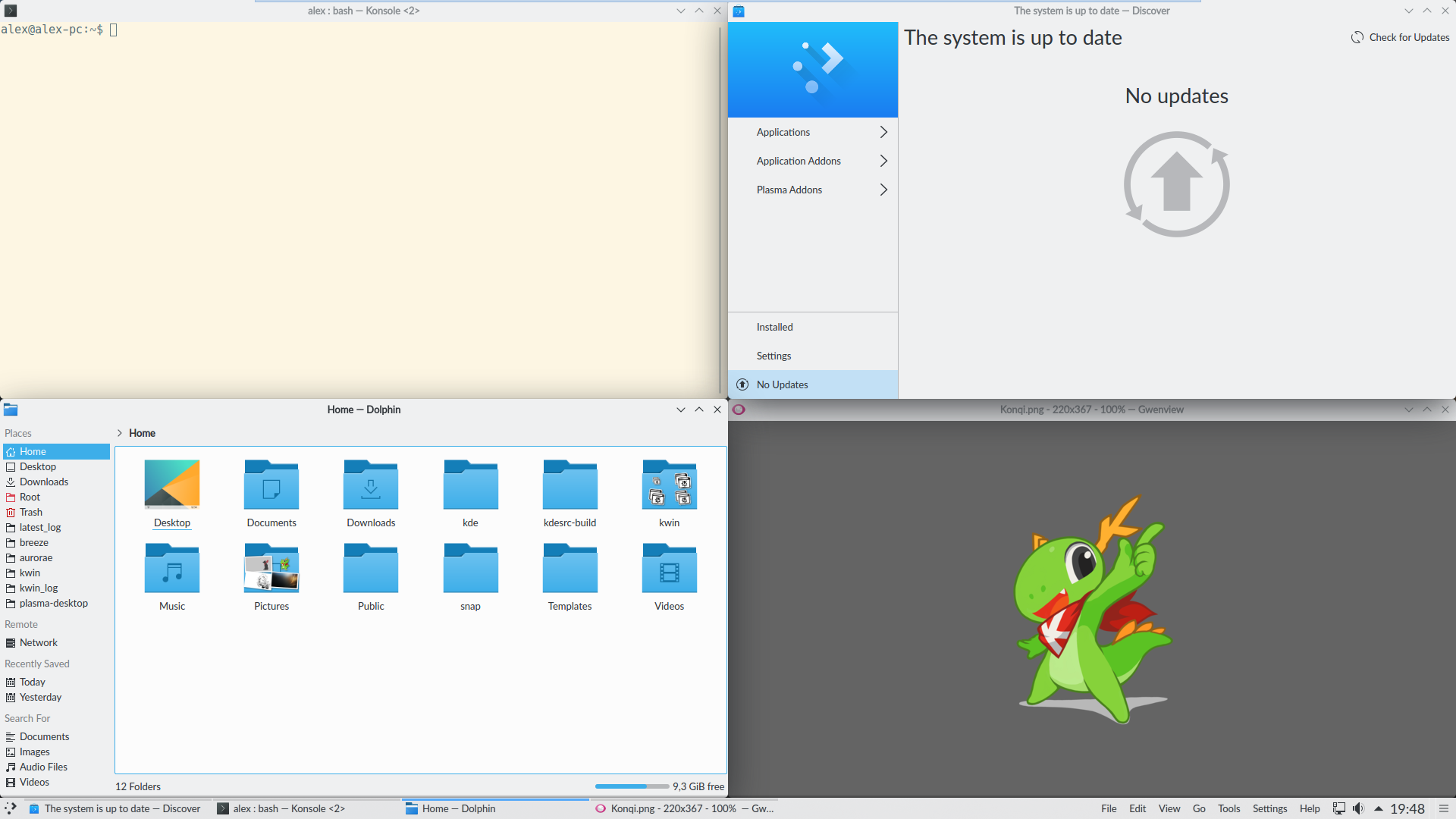
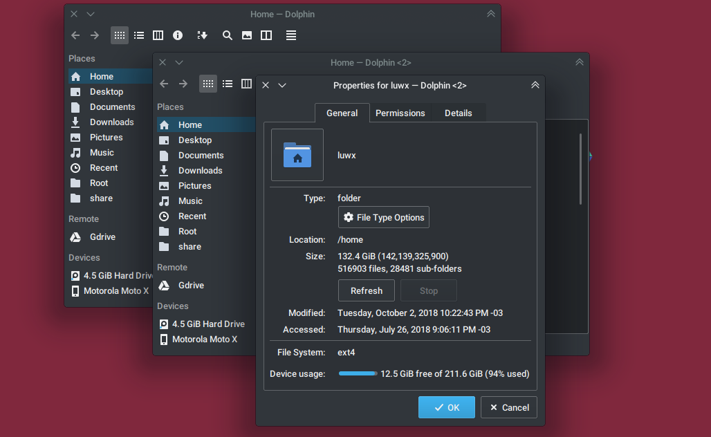
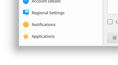
The problem here is that today's software--including all non-KDE software--is increasingly written with the expectation that their content is able to touch the window's edges, and our default border setting interferes with that and causes visual issues. It also limits our own design flexibility by making it difficult to design according to Breeze's own minimalistic style. An example is how System Settings' sidebar tries to be Breezey and minimalistic by using only a single-pixel line to separate itself from the content area, but because of the border, the line doesn't extend all the way to the bottom of the screen, and the list background color differs from the border color:
Thoughts on how we resolve this?