User Details
- User Since
- Feb 15 2021, 10:18 AM (166 w, 5 d)
- Availability
- Available
May 19 2022
| Dark Flow | +2 |
| Blue Ocean | -2 |
| Safe Landing | +1 |
| Hearth v.2 | -1 |
| Liquid Glass | -1 |
| Unnamed | +1 |
| No New Wallpaper | +1 |
Apr 26 2021
I don't quite understand why do we need another way to search, there are kickoff and krunner already. Activity bar might be a nice idea, but I think it would be better if one could actually see the contents of activity without having to click it (like in activity pager plasmoid).
Apr 15 2021
In my opinion it's not really a good idea. Look at "places" for example, each folder looks like a small blue square and is much less recognizable than a monochrome symbol. This will be even worse for smaller screens and screens with low resolutions. For files there is another problem: some of them have similar colors (.h and .xml, binary and .iso or .sh, and so on) which will result in worse recognizability again. Also, some line-art icons look reasonably better on smaller scales (look at cmake file on that screenshot) and leaving it as it is will make it inconsistent with other icons (unless we want to redraw all small icons which is a lot of icons). Anyway, this is just my opinion and see some people here have the opposite one.
Feb 15 2021
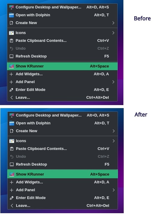
Can we remove empty space before and after separator?
I think it would look prettier that way.