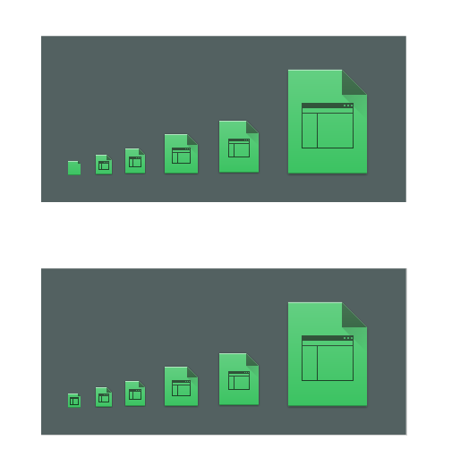
Right now, Breeze switches to monochrome line-art icons for small-sized places, devices, and mimetype icons.
I have a confession to make: I don't think they look good. I think they're kind of crude-looking, they don't actually look like documents or files at all, and they look jarringly different next to colorful app icons or preview thumbnails or anything else that's not monochrome at a small size, and even compared to their own larger sizes.
Here's Dolphin's appearance with small icons in a list. Compare the appearance when the places, devices, and mimetype icons are colorful rather than monochrome line-art:
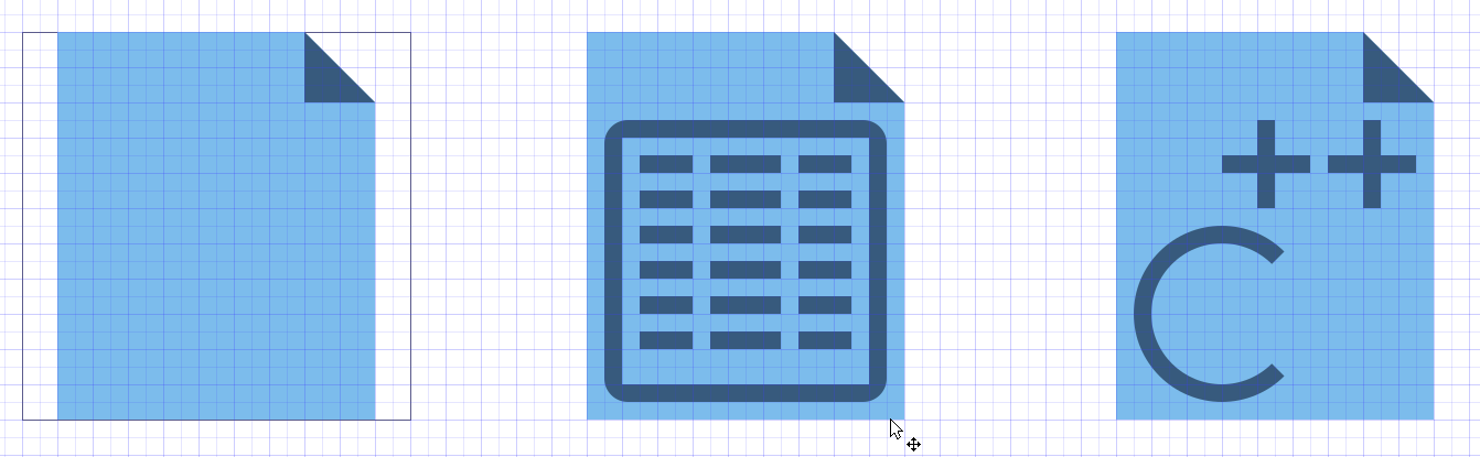
Wow, document icons that actually look like document icons!
This was accomplished by deleting the 16* and 22* folders from the places, devices, and mimetype folders in the Breeze icon theme. Note that this is the crudest possible way to do it and the above image should be considered a mockup, nothing more.
I think the monochrome icons look great for actions, but for files and folders, I'm just not feeling it. Let's explore the idea of using scaled-down colorful icons for places, devices, and mimetype icons. Some of them would probably need some tweaking to ensure legibility at smaller sizes--specially the Places icons, which right now become a bit of a muddy soup; see the Places panel in the above screenshot. That doesn't seem like an insurmountable challenge, and henceforth icon creators wouldn't have to create two different styles for each new places, devices, and mimetype icon.