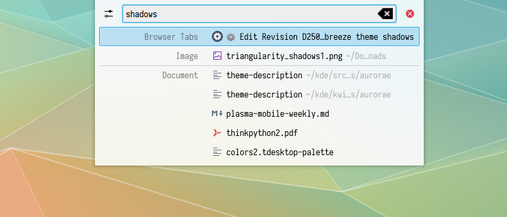
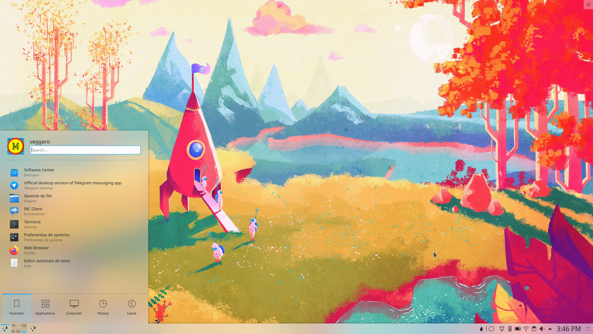
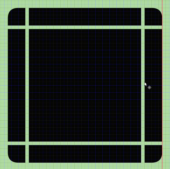
I have received negative feedback (and I agree with it) on the current state of breeze shadows: they are quite dark, narrow, and feel unnatural. I tried to adress that by making shadows more sparse and a bit lighter especially on the angles while trying to keep it distinguishable when on white background. I received some positive feedback on these shadows from T10891 and the VDG channel. More specifically, I changed dialogs/background.svg to have a) longer linear gradients and b) radial gradients instead of linear on the four sides to make the center darker than the angles.
Details
Details
- Reviewers
ngraham The-Feren-OS-Dev ndavis - Group Reviewers
VDG - Commits
- R242:35351ba3f299: Update breeze theme shadows
Diff Detail
Diff Detail
- Repository
- R242 Plasma Framework (Library)
- Lint
Automatic diff as part of commit; lint not applicable. - Unit
Automatic diff as part of commit; unit tests not applicable.
There are a very large number of changes, so older changes are hidden. Show Older Changes
Comment Actions
Testing it. Usability wise the strength is perfectly fine; the shadows still do their job.
Visually it's a definitive improvement for me.
Only thing I'm not sure of is the weaker strength in the corners, but I'm going to keep testing to see if it's just a matter of getting used to it.
Comment Actions
If anything I wonder if we should make them bigger too, to better match the default Breeze shadows.
Comment Actions
I'd prefer to avoid them making more sparse because a) they look worse to me when applied to small objects such as notifications (you have big shadows for a relatively small item, they don't give the impression to be casted by that item) b) lots and lots of techical problem when trying to change shadow size :-/
Comment Actions
I'd prefer the shadows to have equal strength all around, I couldn't get used to weaker shadows in the corners.
Comment Actions
I haven't said much about this idea because I just have a hard time seeing the difference from the screenshots. It seems like a good amount of effort went into this, and I know from experience that adjusting shadows in Inkscape is a major PITA, but I can't approve something just because of that. Maybe we're using the wrong approach for shadows in the first place?
Comment Actions
There's definitely a difference, whereas the shadows are now rough and dark this is subtler.
I'd suggest testing this patch with a light color scheme and then switching to the unpatched theme plus testing against light backgrounds to notice the changes.

Comment Actions
Ah, pixel-perfect before-and-after images make it much easier to see. I will reiterate my belief that the shadows now need to be bigger if we're going to make them lighter and weaker.
Comment Actions
I see the difference now as well. @niccolove BTW, the top right corner is a bit messed up. It's rising above the rest of the shadow on the top edge.
Rather than painstakingly making shadows by hand in Inkscape, perhaps we should be using KWin for the shadows?
Comment Actions
Oh! That's a pity, I really liked them. I will update it as soon as I have time.
Uhm, I will try something and get back to you.
Remember that there are third party desktop themes with SVG that we probably want to support. Wouldn't using KWin for shadows break those?
Comment Actions
If we remove the code for using those SVG shadows, it won't break them in the sense that they will stop working. It'll just mean those parts of the desktop themes won't be used. I suppose that could be seen as a form of visual breakage.
For complete theme sets, this shouldn't be such a problem since they also typically come with their own window decorations and recommend a specific widget style. For people who just want to get rid of the shadows we should probably provide an option somewhere to disable them rather than making them edit the plasma theme. I suppose we could wait until Plasma 6 to make that kind of change, but that's a ways away.
Regardless of the method we use to achieve it (including continuing to use SVGs), I think it might be best to make Plasmashell's shadows match the shadows cast by menus (such as context menus) in applications. These are defined in the Breeze widget style and have different sizes to match the different window shadow sizes.
Comment Actions
One thing we might need to do in order to finally stop changing the shadows is come up with a math based system for deciding how shadows should look based on the elevation we want certain UI elements to have. We could copy Material Design shadows, but I don't think we should. MD's shadows get darker the larger they are, but that's not how real shadows work. Real shadows get darker the smaller they are because light bounces around.
Comment Actions
Well, they look darker, which still isn't realistic: https://material.io/design/environment/light-shadows.html#shadows
Comment Actions

I'm against this; there are many desktop themes that tweak their shadows without being a theme set, and it would be an important regression to ignore them.
Regardless of the method we use to achieve it (including continuing to use SVGs), I think it might be best to make Plasmashell's shadows match the shadows cast by menus (such as context menus) in applications. These are defined in the Breeze widget style and have different sizes to match the different window shadow sizes.
This is interesting. I have to look more into it.
Meanwhile, I tried to do a more sparse and equal-all-around shadow (to address Nate+Filip), but I'm not 100% okay with it. Opinions?
Comment Actions
Hmm, that shadow feels too "hard," somehow. It feels like it ends rather abruptly rather than fading out smoothly.
Comment Actions
Do these shadows get cached or something? When I build the diff and restart plasmashell, the shadows I see are identical, pixel-for-pixel.
Comment Actions
I don't know. But you can manually change them by replacing the .svgz in /usr/share/plasma/desktopthemes/default/ dialogs/background.svgz and widgets/panel-background.svgz with the new svg.
Comment Actions
Okay, after you taught me how to delete the cache files rm ~/.cache/plasma*, I can see other changes to the plasma theme SVG files but I must admit I still don't see a difference between the old and new shadows in this patch. :/
Comment Actions
The problem is not that you don't see, it's that it doesn't show. I'll try to understand what's going on and get back to you.
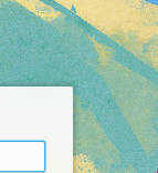
This is a comparison:
The problem is not that you don't see, it's that it doesn't show. I'll try to understand what's going on and get back to you.
Comment Actions
Finally! I'm 100% this works now.
Please refer to the comparison to see the difference now that this patch works, although I think it's quite noticeable :-)
Comment Actions
Yep, can confirm that it works now. It is indeed a more subtle and pleasing effect. I still think the distance away from the window would be lengthened to make it even nicer-looking. :) But if nobody else agrees, I'm okay with this in its current form.
Comment Actions
I just can't get the padding right on angles when changing their size. What size should I change of the colored rectangles?
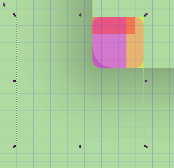
I just can't get the padding right on angles when changing their size. What size should I change of the colored rectangles?
Comment Actions
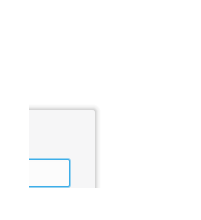
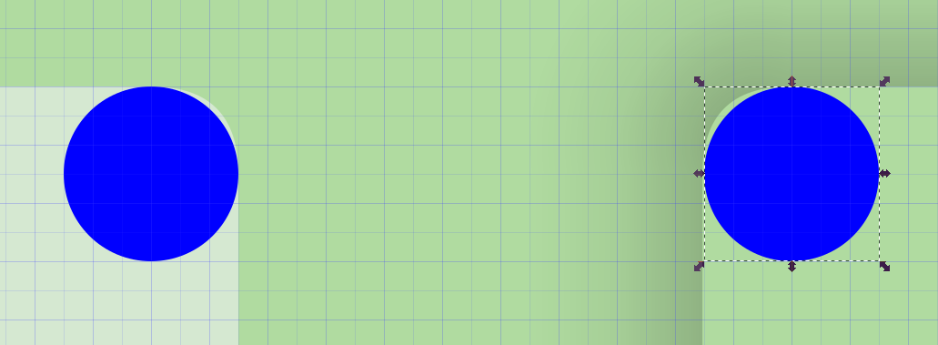
This results in the corners of the System Tray popup no longer looking rounded.
Current:
With patch:
Comment Actions
Actually it looks like that was due to some kind of caching issue. It's gone now. LGTM!
Everyone else good with this?
Comment Actions
Actually, it seems to me that borders are not correctly rounded except when on bright background, and sometimes. I'm not sure why would that be. Do you also see this, or is it just me?

Comment Actions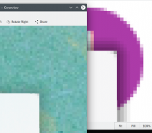
My impression is that the rounding is currently just faked by the shadow. So when the shadow gets lighter, it becomes more obvious that the object itself isn't really rounded.

Comment Actions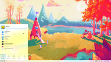
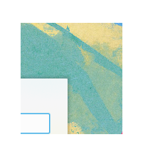
Of course, I can't just turn off the contrast desktop effect. I'm unsure how to move forward with this.
Here's Plasma without desktop effect:

As you can see, shadows are working!
Got it. The shape is actually rounded BUT the desktop contract effect is applied in the whole rectangle underneath, and it makes everything look like a rectangle. Here's the widget with fully transparent background, but with the contract effect on:
Of course, I can't just turn off the contrast desktop effect. I'm unsure how to move forward with this.
Here's Plasma without desktop effect:
As you can see, shadows are working!
Comment Actions
So I guess we can either fix the Background Contrast effect, or stop using it and do the opacity entirely within the Plasma Breeze theme (e.g. by bumping it up from 0.6 to 0.9 or 0.95 or so).
Probably needs Plasma input, especially from @broulik and @mart who I believe are familiar with the history here.
Comment Actions
Not sure why it looks rectangular, on current theme the mask- prefix is correctly used and the blur is correctly shaped with rounded borders
Comment Actions
I just compared the blur and contrast effects and the mask is used in the exact same way :-/ I have no idea what could be wrong there.
Comment Actions
Got it. Blur is not rounded either to me. The shadow was hiding it.

If you remove the shadows, desktop effect and background, do you still see rounded blur? If so, it's my machine.
Comment Actions
Can you please doublecheck that you see everything correctly? The mask thing was weird, but I think I fixed it
(Accidentally put in a file from a different branch, sorry, just a sec)
Comment Actions
Looks like you fixed the rounded corner issues, nice. This does look much better IMO. +1 from me.
Are other VDG folks good with this? @ndavis do the SVG changes look appropriate from a technical point of view?
Comment Actions
It's different from master, which looks pretty normal:


I noticed a few things.
The masks have a rather odd shape and it's not pixel aligned, which might mean something is wrong:
It's different from master, which looks pretty normal:
In the panel-background and tooltip SVGs, the shadow was changed, but the tooltip/panel background was not.
I get the impression that these were changed with the node tool rather than creating the corners from rounded rectangles. I guess that works as long as all the svg corners are consistent with each other, but it's inconsistent with the QStyle and could still lead to visible pixel misalignment when the UI is scaled up.
Why is widgets/background.svg different from the other ones? Maybe there's a good reason, since it's also different in the master branch, but its very odd.

Comment Actions
I know this was going to seem weird, but: the only way to get pixel-perfect mask is to add nodes to the shape, but if I do that, the mask is no longer correctly detected. I tried to group different shapes to be pixel perfect, but that does not work as well. They only way seem to be a single curve, that can only approximate the actual shape. Currently, Breeze Masks are *not* working, although they sure look better than mine. No idea why. Do you have any tip here?
the panel-background and tooltip SVGs, the shadow was changed, but the tooltip/panel background was not.
Mhh, weird. I'll fix that.
I get the impression that these were changed with the node tool rather than creating the corners from rounded rectangles. I guess that works as long as all the svg corners are consistent with each other, but it's inconsistent with the QStyle and could still lead to visible pixel misalignment when the UI is scaled up.
This is already what is done in master though, right? I'm not sure rounded rectangles corner can be used, and all the pieces should be different elements
Why is widgets/background.svg different from the other ones? Maybe there's a good reason, since it's also different in the master branch, but its very odd.
No idea. I did not change that file.
Comment Actions
I'll trust your judgement on the masks and corners. If there's a problem, it can be patched. I know this stuff can be super janky at times.
Comment Actions
Just in case you misunderstood me, when I said create the corners from rounded rectangles, I meant create the rounded rectangle and cut off the parts you don't need so that you're left with corners that you can place however you need. If you're not aware of it, check out Inkscape's Path menu. It has a ton of useful stuff for sculpting shapes.
Comment Actions
Regarding the mask: I'd keep it as is right now and look more into it in the (very near) future. Currently the difference is not noticeable even on different scalings and I cannot find another working solution, so I think it should not be a blocking issue. But yes, I will surely look more into it. But right now I have little time and I spent the last four days without studying and working on KDE and I know I can't keep up that, so I'm just a bit afraid that this patch would end up blocked for weeks again.
Regarding the corners, I will also look into it but not in this patch, as that would be an unrelated change.
Comment Actions
I posted the previous comment in a eccessive state of tiredness and nervousness :-) I will look into doing a better mask *before* asking to land the patch, so I can be sure it's the right path forward.
Comment Actions
I found a way to make masks that follow the current shape by copying it and making them slightly bigger than original ones.
Regarding panels and tooltips: using different roundings (1px vs 3px) seemed inconsistent to me, so I tried to ask in the VDG chat if they though that moving panels and tooltips to 3px was a good idea, which I also think (e.g.: panel endings should be rounded rather than sharp). I thus moved them to 3px rounding as well. I think it's barely noticeable but it looks better than before. I put it in this patch as it was closely related and on the same files, but I could create a different patch if you think it's more appropriate.
Comment Actions
I feel like the shadows might be slightly overcompensating in shadow strength for the small shadow span (it looks kinda weird on first glance), but apart from that minor nitpick, I'd say this is good to go.