Currently, we have two components for lateral navigation in KDE:
- Tab bars
- Sidebars
While sidebars are fine, the way we use tab bars is problematic, as it breaks conventions users from almost every other platform will be expecting.
| platform | editable | non-editable |
| elementary |  |  |
| GNOME |  |  |
| macOS |  | 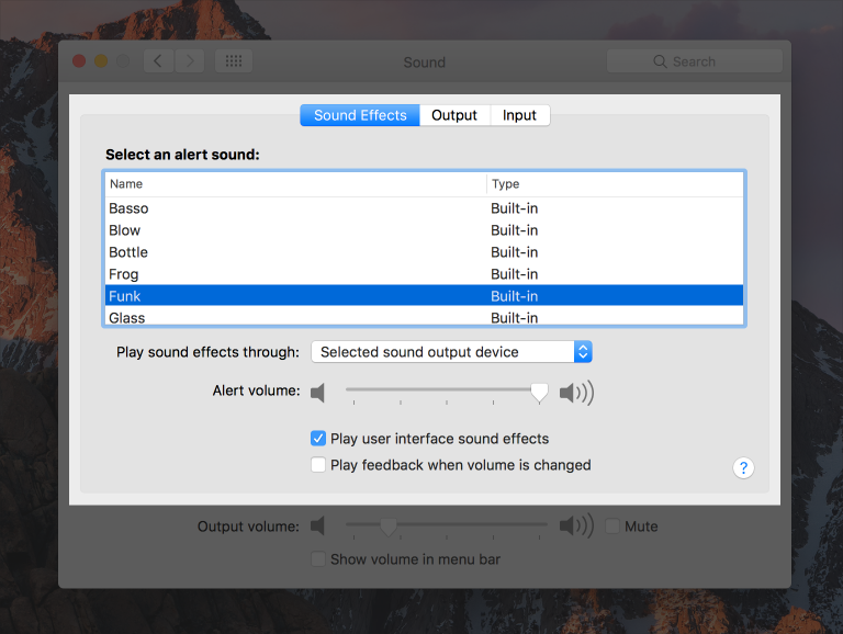 |
| windows | 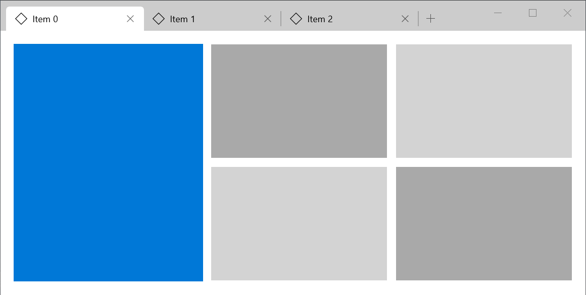 |  |
| chrome (OS) |  |  |
Using the traditional tab shape is an affordance that:
- indicates movable tabs
- indicates tabs that can be created
- indicates tabs that can be destroyed
However, we frequently use the traditional tab shape for non-mutable tabs, resulting in failing to meet users' expectations from the shapes' affordance, much like a door handle that requires you to push instead of pull.
Additionally, it also stands out as being a particularly outdated style, as almost all users of the traditional tab shape for non-mutable tabs are obsolete and deprecated, the only notable exception being winforms, which has design dating to the 90s and is generally considered to be one of the least polished UI toolkits.
I propose the following styles for lateral navigation instead: