Breeze Desktop Theme Transparency
Closed, ResolvedPublic

Description

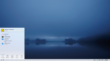
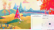
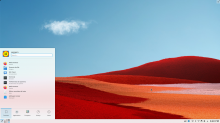
Currently, the desktop theme of Breeze uses a 90% opacity value. There are many criticisms about the choosen value, both for raising that value to 100% or lowering to 80%. Another option is to use a non-transparent solid color for backgrounds based on the dominant color undernith (see https://t.me/vdgmainroom/106731). Some points that were raised in the discussion:

Benefits of raising opacity:

  • Legibility: a default theme should be fully absolutely readable on all wallpapers and situations
    • BUT Using shadows could provide legibility even on lower opacity
  • Higher performance on low-end hardware than current

Benefits of lowering opacity:

  • Lower opacities are usually considered to be prettier
    • BUT might be just a trend that will eventually stop, KDE should not follow trends

Benefits of using solid dominant color:

  • Higher performance on low-end hardwar than current
  • Legibility is granted
  • Still possible to switch to blur
  • Original, could be part of "KDE identity" and not seen as copying others

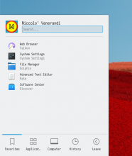
100% opacity:

90% opacity (current):

80% opacity:

75% opacity:
filipf added a subscriber: VDG.Oct 27 2019, 8:25 PM
filipf added a subscriber: filipf.Oct 27 2019, 8:30 PM

I'd go with 80% opacity. That's not the trendy value, lower opacity values are. Text will be legible but the aesthetics are improved.

And just to make a note on why we can't go below cca 75%: https://bugreports.qt.io/browse/QTBUG-70138

Personally I think we should switch to using specific background colors. More generally, this would allow us to replicate the window/view color hierarchy present in apps, and more specifically, we could make the System Tray popup look incredibly gorgeous, per @manueljlin's mockups in T10470:

Then we can make those colors blurry and transparent as needed. Personally I think 90% opacity is fine. I'm not sure 80% is an improvement. By making the colors of whatever's beneath it more prominent, the whole applet becomes more difficult to visually parse quickly.

However since people seem to have fairly strong opinions regarding opacity and blur, we might want to consider making it globally configurable. Right now Plasma's opacity and blurriness are not configurable at all, while the Breeze widget theme does have user-configurable opacity and blur settings. We recently made a global "animation speed" slider to unify how animation speeds are configured throughout Plasma and apps; maybe we should consider doing the same here and make the opacity and blur settings global such that they affect both apps and Plasma equally.

This would be a boon for Goal: Consistency. :)

maybe we should consider doing the same here and make the opacity and blur settings global such that they affect both apps and Plasma equally.

That would be neat. Deepin has it:

And Zren implemented it in his Breeze AlphaBlack theme:

niccolove added a comment.EditedOct 27 2019, 9:16 PM

So, I tried to make some mocks to better explain what I mean by getting the dominant color by the background. These are examples, and I set a .85 lightness value, although I'd prefer to mix them just enough that the text readibility is to a certain value (that's more difficult to implement though.). Mockups are not great, but I have limited pygame skills :-)
This could be considered some sort of accent color that depends on the screen area

maybe we should consider doing the same here and make the opacity and blur settings global such that they affect both apps and Plasma equally.

That is definitively a good idea.

Now, if you let me keep my idea for "accent color based on screen are" for a second before saying how bad it is (:P), I would think that we would have three types of transparencies:

  1. Transparency
  2. Blur
  3. Accent colour

People could switch from one to another in the Desktop Effects sections. At the same time, how much transparency/blur/accent colour should be controlled by that global setting, which would affect:

  • Desktop Theme (only Breeze? there are third party themes that are transparent, but they wouldn't follow our global setting; that might be a problem)
  • Window Backgrounds? (What do you mean with "apps"? because, if we don't support window transparency, people would use kvantum, and kvantum would not follow our global setting; maybe it's time that we offer some optional-notbydefault transparency to push kvantum out of business? :P)
  • Titlebars? (again, there are titlebar themes with transparency. would they have their own transparency factor or can we enfore ours?)

This could be considered some sort of accent color that depends on the screen area

See also T11052

This could be considered some sort of accent color that depends on the screen area

See also T11052

That is definitively related, but I think it's a bit cooler to base the accent color on the window's position rather than the whole wallpaper as Colorful does. But, when you talk about "highlight color" there, it's a different thing entirely, and it's more similiar to what I think is done by macOS: changing colors of elements, not of transparent elements such as panels and titlebars. They don't exclude each other though

This idea to tint the background color of plasma panels and widgets according to the averaged color of what's beneath them is orthogonal to the discussion about the transparency, no? Seems like it would be possible to tint the background with 100% opacity.

This idea to tint the background color of plasma panels and widgets according to the averaged color of what's beneath them is orthogonal to the discussion about the transparency, no? Seems like it would be possible to tint the background with 100% opacity.

That is true, but I felt that it was relevant to the discussion because tinting on the dominant color can be considered (IMO) "as good as" blur in most cases (if you look how blur looks like with current wallpaper, it's just a blueish tint). I think that tinting the dominant color with 100% opacity can have both the advantage of "not making things unreadable" and "being pretty"; thus, if tinting were done by default, a transparency level could not be used at all/set to 100%, making everything opaque (unless you switch to blur in desktop effects).

ndavis added a subscriber: ndavis.Oct 28 2019, 10:06 PM

I think it would be a good idea to make the panel and panel widgets 100% opaque, but desktop widgets could be semi-transparent or use the special coloring @niccolove talked about. The panel is the most critical part of Plasmashell's UI and I think readability should be its highest priority. Desktop widgets are less important and showing the pretty wallpaper behind them would look nicer.

ndavis added a comment.EditedOct 28 2019, 10:09 PM

I think the desktop already works like what I described:

Which means I just think that the panel should be 100% opaque instead of ~90%. It would also blend with the colors of maximized apps better.

+1 for making the panel and panel-based widget popups opaque by default. If we do this, I think it should then be configurable, possibly by the proposed global opacity slider. That way people who like blurry transparency can get it everywhere all at once. :) I'm envisioning a UI like this somewhere in System Settings:

Transparent backgrounds: [x] [Configure blur and transparency...]
                             (This button leads to a page/dialog where you can choose the level of transparency and blurriness)

               Apply to: [x] Desktop widgets
                         [x] Full-screen overlays
                         [x] Lock and login screen
                         [ ] Plasma panels
                         [ ] Application menus
                         [ ] Application windows

Which means I just think that the panel should be 100% opaque instead of ~90%. It would also blend with the colors of maximized apps better.

Do you agree with having the panels-widgets background tinted based on the wallpaper? If so, I'm okay with being opaque. Tinting should not compromise legibility, right?

ndavis added a comment.EditedOct 29 2019, 8:36 PM

Which means I just think that the panel should be 100% opaque instead of ~90%. It would also blend with the colors of maximized apps better.

Do you agree with having the panels-widgets background tinted based on the wallpaper? If so, I'm okay with being opaque. Tinting should not compromise legibility, right?

Maybe as an option, but I'd prefer if they used the exact same colors as the ones provided by the colorscheme by default. One thing to keep in mind is that I design icons around the default colors so that they don't become partially invisible.

niccolove added a comment.EditedOct 31 2019, 11:32 AM

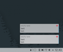
Uhm, I disagree with that :-/ I think that even with very low opacities but strong blurs, all the information (icons and taxt) are correctly displayed with no problem in legibility. Here's an example with small elements (notifications) and strong blur, which in theory should be quite similiar to tinting (but without saturation/hue/brightness adjustments). You can see the color based on the wallpaper but still get all the information.

Even on dark wallpapers:

Text legibility is between 11-16 as per contrast-ratio.com, so good at any fontsize. And this is almost double the transparency/tinting that I'm proposing, so it would be even less noticeable.

At this point I think we will not agree on this topic, so I'll let other people give their opinions.

I'm afraid I can't agree that those screenshots depict adequate contrast. Rather they're a classic case of dark gray text on a light medium gray background. The contrast looks far too low to me. If we ship anything like that, we'll get savaged by users and reviewers who care about text contrast.

I'm okay with bling as long as it's tasteful and doesn't regress usability. I have no opinion regarding the tastefulness of this proposal, but I can't approve it on usability grounds based on how how much darker the popup backgrounds become. Text contrast becomes worse than it currently is.

Uhm, I disagree with that :-/ I think that even with very low opacities but strong blurs, all the information (icons and taxt) are correctly displayed with no problem in legibility. Here's an example with small elements (notifications) and strong blur, which in theory should be quite similiar to tinting (but without saturation/hue/brightness adjustments). You can see the color based on the wallpaper but still get all the information.

Even on dark wallpapers:

Text legibility is between 11-16 as per contrast-ratio.com, so good at any fontsize. And this is almost double the transparency/tinting that I'm proposing, so it would be even less noticeable.

At this point I think we will not agree on this topic, so I'll let other people give their opinions.

I think that using a Accent colour is looks too strange, each notification have a different color and it's a distract me. I think it's beeter to should use the blur, it's looks more natural.

pedrogomes1698 added a subscriber: pedrogomes1698.EditedOct 31 2019, 8:06 PM

Personally I think for contrast reasons, everything could be opaque by default, as long as those "[Configure blur and transparency...]" options make it to Plasma.
Having those options would be a huge improvement.
I'd love to see the accent option available too.

Personally I think for contrast reasons, everything could be opaque by default, as long as those "[Configure blur and transparency...]" options make it to Plasma.
Having those options would be a huge improvement.
I'd love to see the accent option available too.

That's basically where I'm at too.

"Opaque by default, blurry colored bling when needed!" :D

Those mockups look fantastic to me. I think it is because the colours have such a high saturation of the various colours that still fit together because wallpapers tend to have matching colours. The screenshots further down that are based on the actual semi-transparency that is commonly used look way worse to me because the background colour is de-saturated towards the base colour (white):

I think that tinting the dominant color with 100% opacity can have both the advantage of "not making things unreadable" and "being pretty"

I do believe that too but it is a bit hard for me to judge if the mockups are close to how this would look when actually implemented.


Other than that I agree with the majority here that 100% opaqueness is the way to go in this case. Mainly because

By making the colors of whatever's beneath it more prominent, the whole applet becomes more difficult to visually parse quickly.

Especially for noisy backgrounds this can be a problem even if the text contrast was good enough. Having just a little bit of transparency like we currently do is a weird middle ground and not appealing to me.

niccolove added a comment.EditedNov 14 2019, 9:39 AM

Hi!

...

Those mockups look fantastic to me. I think it is because the colours have such a high saturation of the various colours that still fit together because wallpapers tend to have matching colours. The screenshots further down that are based on the actual semi-transparency that is commonly used look way worse to me because the background colour is de-saturated towards the base colour (white):

...

I think that tinting the dominant color with 100% opacity can have both the advantage of "not making things unreadable" and "being pretty"

I do believe that too but it is a bit hard for me to judge if the mockups are close to how this would look when actually implemented.

You are right.

I discovered that a similar feature to what I meant is already implemented; that is, the desktop ContrastEffect. Currently, it is set to

[ContrastEffect]
enabled=true
contrast=0.2
saturation=1.7

where higher contrast value = more usage of background color.

I think the discussion should be around what contrast value to give. This differs from the transparency value because the contrast value means that the wallpaper color is changed based on the readability; If the wallpaper is dark, the lightness will be changed more that if it was white. (At least, that's what I think the ContrastEffect does, I could not find any documentation). Furthermore, the saturation of the area underneath the panels can also be changed.

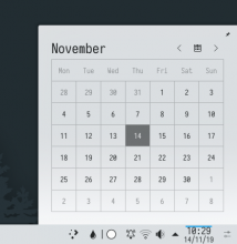
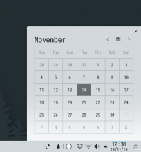
Here are various contrast values with light/dark wallpapers:

light:
contrast=0


contrast=0.2 (current)

contrast=0.3

contrast=0.4

contrast=0.5

dark:
contrast=0


contrast=0.2 (current)

contrast=0.3

contrast=0.4

contrast=0.5

Personally, I prefer a contrast of .3, which looks totally readable to me but manages to be quite pretty. I think it would be absolutely perfect if the bug that makes widgets have their bottom lighter was fixed (if there's any way to fix it. I guess that it's because it takes the white color of the panel).

Oh, and, being able to change the contrast value in system settings would be a good general transparency slider, as the contrast effect is applied everywhere.

I'm still in favor of 100% opacity by default and feel very strongly that we should NOT make things less opaque by default. This would be true "form over function," because reducing opacity has a linear negative relationship with readability. Plasma by default is mature, solid, and productive, not blingy, blurry, and fashionable.

But I agree that we should surface this config UI in a more logical place. In general we have a problem caused by treating KWin effects as the right place to expose config UI rather than using them as backend and crafting a more custom, user-friendly UI.

This would be true "form over function"

Regarding form over function, which is probably what I can't really understand...
Now, I know that I'm not the person who should talk about readability (after all, I'm the same person who writes unbelievably small notes with a light pencil and then expect everybody to be able to read it :P), but this is an important topic for me so I try to get some objective data about it, with contrast-ratio.com, webaim.org/resources/contrastchecker/, accessible-colors.com, contrastchecker.com etc etc.
I've checked the colors that panel/widget get with so many different wallpapers, be it light, dark, busy, etc.


And for every single one of them, the readability factor is in the 16-18, which all those websites tell me to be fully readable at any size, apparently according to w3. I mean, I even tried the "can't-get-busier-than-this" wallpaper and it was the most readable one with a score of 19.
I agree that we should not go with form over function, but I just fail to see how function is compromised in this case. I'm sorry I am so annoying about this, but it's just... I don't get it :-/

The only point I could see is that grey text become unreadable, but gray text is currently considered already unreadable by the contrast checker even on fully opaque white.

Plasma by default is mature, solid, and productive, not blingy, blurry, and fashionable.

Regarding mature and productive, I don't see those value compromised by using a contrast of 0.3, but that's probably because of what I said above. Regarding "Plasma is not blingy, blurry, and fashionable", I kinda understand where that's coming from, but I think that Plasma should be pretty, and a) as far as I know (I'm open to more objective data) what I was proposing is generally considered prettier by users (and I guess you can agree on this point, since you said "form over function"?), and b) I don't think that blur is a inherently bad way of being pretty, unless you compromise function of course, which would bring us again to what I said above.

You're young. You have good eyes. So the degree to which adequate text contrast in particular is important is muted and abstract to you, as you appear to be already aware of. Age 10 or 20 or 30 years and you'll understand. :)

My point is that anytime you reduce the background opacity of something with text on it, the readability of the text is compromised. This is indisputable, it's just a fact. The degree of impairment may be very small if the opacity remains high (90% range), if the transparency has a blur, and if the color of the thing underneath the background is close to the color of the background itself. In these cases, we can accept a degree of reduction in contrast in the interest of aesthetics (if we consider blurry transparency to be aesthetically beautiful), but we much accept that we are reducing contrast.

Because the degree of reduction is connected to the degree of opacity and the strength/weakness of the blur, the more you dial those up, the worse your text contrast becomes. At a certain point, it becomes high enough that the people who strongly value contrast (who were willing to put up with a slight reduction in the interest of aesthetics) will start to complain. That's where I find myself today. :) I can put up with 90% opacity and a little bit of the background showing through as long as there's a strong blur. However if you want to reduce the opacity and strength of the blur any more, I start to feel that we're compromising readability too much.

Now, there are ways around this. If you want reduced opacity or a weaker blur, this can be fine as long as all elements that require contrast (text, line-art, etc) sit on top of of a fully opaque background or frame that's on top of the blurry transparent background. In your proposal image, the button is fine because it has an opaque background, so the blurriness of the background doesn't impact the readability of the the button text. However this requires a wider redesign of everything, because right now there's an implicit assumption that the background itself provides adequate contrast. If we no longer guarantee this, it's kind of a can of worms.

Now, I know a lot of that reads like, "old man yells at cloud." :)

I'm willing to be flexible and bend a little to accommodate changing aesthetic tastes, because the alternative is that we become irrelevant and people ignore us and the project dies of old age and neglect.

So here's a counter-proposal: we experiment with making things more transparent like you're proposing, but we bump up the text color to actually be black. Like, not #232629, but #000000! This would darken both text and also icons, which may be a good thing considering that in T10201 we're planning to darken the background color of the toolbars.

that might fix some stuff but there are still icons with red parts like the audio volume (when volume at 0%, notifications (when silenced) and clipboard popups (delete icon)

niccolove added a comment.EditedNov 14 2019, 5:23 PM

So here's a counter-proposal: we experiment with making things more transparent like you're proposing, but we bump up the text color to actually be black. Like, not #232629, but #000000! This would darken both text and also icons, which may be a good thing considering that in T10201 we're planning to darken the background color of the toolbars.

I did not know that the text wasn't black, I had considered it to be so. I fully agree that we should experiment it to be black. According to those contrast calculators stuff, if we did that, the black text over contrast=0.3 would have the same contrast of our current text over white, so I definitively think that it would help.

I'm absolutely fine with your counter-proposal. It's actually incredibly easy to see how it would look like!

  • Set text view to black on color scheme system settings
  • Change 0.2 to 0.3 in /usr/share/plasma/desktoptheme/default/metadata.desktop
  • I would also suggest to use the highest blur by default (I mean the blur that you can customize on the desktop effect). That's because having a strong blur (afaik) improves readability, as a busy wallpaper would be smoothed out. Tell me if I'm wrong here.

The result should be like this:


The only thing that's probably a must-do before doing something like this would be fixing the lighter bottom in widgets, as it should definitively merge together with the panel.

that might fix some stuff but there are still icons with red parts like the audio volume (when volume at 0%, notifications (when silenced) and clipboard popups (delete icon)

That's true, but the clipboard delete icon is already used on a blue surface that reduces the contrast (the blue highlight). If it was not a problem to use that red icon over that background, will it be a problem to use it on a contrast=0.3 background that is actually more light than the highlight?

Those screenshots look pretty good to me. I might prefer a liiiiiiitle bit less of the background showing through, like maybe only 0.25, not 0.3. But it looks good, I'll admit.

Also keep in mind that the text color is global. Last time I increased the darkness of the text, people complained that the contrast would be too stark for apps that have text over a white/off-white background, such as document readers. Now history has proven them wrong since I have not seen a single complaint about the change (to the contrary, I have received multiple comments to the effect that it was a positive change) since it was done almost two years ago IIRC, but it's something that will come up if we propose making the text pure black.

ndavis added a comment.EditedNov 14 2019, 8:50 PM

I'm still for 100% opacity by default for the same reasons Nate mentioned, but also because I would prefer if the panel and panel widgets used the same colors as apps.
We should have configurable background opacity. Nobody should have to edit the desktop theme to get the setting they want. The contrast effect also seems like it should be user configurable.

Those screenshots look pretty good to me. I might prefer a liiiiiiitle bit less of the background showing through, like maybe only 0.25, not 0.3. But it looks good, I'll admit.

Also keep in mind that the text color is global. Last time I increased the darkness of the text, people complained that the contrast would be too stark for apps that have text over a white/off-white background, such as document readers. Now history has proven them wrong since I have not seen a single complaint about the change (to the contrary, I have received multiple comments to the effect that it was a positive change) since it was done almost two years ago IIRC, but it's something that will come up if we propose making the text pure black.

Keep in mind that changing the NormalText color also changes the separator, frame and sunken button colors.

I'm still for 100% opacity by default for the same reasons Nate mentioned, but also because I would prefer if the panel and panel widgets used the same colors as apps.
We should have configurable background opacity. Nobody should have to edit the desktop theme to get the setting they want. The contrast effect also seems like it should be user configurable.

This is still my preference as well, though I am willing to accept the proposed changes if necessary. The contrast effect is user-configurable, it's just hidden in the settings of a KWin effect where nobody can ever find it. IMO the first step is to make Plasma panels' opacity and blur strength user-configurable in an obvious place.

Those screenshots look pretty good to me. I might prefer a liiiiiiitle bit less of the background showing through, like maybe only 0.25, not 0.3. But it looks good, I'll admit.

.25 (using the shadows from the other patch, btw):


But I would suggest that you try it yourself on an actual machine. The screenshots (unless you display them fullscreen, I guess) make the effect appear stronger than it actually is. If you go ahead and try even contrast=0.4 out, you will see that it's not that crazy at all, and really pretty. Also, if you don't want the background to show less, I think that could also be helped by having a stronger blur, which will make the blurred area look like they are simply a gradient opaque background rather than the background showing through. Right now I'm using the highest blur that the desktop effect setting allows me, but there should be a way to change the maximum value. Finally, it's also possible to lower the saturation desktop effect to avoid giving the idea of desktop effect showing through.

Also keep in mind that the text color is global. Last time I increased the darkness of the text, people complained that the contrast would be too stark for apps that have text over a white/off-white background, such as document readers. Now history has proven them wrong since I have not seen a single complaint about the change (to the contrary, I have received multiple comments to the effect that it was a positive change) since it was done almost two years ago IIRC, but it's something that will come up if we propose making the text pure black.

I think that the fact that users did not complain shows that's not a problem to make the text black. Alternatively, the text could made to something like #131416.

The contrast effect is user-configurable

Is it? I'm unable to change it via SySe, only by editing the desktop theme metadata file.

Oh, by the way, keep in mind that a .2 => .25 change is similiar to changing the transparency from 10% to 12.5%, which is just slightly noticeable. I'm more a fan of .3/.4, but most users won't even notice moving to .25.

Why the bottom panel and tray popups have such a wierd color transition?


LGTM. Honestly I don't think I would even notice the changes if they weren't pointed out to me. I think these kinds of really subtle changes are likely to go un-noticed by most people, for better or worse.

niccolove added a comment.EditedNov 15 2019, 5:52 PM

Why the bottom panel and tray popups have such a wierd color transition?


You mean the lighter bottom? It's a bug of the blur effect. I talked to Vlad in the VDG chat about it, but it seemed that it didn't lead anywhere. I think that it's really important to fix it, it's quite ugly.

By the way, this is also about Breeze dark:

Between opaqueness, blur, contrast and saturation it might be quite hard to figure out the best settings but this definitely already seems like a big step in the right direction to me. So many options!

that's not a problem to make the text black.

Having read my share of black on white .pdf files I tried to figure out why "grey"/"brighter black" text is sometimes used in web dev or in general on digital screens:
Some people say it looks better to them. It honestly seemed like a fad to me. There was once a study that showed that high contrast was bad for dyslexic folks but it has since been refuted. Overall going for black #000000 seems like the correct choice to me purely for accessibility reasons. I don't think it looks worse at all.

This comment was removed by niccolove.

Having read my share of black on white .pdf files I tried to figure out why "grey"/"brighter black" text is sometimes used in web dev or in general on digital screens:
Some people say it looks better to them. It honestly seemed like a fad to me. There was once a study that showed that high contrast was bad for dyslexic folks but it has since been refuted. Overall going for black #000000 seems like the correct choice to me purely for accessibility reasons. I don't think it looks worse at all.

I strongly agree. Having information about that refuted study would be helpful if there are objections.

You mean the lighter bottom?

Yes.

It's a bug of the blur effect. I talked to Vlad in the VDG chat about it, but it seemed that it didn't lead anywhere. I think that it's really important to fix it, it's quite ugly.

  • By the way, this is also about Breeze dark:

It's really looks very ugly :(

In T11925#208340, @KonqiDragon wrote:

It's really looks very ugly :(

"It" is not very descriptive. What looks ugly to you in the above screenshot?

In T11925#208340, @KonqiDragon wrote:

It's really looks very ugly :(

"It" is not very descriptive. What looks ugly to you in the above screenshot?

I think they're just agreeing with @niccolove

Having read my share of black on white .pdf files I tried to figure out why "grey"/"brighter black" text is sometimes used in web dev or in general on digital screens:
Some people say it looks better to them. It honestly seemed like a fad to me.

It mostly has to do with decreasing the chance of making the user experience eye-strain. The tolerance in this is of course different from person to person, however here's a survey conducted by the American Optometric Association on the topic of working with computer screens in 2015: https://www.aoa.org/newsroom/most-americans-experience-digital-eye-strain-from-overexposure-to-computers-according-to-survey
Their findings are that 58% of their test-group (which was a sample size of 1,000 people) reported suffering from eye strain due to heavy use of digital screens.

It's not a fad by far, but it's "overengineered" in many places, and I believe many of that comes from the era of CRT screens, where white on black was really not pleasing to the eye for longer sessions on a computer. From a designer point of view, a non-black-black is in many cases more aesthetically pleasing than black. But there's also good reason to use high contrast with pure black to make it more accessible to visually impaired users.

On that note: KDE has a built-in feature to invert colors on screen, hidden away in the desktop effects menu, but no option to enable a "high contrast" mode in it's accessibility settings. Would it be worth considering to add a color override on that settings page as well?

In T11925#208340, @KonqiDragon wrote:

It's really looks very ugly :(

"It" is not very descriptive. What looks ugly to you in the above screenshot?

I about this:

Why the bottom panel and tray popups have such a wierd color transition?


In T11925#208340, @KonqiDragon wrote:

You mean the lighter bottom?

Yes.

It's a bug of the blur effect. I talked to Vlad in the VDG chat about it, but it seemed that it didn't lead anywhere. I think that it's really important to fix it, it's quite ugly.

  • By the way, this is also about Breeze dark:

It's really looks very ugly :(

@KonqiDragon, try to only quote things that are necessary to understand your comment. This way it's easier to keep the overview and readers don't have to scroll so much. :)


There was once a study that showed that high contrast was bad for dyslexic folks but it has since been refuted. Overall going for black #000000 seems like the correct choice to me purely for accessibility reasons. I don't think it looks worse at all.

I strongly agree. Having information about that refuted study would be helpful if there are objections.

There were a lot of studies done on this matter and I only skimmed through the first two that I found when searching for "dyslexic" and "hight contrast" so it might be irresponsible to take citations from them to represent possible academic consensus but I'll do it anyways:

In The effect of contrast on reading speed in dyslexia (2000) by Beth A. O’Brien, J.Stephen Mansfield, Gordon E Legge:

From these three studies, we find that dyslexic readers show the same contrast dependence in reading as controls. This pattern holds for both children and adults, for reading with and without context across character sizes, and for reading aloud and silent reading. We find no evidence to suggest that (a) the reading curves of dyslexics are shifted to a higher contrast (Table 4), or (b) dyslexics show improved reading speed at low or intermediate contrasts.

We used stimuli typical of normal reading conditions: dark text printed on white cards with an illumination of 100 cd/m2.

The other study was less about reading full texts and more about reading singular words:

The motivation for this work was to examine visual aspects of dyslexics’ reading, under conditions designed to assess only visual skills […]. This aim was achieved by testing subjects on a task that was intended to be as similar as possible to single word reading in all its visual aspects.

We found no difference between dyslexics and controls in contrast thresholds for letter identification presented either on a quiet or on a noisy visual background.

It mostly has to do with decreasing the chance of making the user experience eye-strain. The tolerance in this is of course different from person to person, however here's a survey conducted by the American Optometric Association on the topic of working with computer screens in 2015: https://www.aoa.org/newsroom/most-americans-experience-digital-eye-strain-from-overexposure-to-computers-according-to-survey
Their findings are that 58% of their test-group (which was a sample size of 1,000 people) reported suffering from eye strain due to heavy use of digital screens.

This one isn't about contrast though is it? When I search for the relation of contrast and eye-strain I mainly find reasons to believe that high contrast reduces eye-strain.

This one isn't about contrast though is it?

The Breeze re-theming? No. I was merely stating why some designers do this based on some findings that are circulating in some circles.

This one isn't about contrast though is it?

The Breeze re-theming?

No, I meant the study you were refering to. But now I took a look at what aoa.org says about contrast and eye-strain and they agree that high contrast is better:

From this page on aoa.org:

What causes […] Digital Eye Strain?
Viewing a computer or digital screen is different than reading a printed page. Often the letters on the computer or handheld device are not as precise or sharply defined, the level of contrast of the letters to the background is reduced, and the presence of glare and reflections on the screen may make viewing difficult.

I was merely stating why some designers do this based on some findings that are circulating in some circles.

I mean I understand the argument that some find it prettier. Maybe it is nice for writing in some kind of soft-spoken manner or some other artistic reasons. I don't think these apply for our general purpose text color though.
The circulating findings are a bit puzzling to me
because they seem to be unfounded from what I see. :/

niccolove added a comment.EditedNov 19 2019, 5:39 PM

Another possibility is to have different transparency for panel and widgets:


Or opposite (probably less favorable):

filipf added a comment.Dec 2 2019, 6:27 PM

I like the idea of raising the contrast effect to 0.3, but if people object to that we should just keep it at 0.2.

Having 100% opacity results in dry, rigid and boring surfaces, which is what we tried to avoid when creating Plasma 5: https://notmart.org/blog/2013/11/plasma2-all-about-elegance/

The big change here IMO would be to add a little settings button for Plasma themes that would show a small popup where these Contrast Effect settings would be shown and could be modified.

Since Noah will work on a new QStyle, we will have those areas in windows:

  • Main application view
  • Sidebar
  • Tool area
  • Konsole

And these areas in Plasma:

  • Panel
  • Widget (e.g.: kickoff)
  • Context Menu

I think that it could make sense to create some sort of "Materials" to use consistently in those areas. We could have a "Solid" material to use for Panel and Tool Area, a "Light" material that's slightly transparent to use for widgets and the sidebar, and so on. This would probably help consistency, and the user could customize said materials in one places instead of messing with many things (list of things with an opacity setting: konsole, context menu, plasma theme, desktop application if you use kvantum).

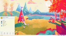
I tried to come up with some examples:


From left to right: Breeze without transparency, Breeze with transparency, Breeze with more transparency and light+sparse shadows, Same but with outline (helps with a "solid" feeling), Microsoft Fluent.

Feel free to tweak the files (although changing the background is near impossible at this point):

The 4th one is just

perfection

ngraham added a comment.EditedDec 3 2019, 5:20 PM

I agree that the fourth column is the best of the transparent ones--at least for Breeze light. The dark version becomes unpleasantly yellow for my tastes, which kind of highlights the problem with semi-transparent backgrounds in the first place IMO. Personally I prefer the first column where everything is opaque. It's bright and cheerful and clearly different from what's underneath it.

macOS has semi-tranclucent-and-blurry sidebars, toolbars, and menubars by default, similar to your proposal, @veggero. I will admit that in some circumstances it is pretty, but in others it's quite ugly (as I find the yellowish breeze dark square to be), and it results in poorer text contrast than there otherwise would be. I always turned off all the transparency when I was still using macOS as my daily driver. Windows has of course copied this and done it even worse (par for the course with Microsoft), and to be honest, I'm not super keen to see us following this trend. By the time we get it implemented, it will be passé and look "dated," because Apple will have moved onto some new whizzy design that everyone wants to copy.

If we do do this, I very strongly want a central location where it can be controlled and turned on and off for everything that can be transparent. Then we can argue over whether certain things should be blurry and transparent by default, but there will at least be an easy way for curmudgeons like me to turn it off. :)

Yes, there should be a global slider controlling:

  • Desktop theme transparency
  • Context menus transparency (this one is waay too hidden atm, it's a pity)
  • Konsole default transparency maybe?

Which KCM should contain it, in your opinion?

I've experimented some more with using the contrast effect to tint the wallpaper based on the color and not letting it strongly leak in. (I'd suggest putting the screenshots in the .tar.gz at fullscreen to better understand how it is)

joricke removed a subscriber: joricke.Apr 20 2020, 3:34 PM
ngraham closed this task as Resolved.May 14 2021, 8:39 PM
ngraham moved this task from Backlog/Planned to Done on the VDG board.
ngraham claimed this task.

This has been effectively resolved/implemented/addressed etc with the Adaptive Opacity feature in Plasma 5.22: the opacity is now lower than it was before, but becomes fully opaque when there are any maximized windows. It's a good compromise between visual bling and usability IMO.