Replace framed views with single-pixel separator lines
Closed, ResolvedPublic

Description

We already did this with sidebars in settings windows (T11279), to great effect and acclaim. Now they look fantastic:

Kirigami also uses this style for desktop apps created with it, and it looks great. For visual appeal and consistency's sake, it's time to bring this style into more of our QWidgets apps, by putting similar single-pixel lines in the following places:

  • Underneath toolbars, to separate them from content views below them
  • Separating QDockWidgets from main views beside them
  • Separating other sidebars more generally from content views beside them
  • Separating status bars from content views above them

Then we should remove the "framed" appearance from content views, since it's no longer necessary once they're framed by the these single-pixel separator lines and the window edges.

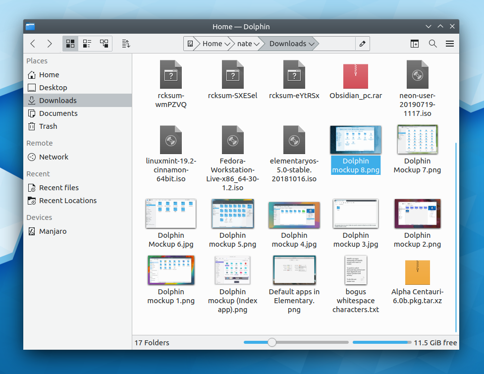
The idea is to reach something like the following for Dolphin:

ngraham created this task.Sep 15 2019, 5:19 PM
ngraham triaged this task as Normal priority.
ngraham updated the task description. (Show Details)Sep 15 2019, 5:22 PM
ngraham added a project: Goal: Consistency.
ngraham added a subscriber: Goal: Consistency.
ndavis added a subscriber: ndavis.Sep 26 2019, 7:38 AM

How much of this is up to breeze and how much is up to the application? This looks pretty, but if too much of it depends on breeze, it may fall apart when 3rd party apps are thrown into the mix.

mmustac added a subscriber: mmustac.EditedSep 26 2019, 9:43 AM

With sidebar ?

  • Looks fantastic!!!

    One way we could get views next to other views to look right is to use the alternate view background color for sidebars

    One way we could get views next to other views to look right is to use the alternate view background color for sidebars

    In general that only makes sense for multi-column tables, because the alternating backgrounds are a visual aid to help your eye line up the data in each row. When there's only one column--like in these kinds of sidebars--it's just extra visual noise IMO.

    What I'm saying is that doing something like what VS Code does could work for making views next to views look good, like a sidebar next to a list view.

    Oh I see what you mean: an alternate background color, not alternating background colors.

    I agree, that could work, as long as the alternate color isn't too different. macOS does this too, using a subtle light blue background color for sidebars.

    Does this apply to the new Kirigami dividers? We're slowly removing lines in some places but now we're adding it between every list item on the sidebars so this feels like one step forward and two steps back lol

    filipf added a subscriber: filipf.Oct 21 2020, 10:57 AM

    Does this apply to the new Kirigami dividers? We're slowly removing lines in some places but now we're adding it between every list item on the sidebars so this feels like one step forward and two steps back lol

    Obligatory reference

    I appreciate the mockups, they look very pretty. And I believe it should be easy enough to remove the visible border around QFrame via the kstyle.

    How does the VDG intend to visualize the focus state though? I hope that's still going to be indicated with a blue highlighted frame?

    But I'm not sure though what to do with dock widgets and tab buttons. More complex apps like KDevelop e.g. allow one to show multiple dock widgets, so a separator between them is crucial I believe. Similarly, tab buttons in apps like Kate or KDevelop will have to have some kind of frame and are usually shown close to the "header area", and will thus remain in conflict with the proposed separator line. I.e. can someone please try to come up with a mockup for a more complex application like e.g.:

    I appreciate the mockups, they look very pretty. And I believe it should be easy enough to remove the visible border around QFrame via the kstyle.

    That's great news. We would love to have your assistance with this!

    How does the VDG intend to visualize the focus state though? I hope that's still going to be indicated with a blue highlighted frame?

    The idea was to indicate that a view is focused by using a focused style for the actual focused item in the view, not drawing any kind of focus rect around the view itself. This is what we do in Kirigami-based apps and it works great. No complaints, and focus is obvious. The focus ring around large views is one of the biggest user complaints we hear, so we'd like to get rid of it it. In particular, we get *endless* complaints for people using Breeze dark. That bright outline drives a lot of people crazy.

    But I'm not sure though what to do with dock widgets and tab buttons.

    Sure, this is a good point. We can come up with a mockup for that. @manueljlin or @ndavis , would you like to have a go?

    I appreciate the mockups, they look very pretty. And I believe it should be easy enough to remove the visible border around QFrame via the kstyle.

    That's great news. We would love to have your assistance with this!

    Simply don't draw anything in Style::drawFrame* but return true. You just need to find the right primitives. See https://doc.qt.io/qt-5/qstyle.html#PrimitiveElement-enum for more information.

    How does the VDG intend to visualize the focus state though? I hope that's still going to be indicated with a blue highlighted frame?

    The idea was to indicate that a view is focused by using a focused style for the actual focused item in the view, not drawing any kind of focus rect around the view itself.

    This reasoning does not apply to text areas, how would you handle that? What about empty views which could still receive events (e.g. a paste operation), when they get focused - how would you visualize this?

    This is what we do in Kirigami-based apps and it works great. No complaints, and focus is obvious. The focus ring around large views is one of the biggest user complaints we hear, so we'd like to get rid of it it. In particular, we get *endless* complaints for people using Breeze dark. That bright outline drives a lot of people crazy.

    I'm pretty sure you'll drive another group of people crazy if you completely remove the focus indicator. Again, please consider forking the style instead of enforcing this for all users, even those that are happy with the current state.

    But I'm not sure though what to do with dock widgets and tab buttons.

    Sure, this is a good point. We can come up with a mockup for that. @manueljlin or @ndavis , would you like to have a go?

    Please in general - do not make changes to the default style without taking more complex applications into account. A lot of people use Kontact, KDevelop and similar "heavy" applications on a daily basis. Many of these applications aren't known to be pretty, but the current Breeze style makes them look quite fabulous compared to their looks in the past. If you only concentrate on the simple applications but then make the heavy ones more ugly, a lot of the long term users of KDE and its "pro" applications will notice in a negative way.

    This reasoning does not apply to text areas, how would you handle that?

    Large frameless text fields such as the ones used in KTextEditor would still indicate focus by having the text field blink when it has focus. IIRC that's the entire point of it blinking, in fact.

    In addition, framed small text fields (e.g. password fields, search fields, etc) of the sort that appear within pages or smaller views will additionally still have a frame that can have their border colors changed to indicate focus.

    Please in general - do not make changes to the default style without taking more complex applications into account. A lot of people use Kontact, KDevelop and similar "heavy" applications on a daily basis. Many of these applications aren't known to be pretty, but the current Breeze style makes them look quite fabulous compared to their looks in the past. If you only concentrate on the simple applications but then make the heavy ones more ugly, a lot of the long term users of KDE and its "pro" applications will notice in a negative way.

    The problem is less that we didn't take them into account and more that the users of these apps tend to be more picky and conservative than other users because they are experts. They have everything set up just the way they like and hate it when anything ever changes, for any reason. And they notice every little change on an individual level.

    FWIW I use Kile and Kate with sidebars open and they feel quite "heavy" to me. I think they look fine with the current set of changes in Plasma 5.21. They don't look perfect and have some visual bugs, but they did before as well.

    Again, please consider forking the style instead of enforcing this for all users, even those that are happy with the current state.

    We can fork Breeze into a new thing, but that will inevitably mean the death of Breeze, just like how Breeze killed Oxygen. Yes, technically Oxygen is still around, but it's unmaintained and gets buggier every year as the world changes all around it and it doesn't keep up. The same fate will befall Breeze if we fork it into something else. By continuing to use an old unmaintained Breeze, you may get a few years' respite from these changes, but the visual style you're trying to preserve will crumble around you anyway, and you'll eventually prefer the new thing simply due to its reduced bugginess.

    That's why I'm inviting you to be a stakeholder and a participant in the new style. Help us make it better in a way that improves the look of your favorite apps. You might even like it in the end. :)

    ndavis added a comment.EditedMar 2 2021, 1:58 AM

    @mwolff For complex UIs with many adjacent view areas, I've looked to Visual Studio Code and Qt Creator for inspiration.

    Obviously, straight up copying their styles wouldn't work for us since it wouldn't fit in. However, we can borrow useful aspects of their designs, such as using a wider variety of background colors for adjacent view areas and using separator lines instead of full frames.

    In some ways, I don't expect KDevelop to be able to be like either, so that also needs to be considered. Between the two, I'd say the UI of KDevelop is most like Visual Studio Code. Both handle focus in a similar way and both have docks that can be dragged and dropped. Qt Creator has docks that can be moved, but you can't move them by dragging and dropping them and it's much more aggressive about giving the main view area the active focus.

    In general, I'd say we should prefer to use delegate highlights in list views and text cursors to show where active focus is rather frames. Of course, those aren't always available. VS Code and Qt Creator do the same thing and it looks quite good without hurting usability much. In fact, the clean appearance is a selling point for those two.

    When there are no delegates to highlight or text cursors to show, we could show a blue frame like we do now, but rather than always surrounding every view area with a frame, we only show a full frame when there is active focus. This avoids the visual issue of having frames within frames. For those that use keyboard navigation, it could also make the focus indicator more obvious than it was before since the whole frame will be appearing and disappearing rather than merely changing color.

    For text fields and small text areas, we'll probably still give those a frame that turns blue with active focus. The removal of frames is mainly for larger areas that tend to get grouped together, resulting in frames within frames.

    mwolff added a comment.Mar 2 2021, 8:30 AM

    @ngraham thanks for the invitation, sadly my resources and time is strained enough as-is already... I'm more than willing to help test things from time to time, or to do code reviews or give suggestions when you are hitting a problem in the code. But I am not interested in spending a lot of time on something that I'm not motivated to change in the first place.

    Good point with the blinking cursors, that could indeed work out in the end!

    @ndavis The problem with "a wider variety of background colors" is that you would have to find a way to implement that without changing application code. I.e. both Code and QTC apply application specific styles, and don't need to be generic - quite the contrary. What you all are trying to achieve here, by changing the central QStyle that will be used by *all* Qt applications on Plasma is _much_ harder. That is why I'm so weary here, call me pessimistic if you will ;-)

    That said, I'm totally on board with the vision you have - getting rid of more frames is something I would like to see too. And I also agree the both Code and QtCreator look more pleasant than KDevelop. So to repeat what I said before already: Feel free to experiment with this as much as you like, and if you have questions that you think I may be able to answer, feel free to ping me. But please try to keep these experiments out of the default style until the end result is pleasant in all applications. I.e. what @ngraham wrote about forking breeze like oxygen sounds totally fine to me actually. Fork breeze - make it work, and if it then turns out to be better in a year or two than breeze then me and many others will jump ship without shedding a tear.

    ndavis added a comment.Mar 2 2021, 7:03 PM

    Good point with the blinking cursors, that could indeed work out in the end!

    @ndavis The problem with "a wider variety of background colors" is that you would have to find a way to implement that without changing application code. I.e. both Code and QTC apply application specific styles, and don't need to be generic - quite the contrary. What you all are trying to achieve here, by changing the central QStyle that will be used by *all* Qt applications on Plasma is _much_ harder. That is why I'm so weary here, call me pessimistic if you will ;-)

    That said, I'm totally on board with the vision you have - getting rid of more frames is something I would like to see too. And I also agree the both Code and QtCreator look more pleasant than KDevelop. So to repeat what I said before already: Feel free to experiment with this as much as you like, and if you have questions that you think I may be able to answer, feel free to ping me. But please try to keep these experiments out of the default style until the end result is pleasant in all applications. I.e. what @ngraham wrote about forking breeze like oxygen sounds totally fine to me actually. Fork breeze - make it work, and if it then turns out to be better in a year or two than breeze then me and many others will jump ship without shedding a tear.

    We have a lot of AlternateBackground colors in KColorScheme's color sets, which I was thinking about using for sidebars and docks. You may be right and we may have to keep the QStyle simple and focus on replacing or augmenting Qt Widgets apps with Qt Quick.

    I know KDevelop uses some QML already, so maybe eventually KDevelop could use Qt Quick for the rest of the UI, perhaps excluding the main text editing area since I'm not aware of anything in Qt Quick that could replace it. The only Qt Quick equivalent to QDockWidget I know of is KDDockWidget, but it's still experimental.

    mwolff added a comment.Mar 2 2021, 8:57 PM

    Rewriting "just" the UI of KDevelop alone would be a multi-man-month project. I doubt you'll find people doing that. And what about the other applications like Kontact? I don't think this approach scales - either you find a suitable approach in the style alone, or you bite the bullet and only support the new style in an opt-in fashion for those applications that can be ported to it somehow.

    ognarb added a subscriber: ognarb.Mar 2 2021, 9:41 PM

    Rewriting "just" the UI of KDevelop alone would be a multi-man-month project. I doubt you'll find people doing that.

    I don't even think it would be possible with the current state of QML and I say that as someone who has been actively porting stuff from QtWidgets to QML. KDevelop relies heavily on tree view and dockers and those have for the moment no equivalent in the QtQuick world.

    And what about the other applications like Kontact? I don't think this approach scales - either you find a suitable approach in the style alone, or you bite the bullet and only support the new style in an opt-in fashion for those applications that can be ported to it somehow.

    I'm currently working on some Akonadi based QML apps for Plasma Mobile, but yeah it doesn't scale :/ I agree that forking the current Breeze theme would probably be the best or maybe even better forking Lightly since Lightly figured out many ways to remove frames and is probably a better start. Also a fork would allow us to progress faster.

    ndavis added a comment.Mar 4 2021, 7:15 PM

    I agree that forking the current Breeze theme would probably be the best or maybe even better forking Lightly since Lightly figured out many ways to remove frames and is probably a better start. Also a fork would allow us to progress faster.

    We shouldn't fork lightly because then we might accidentally introduce a ton of changes we aren't aware of, but we can still look at what lightly did.

    ngraham closed this task as Resolved.Jan 11 2024, 6:35 PM
    ngraham moved this task from Backlog/Planned to Done on the Breeze board.

    This is largely done in Plasma 6 now!