Redesign application launcher
Closed, ResolvedPublic

Tokens
"Love" token, awarded by baberts."Love" token, awarded by alexde."Love" token, awarded by The-Feren-OS-Dev."Love" token, awarded by romangg.
Assigned To
Authored By
manueljlin, Nov 23 2019

Description

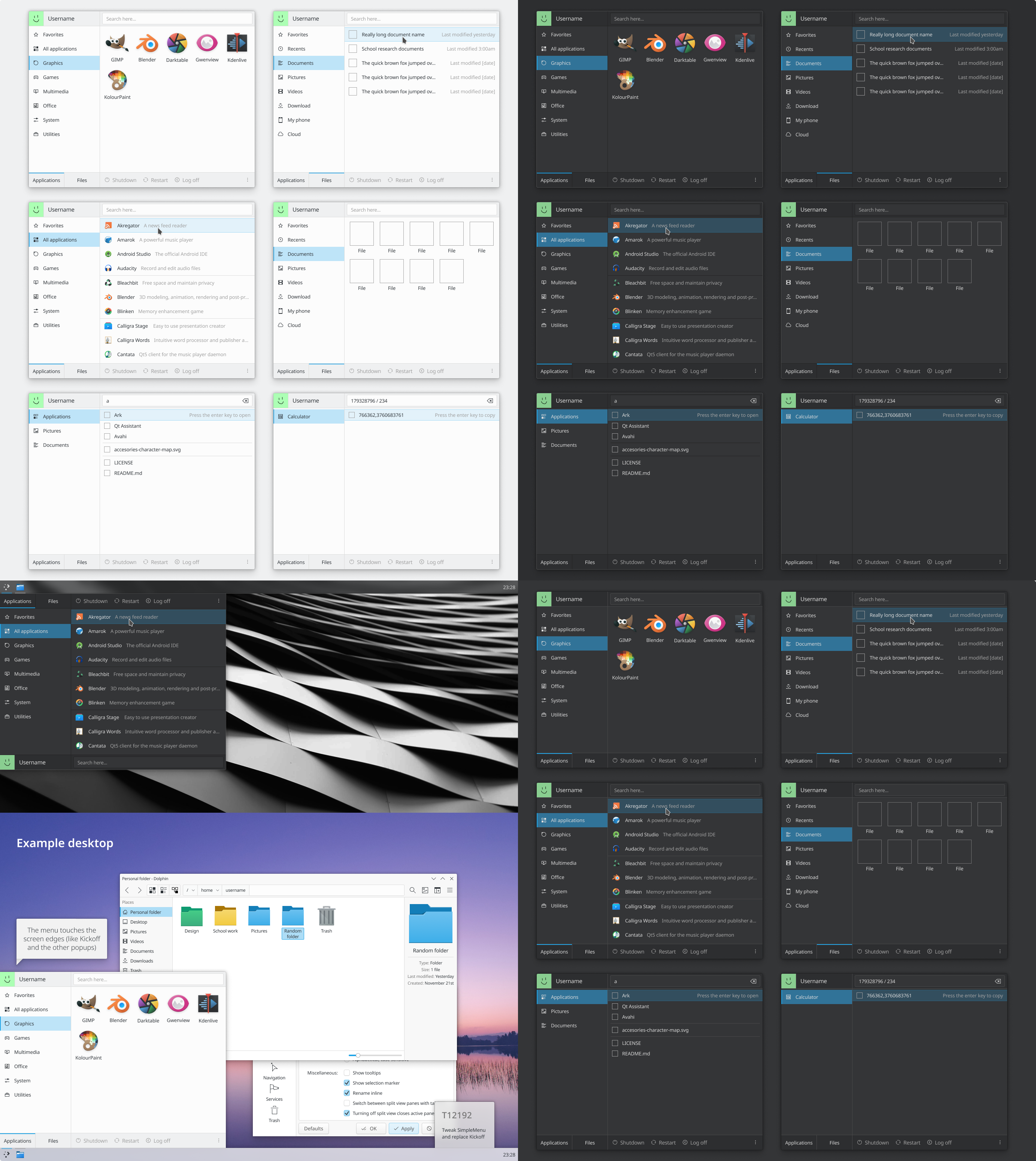
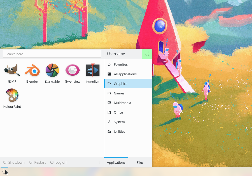
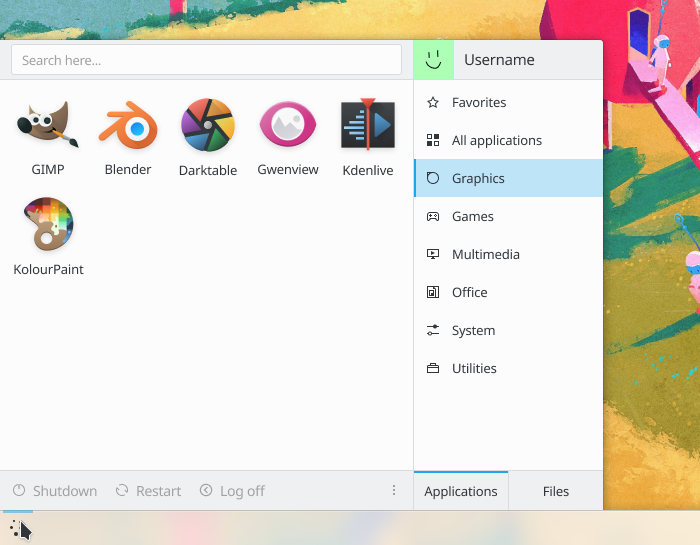
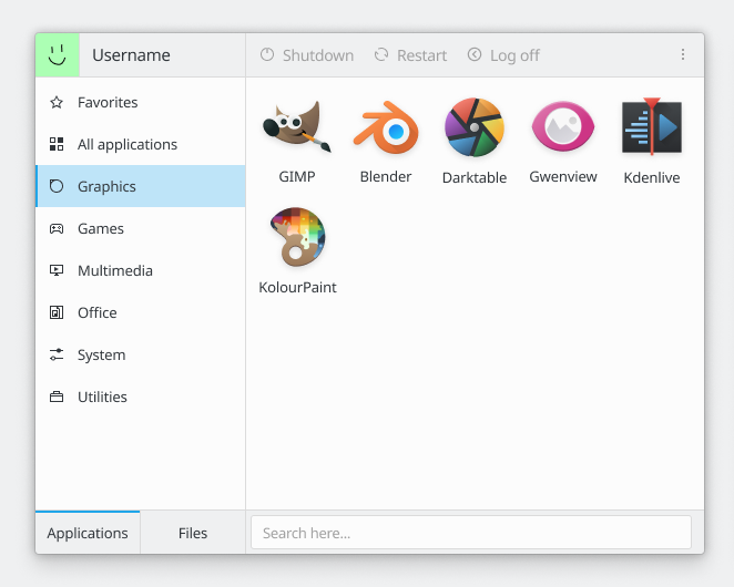
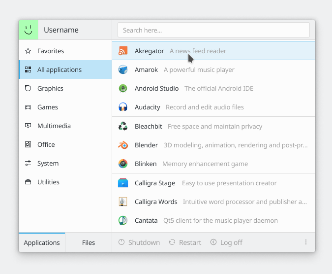
After talking and making many mockups in T9041 about changing the UI of Kickoff, it started to look more and more like SimpleMenu with the following changes:

New features:

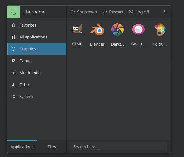
  • Make username and user picture visible, with PC name on hover like what Kickoff does right now
  • Show categories for recently used apps and documents
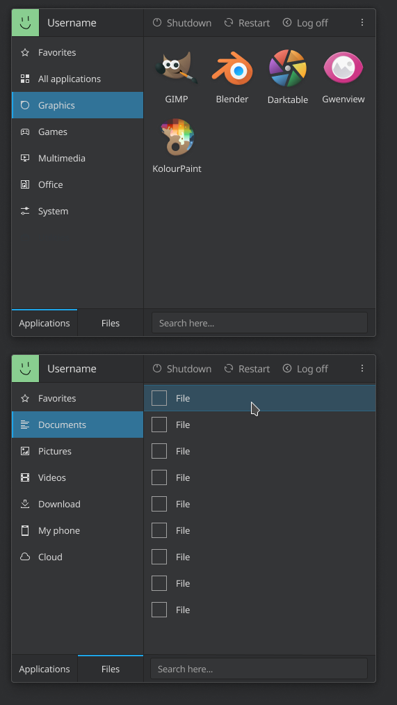
  • Show category for Places
  • Be able to pin folders and files in Favorites category
  • Customizable set of power/session buttons visible on the main UI

UI Tweaks:

  • Move the category list to the left, and implement a triangle filter to prevent accidental category changing when moving the cursor from the widget's panel launcher item to the main view
  • Show favorite apps on a separate page rather than on the first page of the "All Applications" category
  • Make Power/session icons always show text labels, and expose the non-visible ones in an overflow menu
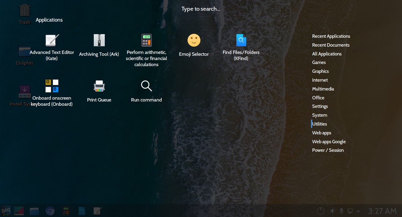
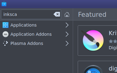
  • Enable more KRunner runners so that you can do math and unit conversion, and switch the search categories using the left and right keys
  • Use the Sliding Popups effect to show it and hide it
  • Scroll long grids rather than having discrete pages
  • Make the menu touch the panel like the rest of the popups

Bugfixes:

  • Make long names in grid views become multi-line strings rather than eliding at the end of the first line

1x


hiDPI 2x

svg

There are a very large number of changes, so older changes are hidden. Show Older Changes
manueljlin added a comment.EditedDec 9 2019, 7:16 PM

Why not make the grid 4 spaces wide? Then make the list view match that and you'll have a fairly reasonable amount of space for both views.

Hmm, while it does the job, I don't know about sacrificing 4 icons

ndavis added a comment.Dec 9 2019, 7:28 PM

Why not make the grid 4 spaces wide? Then make the list view match that and you'll have a fairly reasonable amount of space for both views.

Hmm, while it does the job, I don't know abut sacrificing 4 icons

You could make the icons 48px (their native size), but that would make the buttons smaller.

probably not the best way to do this

ndavis added a comment.Dec 9 2019, 7:44 PM

yeah, gotta have room for the labels

ndavis added a comment.Dec 9 2019, 7:46 PM

Buttons should probably be this large:

One more thing, should the file view be a list view or a tree view? I personally find tree views for file browsing almost universally superior, but I'm not certain that it's appropriate. Simple Menu isn't meant to replace dolphin, but it could be a fast launching point.

The lists of recent and favorite documents have to be list views because they're not more than one level deep. As for the proposed categories that show the contents of various folders, it's tempting, but in general users do not understand tree views. For that reason I'm a tiny bit wary of including these categories in the first place. People probably shouldn't be browsing the file system in SimpleMenu.

@manueljlin We should also make sure that long app names become multi-line strings instead of being elided.

Is it necesseray for the "Search here" input field to have this not so pretty border and padding around it? Why not fuse it with the entire cell it's located in?

This would look more in line with how the avatar is represented, as well as how much space all buttons on the frame are taking up.

I don't agree that it's ugly. We normally use LineEdits for search boxes, so people will recognize it faster like that. The username/avatar can't be interacted with, so making them look similar sends the wrong message.

Well compared to the remaining UI elements that _can_ be interacted with it does look out of place or odd at least. Yes I agree that overall line edits are used for such things and it'd break up consistency, but it doesn't look "right" as it is right now. I'll try to work some thoughts into image later. 

  1. Dez. 2019, 13:05 von noreply@phabricator.kde.org:

ndavis added a comment.

I don't agree that it's ugly. We normally use LineEdits for search boxes, so people will recognize it faster like that. The username/avatar can't be interacted with, so making them look similar sends the wrong message.

TASK DETAIL
https://phabricator.kde.org/T12192

To: > hein, ndavis
Cc: > KonqiDragon, joricke, ndavis, mart, rikmills, ngraham, hein, pedrogomes1698, ognarb, manueljlin, LeGast00n, The-Feren-OS-Dev, cblack, konkinartem, ian, jguidon, hannahk, Ghost6, jraleigh, MrPepe, fbampaloukas, squeakypancakes, alexde, IohannesPetros, GB_2, trickyricky26, ragreen, mglb, crozbo, ZrenBot, firef, alexeymin, skadinna, himcesjf, lesliezhai, ali-mohamed, jensreuterberg, aaronhoneycutt, abetts, sebas, apol, ahiemstra, mbohlender

We need to use a visible text field. As Noah said, it's important for things that are the same to look the same. Visual Consistency is important for learnability and speed.

@manueljlin Now that I'm looking at the mockups some more, I wonder if we should swap the position of the power/session buttons and the search field. That would be a bit closer to the current layout and also more conventional in general (typically search fields are more towards the top of a UI than the bottom).

It used to be like that in the other task and was swapped around to avoid accidental clicks but if no one complains I'll change it

We don't have the concern about accidental clicks anymore because we no longer have tabs directly above those buttons.

I think the layout is entirely fine now if not perfect, TBH, based on the latest comment to have a design in it. The search bar is placed near the menu so users see it first, and the search bar is usually always near the panel.

As for power buttons: I'm fine with them on the top to be honest, though I'd appreciate the option to disable the power button labels to instead have tooltips there if the user desires that.

Just in case we do go with the Simple Menu idea, here's the Feren OS mod of Simple Menu to save you flipping the categories and apps list:

Though, you'd also need to fix the fact the menu button isn't highlighted once the menu is summoned.

What's important is minimizing mouse travel time for common actions and maximizing it for rare ones. Where is the cursor normally? Will it be over the launcher button or somewhere in the middle of the screen? From that I would decide if the search field belongs to the top or not. The system buttons should be on the other side of where the mouse cursor normally is to maximize travel time for these rare interactions.

Another question is if KRunner functionality should be integrated and if yes how to depict it. If the search field is on the top we could show program icons below and additional results like 2+2 above. Or all of it in list form in the main area.

I'd expect the search field to be automatically focused for text input just like the other menus, so location doesn't matter as long as it's visible.

The common case is the user clicking on the panel item to launch it, which means that the cursor will be in the bottom-left corner. This makes me realize that we've reversed the position of the category list and might want to consider moving it back to the right side where it currently is, or else there's the risk of accidentally changing the category when moving the cursor up and to the right to click on one of the entries in the view.

The common case is the user clicking on the panel item to launch it, which means that the cursor will be in the bottom-left corner. This makes me realize that we've reversed the position of the category list and might want to consider moving it back to the right side where it currently is, or else there's the risk of accidentally changing the category when moving the cursor up and to the right to click on one of the entries in the view.

If we're using hover to change categories, that's a good point.

Yes, the categories change on hover.

So something like this?

This is against the flow of the logic: from high-level categories at the root of the menu to the left to the more specific to the right.

I remember there was a patch to context menus some time ago that allowed to move a cursor in an angle over the context menu such that it wouldn't activate the items below. I don't remember the details though. Somebody else knows more?

So something like this?

It might look better with the Avatar on the left of the username.

I think visually, I prefer the sidebar on the left.

Could to swap shutdown/session place and the search?

I like more this, when shutdown/session place on the top and categories on the left.

manueljlin added a comment.EditedDec 11 2019, 7:45 PM

Honestly, I'm against using categories on the right too, it just feels wrong tbh.

edit: meant to say right not left oops

This is against the flow of the logic: from high-level categories at the root of the menu to the left to the more specific to the right.

I remember there was a patch to context menus some time ago that allowed to move a cursor in an angle over the context menu such that it wouldn't activate the items below. I don't remember the details though. Somebody else knows more?

Yes, the concept of the "triangle menu filter" Kickoff has this now. If we keep the categories on the left, Simple Menu should definitely get one too. If we decide to keep the category list there, it's a must-have.

Seeing the mockups with the category list on the right, I kind of agree that visually it's nicer to keep it on the left. So maybe let's stay with that and then request the implementation of a triangle menu filter for the category list to prevent accidental category switching when moving the mouse over them quickly to get to the main view.


Ok, now both tabs have the same size (because the files tab displays now extra info) and there's even a couple of mockups for the krunner style search plugins.

Also, when the search bar is focused and the user has searched for something that has many options, pressing the left/right keys should change the category.
For example, in the lower right corner of every mockup there are multiple categories displayed (Applications/Pictures/Documents) so pressing right would directly select accesories-character-map.svg because it's the first option in the Pictures category.

Perfect.

Shipit!

ngraham updated the task description. (Show Details)Dec 14 2019, 11:17 PM
ngraham updated the task description. (Show Details)Dec 14 2019, 11:25 PM
manueljlin updated the task description. (Show Details)Dec 15 2019, 11:56 AM
zachus added a subscriber: zachus.Dec 16 2019, 3:57 PM

I stick with the old trusty kmenu, come hell or highwater.

ndavis added a comment.EditedDec 16 2019, 4:58 PM

I stick with the old trusty kmenu, come hell or highwater.

You mean Kicker (https://userbase.kde.org/images.userbase/c/c8/Kicker.png)? This isn't replacing Kicker.

Looks great!

hein added a comment.Dec 23 2019, 4:20 PM

Some notes while I start working on implementation:

  • Currently I'm planning to have a "Recent" section on both the Apps and Files tabs, though it's not included in the mockups.
  • I'm not sure what the status of the discussion is on what should be shown as icons and what as lists. My current plan is to default everything in "Apps" to icons except "All Applications" as list, default everything in "Files" to list, and have a context menu action to switch in every view that just remembers the choice. Search results are a list, too.
  • I kind of still like the pagination that the original Simple Menu does. I'm considering having lists be vertically scrollable, but use the pages for the icon views.
  • It's quite tricky to sort out what should be hover-activated and what should be click-activated in this UI design. I'm thinking the Apps and Files tabs need to be click-activated, hover there would be incredibly annoying.
  • I'll see if I can bring some sort of alphabetical categorization a la Dashboard into the All Applications view (maybe as a later round tweak though).
In T12192#214863, @hein wrote:

Some notes while I start working on implementation:

  • Currently I'm planning to have a "Recent" section on both the Apps and Files tabs, though it's not included in the mockups.

That's fine.

  • I'm not sure what the status of the discussion is on what should be shown as icons and what as lists. My current plan is to default everything in "Apps" to icons except "All Applications" as list, default everything in "Files" to list, and have a context menu action to switch in every view that just remembers the choice. Search results are a list, too.

This sounds fine, but I'm not sure if a context menu option to switch between list and grid is necessary.

  • I kind of still like the pagination that the original Simple Menu does. I'm considering having lists be vertically scrollable, but use the pages for the icon views.

I do too because it makes the contents of the view move less, but it's not as obvious as a scrollbar, so I'm torn.

  • It's quite tricky to sort out what should be hover-activated and what should be click-activated in this UI design. I'm thinking the Apps and Files tabs need to be click-activated, hover there would be incredibly annoying.

I agree with this. The sidebar categories can be hover activated while the Applications/Files tabs can be click to activate.

  • I'll see if I can bring some sort of alphabetical categorization a la Dashboard into the All Applications view (maybe as a later round tweak though).

You mean this?

A__________
contents
B__________
contents
C__________
contents

Sounds reasonable as long as the section headers don't take up too much space.

In T12192#214863, @hein wrote:

Some notes while I start working on implementation:

  • Currently I'm planning to have a "Recent" section on both the Apps and Files tabs, though it's not included in the mockups.

Sounds good.

  • I'm not sure what the status of the discussion is on what should be shown as icons and what as lists. My current plan is to default everything in "Apps" to icons except "All Applications" as list, default everything in "Files" to list, and have a context menu action to switch in every view that just remembers the choice. Search results are a list, too.

I know Marco will appreciate being able to choose the display style. :) I wonder if this choice should be in the settings window though and be less granular, rather than having a per-view context menu action.

  • I kind of still like the pagination that the original Simple Menu does. I'm considering having lists be vertically scrollable, but use the pages for the icon views.

Maybe I'm fighting the tide here bug I really hate pagination vs scrolling. Are there any concrete advantages to pagination or is it just a stylistic judgment call?

  • It's quite tricky to sort out what should be hover-activated and what should be click-activated in this UI design. I'm thinking the Apps and Files tabs need to be click-activated, hover there would be incredibly annoying.

Agreed.

  • I'll see if I can bring some sort of alphabetical categorization a la Dashboard into the All Applications view (maybe as a later round tweak though).

Sounds good to me!

In T12192#214863, @hein wrote:

Some notes while I start working on implementation:

  • Currently I'm planning to have a "Recent" section on both the Apps and Files tabs, though it's not included in the mockups.

That makes sense

  • I'm not sure what the status of the discussion is on what should be shown as icons and what as lists. My current plan is to default everything in "Apps" to icons except "All Applications" as list, default everything in "Files" to list, and have a context menu action to switch in every view that just remembers the choice. Search results are a list, too.

Nice, you can add the apps' descriptions and align them like this so it doesn't have unused space:

  • I kind of still like the pagination that the original Simple Menu does. I'm considering having lists be vertically scrollable, but use the pages for the icon views.

Hmm, I don't know if it should be different for both the vertical list and the icon grid

  • It's quite tricky to sort out what should be hover-activated and what should be click-activated in this UI design. I'm thinking the Apps and Files tabs need to be click-activated, hover there would be incredibly annoying.

Yup

ndavis added a comment.EditedDec 23 2019, 7:24 PM
In T12192#214863, @hein wrote:
  • I kind of still like the pagination that the original Simple Menu does. I'm considering having lists be vertically scrollable, but use the pages for the icon views.

Maybe I'm fighting the tide here bug I really hate pagination vs scrolling. Are there any concrete advantages to pagination or is it just a stylistic judgment call?

I think the main advantages (ignoring style) are that the contents of the view don't move as much, making it easier to scan each page with the eyes and you can scroll a lot more at a time with the mouse wheel. The disadvantage is that it's not as familiar and is probably more annoying for people who use touch gestures since you have to swipe a page at a time. The safer option is probably to just use vertical scrolling. Vertical scrolling is also more consistent with other Plasma widgets and KDE applications.

There's a missing input device: the humble laptop touchpad. :) I find that paging is really awkward with a laptop touchpad.

There's a missing input device: the humble laptop touchpad. :) I find that paging is really awkward with a laptop touchpad.

Ouch, I remember how bad it is on those websites that lock the view until you scroll enough to change it with the two fingers scrolling but you accidentally scroll like 3 times

One last thing it might be nice to have is the ability to make the set of power/session buttons shown in the main UI customizable. So by default it would show Shut Down, Restart, and Log Out, but you could replace those with alternatives if you prefer, and then the overflow menu would show different items.

ngraham updated the task description. (Show Details)Dec 26 2019, 9:07 PM
hein added a comment.Dec 26 2019, 9:08 PM

This is also possible in all of the other menus based on the backend, so that's sensible, yeah.

Should it be possible to configure the icon size for grid view?

IMO probably not, or at least not to make them smaller, because small cells in a grid view mean almost no space for the label underneath them. The grid cells need to have a certain minimum width if they have labels or else there just isn't enough room for them.

manueljlin updated the task description. (Show Details)Dec 27 2019, 3:45 PM

Readded files tab as grid and apps tab as list, and tweaked the search padding

hein added a comment.EditedDec 28 2019, 1:05 AM

Should it be possible to configure the icon size for grid view?

Let's not go crazy and try to do the 3.0 before the 1.0 :). These mockups were a lot simpler a few weeks ago, and I'm already a bit unsure if the increase in complexity was warranted. Let's start with something lean and make very careful adjustments thereafter, or we'll end up with a kitchen sink menu again.

In T12192#215384, @hein wrote:

Should it be possible to configure the icon size for grid view?

Let's not go crazy and try to do the 3.0 before the 1.0 :). These mockups were a lot simpler a few weeks ago, and I'm already a bit unsure if the increase in complexity was warranted. Let's start with something lean and make very careful adjustments thereafter, or we'll end up with a kitchen sink menu again.

I don't think anyone would complain too hard if you only implemented the Applications tab and left the Files tab for another release.

Agreed. As long as recent docs get into the 1.0 version (maybe in the standard category list, with no applications/files tabs), I think that's all we really need outta SimpleMenu with respect to files. Being able to access your Places Panel locations and/or the XDG locations are nice-to-haves, not need-to-haves.

ngraham moved this task from Backlog/Planned to Sent to dev on the VDG board.Dec 28 2019, 8:37 PM
ngraham moved this task from To Do to Work in Progress on the Plasma board.
baberts added a subscriber: baberts.
chempfling added a subscriber: chempfling.EditedJan 3 2020, 9:58 AM

Sounds awsome, i have to play with its accessibility later.
Would be cool to keep accessibility in mind just from beginning to have a proper focus and keyboard handling :). I can take a look at the accesdibility roles and labels then if wanted.

hein added a comment.Jan 4 2020, 8:25 AM

@chwmpfling Definitely the plan! Will appreciate your review

In T12192#216454, @hein wrote:

@chwmpfling Definitely the plan! Will appreciate your review

Wow, the menu is very accessible :). Maybe here and there some tweaks if the design is complete but overall a huge benefit to kickoff what is currently not accessible at all.

I m very impressed :). its almost as accessible as the dash menu is. very cool!

i tested the version attached at this comment:

Just in case we do go with the Simple Menu idea, here's the Feren OS mod of Simple Menu to save you flipping the categories and apps list:

Though, you'd also need to fix the fact the menu button isn't highlighted once the menu is summoned.

Its also keyboard only navigate-able :).
there is only a detail i would like to change (with accessibility in mind)
the grid view (where the icons are currently placed) should not change the page by pressing left or right arrow if your current focus is the first or last element at the line / row.

Background:
Blind people don't know how many elements do exist in an line/ row. so they have to try out by "brute force" when the end of line is reached and they can move to next line. In case of accessibility "lists" are better to navigate (as they are just "one dimensional". People can then reach all elements just by pressing arrow up / down. if we use an grid we should provide some continuous navigation as well (like lists do). for this i can come up with 2 ideas:

  1. if the right end of line is reached and the user is pressing arrow right the focus should move to second line first element. if the first element has the focus and i press arrow left it should move to the most upper line and focus the last element. if the page could change by pressing arrow up/ down (if the focus is on first/ last line) instead

or

  1. pressing tab should focus the next element in the grid or even the lists. so pressing tab will bring you to next line if you reached the last element. Shift + Tab will bring you to the previouse element. Ctrl + Tab should change the panel (like move the focus from the category list to the grid).

both navigation solutions are very common and just fine.

just an idea :)

rin added a subscriber: rin.Jan 9 2020, 7:41 PM
joricke removed a subscriber: joricke.Apr 17 2020, 5:09 AM

Coincidentally, since 2018 I have been using a modification I made of the KDE full screen menu

Nate Graham gave me the link to this topic that I did not know, I have noticed among the users I live with, a preference for full screen menus, so I made two variations, which can be obtained in the attached file, or in the link to github

I know that I am very bad with QML code and it must have much more elegant ways of having the same result, however, I share here to see if we can evolve it

https://github.com/biglinux/plasmamenufork/tree/master/plasmamenufork/usr/share/plasma/plasmoids

ngraham moved this task from Work in Progress to Done on the Plasma board.Jan 7 2021, 3:42 PM
ngraham closed this task as Resolved.Jan 7 2021, 3:44 PM
rin removed a subscriber: rin.Jan 10 2021, 9:39 PM
ian added a subscriber: ian.Jan 12 2021, 12:30 PM

Is there a clear search button planned? Like in Discover, Dolphin etc.
See white button in the search field:


For right handed mouse users, using the keyboard means reaching right across the keyboard to press the backspace key n-times with the left hand compared to a one-mouse-click as the cursor is right there already.

In T12192#248159, @ian wrote:

Is there a clear search button planned? Like in Discover, Dolphin etc.
See white button in the search field:


For right handed mouse users, using the keyboard means reaching right across the keyboard to press the backspace key n-times with the left hand compared to a one-mouse-click as the cursor is right there already.

There is already one :)

ian added a comment.Jan 12 2021, 5:56 PM

Thanks. Great. There isn't one on the original Simple Menu and I didn't see one on the previews.

mikeljohnson renamed this task from Tweak SimpleMenu layout and replace Kickoff to Redesign application launcher.May 28 2021, 4:56 PM