Consider a more user-friendly SpinBox control
Closed, ResolvedPublic

Description

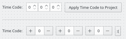
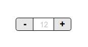
The Breeze theme SpinBox control is very compact:

It doesn't take up much space, but its inline buttons to increase and decrease the value are so small that they require very precise mousing to hit, which is slow (and borderline impossible for people with poor mousing skills). Clicking on them is particularly irritating with a low-quality laptop touchpad, with which small moves are often difficult. And it's flat-out impossible for touch; the click targets are simply too small. I personally often find myself just clicking in the text field area and manually typing a number or using the arrow keys to adjust the value; the controls are just too small for me to quickly and comfortably use on my laptop.

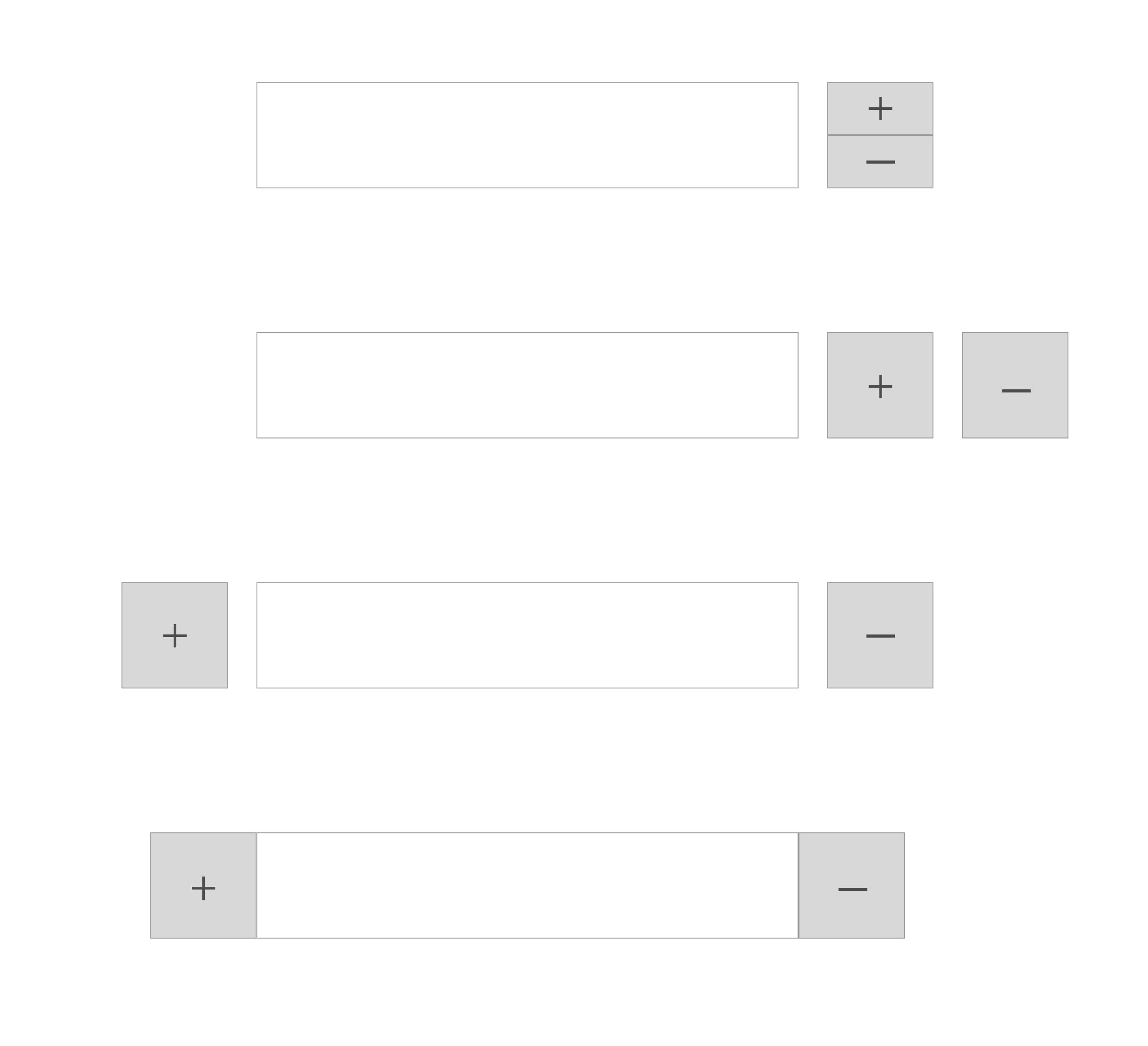
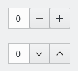
I'd like to consider a more user-friendly control that takes up a bit more space. Something like this:

Expected advantages of this approach:

  • Much larger click targets; faster interaction to click on a single button
  • Faster interaction to click on one button after the other when the control is not very wide: Fitt's law says that the acquisition time is proportional to both the distance and size, so by hugely increasing the size we would offset the increased distance
  • Usable with a touchscreen

Expected disadvantages:

  • When clients use an inappropriate layout that stretches the control to span a very wide space (e.g. System Settings > Desktop Behavior > Virtual Desktops), interaction to click on one button after the other will be slower due to increased distance between controls. Will need to fix clients to alleviate this effect
  • Need to simultaneously change it in Breeze as well as QQC2 theme to avoid an awkward difference between the two
ngraham created this task.Aug 20 2018, 11:23 PM

I'm pretty sure no one uses these buttons if they have an actual mouse, but just the wheel. And I can say that those who use the touchpad don't need to change this (I don't see a usecase where one using his touchpad instead of a proper mouse, will need to change such values that are kept in settings mostly).

For touchscreens, I think it's much better if Breeze detect somehow that the screen is touchable, and if so use the touch-mode spinbox (or any other controls that are hard to use on touchscreens.)

rkflx added a subscriber: rkflx.EditedAug 21 2018, 9:36 AM

I'm pretty sure no one uses these buttons if they have an actual mouse, but just the wheel.

Exactly. Just like nobody uses (or rather should use) the buttons on scrollbars and just performs a scrolling gesture. Moreover:

  • The stacked arrows on the spinbox even indicate visually that vertical scrolling is possible. Taking them away might have the opposite effect of what we want to achieve, i.e. mouse users might stop scrolling and start clicking furiously.
  • We recently made scrollbars even narrower, since nobody uses the buttons, so they are more for indication anyway. Why would we do the opposite for spinboxes?

For touchscreens, I think it's much better if Breeze detect somehow that the screen is touchable, and if so use the touch-mode spinbox (or any other controls that are hard to use on touchscreens.)

Great idea. Another off-the-cuff idea is to pop up another bigger widget upon touch, moving the finger to the top/bottom could scroll up/down, and releasing the finger would close the bigger widget again.

by hugely increasing the size we would offset the increased distance

That sounds a bit odd, why make it harder on purpose in the first place? For touchscreens, GNOME's recommendation makes more sense to me (unless you want to reinvent the wheel again):

Touch mode: [1234 pixels per minute][-][+]

That layout is also better when the content of the spinbox gets very wide, e.g. when a long textual unit is added after the number.

It's important that we treat all input devices as first-class citizens. Saying, "pshah, just use a real mouse" or "nobody should click on this, the hidden accelerator gesture is more efficient" isn't acceptable. We have GUI interfaces precisely because those hidden accelerator interfaces are only suitable for power users and experts. They are critically important and we should never impair them, but we shouldn't fall into the trap of assuming they're suitable for everyone. Dynamically changing the control depending on the input device doesn't seem ideal to me. How would Breeze detect that? And it would be odd to have just one (or a few) UI controls in the layout change its appearance in response to entering "touch mode". It's not just about touch either. Using the arrows with a regular common touchpad is just not a pleasant experience due to the tiny click targets.

I'd be okay putting the - and + buttons on the same side however. I think that's a good improvement over my proposed original.

I like the idea in general. While having -/+ on both sides looks nicer probably, having it only on the right side makes more sense , so we don't run into problems with very long content in the spinbox.

safaalfulaij added a comment.EditedAug 21 2018, 2:20 PM

It's important that we treat all input devices as first-class citizens. Saying, "pshah, just use a real mouse" or "nobody should click on this, the hidden accelerator gesture is more efficient" isn't acceptable. We have GUI interfaces precisely because those hidden accelerator interfaces are only suitable for power users and experts. They are critically important and we should never impair them, but we shouldn't fall into the trap of assuming they're suitable for everyone.

I'll be you for one time and get some documents from popular OSs.
https://docs.microsoft.com/en-us/windows/desktop/uxguide/ctrl-spin-controls
https://developer.apple.com/design/human-interface-guidelines/macos/selectors/steppers

Dynamically changing the control depending on the input device doesn't seem ideal to me. How would Breeze detect that? And it would be odd to have just one (or a few) UI controls in the layout change its appearance in response to entering "touch mode".

Then, if Breeze can detect that (somehow as I said) and the different hard-to-use-on-touchscreen widgets get replacements, that will be ideal, right?
Why sticking to one idea and rejecting anything else? If this is possible then it will be great, although it's harder in implementation, but let's not jump into that part yet and discuss any strange idea first.

It's not just about touch either. Using the arrows with a regular common touchpad is just not a pleasant experience due to the tiny click targets.

I am with this statement that it's hard, but it's not just the spinbox, but everything that requiers moving around, selecting moving selection etc is hard with touchpad, and spinbox is one advanced widget, so I think users understand that. Add to that that you don't see spinboxes everywhere, but only in settings and adding/modifying items in specifc apps (mostly PIM).

I'd be okay putting the - and + buttons on the same side however. I think that's a good improvement over my proposed original.

Android uses number picker (press and hold then move your finger up and down. Maybe this is better for such screens than the proposed buttons and iOS way below.)

iOS: https://developer.apple.com/design/human-interface-guidelines/ios/controls/steppers/
(Let's keep in mind that you are limited in input contol in phones)

Windows: https://img.mywindowshub.com/images9/ME-print1.jpg (Copies)
(Don't be fooled, wheel doesn't work, long press doesn't work, so this is almost pure touchscreen widget that does't take account of desktops)

abetts added a subscriber: abetts.Aug 21 2018, 3:06 PM

I quite like this box. I think it solves a couple of things for the user, clear expectations of what the controls will do, it preserves the ability to edit values manually and it is touch friendly. I support this.

rkflx added a comment.Aug 21 2018, 7:13 PM

@safaalfulaij Thanks for the links, those are quite interesting. So there are actually two different use cases for spinboxes:

  • Changing a value only a couple of ticks (e.g. the number of copies when printing), where you need precise control and therefore are likely to click.
  • Changing a value over a wider range (e.g. a width or height of an image), where scrolling is faster and does not need be precise. Those spinboxes are probably found in large professional apps with dense interfaces and less space for individual +/- buttons.

Hence maybe we should think about providing both options, so apps where density is key (e.g. Krita, Kdenlive, Gwenview's advanced crop bar) can use the current style, and other apps with more space and different uses cases can use the proposed style (e.g. Spectacle's delay spinbox).

In any case, please make sure to consult application authors before mandating any such change via the HIG. This probably also needs a broader discussion beyond spinboxes.

It's important that we treat all input devices as first-class citizens.

clear expectations of what the controls will do

The current proposal does not treat mouse users equally and expectations are not clear for them at all, because nobody will get that they can scroll if the stacked arrows are missing. I think this needs more thoughts.

As for adapting to what type of device a UI is used with, I'd recommend to learn from Microsoft: First they tried to implement bigger controls everywhere, but now they are actually backtracking and heading towards a more adaptive approach, where the density and spacing is not fixed to a single value for all devices anymore.


That said, this was likely my last comment here. Having to read

The usual suspects immediately appeared

in the backchannel in response to comments on this task is highly demotivating and hurts. Either VDG wants to engage in constructive discussions, or such tasks should not be posted to Phab (and then you would also not have to send people here to applaud). Instead of complaining to others please engage with individuals when you think their style of working can be improved.

huftis added a subscriber: huftis.Aug 21 2018, 7:24 PM
In T9460#156233, @rkflx wrote:

That said, this was likely my last comment here. Having to read

The usual suspects immediately appeared

in the backchannel in response to comments on this task is highly demotivating and hurts. Either VDG wants to engage in constructive discussions, or such tasks should not be posted to Phab (and then you would also not have to send people here to applaud). Instead of complaining to others please engage with individuals when you think their style of working can be improved.

Okay I will, and I'll address this publicly.

First of all, I apologize for the negative language. Mea culpa.

Second of all, I want to explain the frustration behind it: it has felt for quite some time that you object to almost anything I propose, and react critically to mistakes I make that other people make too, but they do not draw the same level of passive aggression and criticism from you. An example from one hour ago:

Fantastic, thanks! Works great now.

No, it doesn't. Now the Miscellaneous label is missing, which should be quite obvious when actually running the patch or looking at the code. I'll send a patch…

It's true, I overlooked the issue. However, I did look at the code, and I did test the patch. But I overlooked the issue. My bad. I'm human. I make mistakes. But the patch author also overlooked the issue (repeatedly!), yet you chose to direct verbal aggression ("...which should be quite obvious when actually running the patch or looking at the code.") at me, not him. I didn't see you criticize Kai for letting through a change that totally broke moving desktop icons in Plasma for everyone. Just me.

It feels like you hold me to a higher standard than anyone else, and seem to be following my work just so you can find fault with it or nitpick it to death. I get the sense that you feel like you need to protect KDE from my ill-conceived impulsiveness. It is highly de-motivating to me and the prospect of your appearance is stress-producing--as is the knowledge that you're lurking in the VDG room under an unknown identity, not actually participating in discussions, but rather alert for stray remarks. We could have discussed this topic there. We also could have discussed it at Akademy, where the idea germinated, had you attended.

I want to have a better working relationship with you, but that requires respect on both sides. I respect your doggedness, thoroughness, attention to detail, and investigative ability--and I have told you so before. It remains true! I acknowledge that carelessness is an issue I need to work on, and I aspire to reach your level in these traits.

It sure would be nice if you could find anything to respect in my actions and work style--and if you do, it would be nice if you would express that once in a while so I can stop feeling like you don't respect me. If you can't, then I would appreciate it if you could just avoid the passive-aggressive criticism.

The current proposal does not treat mouse users equally and expectations are not clear for them at all, because nobody will get that they can scroll if the stacked arrows are missing. I think this needs more thoughts.

I actually don't agree with this assessment. The fact that you are adding a visible plus or minus button to the side of editable field is exactly the way that the user will clearly understand what the spin box is for. Moreover, a cool behavior that I see in other applications is that you can also use the scroll wheel in the editable field to go up or down with the values. Some even change the mouse cursor to <-> and you can drag your mouse cursor back and forth to also change the values. I feel we are assuming wrongly here that users will not understand what the control is doing.

in the backchannel in response to comments on this task is highly demotivating and hurts. Either VDG wants to engage in constructive discussions, or such tasks should not be posted to Phab (and then you would also not have to send people here to applaud). Instead of complaining to others please engage with individuals when you think their style of working can be improved.

The same goes for the other side. We should practice what we preach. If you feel that the VDG is taking steps that you don't agree with, that somehow they are beyond just talking about the work, bring it to us as well. We are happy to work with you and discuss. I am sure that we can see that there are many assumptions that we make that were nothing like what we thought. ;) However, it is hard to propose changes to the UI in general for the team. We get the same set of people pushing back on changes and it can get very tiring to deal with that. Instead of having that kind of behavior, we could have a meeting or get together to discuss these things and get to know each other better. The important thing is that we are able to take in changes and modify to fit our users the best.

@ngraham I have suggested this multiple times in response to similar apologies of yours before, and here I'm only doing it again because I still care at least a little bit and I still hope there will a chance for change: Please let go of your assumptions regarding hidden agendas or how often, where and why I comment on your work. Nobody is here to specifically pick on you, I'm sorry that you still seem to get that impression.

The issues you listed are nothing new and I'm far from the only one having concerns regarding some of the recent proposals themselves and also the style in which they are discussed. Good ideas will attract contributors and result in change, dismissing legitimate concerns will only lead to resistance. As Martin said: Don't jump to conclusions and then fight to death over a solution, but try to find consensus on the problem first, respect what was done before and see how others have solved the issue. Your proposals might get stuck less often if you put more work into researching the issue beforehand and moderated the discussions more in terms of finding the best solution rather than gathering your troops against some perceived opponents.

@abetts Thanks for the offer. As you may have noticed, my schedule does not allow to respond in realtime in your chatroom. All I can do is read the backlog to see what was discussed (and try to ignore when contributors are mocked), and add input to a few selected Phab tasks.


Back to the topic:

I feel we are assuming wrongly here that users will not understand what the control is doing.

It's not about the control in general, it's about whether mouse users will know that they can use their scroll wheel at all. My mouse has exactly those stacked arrows of the spinboxes printed next to the scrollwheel, it does not have horizontal +/- buttons printed on it. That visual connection would get lost. As you noted, there'd need to be another way to indicate scrollability besides the +/- buttons.

Another point that needs clarification: I assume the buttons are to be square to be easy to touch, so then they'd significantly increase the widget's width (sorry, still has the old button order):

This means applications which use spinboxes for their compactness would need to be adapted. However, if the spinbox change is only done in Breeze, other themes will fall over, including people wanting to write cross-platform applications which also have to work on Windows and macOS. There the QSpinBox would still be in its original form, i.e. a widget where you can "spin" your mouse wheel and which is much less wide. That's why I think a dedicated new widget might be preferable.

Note that in GNOME the widget itself provides the +/- buttons, so even with Breeze you get those buttons in some GTK3 apps right now, avoiding exactly the issues I outlined above. IOW, it's not done in the theme, but directly in the toolkit, meaning the change would have to be done in Qt (or maybe in a QPA?) if we were to replicate that approach, not only in Breeze.


As said before, IMO it would be good to align this to a bigger plan regarding touch friendliness, and address the concerns regarding compatibility with other OS platforms, themes and legacy apps as well as different use cases for different forms of this type of widget.

In T9460#156550, @rkflx wrote:

@ngraham I have suggested this multiple times in response to similar apologies of yours before, and here I'm only doing it again because I still care at least a little bit and I still hope there will a chance for change: Please let go of your assumptions regarding hidden agendas or how often, where and why I comment on your work. Nobody is here to specifically pick on you, I'm sorry that you still seem to get that impression.

The issues you listed are nothing new and I'm far from the only one having concerns regarding some of the recent proposals themselves and also the style in which they are discussed. Good ideas will attract contributors and result in change, dismissing legitimate concerns will only lead to resistance. As Martin said: Don't jump to conclusions and then fight to death over a solution, but try to find consensus on the problem first, respect what was done before and see how others have solved the issue. Your proposals might get stuck less often if you put more work into researching the issue beforehand and moderated the discussions more in terms of finding the best solution rather than gathering your troops against some perceived opponents.

@abetts Thanks for the offer. As you may have noticed, my schedule does not allow to respond in realtime in your chatroom. All I can do is read the backlog to see what was discussed (and try to ignore when contributors are mocked), and add input to a few selected Phab tasks.


Back to the topic:

I feel we are assuming wrongly here that users will not understand what the control is doing.

It's not about the control in general, it's about whether mouse users will know that they can use their scroll wheel at all. My mouse has exactly those stacked arrows of the spinboxes printed next to the scrollwheel, it does not have horizontal +/- buttons printed on it. That visual connection would get lost. As you noted, there'd need to be another way to indicate scrollability besides the +/- buttons.

Another point that needs clarification: I assume the buttons are to be square to be easy to touch, so then they'd significantly increase the widget's width (sorry, still has the old button order):

This means applications which use spinboxes for their compactness would need to be adapted. However, if the spinbox change is only done in Breeze, other themes will fall over, including people wanting to write cross-platform applications which also have to work on Windows and macOS. There the QSpinBox would still be in its original form, i.e. a widget where you can "spin" your mouse wheel and which is much less wide. That's why I think a dedicated new widget might be preferable.

Note that in GNOME the widget itself provides the +/- buttons, so even with Breeze you get those buttons in some GTK3 apps right now, avoiding exactly the issues I outlined above. IOW, it's not done in the theme, but directly in the toolkit, meaning the change would have to be done in Qt (or maybe in a QPA?) if we were to replicate that approach, not only in Breeze.


As said before, IMO it would be good to align this to a bigger plan regarding touch friendliness, and address the concerns regarding compatibility with other OS platforms, themes and legacy apps as well as different use cases for different forms of this type of widget.

I agree with your last point. We are working in hig.kde.org to make sure that we are adding these ideas to the guidelines. We need help in that area. You seem to have a really good idea of that. How can we bring you to the table to work more closely together on that? I know that our team in Kirigami is looking to have more input on what works and doesn't work in mobile.

One interesting thing is that while we may have some reservation with the width of this widget, the new settings alignment that we are pushing for would not be a problem for this widget. The new arrangement looks for verticality. You can see some examples in the system settings mockups in Pholio.

The width is probably not as much of a problem if you do it tastefully:

https://dribbble.com/shots/606655-Plus-Minus-Buttons
https://dribbble.com/shots/671118-BHGRE-Slider-Interface

But I do feel that we are pushing Breeze to places where it hasn't been before and it makes people feel uncomfortable. I think we need to determine what we want out of Breeze. Do we feel that Breeze is set in stone and cannot be touched? Or do we feel that Breeze can be improved and iterated?

Depending on the answer we could go two ways, one would be to leave Breeze alone and only do maintenance. No radical changes. Option two would be that Breeze is a playground where we experiment and test new UI ideas.

My feeling is that the public in general, while they like consistency, the public also likes evolution and changes. If that were not the case, we would still have the first version of Android out, or iOS 1 still around. Or even KDE 3 around. Why does the public feel the need to change what we use everyday? I think we need to solve these questions and tune our attitude to what we feel is the best outcome for Breeze.

As a designer, I am on the side of moving forward with design. Maybe from a technical perspective our engineers feel that we should not do that. We must come to a conclusion before moving forward and we all become frustrated.

Thoughts?

@rkflx

I have suggested this multiple times in response to similar apologies of yours before, and here I'm only doing it again because I still care at least a little bit and I still hope there will a chance for change

Wow, Nate must feel really blessed in light of your graciousness.

That said, this was likely my last comment here.

You should have followed through on this if you can't take the hand, that Nate reached out to you. Instead you had to react with more hostility towards him.

So yes, it seems you have something in general against him and his work. If it's because you see a pattern of insufficient thought and research in his proposals, then talk to him in private about that and make suggestions on how to improve. I'm sure Nate wouldn't just ignore that. In fact he already stated, that he wants to improve in this regard.

But if you are one of these people, who just don't want other people to succeed, to change the status quo and to push stuff forward like Nate did in one year in KDE more than others did in 10, then I ask you to get rid of your pettiness.

rkflx removed a subscriber: rkflx.Aug 24 2018, 6:36 AM

talk to him in private about that and make suggestions on how to improve. I'm sure Nate wouldn't just ignore that.

In fact, I did multiple times, back in 2017 even. Apologies were exchanged, and it was promised that everything will be fine. Several months later, I have to read "mea culpa" and the same promises again, the only difference is that even more people got alienated in the process. Don't blame this on me, there are other incidents where I wasn't even involved.

Anyway, I tried to make it work, but it doesn't, so I'm leaving the project now and stop contributing what is 10 times less worth having than what others are doing.

A few tech notes:

The Fusion style does things like this, so you can switch to that to see how things behave in situe.


For touch, spinboxes with moved buttons might suck less, but they still suck, tumblers often are the way forward as you can swipe. We're using this when we're doing UI rewrites that think about touch from the ground up but it's not something that you can switch to globally.

A few tech notes:

The Fusion style does things like this, so you can switch to that to see how things behave in situe.

I see this for Fusion:

I agree that the proposal makes things only "suck less" for touch. In my mind, this isn't explicitly a proposal to make it touch-friendly though; that's only a fringe benefit. Rather, my proposal to use larger click targets is mostly based on the desire to improve the mouse and touchpad use cases. The current arrows are very small and require precision pointer movement skills. Many users are not mouse experts, and quickly manipulating them using a touchpad is very frustrating given the state of Linux touchpad drivers. Regardless, bigger click targets reduce acquisition time and therefore will increase speed for users who want to click. I see people on all platforms that implement the current style giving up on the buttons and simply entering a number by hand or using the hidden scroll-to-change-the-number UI (if they know about it and use a wheel mouse). I think that's a sign that the click workflow has not been adequately prioritized; it is not "Simple by default."

I don't feel like retaining the stacked ^v buttons is a necessity to clue people into the fact that they can scroll to change the number. No mouse I've ever used has those symbols on it. I looked at all the mice I could find in my workplace the other day and couldn't find a single one with stacked ^v symbols near the wheel. And no touchpad ever has or ever will have those symbols. So the visual connection to people's hardware is non-existent for most. Also, using a touchpad to scroll over the control is sub-optimal because the speed is much too high. Touchpad scrolling doesn't involve the discrete "ticks" of a mouse wheel, so it's inherently less precise. We could probably reduce the scroll speed there regardless of what visual changes (if any) we make.

Can folks help me find user interfaces that put spinboxes next to each other horizontally so we can see if the increased horizontal width presents a problem in practice? Among the software I use regularly, I haven't actually found any examples of this yet. I mostly see spinboxes stacked in a vertical layout, like @abetts brings up.

Ah, the Gwenview Crop toolbar's Advanced mode is one such interface:

abetts added a comment.Sep 2 2018, 5:45 AM

Here are other samples that I have seen.

Please note that our goal here is "not" saving space. That is something that is often mentioned by engineers while designers generally want more empty space. I think we can update the design, give it more functionality while finding the middle ground where a new spinbox meets all these requirements. I particularly like the combined control with the plus and minus buttons on each side.

For what it's worth, I notice that ElementaryOS is already doing this:

(saw it on https://www.omgubuntu.co.uk/2018/09/elementary-os-juno-beta-2-released)

IlyaBizyaev added a subscriber: IlyaBizyaev.EditedApr 3 2019, 8:42 PM

I agree that on touch input, the current spinboxes are unusable.
I am also that person who actually clicks up and down arrows with a mouse; I find it more precise than scrolling.
When using a touchpad, I prefer having big clickable - and + buttons (regardless of their location).
I disagree that touchpad users "don't really need" working with this control: it's not only in settings, I regularly change screenshot timeouts in Spectacle, etc.

Now, as for the visual part:
I tend to agree that current appearance is the most stylish and compact you can come up with.
I agree that having the control style depend on the input type sounds like a more substantial improvement, as I'd also like to see e.g. bigger checkboxes on touch devices.
And I see that this might potentially open up some new bugs for us and 3rd-party application developers who somehow relied on spinboxes being compact.

Example of a touchpad-friendly spinbox in KvArcDark theme:

gikari added a subscriber: gikari.Apr 30 2019, 8:42 PM

Hello,
I have made two mockups of SpinBoxes: the first one - with plus & minus signs and the second one with arrows instead of signs. Maybe it will be a compromise with mouse scroll mnemonics mentioned above. And the bonus point: you actually can control value inside a SpinBox with the up and down arrows on a keyboard, so, in my opinion, arrows on the buttons will be a better match with that behavior.

Ooh, I like the arrow version. That does seem like it could be a sensible compromise.

gikari added a comment.May 8 2019, 6:01 PM

Can folks help me find user interfaces that put spinboxes next to each other horizontally so we can see if the increased horizontal width presents a problem in practice? Among the software I use regularly, I haven't actually found any examples of this yet. I mostly see spinboxes stacked in a vertical layout, like @abetts brings up.

Here some from Konsole configuration window. There is a plenty of space on the right, so no problem with resizing these spinboxes.

Also, I checked Krita a bit. There is some custom widgets with background color fill, that behaves like spinboxes with the same arrows on a right side. Considering the big width of these custom widgets, there will be no problem to shrink them to gain some space for buttons on the modal window below.

There are also the two of these guys on a toolbar too, but again - a lot of space on the right.

However, I found actual spinboxes with no free space on the sides in 4.2.0-alpha version of Krita in Artisitic Color Selector dock inside "Docker Settings" popup, that use placement in one line for RGB in Luma Coefficients group.

felixernst added a subscriber: felixernst.EditedMay 31 2019, 11:28 AM

Maybe it will be a compromise with mouse scroll mnemonics mentioned above. And the bonus point: you actually can control value inside a SpinBox with the up and down arrows on a keyboard, so, in my opinion, arrows on the buttons will be a better match with that behavior.

I agree. Furthermore my suggestion is to go all in on the approach that the spinboxes work like vertical scrollbars. Using abetts' suggestion of changing the mouse cursor would make this even clearer:

Moreover, a cool behavior that I see in other applications is that you can also use the scroll wheel in the editable field to go up or down with the values. Some even change the mouse cursor to <-> and you can drag your mouse cursor back and forth to also change the values. I feel we are assuming wrongly here that users will not understand what the control is doing.

The downside of this is that it becomes less clear on hover that the value can be directly entered. I don't think this is a big problem since the drag mechanic serves the same purpose and as soon as one starts dragging the spinbox can become editable regardless.

I agree with abetts that with the changed mouse cursor ("<->" but vertically aligned) the following concern isn't as valid anymore:

In T9460#156233, @rkfl x wrote:

[...] expectations are not clear for them at all, because nobody will get that they can scroll if the stacked arrows are missing. I think this needs more thoughts.

If users actually drag the spinbox to change its values the click-target becomes most of the spinbox. This will in theory solve spinboxes for touch users. In practice they will have no way of knowing that dragging is an option since they don't have a changing mouse cursor to let them know. Some additional indicator could probably solve this issue. The best I could come up with so far is displaying additional arrows while the SpinBox is being touched.

Now talking about space concerns like this one:

However, I found actual spinboxes with no free space on the sides in 4.2.0-alpha version of Krita in Artisitic Color Selector dock inside "Docker Settings" popup, that use placement in one line for RGB in Luma Coefficients group.

In cases with so little space I see no way but to keep the current style. I don't know about feasibility but I would propose to use the current style when not enough space is available and switching to the separate up and down arrows when there is enough space available for both the content and the buttons. This way we always have the best solution no matter the space constraints and since in both cases the same arrows are used it wouldn't be too irritating.

About the dragging mechanic:
This comes down to testing but I imagine dragging to change the "change-rate" instead of the "value" might be the way to go.
Having dragged slightly above the box would then increase the value by 1 every half a second. If it was dragged 10 times the spinbox height above it could change by 1 every 10 ms.

An alternative:
This far I have spoken in favor of a vertical approach but I think a horizontal approach would have similar benefits. To sum it up in a picture:

Users would then drag towards the "+" to increase and towards the "-" to decrease which I think is pretty elegant. The disadvantage is that one wouldn't think about using the scroll wheel in this case but dragging with a mouse button seems more comfortable to me anyway.

In cases with so little space I see no way but to keep the current style. I don't know about feasibility but I would propose to use the current style when not enough space is available and switching to the separate up and down arrows when there is enough space available for both the content and the buttons. This way we always have the best solution no matter the space constraints and since in both cases the same arrows are used it wouldn't be too irritating.

I forgot, that in my example there was a popup. That means it's width can be accommodated to the new wide spinboxes, so no problem here too. More over, input fields in a single row (not only spinboxes) are a such rare thing, so implementing hard technique of dynamic widgets' resizing for a single application is overkill.

If I add my late input on this: I'd say the + should indeed be on the right side of the input and on the right of - so that both are touching each other. Just that this is the most commonly used design that users except for a spinbutton outside of both being on top of each other (aka the currently used design), plus it'd add a bit of consistency with the GTK Breeze themeing.

Is it not possible to query the device the box has to be rendered on whether it uses touch or pointer input? If it is possible, the SpinBox could render in two different ways, one of which is the current design and the other being a touch optimized render.
Mobile users are very much used to in input field with a Minus control button on the left and a Plus control button on the right to modify the value of the input by a pre-set step. However this design is not very logical for pointer input devices such as regular desktop PCs, or laptops.

joricke removed a subscriber: joricke.Apr 17 2020, 5:11 AM
mart added a subscriber: mart.Apr 17 2020, 7:53 AM

the problem is as usual: easy to do with qml stuff, hacky and pain for qwidgets..
that said, the most user friendly spinbox i ever found was in a super ancient version of Corel Draw (something that still ran on windows 3.1 iirc :p)
the look was stil pretty much the same of the current spinbox, but with something that reminded an handle fused with the arrow buttons.
if one keeped the mouse pressed and dragged up and down, could make the values go up and down in a very fast, efficient and suprisingly super precise way.

ndavis added a subscriber: ndavis.Apr 19 2020, 6:31 PM

as long as you can still single click on the arrows to increment/decrement or scroll with the mouse wheel to increment/decrement, adding the ability to click/tap and drag to change the value seems like a good idea.

ngraham closed this task as Resolved.Aug 9 2021, 1:57 PM
ngraham moved this task from Backlog/Planned to Done on the Breeze board.
ngraham removed a project: Kirigami.