This task just lists the different components that were used by different VDG designers and their differences.
I hope we can discuss what's the parts we like the most and try to combine these into one.
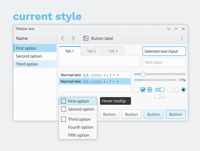
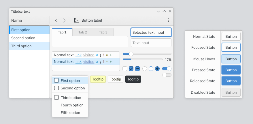
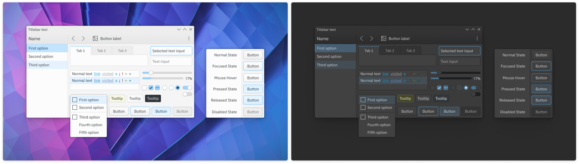
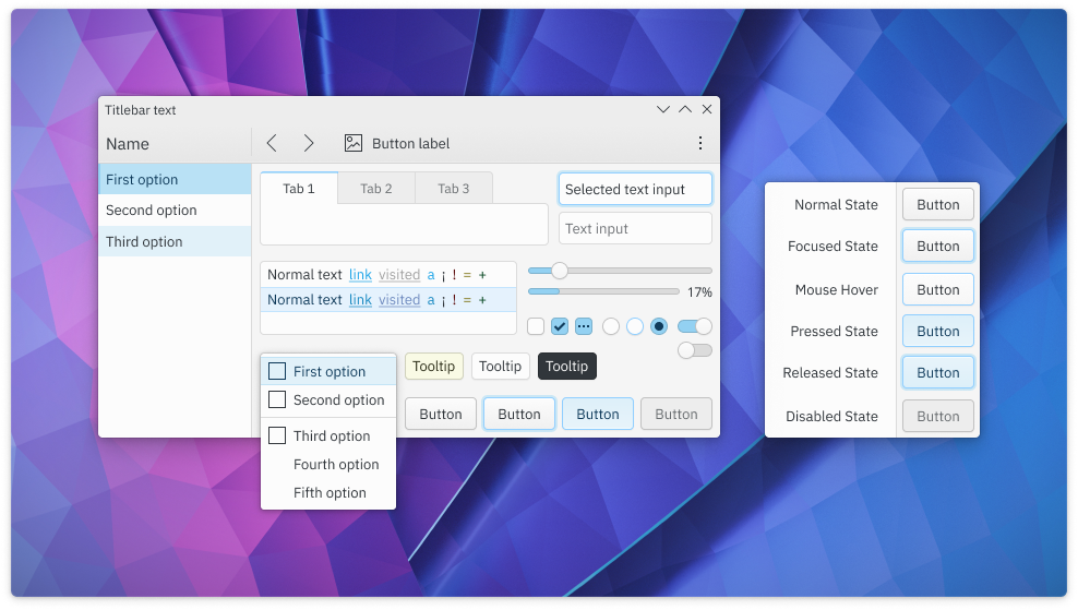
"Base" design toolkit
250%: [F8795986]
Based on the Breeze Theme Evolution tasks, it was made for the system tray redesign, new Simple Menu and Dolphin.
The colors here are mostly placeholders and a bit soft, but it's mostly similar to the pre-figma mockups.
Andy Betts' Breeze Tweak
250%: [F8796152]
Changes to the base design toolkit:
- Flatter buttons with strong and short shadows
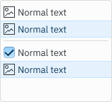
- Light checkboxes
- Bigger titlebar label size
Pontaoski's Skeumorpho
250%: [F8795728]
A custom set of components with a nice, skeumorphic style:
- Vibrant and saturated colors
- Light source at the top left corner (similar to Win9X, Haiku)
- Thick button border
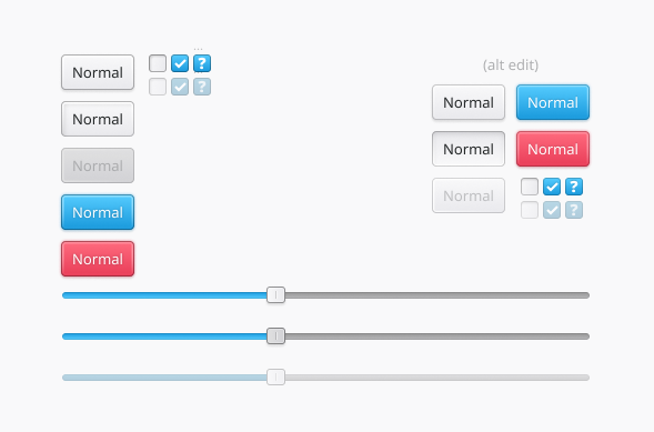
Pontaoski's Breeze Tweak
250%: [F8795812]
Changes to the base design toolkit:
- Removes the button gradient
- The normal button color is a bit darker
- The shadow is a Win9X style shadow with hard edges on the bottom right side.
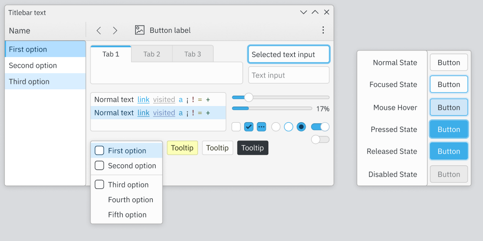
Manueljlin's "ocean" (better than "alt" :p)
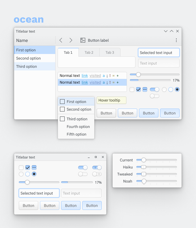
250%: [F8796068]
Changes to the base design toolkit:
- Tones down the current breeze blue and changes the hue slightly
- Has more contrast overall, specially on the toolbar
- Has 1px strong highlight line and a 2px soft highlight line on the text input and button selection, like on GitHub
- It's inspired by late non-textured skeumorphic UIs, but still remains mostly flat w/ soft gradients
(I might have missed something because it's quite late here, so please check if everything's there abetts and pontaoski)
Currently favored seems to be blue ocean:
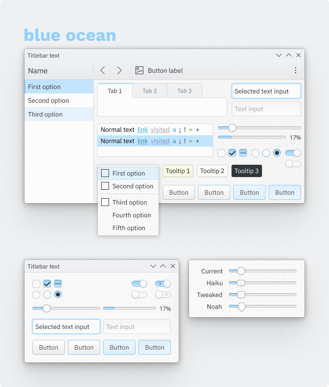
250%: [F8799135]
Most current state:
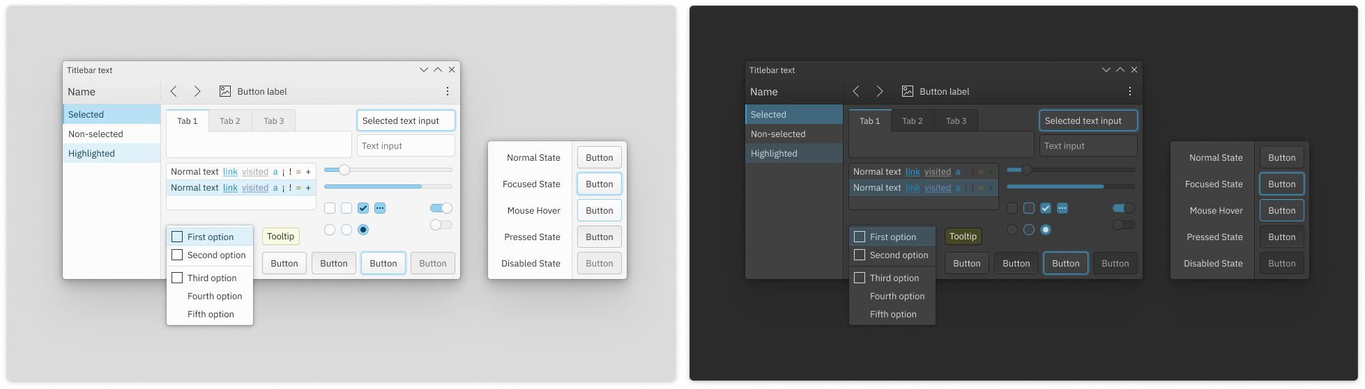
@2.5x F9410634


