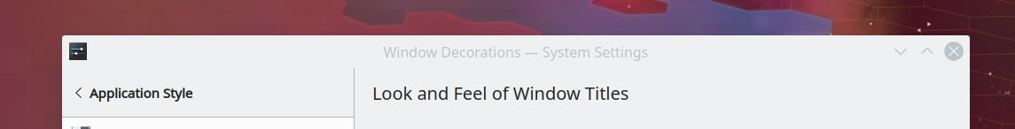
Right now, the Breeze color scheme uses a color for the active titlebar that's different and very strongly contrasting with the rest of the window background color:

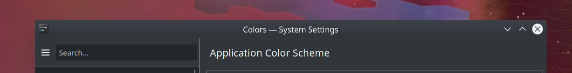
When the window becomes de-focused, the titlebar changes color:
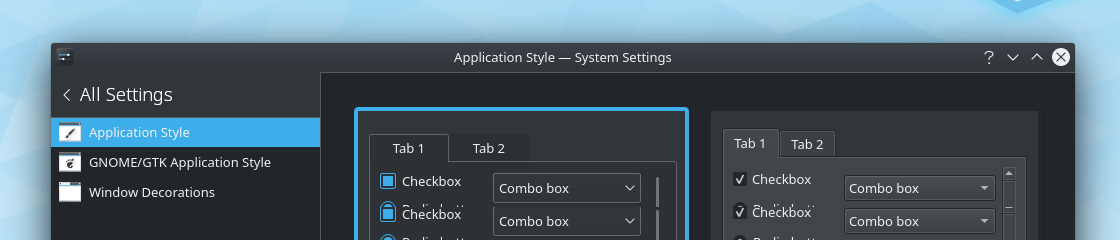
The Breeze dark theme, on the other hand, matches the titlebar color to the rest of the window background color and does not change it when the window becomes de-focused:
This is inconsistent, and each one has a significant disadadvantage associated with it:
- Breeze: Having the titlebar color differ from the window color kind of looks unattractive, and I think this is one of the things that makes people say that we should use GNOME-style headerbars
- Breeze Dark: There's almost no visual difference between focused and de-focused windows
I'd like to propose the following changes:
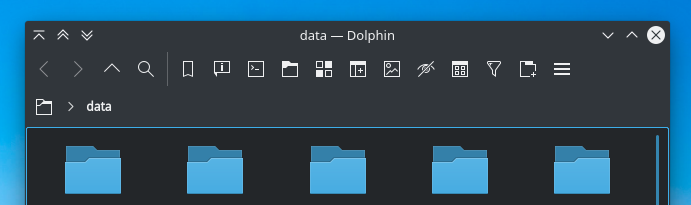
- Define a "Tools Area" at the top of the window that consists of the titlebar, menubar, and toolbar (or any combination thereof)
- The entire Tools Area has the same background color, which is slightly darker than the normal Window Background color
- Draw a single-pixel horizontal line separating the Tools Area from the window content beneath
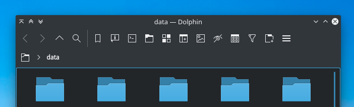
- When the window is inactive, desaturate or lighten the Tools Area's background, text, and icons, and reduce the size of the window shadow
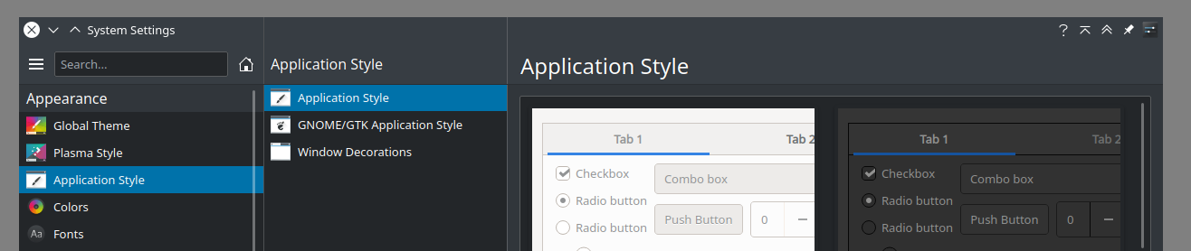
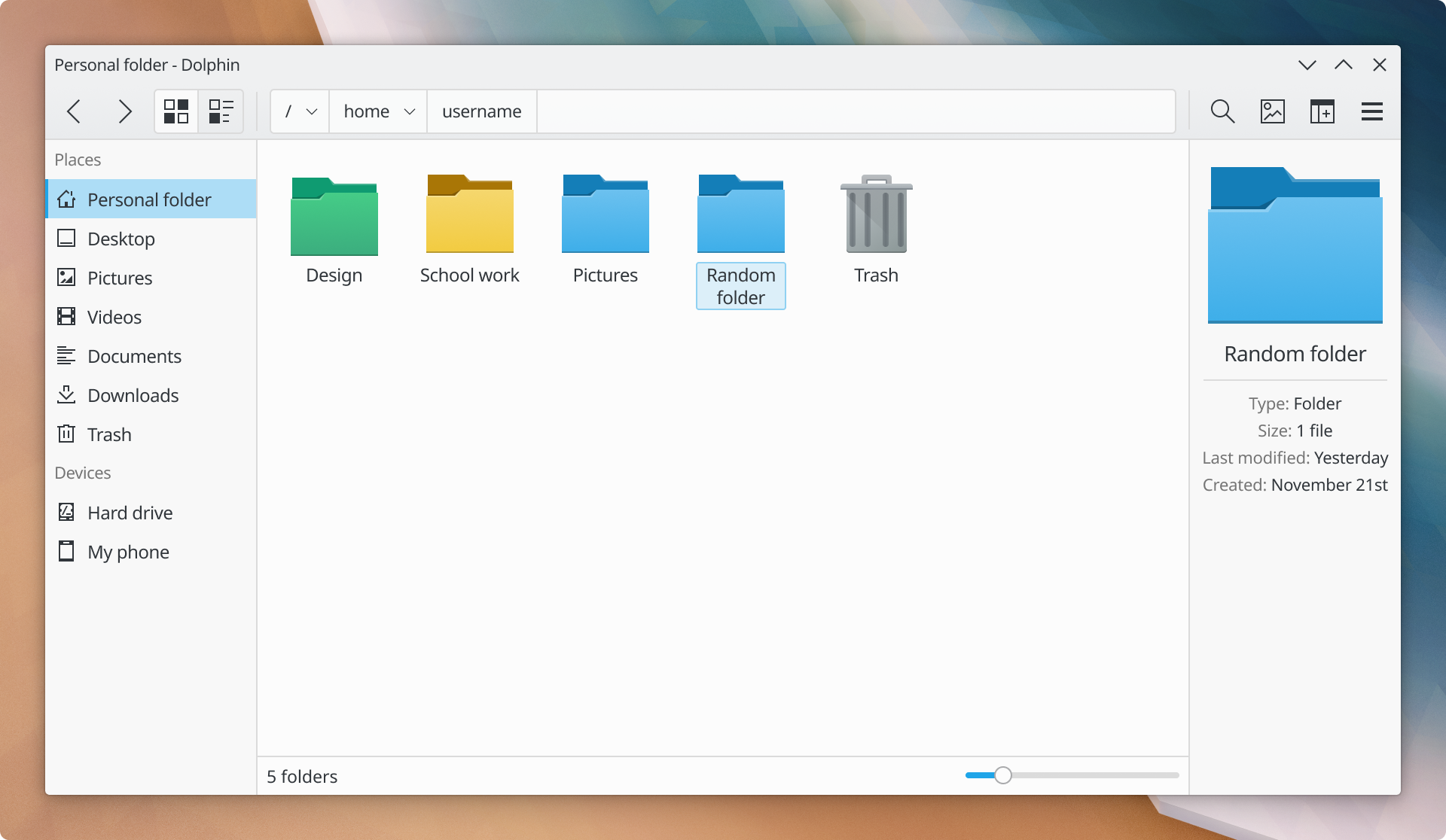
The non-dark version would wind up looking a bit like this on Dolphin. Thanks to @manueljlin for the fantastic mockups:
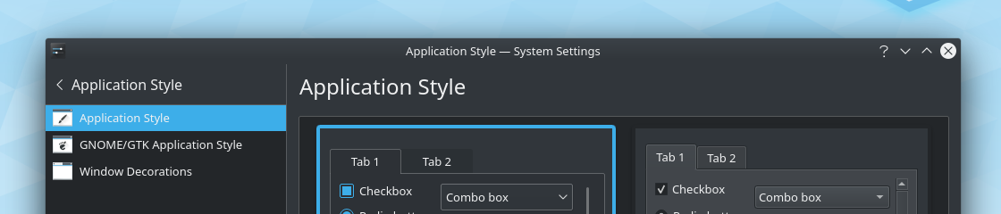
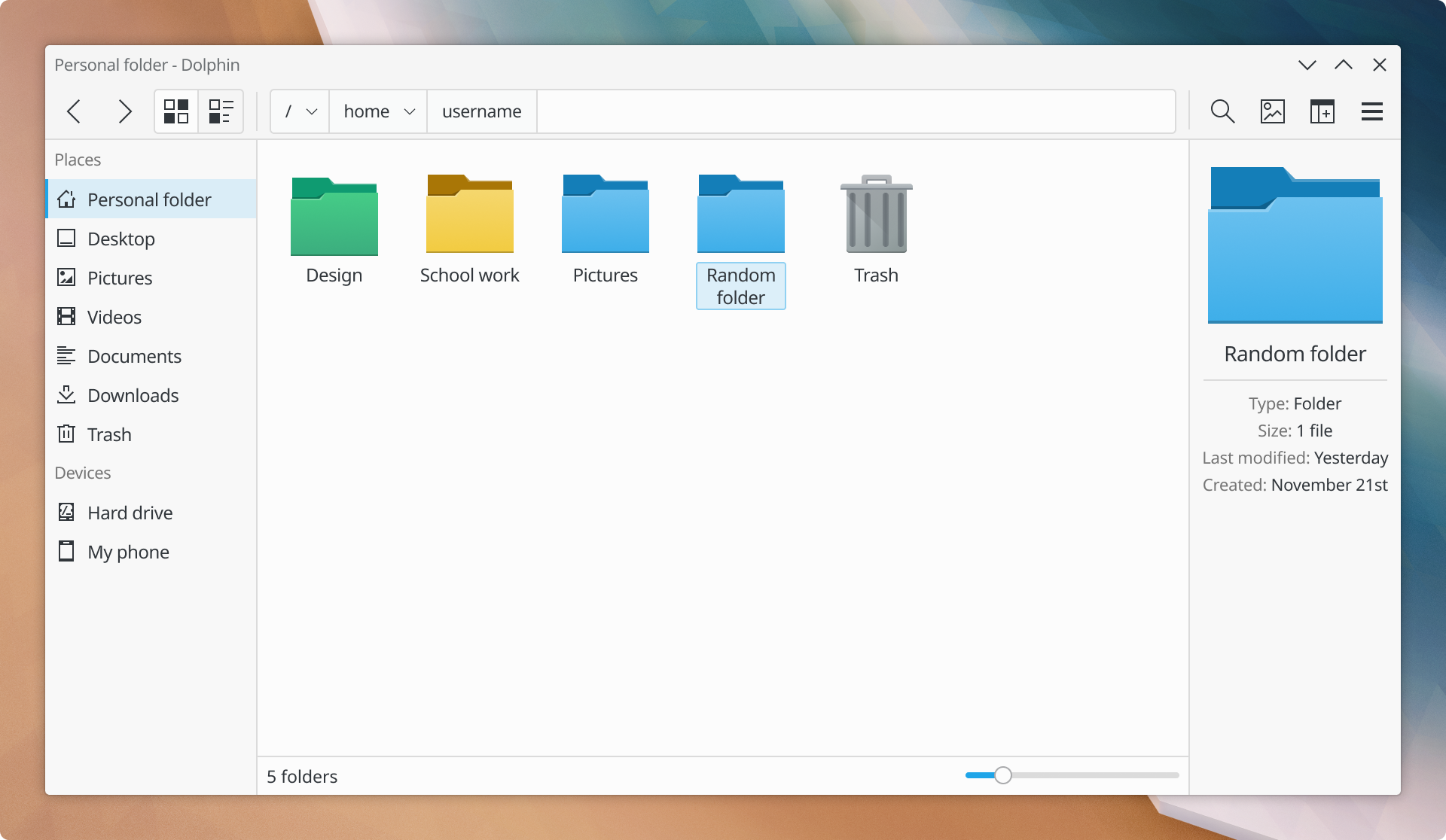
And then when the window is inactive:
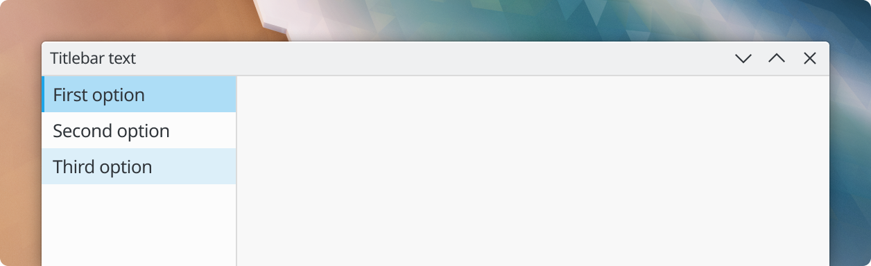
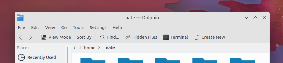
And here's generally how it would look with a window that has no menubar or toolbar, just a titlebar: