Unify navigation through sidebar categories/views
Open, Needs TriagePublic

Description

Some apps want to show a sidebar with many different pages or views that can be navigated through tabs.. The mean of navigation of those sidebars is often inconsistent through them and should be unified.

Notable implementations and proposed implementations are:

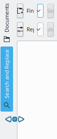
1. Horizontal tab bar/segmented control that becomes icons-only when the text would be elided

Okular mobile uses this style, though with custom QML code rather than QDockWidgets (which don't exist in Kirigami)


Pros:

  • Each view accessible with a single click
  • Uses little space and can be integrated into the sidebar itself
  • Responsive UI that adapts to the amount of space by showing text in the tabs when there's enough room

Cons:

  • No text when there are a lot of tabs or when the view is narrow

1b. Same as before, but when there is no space, current view text is mantained

There is usually enough space to show at least the current view text.

Additional pros:

  • Easy to understand which is active view
  • Users can read all names by switching the views

Additional cons:

  • When showing text on only the current button, other buttons and their click targets shift around as the category is changed

2. Vertical tabs or buttons on the left of the sidebar that can be clicked on to hide the sidebar

This is what Kate and KDevelop do.

Pros:

  • Text and icons
  • Can accommodate many tabs
  • Can easily hide the sidebar without needing to rely on a toolbar button or menubar item elsewhere in the app

Cons:

  • Dated appearance
  • Visually awkward because the user has to read sideways
  • No way to hide just the category chooser to save space but keep the sidebar visible (and even if there was, then there would be no visible way to switch the sidebar's current view)

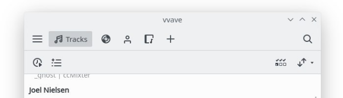
3. Combo box on the top of the sidebar that lists its different categories/views
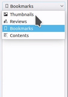
Pros:

  • Horizontal text and icons
  • Uses little space and can be integrated into the sidebar itself
  • Can accommodate an arbitrary number of categories/views

Cons:

  • Switching categories/views is somewhat slow (requires two clicks or a click-and-drag) on a small click target
  • Presence of other categories/views is non-obvious because they're hidden behind the combo box's popup

Rejected implementations:

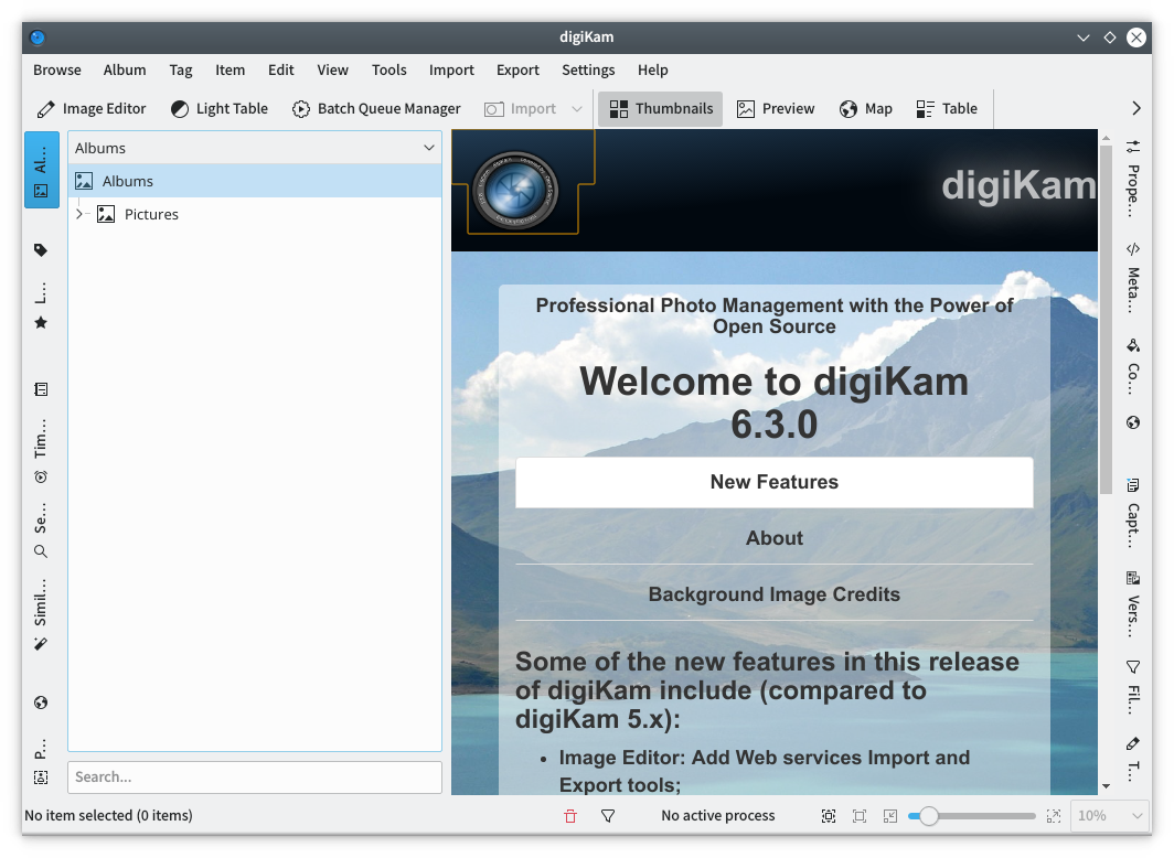
4. Wide sidebar with large icons and text underneath

Rejected because having two sidebars side-by-side is weird and takes up too much space
This is what Calligra and Okular currently do (...in different ways, though). It's also what we do for all settings sidebars.


Pros:

  • Attractive when implemented using colorful icons in a KPageWidget with a white background, as in settings windows
  • Horizontal text and icons
  • Can accommodate many categories/views

Cons:

  • Uses a lot of horizontal space; feels like too much in conjunction with a second sidebar next to it that displays content
  • No way to hide just the category chooser to save space but keep the sidebar visible (and even if there was, then there would be no visible way to switch the sidebar's current view)

5. Use collapsible and re-arrange-able headers that are visible all time

Rejected because this works best for when you want to see multiple small views, but not for the general case of switching between views

This is what we want to do for Dolphin's Places panel, see https://bugs.kde.org/show_bug.cgi?id=389803 and https://bugs.kde.org/show_bug.cgi?id=389803

macOS Finder and ElementaryOS Pantheon Files have this.

Pros:

  • Horizontal text and icons
  • Can accommodate many categories/views
  • Can show multiple categories/views at once

Cons:

  • Amount of content capable of being shown in each category/view is limited; not suitable for rich views like Okular's thumbnail list
  • Would require a bunch of custom code since nothing like this is currently implemented

6. Small toolbar on the top of the sidebar with mutually-exclusive icons-only toolbuttons or a segmented control

Rejected because this is basically the same as idea #1, but lacks the ability to show text when there's room

Pros:

  • Each view accessible with a single click
  • Uses little space and can be integrated into the sidebar itself

Cons:

  • No text label; could be hard to tell what the categories are from their icons alone
filipf added a subscriber: filipf.Sep 10 2019, 11:00 AM
filipf added a subscriber: VDG.

At least for IDEs vertical tabs seem to be the usual pattern use.

Eclipse:
https://www.eclipse.org/che/images/hero-home.png
Visual Studio
https://4.bp.blogspot.com/-xJAiMjvfj8g/WPuFSRM5hEI/AAAAAAAACGQ/5B78M3QTFcMLqKxvfkg4wo94aIwlFI3hwCEw/s1600/vvvs1.png

Let user navigate through big square buttons on the left with big icon and horizontal text undernith
A lot of newer application seem to go icon only and dont display any text. (which would actually pretty much unify it with vertical tabs)

ngraham renamed this task from Unify navigation through sidebars to Unify navigation through sidebar categories/views.Sep 10 2019, 2:05 PM
ngraham updated the task description. (Show Details)

My sense is that for sidebars that are purely used to switch between different categories of a window's main view, the current appearance for settings windows is popular, successful, and uncontroversial. People seem to like the large colorful icons with text beneath them in a white sidebar. However this is too big for being the category chooser for a sidebar. Using this style makes it feels like there are two sidebars (one to switch categories, and another to display the actual content).

Especially when the window is not very wide or is inherently vertical in shape (e.g because it's a document-based app like Okular), I don't think using this is a good idea because it just takes up too much space--most of which is wasted whitespace when there are few categories and the window is tall. If we try to reduce its use of space by using small icons and removing the text, then there's no advantage over the "Small toolbar on the top of the sidebar with mutually-exclusive icons-only toolbuttons or a segmented control" option.

So I'd like to propose that we use this style only for settings windows where you have a paradigm of the sidebar being purely a category chooser for the rest of the window, and we find a different style for sidebars in apps' main windows.

My sense is that for sidebars that are purely used to switch between different categories of a window's main view, the current appearance for settings windows is popular, successful, and uncontroversial. People seem to like the large colorful icons with text beneath them in a white sidebar. However this is too big for being the category chooser for a sidebar. Using this style makes it feels like there are two sidebars (one to switch categories, and another to display the actual content).

I agree, that's why I did a different task for T11153. That task is for sidebar for navigating main window, this one is for navigating pages in the sidebar itself. I'm sorry I did not make that more explicit / clear.

ngraham updated the task description. (Show Details)Sep 10 2019, 3:13 PM
niccolove updated the task description. (Show Details)Sep 10 2019, 3:16 PM
ngraham updated the task description. (Show Details)Sep 10 2019, 3:20 PM

I agree, that's why I did a different task for T11153. That task is for sidebar for navigating main window, this one is for navigating pages in the sidebar itself. I'm sorry I did not make that more explicit / clear.

Then we should probably remove the "Wide sidebar with large icons and text underneath" category from this task, or move it to a "Rejected ideas" section.

niccolove updated the task description. (Show Details)Sep 10 2019, 3:24 PM
niccolove updated the task description. (Show Details)
niccolove updated the task description. (Show Details)Sep 10 2019, 3:26 PM
ngraham updated the task description. (Show Details)Sep 10 2019, 4:27 PM
alexde added a subscriber: alexde.Sep 10 2019, 4:39 PM
ngraham updated the task description. (Show Details)Sep 10 2019, 4:51 PM
ngraham updated the task description. (Show Details)Sep 10 2019, 4:57 PM
ngraham updated the task description. (Show Details)
ngraham updated the task description. (Show Details)Sep 10 2019, 5:01 PM
niccolove updated the task description. (Show Details)Sep 10 2019, 5:25 PM
ndavis added a subscriber: ndavis.Sep 10 2019, 6:07 PM
ngraham updated the task description. (Show Details)Sep 10 2019, 7:36 PM

Some of the VDG people seem to be in favour of approach 1/1b and I think it definitely can work. But so far I still think having 2 as the basis is the best way forward. Here is a mockup that expands on 2 and @fabianr's comment.

  • Regarding 1b: maybe tabs on the top would look better than buttons? Something like this: (terrible mock, forgive me)

    Personally, I prefer the suggestion of @felixernst with some small changes

    • Don't resize until we have a listview like in settings ... a listview has a differen purpose and the design doesn't seem suitable to me for Kate/Okular etc.

    Furthermore, I want to specify the "resizising more", as far as I understood it only depends on the width whether the bar is vertical or horizontal. I would make it dependent on something else.

    If we have more width than height, use horizontal bar
    If we have more height than width, use vertical bar

    e.g. the the vertical bar takes the space we have the most oft

    horizontal tab bar: Resize text and icon depending on how much width we actually have (height changes nothing unless condition above changes)
    vertical tab bar: Resize text and icon depending on how much height we actually have (width changes nothing unless condition above changes)

    As I'm not good with mockups, here a quick and dirty qml application:

    The problem with that is that the sidebar category chooser will be huge much of the time. This is a current irritation with Okular's sidebar and it was specifically what I was trying to fix with my rejected Okular patch. When a sidebar has multiple views that you could switch through, this needs to be made obvious, but not by consuming a ton of precious horizontal space that the sidebar itself wants to use.

    Leon0402 added a comment.EditedSep 21 2019, 11:55 AM

    @ngraham I hope I understand you correctly. Your problem is that the actual sidebar or the side view, which comes if you click on the sidebar, takes width as well ... and therefore you don't want to waste more width, right?

    What do you think of modifying the condition:

    horizontal: (windows.width - sidebar.width - sideview.width) >= windows.height
    vertical: (windows.width - sidebar.width - sideview.width) < windows.height

    This calculation would take into account the width problem and would show the vertical mode faster if there is not enough width.

    Here is a first test run, although I just used 300px for "sidebar.width + sideview.width".

    Obviously we should start settings min width and heights for the window ... sure you could also start and switch in some size to "icon only" ... but at some point, there should be a stop ... the application doesn't have to run in a 2px x 2px window.

    felixernst added a comment.EditedSep 21 2019, 1:17 PM

    I was mostly thinking about manual resizing by the user. In a picture:

    Having automatic resizing might be an interesting option as well but I think giving the user the means to easily resize with a familiar and self-explanatory action is more important. I think if Okular had resize-handles indicated by a mouse cursor change there wouldn't be many complaints about it's default size because the width could easily be reduced to vertical tabs-width.

    Not to say automatic resizing isn't also important but I would focus on the basics first.

    • Don't resize until we have a listview like in settings ... a listview has a different purpose and the design doesn't seem suitable to me for Kate/Okular etc.

    I agree that it isn't particularly useful for Kate/Okular. I added the listview as the widest of the resize-options in the mockup because:

    • There is hardly any harm in allowing resizing up to that level (if it is a manual action by the user).
    • We can give the user the choice to select a list-like sidebar if an application has many entries or the user likes to have icons and labels in a row.
    • On the flipside: The user would be free to change the width/style of the sidebar in system settings. For example to switch to the icon above label style.
    • Unification

    But we can still decide to not have the listview as an option. Let's first see if we can find a consensus about the overall approach.

    Let's not forget digiKam :)

    (Of course my monitor is small compared to today's standards. It is not suitable for working with digiKam at the first place, but just to show you the number of sidebars)

    @ngraham I hope I understand you correctly. Your problem is that the actual sidebar or the side view, which comes if you click on the sidebar, takes width as well ... and therefore you don't want to waste more width, right?

    What do you think of modifying the condition:

    horizontal: (windows.width - sidebar.width - sideview.width) >= windows.height
    vertical: (windows.width - sidebar.width - sideview.width) < windows.height

    This calculation would take into account the width problem and would show the vertical mode faster if there is not enough width.

    Here is a first test run, although I just used 300px for "sidebar.width + sideview.width".

    Obviously we should start settings min width and heights for the window ... sure you could also start and switch in some size to "icon only" ... but at some point, there should be a stop ... the application doesn't have to run in a 2px x 2px window.

    I think the vertical sidebar is ugly.

    Would it be possible to drop the vertical text (both bottom-to-top and top-to-bottom) on the sidebar, and instead just use buttons with tooltips? From a UX standpoint, vertical text can be a big negative to users, as you're possibly making them tilt their heads to read the text better. It can also make the UI feel a bit inconsistent by being the only place(s) where text is not horizontal.

    I think tooltips are very disturbing for such toolview buttons.
    You very often hover over them during switching and then you always get your stuff hidden by the tooltip.

    Tooltips don't need to immediately pop up, of course, like most tooltips nowadays. They would not hide your stuff unless you kept hovering over an item for long enough.

    Would it be possible to drop the vertical text (both bottom-to-top and top-to-bottom) on the sidebar, and instead just use buttons with tooltips? From a UX standpoint, vertical text can be a big negative to users, as you're possibly making them tilt their heads to read the text better. It can also make the UI feel a bit inconsistent by being the only place(s) where text is not horizontal.

    Omitting the labels is even worse for UX imo. At least users see there is something to read there whereas for tooltips they have to be familiar with the concept of tooltips, move their mouse (if they have one) and hope one will show up. There is an option to turn them off in settings as well. That being said I am in favour of having tooltips for the vertical tabs just like we already have them. I just think we shouldn't rely on them to make an application useable.

    It seems like for most the biggest nuisance of approach 2 is the vertical text. It certainly isn't ideal but it is the only way to have text when there is so little horizontal space.
    This is one of the reasons I am confident in my suggestion because if a user doesn't like the vertical text they can switch to icon-only or trade in horizontal space for better legibility and bigger icons. Or if we or an application maintainer doesn't like it they can choose the best default for the given app all while using the same sidebar as (hopefully) most of KDE.

    Talking about the general approach:
    AFAICS approach 2 is really the only one that can tackle demanding use cases like KDevelop or DigiKam. Being able to collapse and choose panels at the side is just very convenient and for KDevelop probably even necessary. I am not saying we have to use the same approach everywhere but so far I think a solution that is somewhat related to my suggestion would allow for that relatively well.

    Note-worthy: Maui often uses concept 1b for its applications. In this case, you have icons for all possible views and only the label of the active view is used. I think it's a quite elegant approach.

    Could you please add hiding the sidebar altogether to the proposal? If you go that expansion path, further collapsing from the vertical could lead to the sidebar being hidden altogether with only a slight visual hint that there is something that can be expanded (like the libreoffice sidepane).

    I am often annoyed by the okular sidebar as I only want to see the document without any further visual clutter and Okular does not allow to hide the sidebars.

    @esokrates, I think that's a good idea. It does make sense to me to be able to collapse it even further. This would make a "Hide Sidebar"-button in a toolbar even less necessary. So consider it added to my proposal.

    I only worried for a moment that users might collapse a sidebar to this 8 pixel wide minimum and then forget that it is there. But the way I see it implemented in LibreOffice I don't think it is that easily overlooked. For reference:

    Some applications maybe don't want the sidebar to be completly hideable though. For example if the application becomes hardly usable without the sidebar switcher it might be necessary to allow developers to disable this state of the sidebar for an application. Another case in which someone using the framework might want to disable a state would be if they really disliked vertical text. They could disable those states so the sidebar would jump to icon-only states for those sizes.
    But I'll stop myself from further public pondering on details. Deciding on a sidebar is already complicated enough as it is.

    Okular does not allow to hide the sidebars.

    The sidebar is called navigation panel in Okular. You can hide it by clicking Settings->Show Navigation Panel.

    Note-worthy: Maui often uses concept 1b for its applications. In this case, you have icons for all possible views and only the label of the active view is used. I think it's a quite elegant approach.

    This approach works well in a wide toolbar, but in the header area of a sidebar where there isn't much space, something's going to get clipped or elided, unless you can set a large minimum width which I think would upset people.

    I tried again with Okular and came up with this:

    I went for icons-only tabs with the title of the active view visible inside that view rather than in the tab bar. That way we have enough horizontal space for more than just a few tabs/categories (Okular's sidebar has a up to six) and the title of the active tab is visible without digging into the already-limited horizontal space.

    This still has the drawback of not showing labels for inactive views but I don't think there's any way around that without using a combobox, vertical tabs, enforcing a very large minimum width for the sidebar, or only ever having a maximum of like 2 tabs.

    Looks good! I wonder if it could be some sort of re-usable component for other applications as well.

    It could probably be made into one, yeah. I know that @felixernst and @mmustac were interested in exploring a dual-sidebar design, so perhaps the re-usable component could allow tabs to be dragged between instances, and then the app could gain the ability to have multiple sidebars. Then again that feels like it would be re-inventing the QDockWidget! It already has the ability to become tabbed when multiple docks are added to it. Maybe we should see if we can use icons-only tabs and explore that? I can see it being possible to re-implement my Okular patch using QDockWidgets.

    Yes, exploring icons only tabs is the best option IMO.

    Yeah, show me how to use QDockWidget in a KPart! I tried it, but found no way.

    Otherwise, I like the idea of reinventing QDockWidget. Currently there are several applications which reinvent QDockWidget using KMultiTabBar, but KMultiTabBar is really only the bar. Consequence is that the implementations have different abilities, like moving panels arround, showing two panels in the same sidebar,...

    I suggest to provide a framework which provides a widget which:

    • Takes a central widget (like QMainWindow::setCentralWidget())
    • Provides dock areas
    • Takes widgets, with information in which dock area they appear
    • Creates tab bars as needed
    • Allows the user to show/hide panels and move them to other dock areas

    The user interface appearance can be developed at one central point, to allow

    • Creating toolbar actions to show/hide all dock areas at once
    • Showing KMultiTabBar or plain tab bars or combo boxes or ...
    • Nice rainbow glitter

    All in all QDockWidget without being bound to QMainWindow, because KParts can’t use QMainWindow.

    Sounds awesome to me! Each discrete dock area/sidebar should also be showable and hideable, as with Dolphin panels. UI-wise, we could standardize on a default UI of icons-only tabs or toolbuttons for tabbed views with the current view's title underneath the tab bar inside the view itself as I did in https://invent.kde.org/kde/okular/-/merge_requests/156, something easily replicable in a Kirigami component for consistency, even if it wouldn't have the ability to re-arrange things--or maybe it could?)

    This is probably a bit beyond my technical abilities, but if you'd like to have a go at it, I think it could be a really nice addition.

    Now we just need @manueljlin to make an amazing mockup so everyone wants to use it for everything. :)

    That's the kind of solution I was hoping for. With this idea I can see all KDE applications be it Dolphin, Marble, KDevelop or Okular use the same component although I know that that might seem like too much to ask for. There might still be some decision making necessary for specific applications to figure out which interface appearance would be best but as long as we would be using one component in the background all the groundwork would be done to facilitate easy switching between complete solutions if the situation calls for it.
    I hope this idea will also work nicely on a technical level.

    abetts added a subscriber: abetts.Apr 27 2020, 2:31 PM

    Many good ideas here. I just want to add that I still think having labels in one way or another would be really useful, for several reasons. (I listed a few more in issue D29242). After all, horizontal space really isn't an issue with modern computers all using 16:9-screens. A portrait view might be another matter, there I'd prefer the ComboBox.

    After all, horizontal space really isn't an issue with modern computers all using 16:9-screens. A portrait view might be another matter, there I'd prefer the ComboBox.

    I wish to politely object. :) Horizontal space is not an issue when a window is maximized on such a display, but it is very much an issue when two windows are tiled size-by-side, which is an arrangement that is otherwise quite natural and comfortable on widescreen displays.

    Ok, true, I can see people doing that. Perhaps the text can simply get hidden once the window sizw is half or less than the screen size. The example above that displays text for the selected option is a decent middleway too. Then it is at least easy to click through the alternatives and learn them while it doubles as a heading.

    If the icon route is chosen, and I can understand this is a case where it's hard to have text in combination with icons, then I would really prefer slightly bigger icons with more color, both making the area easier ti "hit" when clicking, but mainly to make it easier to make out what the icon actually represents. Big full-color icons tend to be much better at conveying a clear concept than a tiny monochrome scribble.