Improve the colors, color consistency and colorscheme compatibility of Breeze
Open, Needs TriagePublic

Description

There are many inconsistencies and some usability issues in Breeze and Breeze icons.

In no particular order:

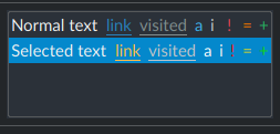
  • We currently use ColorScheme-Highlight for blue in monochrome Breeze icons. This causes an issue where parts of icons that use blue become invisible on selected widgets. As long as Plasma Blue is our selection color this will still be somewhat of an issue, but it can be slightly improved by using a different blue for icons.
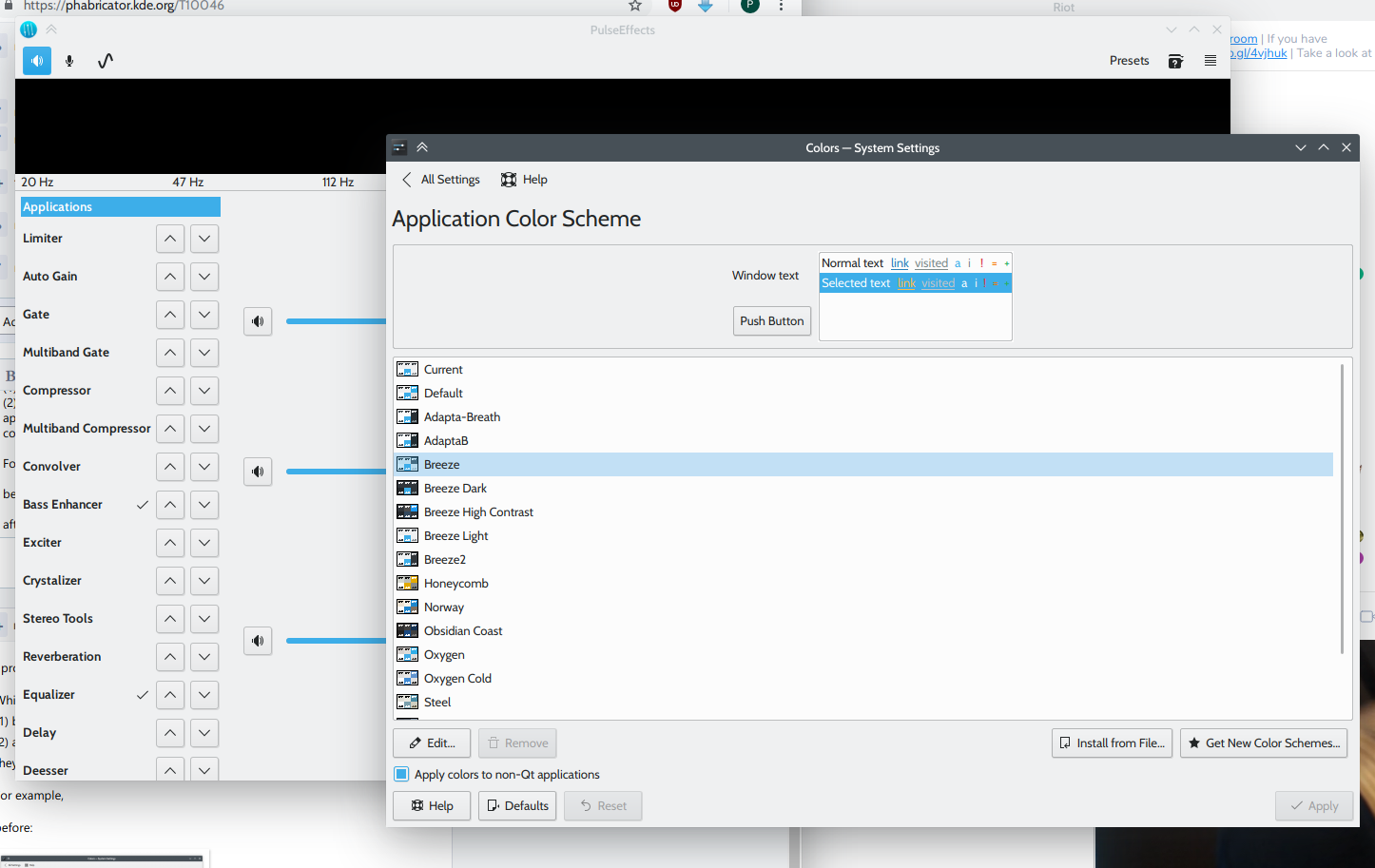
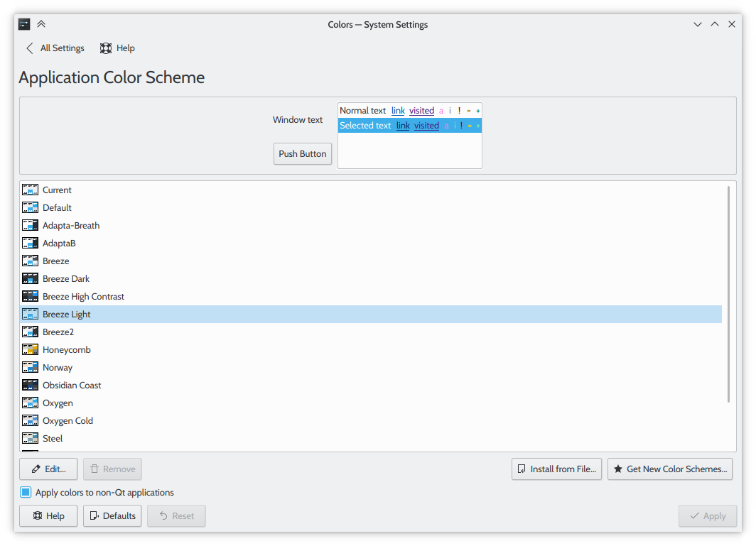
  • (minor) The Breeze colorscheme uses a color for text that is almost exactly the same as our Shade Black color. There is no reason for it to be slightly different.
  • Breeze monochrome icons use Icon Grey and Breeze Dark monochrome icons use #f2f2f2, but these colors are only used in GTK applications. They should use Shade Black and Cardboard Grey instead so that icons look the same in Qt and GTK applications.
  • 32 and 64 px folder icons should be made to support colorschemes. we can do this by using a solid color from a colorscheme as a background and putting white or black semi-transparent gradients over that so that they look like proper Breeze color icons.
    • Bad idea. It's very easy to end up with folder colors that don't work well. A colorscheme must to have a colorful highlight color in order for it to look good and for colors to remain the same for Breeze/Breeze Dark colorscheme users.
  • There should be a way for the Breeze Light and Breeze Dark Plasma themes to stick to the Breeze and Breeze Dark colorschemes without needing to copy the colorschemes into the plasma-framework repo. This will make it easier to keep Plasma theme colorschemes up to date.
    • This change is meant to help developers, not users.
  • We need a proper up to date color palette for new Breeze icon devs and/or some guidelines for coming up with your own colors. It's important to help new developers avoid using colors that make their icons hard to see against background colors from the Breeze and Breeze Dark colorschemes.
  • Put Breeze icon stylesheets into a single file that can be linked into each theme-able icon (https://www.w3.org/TR/SVG/styling.html#LinkElement). This will make it easier for new Breeze icon devs to add stylesheet support.
  • (maybe) Make an Inkscape plugin to add colorscheme support to elements from within Inkscape if that's possible.
    • Aliases for various sed commands work OK for now.
  • We don't have enough colors from the colorscheme to use in monochrome icons. Monochrome icons aren't meant to be very colorful, but sometimes it helps to use colors to convey meaning in parts of some icons. Perhaps there should be icon specific colors in the colorscheme? Adding that would hurt icon theming support for unmaintained colorschemes, but it would allow colorscheme makers to ensure that only good colors are used for icons.

If you have any ideas to add to the list, let me know.

ndavis created this task.Nov 15 2018, 11:30 PM
ndavis updated the task description. (Show Details)Nov 15 2018, 11:32 PM
ndavis updated the task description. (Show Details)Nov 16 2018, 2:26 AM
ndavis updated the task description. (Show Details)Nov 16 2018, 2:29 AM
ndavis updated the task description. (Show Details)
ndavis updated the task description. (Show Details)Nov 16 2018, 2:38 AM
ndavis updated the task description. (Show Details)Nov 17 2018, 10:37 AM
ndavis updated the task description. (Show Details)
ndavis updated the task description. (Show Details)Feb 16 2019, 1:25 AM
rooty added a subscriber: rooty.EditedFeb 16 2019, 2:57 AM

I propose that we consider Breeze Light as a replacement for the default color scheme.

While it isn't substantially different from Breeze itself, it seems to offer:
(1) better contrast when it comes to selected text and
(2) application title bars that become contiguous with the rest of the applications they belong to (provided that they're part of Plasma, of course)

For example,

before:


Please take note of the stark difference in contrast between an active window's title bar and that of an inactive window.

after:

If the difference between an active window and an inactive window needs even more emphasis we could either make the inactive window cast a lighter shadow, or make the inactive title bar text even dimmer (or both).

This change wouldn't have any adverse effects on non-Plasma applications,

and looks just as contiguous/uninterrupted in GTK applications (using the Breeze GTK theme) as it does in Qt applications:

This article on designing systemic colours (and comment) explores some of the challenges faced with designing color palettes. Example implementation in JS

This or something like it could form the basis for new color palettes.

filipf added a subscriber: filipf.Jun 12 2019, 3:32 PM

My general take on colors is that we need some more contrast. Rough suggestions for revamping the colors would then be:

BREEZE

  • make the window background color a notch (really just a notch) lighter so we don't come off looking grey -> e.g go from #eff0f1 to #f4f4f5 -> the distinction between the window and the view is still preserved

  • seriously rethink white text on Plasma Blue highlight color -> there's very little contrast, but it's less of a problem than with Breeze Dark so maybe drastic changes aren't required

BREEZE DARK

  • invert the logic -> view gets the lighter color, window gets the darker color
  • the former consequently means Breeze Dark will be darker in general, which I think is something we should go for
  • we definitely need to tone down the highlight color because it's blaring right now -> e.g. go from Plasma Blue to #0373ab

Implementation:

  • darker highlight color in Breeze Dark means we needed changed icons -> new folder icons would be a must, but other icons using Plasma Blue should be changed as well
  • Konsole schemes would need updating
  • all color changes would have to be reflected in our GTK themes as well

My general take on colors is that we need some more contrast. Rough suggestions for revamping the colors would then be:

BREEZE

  • make the window background color a notch (really just a notch) lighter so we don't come off looking grey -> e.g go from #eff0f1 to #f4f4f5 -> the distinction between the window and the view is still preserved

+1

  • seriously rethink white text on Plasma Blue highlight color -> there's very little contrast, but it's less of a problem than with Breeze Dark so maybe drastic changes aren't required

+1, I would support using a more pastel color for the highlight effect and keeping the regular black text color (for Breeze light, of course)

In terms of implementation, we just need to make sure that we change the colors in all the relevant places. Off the top of my head, these are the colorscheme itself, the "default" color scheme, somewhere in Kirigami, somewhere KWidgetsAddons or maybe KCoreAddons IIRC, the Konsole color scheme, and the GTK theme.

mglb added a subscriber: mglb.Jun 15 2019, 12:34 PM
  • darker highlight color in Breeze Dark means we needed changed icons -> new folder icons would be a must, but other icons using Plasma Blue should be changed as well

Why?

In T10046#188966, @mglb wrote:
  • darker highlight color in Breeze Dark means we needed changed icons -> new folder icons would be a must, but other icons using Plasma Blue should be changed as well

Why?

IMO the folders are noticeably brighter than the new highlight color. I like what Deepin does with its deepin-dark icon theme, it mutes icons as well:

ndavis added a comment.EditedJun 16 2019, 1:36 AM

I don't think it's a particularly good thing to have the folder colors the same color as the highlight color because the contrast would be (and currently is) poor. Also, if we are going to make the folder color match the highlight color, it would make sense to make the folder color change with the colorscheme. People have requested that and I tried that already, but it just doesn't work well. Folders end up looking way too dark on colorschemes with dark highlights and dark background colors.

[...] I like what Deepin does with its deepin-dark icon theme, it mutes icons as well:

I think it's a lot more necessary to have different folder colors in deepin's dark icon theme. The folder icons are probably too bright for the light theme in the first place.

^ Indeed. Here is how a tweaked Breeze Dark looks like with deepin-dark icons:

mglb added a comment.Jun 16 2019, 5:45 PM
In T10046#188966, @mglb wrote:
  • darker highlight color in Breeze Dark means we needed changed icons -> new folder icons would be a must, but other icons using Plasma Blue should be changed as well

Why?

IMO the folders are noticeably brighter than the new highlight color. I like what Deepin does with its deepin-dark icon theme, it mutes icons as well:

They are, but I think breeze icons (especially directories) are not too bright and don't hurt eyes at night, like bright Deepin ones. If the purpose is to have everything darker, it could be better to just lower monitor brightness.
Or... did I misunderstand and you would like to just make backlight and directory icon color the same?

I don't think it's a particularly good thing to have the folder colors the same color as the highlight color because the contrast would be (and currently is) poor.

+

Also, if we are going to make the folder color match the highlight color, it would make sense to make the folder color change with the colorscheme. People have requested that and I tried that already, but it just doesn't work well. Folders end up looking way too dark on colorschemes with dark highlights and dark background colors.

What about not changing icon brightness past some contrast level? E.g. you can use black bg and 5% red highlight, but the icon will use 25% red.

Something that's become obvious is that we won't need to change highlight color in either color scheme if we go through with T11124.