Unify sidebar color in Kirigami apps
Open, NormalPublic

Description

Currently Kirigami apps don't have a consistent sidebar/main view color scheme. We should probably pick a style and ensure that all apps are following it.
We should also formalize a guideline at hig.kde.org

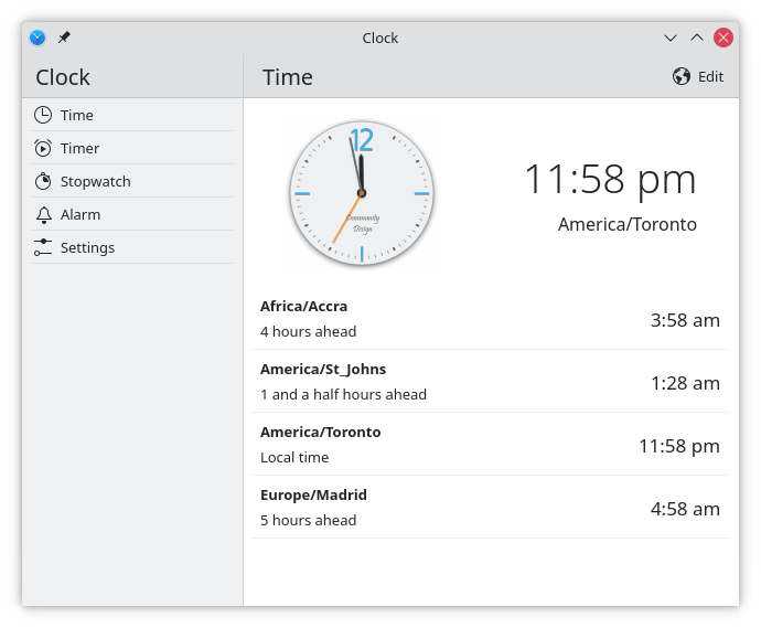
Here are a few examples:

White sidebar/grey content

white sidebar and content

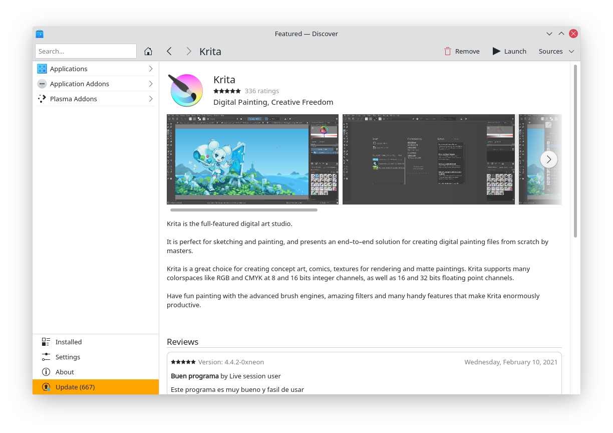
Grey sidebar/white content

dark themes should be considered as well

mikeljohnson triaged this task as Normal priority.
mikeljohnson updated the task description. (Show Details)Mar 20 2021, 9:07 PM

Kirigami seems to give a very light page background for lists, but a darker one for other content.

reference from other vendors:

Windows 10:

macOS:

Google:

mikeljohnson updated the task description. (Show Details)Mar 22 2021, 9:11 PM
iothes added a subscriber: iothes.Apr 1 2021, 5:47 AM

I think giving the lightest color to the widest areas seems technically the best: You got the darkest shade for titlebars, the middle one for sidebars and the rest (usually) will have the lightest color. (Talking about Breeze Light).

Doing the reverse may drastically change the appearance of current Light Theme. But I think it would be cool to consider.

I don't know about Dark theme though, but it would work in a similar way as the one described above I suppose.

It strikes me that there is an easy way to conceptualize this.

We use the view color (off-white) for views. A view is a scrollview with items/delegates in it, as opposed to UI controls.

In QtWidgets apps, scrollviews are generally visibly framed, such that there is a scrollable view with an off-white background located within the gray background color of the rest of the window.

In Kirigami, we use un-framed views touching the edges of the surrounding elements as much as possible, basically covering up as much of the window background as we can.

Therefore all Kirigami sidebars should use the off-white view color as they are in essence unframed views.

ngraham moved this task from Backlog/Planned to Sent to dev on the VDG board.May 14 2021, 4:40 PM
iothes added a comment.EditedMay 14 2021, 8:59 PM

What about desktop-"focused" apps like dolphin? I think that those apps could look like dolphin: window content (large areas) should be lighter than sidebars and titlebars+toolbars, in breeze light. I haven't studied dark theme though to tell a lot.

I mean something like the clock app depicted above.

Dolphin's sidebar is a scrollable view of content items, so logically it should have a white sidebar too. It's even attempting to do so in a frameless manner already, it just doesn't really succeed because there isn't a solid line border on all sides of it.

iothes added a comment.EditedMay 15 2021, 5:24 AM

I'm kinda confused. You mean that, the sidebar and the files view (content) should share the same colour? Like in Discover? Wouldn't it help users to identify whether what they look at is a sidebar if it has a different colour (like eff0f1)?

Is off-white a codename? Or you mean that one color which is super slightly darker than fcfcfc? Do you refer to the color that you see in inactive dolphin files view/ the one when you unlock its sidebars?

I'm kinda confused. You mean that, the sidebar and the files view (content) should share the same colour? Like in Discover?

Yes.

Wouldn't it help users to identify whether what they look at is a sidebar if it has a different colour (like eff0f1)?

I don't think this is a real problem that users face. :)

Is off-white a codename? Or you mean that one color which is super slightly darker than fcfcfc?

"Off-white" is the term I was using to refer to the View background color (with Breeze Light, of course). It's the color of dolphin's view background.

Oh alright, I thought that, using two colors, like the clock app depicted above, would appeal more without destroyed UX and usability. It would make apps look more "interesting" imo. Maybe I'm just saying all those because it happens in most other popular software.

GB_2 added a subscriber: GB_2.Jul 24 2021, 3:15 PM

I'm kinda confused. You mean that, the sidebar and the files view (content) should share the same colour? Like in Discover?

Yes.

Does not seem like a good idea to me. We should make an effort to help users distinguish the areas of the window more easily, like we already do with the titlebar and window content. Pretty much every platform has this separation. It's also more pleasing to the eye.

ognarb added a subscriber: ognarb.EditedJul 24 2021, 5:30 PM
In T14211#260924, @GB_2 wrote:

I'm kinda confused. You mean that, the sidebar and the files view (content) should share the same colour? Like in Discover?

Yes.

Does not seem like a good idea to me. We should make an effort to help users distinguish the areas of the window more easily, like we already do with the titlebar and window content. Pretty much every platform has this separation. It's also more pleasing to the eye.

+1 personally I would like to see sidebar using a subtle grey and the content all white. This would give a nice visual hierarchy there white is the predominant color on the screen and this will also reduce the impression that Breeze is old-looking because it's too much grey.

Kinda like the Clock screenshot but with a sidebar even less greyish

ognarb moved this task from Sent to dev to Work in Progress on the VDG board.Jul 24 2021, 5:32 PM
filipf added a subscriber: filipf.Jul 31 2021, 8:55 PM
In T14211#260924, @GB_2 wrote:

I'm kinda confused. You mean that, the sidebar and the files view (content) should share the same colour? Like in Discover?

Yes.

Does not seem like a good idea to me. We should make an effort to help users distinguish the areas of the window more easily, like we already do with the titlebar and window content. Pretty much every platform has this separation. It's also more pleasing to the eye.

+1 personally I would like to see sidebar using a subtle grey and the content all white. This would give a nice visual hierarchy there white is the predominant color on the screen and this will also reduce the impression that Breeze is old-looking because it's too much grey.

Kinda like the Clock screenshot but with a sidebar even less greyish

+1 I agree