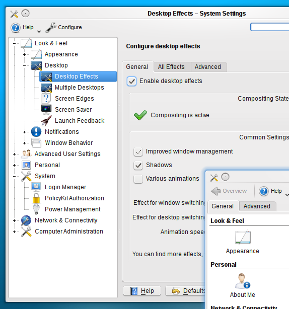
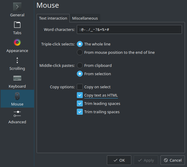
Main requirement is a check mark symbol: https://bugs.kde.org/show_bug.cgi?id=407141
Design preview (focused left, normal right):
Since the radio button shares overall design concept with checkbox, it should also use the new style.
Part of T10891.
Main requirement is a check mark symbol: https://bugs.kde.org/show_bug.cgi?id=407141
Design preview (focused left, normal right):
Since the radio button shares overall design concept with checkbox, it should also use the new style.
Part of T10891.
| Status | Assigned | Task | ||
|---|---|---|---|---|
| Open | None | T10891 Breeze theme evolution | ||
| Resolved | ngraham | T13451 Combine the best aspects from the various Breeze style proposals (Final style: "Blue Ocean") | ||
| Resolved | ndavis | T10997 Improve check box design |
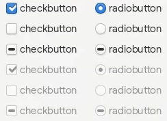
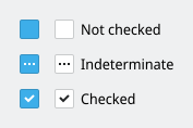
The "Indeterminate" state is most often represented by a square. Maybe we should do the same? That being said I didn't find a location where this state is actually used.
I felt like the check mark might be a bit small so I made a bigger version as a test. I think I like it better this way but yours looks good already.

I feel like the square is too similar to the current checked state and users would get confused by it. Even new users might get confused because of screenshots containing the current checkbox design.
I do think a slightly larger checkmark is good.
+1, I kind of like the use of an ellipsis to denote an mixed state checkbox. These should be super rare anyway.
So would we also be updating the radio buttons to have a black circle in the middle of the selected button instead of a blue circle?
I saw square in Windows and Qt Fusion theme, and horizontal line in everything else. Square is not an option for reason mentioned by @ndavis.
I went with ellipsis as the state (in most cases) represents exactly what ellipsis represents in written text (especially in UI) - ommited text/details. The use case I'm talking about:
Install:
[v] Plasma
[…] Applications
    [ ] Dolphin
    [v] Konsole
It is also visually similar to horizontal line, so macOS and web apps users should recognize it instantly.
I felt like the check mark might be a bit small so I made a bigger version as a test. I think I like it better this way but yours looks good already.
+1
I think so - I'm not a fan of Plasma Blue details on white background (neither is WCAG).
Ellipsis seems to be the best option then. Thanks for convincing me!
So would we also be updating the radio buttons to have a black circle in the middle of the selected button instead of a blue circle?
I think it would look out of place if we didn't.
+1 for using a checkmark instead of a sqare. (Although I like the animation of folding and unfolding the sqare.)
-1 for using ... for tristate/indeterminate. That looks like the checkbox will open a dialog (https://hig.kde.org/style/writing/labels.html?highlight=ellipsis). If looking fast, it even looks like a hamburger button, which will open a menu. At least, it looks more like a pushbutton than a checkbox.
Hmm, that's a good point.
FWIW Apple uses a minus sign in the checkbox to indicate tristate, while Windows uses a square. I'm not a huge fan of the square since it looks like the "checked" state. This would be especially true of ours since we already somewhat confusingly use a square for the checked state.
Maybe something to consider:
Wikipedia lists a few more countries where it is used with a negative meaning
Yeah, I had no idea! Maybe we should actually make the symbol respond to the current locale and handle those kinds of regional differences.
You don’t mean QLocale? That’s why dolphin shows swedish weekdays only just because I set the date format to ISO 8601, or did someone fix that?
If it works, we could let the user choose whether to use the current sqares, checkmarks, or crosses. Oxygen had that option too.
I think it makes much more sense to have this automatically set according to the locale (or language, or whatever makes the most sense) than making it user-configurable. Nobody would ever find it.
Okay, which is the locale setting for “Checkbox”? Just dictating which checkbox design the user has to like doesn’t sound good to me. Imagine your coworker has a design you like more and you can’t change it...
[...] making it user-configurable. Nobody would ever find it.
Sure? I would just say: Nobody who doesn’t care would ever find it.
KRunner “Widget Style” brings the Breeze configuration dialog. That one seems appropiate to me.
We can't make everything configurable, and configurability is never a substitute for good default behavior. What if I want the letter Z or an Emoji in my checkbox? Should we go out of our way to support those too? Let's not bikeshed this too much and derail the task.
If it is already configurable trough a locale setting, why not explicitly?
[_] Override locale setting and use [Square V]
That’s all I wanted to say.
Sure, I think that would be fine. Allowing a reasonable/good default setting to be overridden seems acceptable.
Checkmark will be animated too :P
-1 for using ... for tristate/indeterminate. That looks like the checkbox will open a dialog (https://hig.kde.org/style/writing/labels.html?highlight=ellipsis). If looking fast, it even looks like a hamburger button, which will open a menu. At least, it looks more like a pushbutton than a checkbox.
You're right. However, in real life use case, indeterminate is used in one place - tree views. And everything there is a problem:
Any ideas?
Ellipsis:


Horizontal line:


"not all"/⠴:

Re check meaning around the world:
"Check mark" meaning does not always apply to check boxes. E.g. teachers in Poland use ✓/✗ or ✓/― or +/- as "correct"/"wrong", but in tests, forms and voting cards ✗ is almost always placed in a square as the choice marker.
Re customization:
System style can be easily changed to another one, so whats the point of detailed customization?
Re localization:
Checkbox symbol is not localized currently. And I would keep it that way:
I start to prefer these options again:
I think we definitely need to make the checked state display a checkmark. We are the only ones who don't do this.
Looking at the options I find myself preferring the ellipses for the indeterminate state version. A square wouldn't be terrible either, though that would have the potential to be very slightly confusing to some of our current users since right now a square means checked. And yeah, everywhere a tri-state checkbox is used outside of a tree view is an error that we need to fix.
[ ~ ] Tile is sometimes used to show an approximate value. Could we use that for indeterminate state?
I think the icon for an intermediate state should visually be like a fraction of the checked state. That would make it visually clear which state corresponds to more selected sub-items.
What I mean could be roughly described as: the intermediate state icon should not contain filled pixels where the checked state has none. And also the checked state icon should have more filled pixels in total than the intermediate one.
The current check box design meets this criterion as the intermediate state triangle is visually just a fraction of the checked state square.
A bad example would be the windows style, where a square that fills the whole box is used as the intermediate state. This looks like "more selection" than when a checkmark is shown, which only fills a fraction of the box.
A way to make a checkmark comply to this may be to tilt the "not all" icon to an angle as if it would be a checkmark with a few parts left out. (in general like a checkmark drawn with a dashed line)
Localized check/intermediate icons might lead to confusion for users who look at tutorials where a different locale is used.
When using checkmarks, I think it should be consistent to the checkmark icon used on OK-Buttons. In my opinion it would be nice in general if whatever icons get chosen, they are consistent to the rest of the breeze style/icons, e.g. regarding line thickness.
I don't know if this would be a concern, but where checkmarks are used, maybe they should also differentiate themselves sufficiently from nearby arrows of dropdown-menus or spinboxes etc.
Will animations be OK?

I think the symbol is too small for dashed line:
Another problem I see with the dotted line is that it looks more like it's saying the checkbox is disabled.
Why checkboxes have two variants? Square and Round, maybe leave single? I really don't understand why two.
For example:

Well the square one are checkboxes they can be checked or unchecked, typicall yes/no choices.
The round ones are radio buttons at least two or more belong to the same group and only one of this group can be checked and uncheckes the others they are used here for example to switch between different behavior.
Let's not let this get killed off by bikeshedding. I'd like to see a patch and maybe we can keep arguing in there. For the record I'm fine with a minus as well as ellipsis.
The code (super dirty): https://cgit.kde.org/breeze.git/log/?h=mglb/checkbox-redesign
I managed to make good looking dot-line check mark for half-checked state.
I don't have access to a PC for some time. I hope I'll be available on weekends though.
What about a real context on desktop ui where this state can appear - tree view? I saw material like usage on macos, but only tree view on windows and in Qt apps.
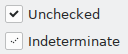
I still think 3 horizontal dots is the best form of half checked state proposed here.
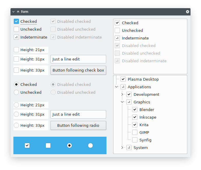
UI-wise, looks pretty good overall! I like how the focus effects are now consistent: focused == blue background; otherwise, there's no color involved.
While I think both look quite good, I would go with the horizontal line. Our current goal is to make the look more consistent and I feel like part of this should be to respect cross de standards. And at least to me, the horizontal line seems to be the standard out there.
I need some more time (~week) for fixes and cleanup.
For now: https://cgit.kde.org/breeze.git/?h=mglb/checkbox-redesign

This looks really nice. Do you think you could reverse the animation when unchecking? I think it might be a good idea to speed up the animation a bit too.
I noticed that the new checkboxes/radio buttons don't apply to menus and that they have a visible area of 20px vs 16px for the older version.
I also noticed you made checkbox.cpp. Do you think it would be a good idea to separate more widgets into different files in the future? That might make it easier for new themers to hack on Breeze.
Menu checkmark is drawn in another place for some reason. I'll change it to use the new code.
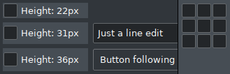
they have a visible area of 20px vs 16px for the older version.
Yes. Labels have similar height (with default font size), so UIs won't grow much (if at all) and distances between checkboxes/radios are now similar to distances between other controls.
I also noticed you made checkbox.cpp. Do you think it would be a good idea to separate more widgets into different files in the future? That might make it easier for new themers to hack on Breeze.
So far this is just for my convenience (faster compilation), I'll move this code back to breezestyle/helper.cpp later. Splitting "by control" could be tricky (lots of shared code), but it would be nice to split the code somehow (if possible).
As for animations and speed - they are really easy to modify/change, so I'll polish them last. I want to improve animation controlling code first. Ofc suggestions are welcome until then.
They do? Is this including the margins? BTW, we currently have icons that are made to look like check boxes, so it could be an issue if there is no 16x16 version of the new checkboxes.
I meant the widget height. They stay the same. Your screenshot with two styles side by side:
Checkbox widget has now 1px padding, so even when you make checkboxes with zero distance between them (i.e. zero spacing in a layout), there still be 2px visual distance between borders. Grid layout with default 6px spacing; checkboxes drawn side by side without spacing:
BTW, we currently have icons that are made to look like check boxes, so it could be an issue if there is no 16x16 version of the new checkboxes.
Which ones? I know only check mark icon (no size related problem, as the mark is smaller) and emblem-checked (they come in 8, 16, 22 px, and dont look exactly as checkboxes in the style)
Sorry it took so long to get back to you on this. The ones that look like checkboxes are gnumeric-object-checkbox and all of the package-* emblems. The package-* icons are used in the Synaptic and YaST graphical package managers:
I guess it's not that big of a deal.
Going back to this. From visible things: implemented drawing of checkboxes/radios in menus; selected list items have checkboxes with hover&focus style.
This is intended to be released with Plasma 5.18, right?
Yep. Though if nothing else is ready in time it might end up delayed until Plasma 6 (planned to be the next one after 5.18).
I have to be honest here though: I'm having second thoughts about losing the blue background for the checked checkboxes and radio buttons. I think it makes them fade into the background more (especially with Breeze Dark) and makes it harder to tell at-a-glance what's
I wonder if we might consider keeping the blue background. Keyboard focus is already indicated with a line underneath the text so maybe that will be sufficient for adequate keyboard focus visibility.
Why should they stand out more than other controls?
I wonder if we might consider keeping the blue background. Keyboard focus is already indicated with a line underneath the text so maybe that will be sufficient for adequate keyboard focus visibility.
There's also an option for gray background, like "checked" tool buttons. I think it would be more consistent.
Current look:
Checked gray:

Checked blue:

Checked blue, toned down outline:
There's also an option for gray background, like "checked" tool buttons. I think it would be more consistent.
Current look:
Checked gray:
I think these two are not so good, because at the first glance it looks like only the focused checkox is checked. An the bottom two might look like tristate.
So, I prefer checked = blue.
Answering my own question: selected list items are also blue, even when list is not focused.
Looks amazing for Breeze Light! For Breeze Dark, the blue is way too bright, but that may be a color scheme issue?
Color scheme issue. Highlight background color is used. I could change it to something like background color of selected item in unfocused sidebar, but then it won't look that good in light Breeze.
We need to change the colorschemes anyway, so think about how colorscheme colors should be used based on semantics rather than what the actual colors are.
Is the next version really Plasma 6? That seems way too soon. Either way, it might be best to wait until Plasma 5.18 is tagged so that we can get the LTS version out of the way before introducing a lot of changes to the Breeze widget style. I'll want to start introducing my changes soon after this lands so that I can keep the style consistent before the next release.
Currently it seems that checked checkboxes use “button focus decoration” color when checked, and “button hover decoration” while hovered. There doesn’t seem to be a “button selection” color, so it seems semantically correct to me.
(In my customized Breeze Dark, I use a middle brown for selection background, and a dark green for focus decoration.)
Not much, but I'm going to finish at least user-visible things in next 2 weeks.
Todo (user-visible):
Did I miss something?
BTW. Do you have some script/formatter config for code style used in the project?
Todo (user-visible):
Ping
I know I'm late in saying this but BTW elementary OS uses circles on checkboxes IIRC.
I see the WIP code available at https://cgit.kde.org/breeze.git/?h=mglb%2Fcheckbox-redesign.
@mglb do you need someone else to take over?
@ndavis looks like you may need to. Please feel free to do so. I'd really like to get this shipped for 5.20. It's slipped long enough already.
I guess it has been settled on a design already? Does that mean it has been agreed to use round edges everywhere then and make the overall appearance rather soft?
Also I saw a design from @ndavis today which I really liked and which I copied into my mockup. That then looks like this:

We're using 3px as the standard rounded rectangle radius, IIRC. Breeze already has that to a degree, but it switches between 2px and 3px somewhat inconsistently.
Hm, if I have the correct version of blue ocean (which afaik is the current favored style), that seems to use 4px radius mostly (with some exceptions like 3px for tooltips).
With https://invent.kde.org/plasma/breeze/-/merge_requests/26 being merged, this is now done!