Make adjacent mutually exclusive ToolButtons look like segmented controls
Open, NormalPublic

Description

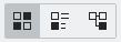
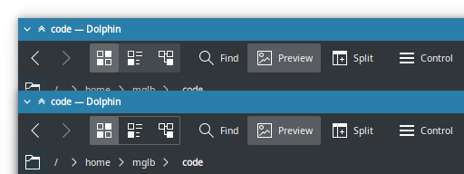
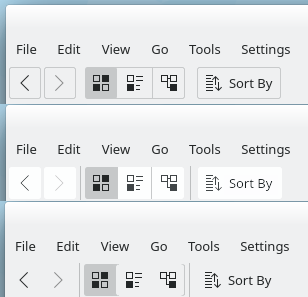
Right now, when there are adjacent mutually-exclusive checkable toolbuttons (e.g. Dolphin's view mode chooser), nothing visually indicates that the buttons are grouped and only one can be enabled at a time.

I'd like to propose that in the Breeze style, we detect this condition and adjust the visual appearance to draw a frame around them to indicate their grouping:

See also https://bugs.kde.org/show_bug.cgi?id=384514

ngraham created this task.Sep 15 2019, 5:46 PM
ngraham triaged this task as Normal priority.
mglb added a subscriber: mglb.Sep 15 2019, 6:56 PM

Maybe different background instead of frame? Frame stands out too much, a bit like focus/hover.

Putting a common background behind them would work too. Really I have no strong opinions regarding what visual style is eventually agreed upon, as long as it's something. :)

ndavis added a subscriber: ndavis.Sep 15 2019, 11:02 PM
onvitaik added a subscriber: onvitaik.EditedSep 17 2019, 3:10 PM

Personally, I think the different background looks better than a frame. I'm afraid it might look out of place either way, though, as the other buttons have neither frames nor different background colors.

I'm afraid it might look out of place either way, though, as the other buttons have neither frames nor different background colors.

That's the whole point. :) Segmented controls should look different, because they are different. Different things should look different.

onvitaik added a comment.EditedSep 18 2019, 1:48 AM

I'm afraid it might look out of place either way, though, as the other buttons have neither frames nor different background colors.

That's the whole point. :) Segmented controls should look different, because they are different. Different things should look different.

I understand that. What I meant to say is that on toolbars, buttons are borderless, shadowless, and use the same background color as the entire toolbar, while buttons everywhere else have those things. It seems to break the consistency toolbars have.

My 3 suggestions would be: Make all buttons have borders, or give all of them a different background color, or make the grouping look as simple as possible. This shows examples of all three.

The last one is subtle, but I think it manages to not stray too far from the "borderless and flat" look of the toolbars, while still making the buttons look grouped. But the other two are much more visually clear and consistent.

I really like the first approach even more if we could make it a little bit more like GNOME:


When T10201 is finished we could maybe also change the color of the toolbar buttons so that they would stand out more?

The last one is subtle, but I think it manages to not stray too far from the "borderless and flat" look of the toolbars, while still making the buttons look grouped. But the other two are much more visually clear and consistent.

I really really really really like the first one! I can't tell you how often I hear users "in the wild" (so to speak) complain about borderless toolbuttons. The biggest issue with making them look buttonlike is that the appearance could look too heavy or overwhelming for toolbars with lots of buttons, but your mockup strikes a great balance and doesn't seem to suffer from that problem!

I like this so much that I think we should open a separate Phab task to track and discuss it. Would you like to do that?

mglb added a comment.Sep 18 2019, 9:44 PM

Adding border to all toolbar buttons will be super heavy in cases where there is more than a few buttons.
To do changes like this I think we should separate concept of classic toolbars (few toolbars, each with many buttons/controls) and modern "widgets row" (few controls visually aligned with window/content). Or just use QToolButtons with disabled autoRaise to get the border on them.

as the other buttons have neither frames nor different background colors.

Checked buttons have background. Group can be seen as some always-on on/off action (in this case "show items view") with additional mode selector. But this reasoning fails when all group options can be turned off (are there groups like this?)

ngraham added a comment.EditedSep 18 2019, 9:56 PM
In T11665#201377, @mglb wrote:

Adding border to all toolbar buttons will be super heavy in cases where there is more than a few buttons.
To do changes like this I think we should separate concept of classic toolbars (few toolbars, each with many buttons/controls) and modern "widgets row" (few controls visually aligned with window/content). Or just use QToolButtons with disabled autoRaise to get the border on them.

Yeah, I agree that this would be totally inappropriate for e.g. LibreOffice or FreeCAD which have huge toolbars stuffed to the gills with unlabeled toolbuttons (whether it's ever a good idea to do this in the first place is left for another discussion...). I was thinking about our apps, really.

as the other buttons have neither frames nor different background colors.

Checked buttons have background. Group can be seen as some always-on on/off action (in this case "show items view") with additional mode selector. But this reasoning fails when all group options can be turned off (are there groups like this?)

In this case they shouldn't really have a visually grouped appearance IMO. I'm also not aware of any examples of this.

onvitaik added a comment.EditedSep 19 2019, 2:42 AM
In T11665#201377, @mglb wrote:

Adding border to all toolbar buttons will be super heavy in cases where there is more than a few buttons.
To do changes like this I think we should separate concept of classic toolbars (few toolbars, each with many buttons/controls) and modern "widgets row" (few controls visually aligned with window/content). Or just use QToolButtons with disabled autoRaise to get the border on them.

Yeah, I agree that this would be totally inappropriate for e.g. LibreOffice or FreeCAD with have huge toolbars stuffed to the gills with unlabeled toolbuttons (whether it's ever a good idea to do this in the first place is left for another discussion...). I was thinking about our apps, really.

I agree. Toolbars are meant to only show the most frequently used commands, not all of them. Cases where they're stuffed to the brim are the exception, not the norm.

as the other buttons have neither frames nor different background colors.

Checked buttons have background.

That's because it represents the button's different state ("This is already selected"). I had buttons in their neutral state in mind, and those have neither borders nor different background colors. Having all buttons with borders would keep their look consistent and make representing those grouped buttons be as simple as showing their borders are joined.

Edit: I also agree a separate phab task for this would probably be necessary.

ngraham renamed this task from Make adjacent musually exclusive ToolButtons look like segmented controls to Make adjacent mutually exclusive ToolButtons look like segmented controls.Sep 19 2019, 3:22 AM

Please feel free to open it! Or I can, if you'd prefer not to.

Please feel free to open it! Or I can, if you'd prefer not to.

Please do. I would say I'm not too confident in making one myself.