Update ellipse shadow comment again and rounded rect shadow parameter name
Feed Advanced Search
Dec 19 2019
Dec 19 2019
ndavis updated the diff for D26094: Add shadow rendering helper functions.
alexde awarded D25814: [KColorScheme] Add SeparatorColor a Like token.
Actually, it might not even an optical illusion. It might just be because my laptop screen is low quality :(
Sorry for all the fuss
ndavis updated the test plan for D26094: Add shadow rendering helper functions.
ndavis updated the diff for D26094: Add shadow rendering helper functions.
Edit ellipse shadow comment
ndavis added a comment to D26093: Use a fixed icon size for the notification popup close button.
It may just be an optical illusion. Sometimes red next to blue or another highly saturated color will appear to be 1px higher than it actually is.
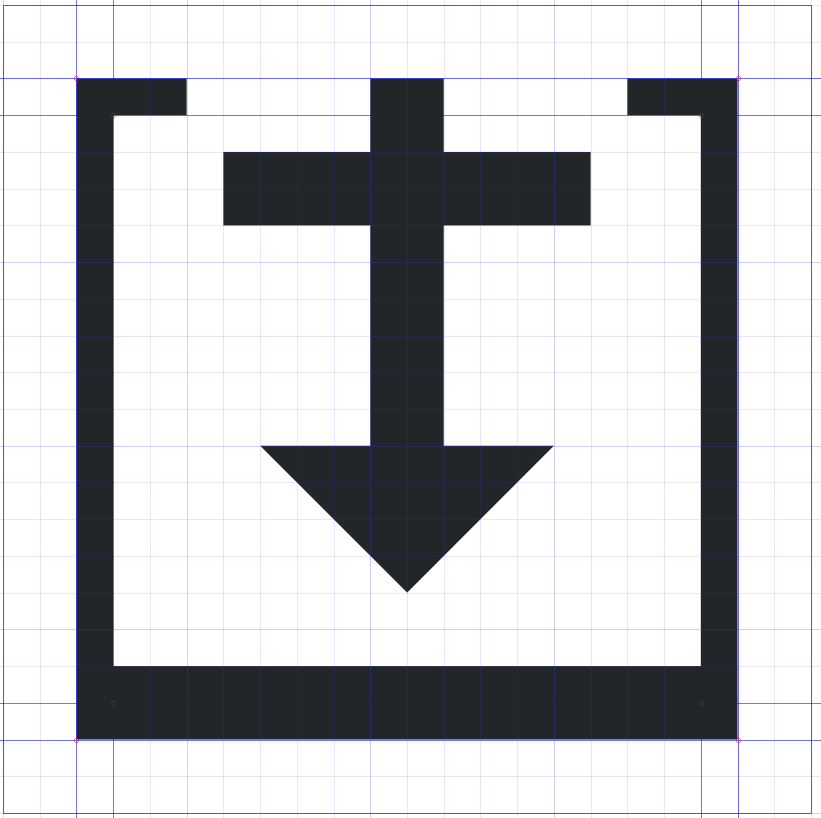
Here's a white icon:
ndavis requested review of D26094: Add shadow rendering helper functions.
Dec 18 2019
Dec 18 2019
ndavis added a comment to D26093: Use a fixed icon size for the notification popup close button.
I think the larger close icon looks nicer and more in line with window decorations:

The offset is still there, unfortunately.
ndavis added a reviewer for D26093: Use a fixed icon size for the notification popup close button: VDG.
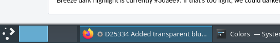
ndavis added a comment to D25334: Added transparent blue background to tabbars.
Dec 17 2019
Dec 17 2019
Visually LGTM
ndavis added inline comments to D26039: [Plasma Style KCM] Add search filter.
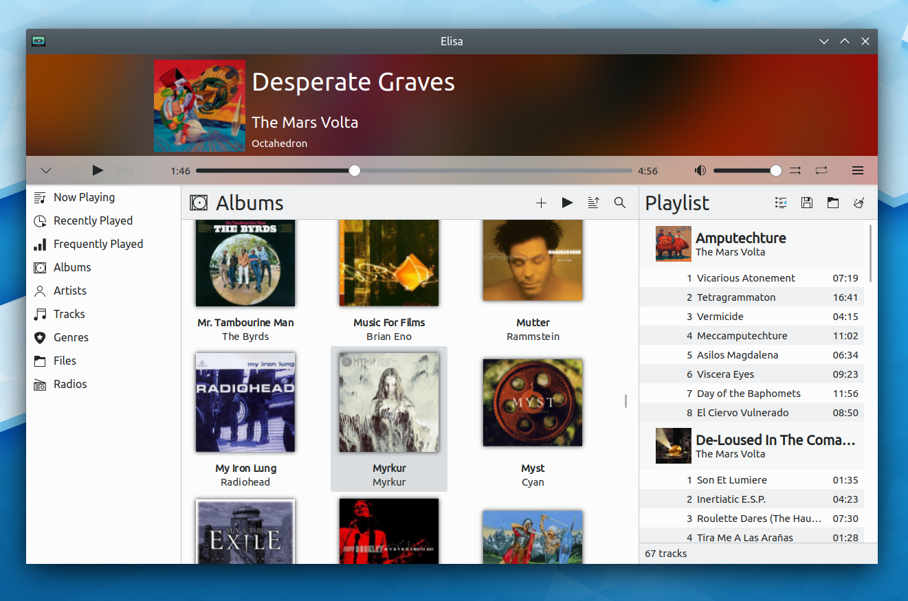
ndavis added a comment to T12372: Elisa UI Redesign.
Dec 16 2019
Dec 16 2019
+1
ndavis added a comment to T12372: Elisa UI Redesign.
Dec 15 2019
Dec 15 2019
+1
Makes sense to me.
ndavis resigned from D25999: Add optional subtitle to grid delegate.
Whoops, didn't mean to give my official approval
+1 visually
Dec 14 2019
Dec 14 2019
ndavis added a comment to D19890: Reduce the indicator arrow size for press-and-hold menus in QToolButtons.
ndavis committed R31:c88da6e70c3f: Change rubberband selection background opacity to exactly 20% (authored by ndavis).
Change rubberband selection background opacity to exactly 20%
Fix rubberband selection outline position
ndavis updated the diff for D26001: Fix rubberband selection outline position.
fix code style
ndavis updated the diff for D26001: Fix rubberband selection outline position.
Remove opacity change
ndavis added a comment to D26001: Fix rubberband selection outline position.
ndavis updated the test plan for D26001: Fix rubberband selection outline position.
ndavis updated the test plan for D26001: Fix rubberband selection outline position.
@broulik Does this fix the problem for you?
ndavis updated the test plan for D26001: Fix rubberband selection outline position.
ndavis requested review of D26001: Fix rubberband selection outline position.
ndavis added a comment to D25889: Polish the reviews UI and presentation.
I don't find this better than the current form:
ndavis added a comment to D25925: Mark applications that play audio, for all task icon sizes.
Dec 13 2019
Dec 13 2019
ndavis added a comment to D19890: Reduce the indicator arrow size for press-and-hold menus in QToolButtons.
ndavis added a comment to D19890: Reduce the indicator arrow size for press-and-hold menus in QToolButtons.
We could also do these things:
- In Dolphin, mimic the back/forward buttons in Firefox/Chromium/Falkon by making the right click menu provide the history instead of the normal menu for manipulating the toolbar. Inconsistent with what we normally do, but not unexpected for anyone used to web browsers. Clicking and holding is also awkward and slow for mouse and touchpad users.
- Remove the feature. It's not essential, but it is nice to have.
ndavis added a comment to D19890: Reduce the indicator arrow size for press-and-hold menus in QToolButtons.
Ok, so there is an overlap problem, but it's quite rare. It happens when an icon uses 100% of the available space in the bottom right corner (or left with RTL, I think).
Here I changed the stop icon in KDevelop to the icon for Codelite:
+1 for readability
ndavis requested changes to D19890: Reduce the indicator arrow size for press-and-hold menus in QToolButtons.
ndavis added a comment to D19890: Reduce the indicator arrow size for press-and-hold menus in QToolButtons.
ndavis added a comment to D19890: Reduce the indicator arrow size for press-and-hold menus in QToolButtons.
One problem I see with this is that the tops of the down arrows are a bit blurry. The way to fix that is to increase the size just enough that they fill the pixel. The bottom point should also have a MiterJoin so that it isn't a horizontal flat tip on high DPI screens.
Add 32, 48 and 64 px user-desktop icons
ndavis updated the test plan for D25897: Add 32, 48 and 64 px user-desktop icons.
ndavis updated the diff for D25897: Add 32, 48 and 64 px user-desktop icons.
- increase line thickness for 48 and 64 px
ndavis added a comment to D25897: Add 32, 48 and 64 px user-desktop icons.
Dec 12 2019
Dec 12 2019
ndavis added a comment to D25897: Add 32, 48 and 64 px user-desktop icons.
Dec 11 2019
Dec 11 2019
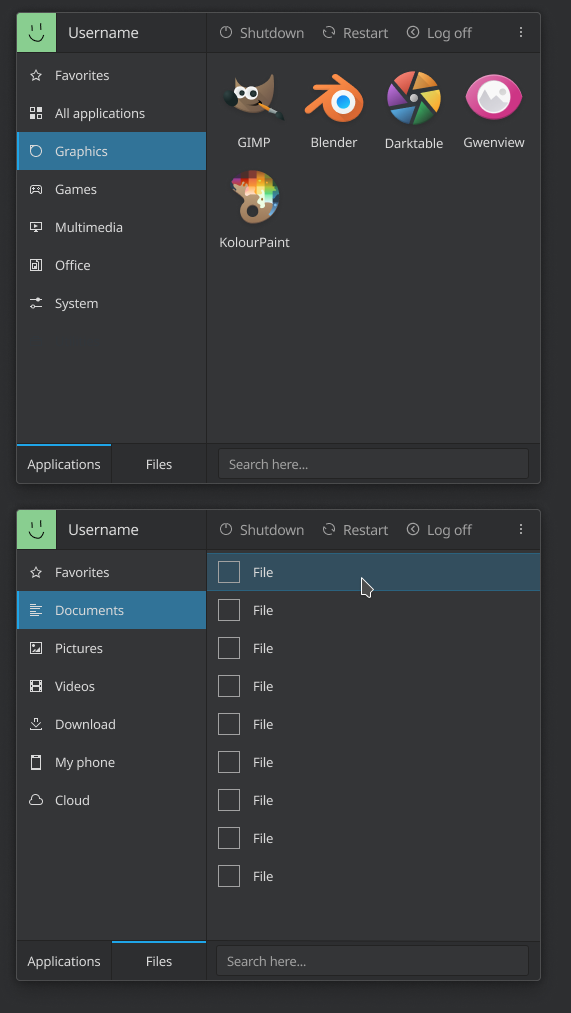
ndavis added a comment to T12192: Redesign application launcher.
I think visually, I prefer the sidebar on the left.
ndavis updated the test plan for D25897: Add 32, 48 and 64 px user-desktop icons.
ndavis requested review of D25897: Add 32, 48 and 64 px user-desktop icons.
ndavis added inline comments to D25873: [KCMs/Workspace] Add explanatory labels for click-related settings.
Dec 10 2019
Dec 10 2019
ndavis added a comment to T12349: "Last <day>" in condensed dates is unclear in English.
I agree, I hate this kind of ambiguous language.
ndavis added a comment to D25820: SimpleScreenRecorder icon added.
I agree with this.
ndavis added a comment to T12192: Redesign application launcher.
I don't agree that it's ugly. We normally use LineEdits for search boxes, so people will recognize it faster like that. The username/avatar can't be interacted with, so making them look similar sends the wrong message.
Dec 9 2019
Dec 9 2019
ndavis added a comment to D25814: [KColorScheme] Add SeparatorColor.
ndavis added a comment to D25815: Transmission-Qt tray icon added.
wait scratch that, it does work. I had to remove the 22-22- prefix, which is what you normally need when you have multiple icon sizes.
ndavis added a comment to D25815: Transmission-Qt tray icon added.
ndavis added a comment to D25814: [KColorScheme] Add SeparatorColor.
ndavis added a comment to T12192: Redesign application launcher.
Buttons should probably be this large:
ndavis added a comment to T12192: Redesign application launcher.
yeah, gotta have room for the labels
ndavis added a comment to D25814: [KColorScheme] Add SeparatorColor.
ndavis added a comment to T12192: Redesign application launcher.
One more thing, should the file view be a list view or a tree view? I personally find tree views for file browsing almost universally superior, but I'm not certain that it's appropriate. Simple Menu isn't meant to replace dolphin, but it could be a fast launching point.

ndavis committed R242:7e52c869de2d: Added background colors to active and inactive icon view (authored by ndavis).
Added background colors to active and inactive icon view
ndavis updated subscribers of T12218: Try to get PositiveColour/NegativeColour/NeutralColour into QPalette upstream.
@hein brings this up in the VDG chat every now and then when we start talking about colorscheme colors: https://www.eikehein.com/colors.pdf
ndavis added a comment to T12192: Redesign application launcher.
@ngraham +1, sounds reasonable
ndavis added a comment to D25815: Transmission-Qt tray icon added.
Here's one way to make a nice looking trapezoid in the Breeze style. I started by making a stroke with end points in the middle of pixels and the other settings I mentioned in my first comment. Then I converted it to a path and I added a 2px high rectangle to increase the thickness of the bottom part.

ndavis added a comment to D25815: Transmission-Qt tray icon added.
ndavis added a comment to D25814: [KColorScheme] Add SeparatorColor.
ndavis added a comment to D25814: [KColorScheme] Add SeparatorColor.
filipf awarded D25814: [KColorScheme] Add SeparatorColor a The World Burns token.
ndavis requested changes to D25820: SimpleScreenRecorder icon added.
Good start! The lens flare looks upside down and the icon needs more pixel alignment. I feel like the red/green/blue colors of the center area are a bit too dark as well.
ndavis added a comment to D25814: [KColorScheme] Add SeparatorColor.
@hpereiradacosta, Fair points and I'm glad you spoke up. JFYI, I'm in no rush to land this and I will consider reserving this change for KF6 if experienced KDE devs think that is best.
ndavis added a comment to D25815: Transmission-Qt tray icon added.
ndavis added a comment to D25815: Transmission-Qt tray icon added.
The actual name of the icon is transmission, so you would have to rename the file to that and add id="transmission" to the group. Since this is a desktop theme icon, you would also have to add an invisible 22x22 rectangle to the group.
Dec 8 2019
Dec 8 2019
ndavis requested changes to D25815: Transmission-Qt tray icon added.
Hey, thanks for the patch!
ndavis updated the diff for D25814: [KColorScheme] Add SeparatorColor.
- update @since version
ndavis updated the summary of D25814: [KColorScheme] Add SeparatorColor.
ndavis updated the summary of D25814: [KColorScheme] Add SeparatorColor.
ndavis updated the summary of D25814: [KColorScheme] Add SeparatorColor.
ndavis requested review of D25814: [KColorScheme] Add SeparatorColor.
ndavis added a comment to T10413: Find a way to specify whether to use monochrome or color icons in applications.
ndavis updated the summary of D25340: Added background colors to active and inactive icon view.
ndavis updated the test plan for D25340: Added background colors to active and inactive icon view.
ndavis updated the diff for D25340: Added background colors to active and inactive icon view.
- change minimized bg opacity to 8%
ndavis renamed T10413: Find a way to specify whether to use monochrome or color icons in applications from Specify how to use and classify monochrome vs color icons to Find a way to specify whether to use monochrome or color icons in applications.
ndavis added a comment to T10413: Find a way to specify whether to use monochrome or color icons in applications.
Update with a conversation I had on #kde-devel: https://webchat.kde.org/#/room/#kde-devel:kde.org/$157537933341042bwtvA:kde.org