I took the existing DigiKam icon and tweaked it to rebuild the original icon of SimpleScreenRecorder.
Original:
Breeze:
BUG: 412490
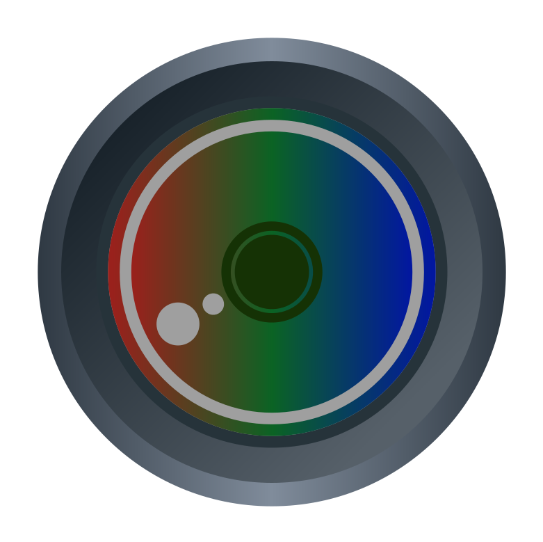
I took the existing DigiKam icon and tweaked it to rebuild the original icon of SimpleScreenRecorder.
Original:
Breeze:
BUG: 412490
| Lint Skipped |
| Unit Tests Skipped |
Good start! The lens flare looks upside down and the icon needs more pixel alignment. I feel like the red/green/blue colors of the center area are a bit too dark as well.
I agree, I think brighter and slightly less saturated colors would look nice.
Thank you for adding this btw, the old icon doesn't fit in.
That was intentionally to make it distinguishable from digiKam.
and the icon needs more pixel alignment.
I didn't move anything around besides the lense flares. So consequentially the digiKam would need that as well. I'm not sure if that's intended?
I feel like the red/green/blue colors of the center area are a bit too dark as well.
Yes, I'd thinks so too - but I took the original icon's colors. So we'd better not change that or the icon would move to far from the original?
I don't think it works because the light source in Breeze comes from the top left.
and the icon needs more pixel alignment.
I didn't move anything around besides the lense flares. So consequentially the digiKam would need that as well. I'm not sure if that's intended?
It's the lens flare and center part that aren't pixel aligned. Except for the smaller dot in the lens flare, they were aligned in the original version.

I feel like the red/green/blue colors of the center area are a bit too dark as well.
Yes, I'd thinks so too - but I took the original icon's colors. So we'd better not change that or the icon would move to far from the original?
It's OK to deviate a bit from the original as long as you preserve the spirit of the original.
In case you haven't seen the HIG, here is a list of some official colors you can use: https://hig.kde.org/style/color/default.html
You can deviate from that list, but be mindful of the hues and saturation levels so that your choice of color isn't too far from what Breeze normally looks like. Also, avoid using any of the "Primary" colors (excluding Icon Gray, which we don't actually use for icons much) for backgrounds unless you have an outline in a different color. You don't want your icon to blend into the background of the UI.
An extra tip: Zoom out to 100% with the grid, guides and page outline turned off so you can see what your icon would normally look like. It's important to make sure it looks good at higher zoom levels too since SVGs are scalable, but you should be most concerned with how it looks at 100% size.
As you can see, even though there is an inner ring and a smaller circle, it looks like one dark green circle because they aren't pixel aligned. The smaller circle in the lens flare looks a bit shorter than it actually is for the same reason.
