Changes the drawing of inline indicators with QToolButtons so that it
is drawn as a small arrow in the lower right corner.
Details
Details
Show QToolButton with Menu and PopupDelay enabled
Diff Detail
Diff Detail
- Repository
- R31 Breeze
- Branch
- draw_small_arrow (branched from master)
- Lint
No Linters Available - Unit
No Unit Test Coverage - Build Status
Buildable 9867 Build 9885: arc lint + arc unit
Comment Actions


Hi @ngraham ,
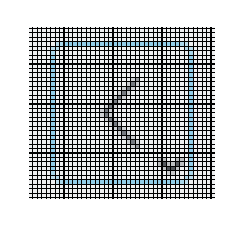
I have made this separate change to discuss the redesign of the indicator arrows. The current patch changes the indicator arrow so that the toolbutton stays the same size and the indicator arrow is drawn as a two pixel arrow with one pixel margin to the border. Below is some screen shots:
Indicator arrow size 2 pixels:
I also did a test with a 3 pixel arrow size:
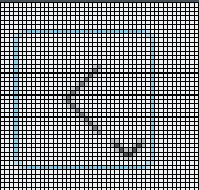
Finally, the before picture:

Comment Actions
Did anyone check how this patch look with other icons than those in the screenshot ?
E.g. the preview icon in dolphin, or list sorting or search icons ? Does the new arrow overlap with the said icons ?
Comment Actions
Yes I checked, and they looked fine.
However I'm considering reverting the patch anyway because I'm un-convincing myself that it was needed at all to properly support D19311.
Comment Actions
In retrospect, I think I reverted this too quickly in response to concerns. As expected, we have been receiving user complaints that the arrows in the corners of Dolphin's back and forward buttons are too large. This patch fixes the issue by making them less obtrusive, and I tested it with oxygen5-demo and several icon themes and our own icons and could not find any cases where the arrow overlaps with the icon. I would like to propose re-merging it.
Comment Actions
One problem I see with this is that the tops of the down arrows are a bit blurry. The way to fix that is to increase the size just enough that they fill the pixel. The bottom point should also have a MiterJoin so that it isn't a horizontal flat tip on high DPI screens.
Comment Actions
Ehh, I'm already working on it and figuring it out as I go. I have to move points in a vector around, which is annoying since I can't see the dimentions of the area I'm drawing in. I'm not even sure where the origin is. I would assume the top left of the area I have, but I'm not certain since -4 is apparently a valid X and Y position.
| kstyle/breezehelper.cpp | ||
|---|---|---|
| 1308 | The vector I'm talking about | |
Comment Actions .
.
Ok, so there is an overlap problem, but it's quite rare. It happens when an icon uses 100% of the available space in the bottom right corner (or left with RTL, I think).
Here I changed the stop icon in KDevelop to the icon for Codelite:
I could get around this in a number of ways that all have their downsides:
- Move the arrow to the very bottom right and make sure it's small enough that no clipping happens
- This looks bad and makes it harder to see the arrow
- Reduce the default icon size for flat buttons
- This is more consistent with non-flat buttons, but I like the bigger icons. They're more readable too.
- Increase the padding around flat buttons
- I like the current padding
- Ignore the problem
- Will look fine with most icon themes, but bad in some cases such as the one described above.
Comment Actions
I honestly think ignoring the problem is the best solution, because it's not even really a problem in practice: the vast, overwhelming majority of icons use correct margins, especially action icons which are going to be the ones used 99.9% of the time in buttons that will get these corner arrows. The alternative is to regress something significant for a more common use case or abandon this change and live with user complaints about these buttons taking up too much space, neither of which seem very appealing.
Comment Actions
2/ Reduce the default icon size for flat buttons
- This is more consistent with non-flat buttons, but I like the bigger icons. They're more readable too.
3/ Increase the padding around flat buttons
- I like the current padding
4/ Ignore the problem
- Will look fine with most icon themes, but bad in some cases such as the one described above.
Confused about 2: I thought icon size was the same for flat and non flat toolbuttons (see oxygen-demo5, buttons tab)
About 3: really I think that would be bad
I too think that either 4 (ignoring the problem) or 5: don't change the current code, and dont revert the revert, is the way to go.
for 4: only a few icons would be affected, and only for toolbuttons with long popup delay (the only case for which this arrow is drawn).
These are already rather rare, and considered bad UI anyway if I remember right.
Please pretty please, do not (re) add this arrow (whether tiny or large) to instant-popup toolbuttons though.
Hugo
Comment Actions
We could also do these things:
- In Dolphin, mimic the back/forward buttons in Firefox/Chromium/Falkon by making the right click menu provide the history instead of the normal menu for manipulating the toolbar. Inconsistent with what we normally do, but not unexpected for anyone used to web browsers. Clicking and holding is also awkward and slow for mouse and touchpad users.
- Remove the feature. It's not essential, but it is nice to have.
What are correct margins though? Margins are only correct if following an HIG that requires margins. There are no universally correct margins.
Comment Actions

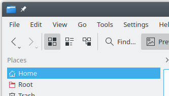
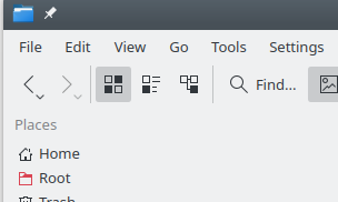
Here's what it looks like when flat buttons and normal buttons are both using 22px icons.

Most normal buttons use 16px icons while flat buttons on the toolbar use 22px icons.
Here's what it looks like when flat buttons and normal buttons are both using 22px icons.
About 3: really I think that would be bad
I also think that it would cause more trouble than it would fix.
I too think that either 4 (ignoring the problem) or 5: don't change the current code, and dont revert the revert, is the way to go.
for 4: only a few icons would be affected, and only for toolbuttons with long popup delay (the only case for which this arrow is drawn).
Are you saying not to revert the revert at all and instead write a new patch or is that just part of #5 (not changing the code)?
These are already rather rare, and considered bad UI anyway if I remember right.
Correct, I personally think we should never use long popup delay buttons for devices with touchpads or mice.
Please pretty please, do not (re) add this arrow (whether tiny or large) to instant-popup toolbuttons though.
Ok. Why do we use those arrows for pushbuttons with instant popups, but not toolbuttons?
Comment Actions
As a side remark: did you check how it looks when one selects "text under icon" or "text beside icon" for toolbar button ?
Comment Actions
There is no problem with text, even if you set the font size to something outrageous like 20pts.