[KColorScheme] Add SeparatorColor
AbandonedPublic

Authored by ndavis on Dec 8 2019, 9:31 PM.

Details

Reviewers
dfaure
Group Reviewers
Frameworks
VDG
Summary

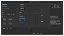
This patch adds SeparatorColor to DecorationRole. SeparatorColor is for separators and frames. The default color is the same as the color that the Breeze widget style currently produces with the Breeze colorscheme (KColorUtils::mix() with 75% Window NormalBackground, 25% Window NormalText).
It needs patches in the colorscheme editor, Breeze/Breeze Dark colorschemes and Breeze widget style to be useful. I will post those later. I intend to land this at the same time as those patches.

Users sometimes ask for the ability to customize the color of separators.
When talking about how the next version of Breeze Dark should look, some developers prefer dark separators and some prefer light separators.
Since opinions about separator color are pretty divided, it seems like a good idea to make it customizable.

Diff Detail

Repository
R265 KConfigWidgets
Branch
separator-color (branched from master)
Lint
No Linters Available
Unit
No Unit Test Coverage
Build Status
Buildable 19601
Build 19619: arc lint + arc unit
ndavis created this revision.Dec 8 2019, 9:31 PM
Restricted Application added a project: Frameworks. · View Herald TranscriptDec 8 2019, 9:31 PM
Restricted Application added a subscriber: kde-frameworks-devel. · View Herald Transcript
ndavis requested review of this revision.Dec 8 2019, 9:31 PM
ndavis edited the summary of this revision. (Show Details)Dec 8 2019, 9:39 PM
ndavis added reviewers: Frameworks, VDG, dfaure.
ndavis edited the summary of this revision. (Show Details)Dec 8 2019, 9:42 PM
ndavis edited the summary of this revision. (Show Details)Dec 8 2019, 9:44 PM
ndavis edited the summary of this revision. (Show Details)
ndavis updated this revision to Diff 71096.Dec 8 2019, 10:12 PM
  • update @since version
dfaure accepted this revision.Dec 8 2019, 10:20 PM

Code looks OK. No opinion on usefulness though.

This revision is now accepted and ready to land.Dec 8 2019, 10:20 PM

Adding new entries to the kcolorscheme should be done with a lot of care, because it could be seen as some sort of API break for existing colorscheme, as soon as you start using this color in the widget style: you would need a fallback implementation, for all the colorscheme in the open which do not implement this particular color. These kind of additions happened a lot whith gtk3 css style and resulting of overall unhappiness and distrust from theme/color scheme developpers. This also increases the complexity of the code and difficulty to maintain.

Also I am not convinced about the usefullness of this option either, especially considering that tweaking the colorscheme in the systemsettings is already quite advanced configuration (I would bet that most users stop at switching between pre-made color schemes, rather than tweaking a particular one. This will get even less the case if you start implementing more corner case colors.
Or do you plan to ship a "breeze dark with dark separators" +and+ a "breeze dark with light separators" ?
All in all i would say that people (that is: active developpers and the very few that manifest themselves on developper/vdg channels) having different opinion is not a strong enough argument to expose such a low level tweaking to all. Or is there an actual poll that shows (on a larger data sample) that one really cannot decide between the two options ?

My two cents.

Hugo

Would also be good to have the opinion of @cfeck on this.

ndavis added a comment.Dec 9 2019, 1:23 AM

@hpereiradacosta, Fair points and I'm glad you spoke up. JFYI, I'm in no rush to land this and I will consider reserving this change for KF6 if experienced KDE devs think that is best.

Adding new entries to the kcolorscheme should be done with a lot of care, because it could be seen as some sort of API break for existing colorscheme, as soon as you start using this color in the widget style: you would need a fallback implementation, for all the colorscheme in the open which do not implement this particular color. These kind of additions happened a lot whith gtk3 css style and resulting of overall unhappiness and distrust from theme/color scheme developpers. This also increases the complexity of the code and difficulty to maintain.

In terms of breakage, I think it would be fine if I made the color fallback (as you said) to what the breeze widget style currently does. 3rd party widget styles wouldn't use this color without modification, so it shouldn't hurt them. KColorScheme already has default colors, but they're defined before KColorScheme tries to read colors from the colorscheme file instead of when a color is not found. That hurts the flexibility of these defaults and seems backwards to me, but there may be a reason for it that I don't know of.

Also I am not convinced about the usefullness of this option either, especially considering that tweaking the colorscheme in the systemsettings is already quite advanced configuration (I would bet that most users stop at switching between pre-made color schemes, rather than tweaking a particular one. This will get even less the case if you start implementing more corner case colors.

Yes, it is yet another option in a sea of options, many of which are completely useless when a user ventures outside of the Common Colors section. You're probably correct that most users don't even bother with manually adjusting colors since choosing good colors can be tricky. I don't think that makes this option useless though, except for the fact that it's repeated for each color set and only a few versions of it will get any amount of use. I hope to simplify the colorscheme editor in the future so that only options that do something are exposed.

Or do you plan to ship a "breeze dark with dark separators" +and+ a "breeze dark with light separators" ?

I do not.

All in all i would say that people (that is: active developpers and the very few that manifest themselves on developper/vdg channels) having different opinion is not a strong enough argument to expose such a low level tweaking to all. Or is there an actual poll that shows (on a larger data sample) that one really cannot decide between the two options ?

There is no such poll.

filipf awarded a token.Dec 9 2019, 4:26 AM
filipf added a subscriber: filipf.Dec 9 2019, 4:34 AM

I think this is useful. Every once in a while we get opinionated people who think light separators are awful in the Breeze Dark scheme (I would hate dark ones on the other hand) or even some ricer people who want to turn off separators (which they could do now by matching it with window color I guess).

Implementation-wise there definitely always needs to be a fallback value so we don't break third-party color-schemes.

Few more comments on this:

  • general: you will never be able to make all the opiniated people happy, and you have to draw a line (otherwise your code will become bloated, buggy, and unmaintainable)
  • regarding this specific case: many widget style will not implement this new color. For those this will just generate bugs reports: why is my color scheme not respectd ?
  • some widget styles (oxygen at least, but I'm sure there are others) use two colors for frames and separators, to mimic shadows or relief effects. Adding one single color for this will not fit such schemes.
  • in the end if you need an extra color for a given theme (be it future-breeze or whatever), there is also the possibility to add it as a extra option for this specific theme, rather than forcing it to kcolorscheme and imposing it to all styles (or making kcolorscheme broken for all the styles that wont use it).

This is how window decoration shadows and glow were handled to oxygen.
I think this change will break more things than it will fix, especially if the fix is to make some opinionated people happy.

dfaure resigned from this revision.Dec 9 2019, 8:27 AM

Hugo's arguments make sense, removing my approval.

This revision now requires review to proceed.Dec 9 2019, 8:27 AM
cfeck added a comment.Dec 9 2019, 9:29 AM

I also agree with the concerns rised by Hugo. An application will use various frame primitives, and the style decides how to draw them. It doesn't belong in the API, though (but neither do Focus and Hover colors).

Can we clarify what separators we're referring to.

Can we clarify what separators we're referring to.

Frames around UI elements and horizontal/vertical lines that separate UI elements.
These are the most common examples, but probably not absolutely everything:

ndavis added a comment.Dec 9 2019, 1:24 PM

Few more comments on this:

  • general: you will never be able to make all the opiniated people happy, and you have to draw a line (otherwise your code will become bloated, buggy, and unmaintainable)
  • regarding this specific case: many widget style will not implement this new color. For those this will just generate bugs reports: why is my color scheme not respectd ?
  • some widget styles (oxygen at least, but I'm sure there are others) use two colors for frames and separators, to mimic shadows or relief effects. Adding one single color for this will not fit such schemes.
  • in the end if you need an extra color for a given theme (be it future-breeze or whatever), there is also the possibility to add it as a extra option for this specific theme, rather than forcing it to kcolorscheme and imposing it to all styles (or making kcolorscheme broken for all the styles that wont use it). This is how window decoration shadows and glow were handled to oxygen. I think this change will break more things than it will fix, especially if the fix is to make some opinionated people happy.
  • I know it's not a great reason, but I want the setting too. I'm not only making it for others.
  • The most popular 3rd party themes (Kvantum themes) don't even support colorschemes. For Kvantum users, colorschemes are only useful for setting the colors on QML apps, which Kvantum doesn't properly set the colors for. AFAIK, the only other commonly used QStyles are Breeze, Oxygen and QStyles provided by Qt. Qt's QStyles only uses colors that map to QPalette colors. The only customizable colors which don't map to QPalette that Oxygen and Breeze use are View FocusColor, View HoverColor and View NegativeText. Oxygen also uses KColorScheme's shade colors. If KColorScheme is only used by us, what is is the point of having KColorScheme if we barely use it and we cannot extend it for use with our own software?
  • I don't intend to change Oxygen.
  • The VDG has been trying to make it easier to navigate through SySe, so I want to avoid putting more settings in poorly visible locations. I also want access to this color outside of the Breeze widget style so that it can be used in Plasmashell and QML apps. I suppose I wouldn't have to make this customizable for users to do the last part.
  • I'm not sure what you mean by "break". Do you mean themes that previously worked will stop working?
ngraham added a subscriber: ngraham.Dec 9 2019, 2:51 PM

Can we clarify what separators we're referring to.

Frames around UI elements and horizontal/vertical lines that separate UI elements.
These are the most common examples, but probably not absolutely everything:

So the background here is that we've gotten a new VDG designer who produced mockups of Breeze dark with dark separators, and some people absolutely fell in love with them, while other people hated them. We could not achieve consensus on moving to use dark separators for Breeze Dark, so there was a desire to offer people that choice. It occurs to me that we could put this in the Breeze style's own settings, if it's strictly necessary to expose this to users. Personally I would prefer to just make a decision on separator colors one way or the other rather than making it explicitly configurable (dark separators FTW :) ).

hpereiradacosta added a comment.EditedDec 9 2019, 4:10 PM

So the background here is that we've gotten a new VDG designer who produced mockups of Breeze dark with dark separators, and some people absolutely fell in love with them, while other people hated them. We could not achieve consensus on moving to use dark separators for Breeze Dark, so there was a desire to offer people that choice. It occurs to me that we could put this in the Breeze style's own settings, if it's strictly necessary to expose this to users. Personally I would prefer to just make a decision on separator colors one way or the other rather than making it explicitly configurable (dark separators FTW :) ).

+1 to this. I really think one should just make a decision here, knowing that some people will not be happy about it. There will always be vocal unhappy people no matter what you do. Adding options to avoid that is not the right way to go. This literally is a bikeshed discussion.

Can we clarify what separators we're referring to.

Frames around UI elements and horizontal/vertical lines that separate UI elements.
These are the most common examples, but probably not absolutely everything:

  • You should add toolbar separators, tabboxes and group boxes to that. For toolbar separators, I wonder how this would play with monochrome (color-themed) icons.
  • Note that for frames, they come in three flavor (raised, sunken or flat) and not all widget themes ignore this additional setting the way breeze does (design decision). Oxygen does not.
  • as discuss, oxygen does not fit in this picture: most of the frames mentioned here are rendered using shadows only. (but then if there is no plan to implement this in oxygen this is not a problem)
  • in breeze and in almost all widget themes, button frames are not the same color are ordinary frames. The former uses ButtonText and ButtonBackground, the later uses WindowText and WindowBackground. By replacing this by one single color, one would effectively break all the color schemes that use different colors for these two sets.
ndavis added a comment.EditedDec 9 2019, 7:23 PM
  • You should add toolbar separators, tabboxes and group boxes to that. For toolbar separators, I wonder how this would play with monochrome (color-themed) icons.

I'm not sure what you mean when you wonder how it would play with monochrome icons. It should have nothing to do with them unless you embed stylesheets in the SVGs to use the separator color in breeze icons.

  • Note that for frames, they come in three flavor (raised, sunken or flat) and not all widget themes ignore this additional setting the way breeze does (design decision). Oxygen does not.

That's a good point and I hadn't considered it. I suppose whether or not SeparatorColor is used for all frames or just some frames would be left up to the theme, but that does hurt where this color can be applied.

  • in breeze and in almost all widget themes, button frames are not the same color are ordinary frames. The former uses ButtonText and ButtonBackground, the later uses WindowText and WindowBackground. By replacing this by one single color, one would effectively break all the color schemes that use different colors for these two sets.

Decoration colors can be customized individually for each color set, so button frames can use Button SeparatorColor.

Some other thoughts:

  • Complementary SeparatorColor could be used for dark separators when a theme uses both light and dark separators or frames.
  • I suppose I could use AlternateBackground or InactiveText instead of SeparatorColor, but that seems semantically incorrect.

I'm not sure what you mean when you wonder how it would play with monochrome icons. It should have nothing to do with them unless you embed stylesheets in the SVGs to use the separator color in breeze icons.

I meant: do the "light" (with window text color) toolbar icons play well with dark toolbar separators as opposed to current semi-light toolbar separators

  • in breeze and in almost all widget themes, button frames are not the same color are ordinary frames. The former uses ButtonText and ButtonBackground, the later uses WindowText and WindowBackground. By replacing this by one single color, one would effectively break all the color schemes that use different colors for these two sets.

Decoration colors can be customized individually for each color set, so button frames can use Button SeparatorColor.

Fair point: I forgot you can specify the three different color flavors separately. Still: that makes three colors to change to make one happy with dark "separators"

Some other thoughts:

  • Complementary SeparatorColor could be used for dark separators when a theme uses both light and dark separators or frames.
  • I suppose I could use AlternateBackground or InactiveText instead of SeparatorColor, but that seems semantically incorrect.

Agreed

ndavis added a comment.Dec 9 2019, 9:06 PM

I meant: do the "light" (with window text color) toolbar icons play well with dark toolbar separators as opposed to current semi-light toolbar separators

I assume you mean visually play well. It could, but it depends on other factors like consistency with the rest of the theme and other types of styling. Fusion uses dark toolbar separators (although they are lighter on the right side) and it doesn't stand out as ugly, but they're not quite my taste and a bit hard to see.

FWIW, Adwaita Dark uses dark separators, but GNOME doesn't use nearly as many icons as we do.

I see icons as similar to text in how other UI elements should be designed around them.

FWIW, Adwaita Dark uses dark separators, but GNOME doesn't use nearly as many icons as we do.

To me, this image really shows how good the dark separators look. I don't think the fact that our UIs are more icon-heavy is a significant factor here. Unlike GNOME, we tend to use ToolButtons, which have no outline until hovered over. So in fact there are probably fewer lines with the separator color in our Toolbutton-heavy UIs compared to GNOME.

Already asked in VDG, but repeating here: how would we handle dark separators on really dark color schemes?

This is the most downloaded color scheme and it won't work well with dark separators: https://store.kde.org/p/1294011/

alexde added a subscriber: alexde.Dec 9 2019, 10:16 PM

Already asked in VDG, but repeating here: how would we handle dark separators on really dark color schemes?

This is the most downloaded color scheme and it won't work well with dark separators: https://store.kde.org/p/1294011/

Are you asking in the case that we don't have a colorscheme color for separators or in the case that we do?
Without: Either use special logic to use light separators when the background gets too dark or just allow the separators to be nearly invisible
With: The colorscheme specifies an appropriate separator color or use Window Background 75%, Window Text 25% as the fallback color.

I wonder if a path forward is to move this option into Breeze itself and keep it out of the color scheme. We would add an option for "dark separators when using a dark color scheme" in the super hidden Breeze settings window.

ndavis added a subscriber: broulik.Jan 9 2020, 7:42 PM

I wonder if a path forward is to move this option into Breeze itself and keep it out of the color scheme. We would add an option for "dark separators when using a dark color scheme" in the super hidden Breeze settings window.

Hugo did suggest that. Although @broulik was just mentioning in the VDG chat that QML can't reuse the color because it's defined in Breeze and not part of the colorscheme.

ndavis added a comment.EditedJan 21 2020, 7:08 PM

I think adding a frame/separator color is still ultimately the right thing to do. Making the frame/separator color a mix of 2 other colors makes it harder to get just the right color for both the light and dark variations of a theme unless you design the color palettes to solve problems in the QStyle. That makes it more difficult for users/3rd parties to design color schemes unless you're very familiar with the way the QStyle works.

I missed this from before:

I also agree with the concerns rised by Hugo. An application will use various frame primitives, and the style decides how to draw them. It doesn't belong in the API, though (but neither do Focus and Hover colors).

Why don't focus and hover colors belong?

Why don't focus and hover colors belong?

Because an application cannot know if and how a style does indicate focus or hovering.

ndavis added a comment.EditedMay 6 2020, 1:48 AM

Why don't focus and hover colors belong?

Because an application cannot know if and how a style does indicate focus or hovering.

I don't understand this objection. What would allow an application to know about the button background from the QStyle? It could be using a PNG texture instead of QPalette, and yet setting the button background color is perfectly fine.

I have to agree with @ndavis here. Adding a separator color to the color scheme seems sensible enough to me, for the reasons previously provided.

I actually ran into this with the new Card designs I implemented in Kirigami. Kirigami right now does a lot of tint(backgroundColor, textColor) to generate separator colours. However, this leads to potential differences when the color set is View vs. Window or other cases, making separators looks slightly different based on where they are used. I don't think that's a good idea personally and in any case, having an explicit separator color would make it an explicit design decision instead of an implicit technical artifact. So +1 from my side for adding this.

cfeck added a comment.May 6 2020, 11:51 AM

There is QPalette::Button, but I don't see any hover/focus colors in QPalette.

If we want more roles, we seriously need to contribute them upstream. Qt 6 is a chance to avoid diverging more.

Relevant link on that last comment: https://bugreports.qt.io/browse/QTBUG-63331

They actively seeked our opinion on colour roles

OK, I can agree with contributing upstream. I'll try talking on that bug report.

ndavis abandoned this revision.May 19 2020, 7:52 PM

Abandoning this since others would rather have this in QPalette

How would we add the separator role to color scheme files if separator color was added to upstream Qt? Wouldn't we still need to add a separator role to KColorScheme so that we could map the color in the color scheme file to the equivalent QPalette ColorRole?