User Details
- User Since
- Mar 30 2016, 2:05 PM (420 w, 1 d)
- Availability
- Available
Aug 4 2020
Thanks for this change !
Can the same be done in the breeze window decoration ? It is strange to have an animation settings there and not in the style.
Apr 30 2020
Apr 7 2020
I have no idea how this is supposed to work. But the current fix overwrites what's in the breeze configutation, right ? Would it not lead to utter confusion ?
These settings should be set at one place and one only. Whether breeze or global I have no strong oppinion (so no strong objection to this approach), but then the other setting must go. (presently: the one in breeze)
Mar 31 2020
Hi
I don't think it is very satisfactory to say that the perforrmance hit it is "the apps fault" ... It is not there without the change, and with other widgets styles (or is it ? Did any one check, e.g. oxygen which is quite resource heavy because of gradients and so ?)
You can't expect applcations dev to go optimize their app for the need of a given style. especially if it is not trivial.
I don't see another choice, if such popular apps as kate and kdevelop are affected, than to go do the optimization 'ourself', if indeed this is the issue.
At the minimum someone should try to profile this, using e.g. callgrind, to see where the curlprit is ...
Mar 29 2020
Mar 26 2020
Mar 25 2020
All good, as far as I am concerned. Thanks !
I finally got some time to look at the code. Some minor comments below (compiler warnings)
Also there is a problem with menubar text color when option is disabled. Here at least it is still set to the decoration color, leading to invisible text with default breeze color scheme.
See:

Mar 23 2020
Hi Carson,
Thanks for the update. At first glance this all look pretty good. I should be able to do some more in depth testing and code review by the end of tomorrow.
Hugo
Mar 21 2020
Hi Carson,
Thanks for the updated patch and screenshot.
First I agree that the new (latest) checks on whether the toolbar palette was changed or not are much more elegant and just as efficient as the previous implementation.
Second, some more comments below.
Mar 17 2020
Hi,
finally had some time to double-check into kiconloader, and confirmed that setting the custom palette and reseting is pretty harmless since it does not invalidate the cache. So to me it is fine to leave this part as it is now.
I have added a few more optimization comments below.
Appart from these, I think what's still missing are:
- an option to disable (both manually and automatically with non-null borders)
- adressing the remaining comments (such as the unrelated metrics change, which IMO should really go into a separate commit and be justified on its own rather than within this (large) changeset,
Many thanks !
Mar 14 2020
Generating the toolarea colors from the windows colors and making sure the WindowText color still works; is also a solution. But it requires to also change the decoration to use this generated color instead of that of a palette, and an option to go with it. Also: you would still need an option to disable all this, especially when window borders are not "none", or when people want to use their palette decoration color.
For what its worth: what you would need to fix this properly, is a new QIcon::Mode for "in active tool area" that you would map the the right colors when generating a given pixmap from the svg inside kiconloader.
Only then would you be able to cache for a given icon its properly colored pixmap for being inside the tool area; in a regular button; active; disabled, etc ... without the need to resort to different QPalette as done now (namely one palette for active toolarea and one palette for all the rest).
Mar 13 2020
Mar 11 2020
I noticed there seems to be something wrong in the color logic when
- active window decoration color is the same as the main window decoration
- inactive window decoration is different
(essentially the opposite as current breeze theme)
In that case, one would expect the inactive tool area to be colored and the active one not to be. It seems that neither are colored except for the menu bar.
See:

corresponding to an *inactive* window in this modified color scheme (just for illustration purpose)
Mar 10 2020
A few more comments, but all in all seems to be getting there (beside the options to disable and/or to define the colors based on the QPalette and not the decorations)
Some more comments about the code.

Some more comments, mostly code related.
Thanks for addressing all the comments so far !
The toolbar background seems to be broken when there are multiple toolbars in the same row.
See, e.g. ktorrent:
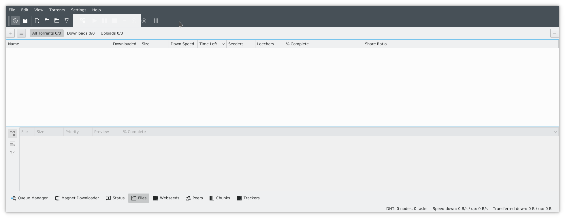
Does not happen for applications that have a single toolbar (most applications these days)
Or multiple toolbars but one per row.
Also happens with kdevelop, or konqueror.
Then also there are problems with colors (for all color schemes that have strong contrast between window decoration and window). But should be discussed once the above is fixed.
Mar 9 2020
In my opinion this should really go into a different decoration. Starting to have "styles inside styles" inside a single decoration is a UI mess.
If you want to turn breeze into a theme engine and not a theme, then so be it, but one must go the full way. Not just essentially duplicating the code to render a different set of visually orthogonal buttons into the engine. The new buttons must have a different entry in the kcm. Not be selectable by an internal option. See how decoration engines like aurorae implements different entries in decoration page as the way it should be.
How is a new user supposed to discover that what she/he sees in the KCM is not the only set of icons she/he can chose ?
Also on the code side, the current patch makes the code maintainability much more complicated.
Mar 5 2020
Feb 29 2020
also adding @davidedmundson in the loop in particular for opinion on the devicepixel ratio business, and in case he can reproduce the crash.
Feb 28 2020
Overall, this is good stuff I think (although we should also discuss whether this should be part of breeze or rather a next-gen theme).
Still:
right now it crashes all applications (here at least) when you unlock toolbars, move them to a different position, then move them back to top.
Tested with dolphin, okular, etc. All crash.
Jan 29 2020
thanks !
Makes sense, thanks !
Jan 22 2020
To compile with kde4:
cmake -DUSE_KDE4=1
This breaks the KDE4 compilation of breeze style (of course !)
So if this patch is to stay, then one should officially drop the kde4 support (or make a branch for it).
In that case, much more code can go (a lot of QT Version ifdefs, some CMake magic, etc.)
Otherwise, the kstyle part of this patch at least, should be reverted.
Jan 21 2020
Thanks for the fix.
On a different topics, I have found a couple more places where the separators look weird. See:
or
In the second screenshot it is barely visible, but that makes it look even more like a bug.
In my opinion we should revisit the heuristics for showing this separators, limiting it to actual sunken, non-transparent scroll areas, as opposed to standalone scrollbars.
opinions ? (about the two screenshots above ? About the solution ?)
Jan 16 2020
Can the top of the scrollbar go below the column headers instead of next to them?
Like this:
As a side note: I have been using this code for a couple of days now, and while I think the separator looks well for vertical scrollbars, when you have both vertical and horizontal, ... this will need some getting used to.
See:

This is with a thin handle, but having the thick one does not really improve. The view looks like a frame inside a frame, first one being off-centered.
I have no clue how this can be improved
Jan 15 2020
Confirmed that the centering is fixed. Now the arrow seem to have moved vertically (for vertical scrollbars) by half a pixel, which is probably a consequence of the 20->21, and make them look somewhat thicker due to antialiasing. It is a minor detail, so feel free to ignore.
Other than that, no more comments !
yeah thanks !
Now, it turns out that the arrows are still ill-aligned (with respect to the handle). Maybe they use the full width for rendering ?
Alignment again: so you increased the width of the groove rather than increasing the width of the scrollbar. This indeed fixes the alignment of the handle (and groove), but now the scrollbar arrows are off centered. (for the same reason), with both the scrollbar groove and with respect to the line. I would revert to the old handle width and rather increase the scrollbar width by 1 pixel. Then adjust the positioning. Does that make sense ? Increasing the width of the arrows by one pixel might break pixel alignment and create inconsistencies with other places were arrows are rendered ...
Now I realize that the thin scrollbar will still be off centered (and always was so far) while it is well centered with your patch, since it is only 3 pixels while the thick one is 6 pixels ... This was not visible without the separator line. But it is going to dissapear with the other patch anyway. (otherwise one would probably need to increase its width to 4 pixels)
Hi again Marco,
since you mentionned centering in plasmoids in the other commits, in fact here also the centering is wrong, with the added separator. Probably the offset is the one pixel you take for the separator. Can you double check ? (this appears true for QWidget based scrollbars, not QQC). Likely you need to increase the scrollbar width by 1, and tune the positionning of the groove+handle.
Jan 14 2020
my complain here is that this argument was either not made or discarded, when the first switch to thin scrollbar was done.
This is my main concern about this change: the going back and forth using adhoc arguments each time to justify the change, often contradicting each other. It means essentially that we either don't know what we are doing, or dont think our changes enough. This is bad imoIf I had been around back then or noticed the patch, I would have made this argument.
I would start by
- rebase this patch to apply cleanly
- split it in two (one for the separator line and one for the think handle removal), because these are really two features, adressing two different issues:
1: the item truncation into nothingness
2: the too small handle that few people dislike.
Removed previous comment because after testing the patch it turns out that this is not too strong of an issue.
However I also noticed that you not only removed the think handle but also the color blending. This make the handle not only larger but also stronger in terms of colors, especially in the case where the parent list has focus (you get a strong blue handle).
Is this really intended ?
I would at least keep the color blending, making the color stronger only when the scrollbar is actually hovered.
With all due respect:
This is irrelevant unless you do an actual poll.
You will have user feedback that want the thin scrollbar back. (I will).
Hi Notmart,
you need to rebase (you have some unrelated changes in the diff, which revert latest change from Noah)
- Concerning the separator, it looks great.
- Concerning reverting the thin bar, I think this is really unfortunate. I expect you will have as many complaints after the revert for people to have it back, as now of people who want the thick one. I would be among the former. Going back and forth in these design issues really gives wrong impression IMHO on our design capabilities, and I think this would be one of VDG's task to avoid this at all cost.
Now, the thin bar might not work very well with the new separator (and both pursue opposite goals: one to make the scrollbar more visible and the other less visible).
But then again, it just means that we, (including our designers and usuability experts), keep going back and forth on which direction to follow (here regarding whether we should make the scrollbars more prominent or less prominent). This does not give a good impressing to the outside world IMHO.
- In QQC there is an issue of overlap between item selection (and header titles) and scrollbar. Isn't that made even worth with the addition of the thin separator ?
Or is it now fixed ? (I could not see it in your other commit's screenshot. I do see it here in e.g. systemsettings)
Jan 13 2020
I'm confused: it has happened, no ? If I apply the patch I now get a white background (with normal breeze color scheme), behind checkboxes and radio button, always, which was not there before. This is , I think because of the change at line 3889.
in more detail: imagine a color scheme where window background is black, window text is white, view background is white view text is black.
you will get a white square on a white background for unchecked checkbox ...
I would really revert this part of the change
I would strongly object to that:
first that is a visual change unrelated to the issue this patch adress
second this is semantically wrong, and this will break on some color theme.
Things should be kept consistent. If you change the background role, you must also change the foreground role, and then you might really get funny results.
ship it. No strong feeling.
Jan 11 2020
I would prefer not systematically render the background, because it might break existing applications, like rendering a widget on top of a painted image. Also this goes against Qt's rendering model which does not require rendering widget background, relying on that of the parent widget or window itself. I would instead either do it in qqc, or detect if we are rendering a qqc control and in this case only render the background systematically. There are several places in the code that do that already. Look of "#if BREEZE_HAVE_QTQUICK" blocks.
Jan 4 2020
Dec 30 2019
Dec 29 2019
-1:
if QWeakPointer::data() is obsoleted, (while needed in the code), I would object to adding toStrongRef, in between, since as pointed out by Antony, calling data immediately after brings no further security, and just results in some overhead (Weak to shared pointer). It means that either
- weakPointer::data should not be obsoleted
- the kdecoration api should be changed (to return shared pointers, or provide direct access to the data).
Dec 27 2019
looks good. See comment about the symbol pen width change and then ship it.
Dec 19 2019
Looks good and sensible. Very nice consolidation. Thanks !
Dec 17 2019
Just a remark: WASD is very keyboard layout dependent. For AZERTY keyboards (as used in France for instance) this is completely broken, and something any gamer has to always change manually (to ZQSD) if not already done automatically by the game (which may games do)
Arrows on the other hand are much less layout dependent.
Dec 14 2019
As a side remark: did you check how it looks when one selects "text under icon" or "text beside icon" for toolbar button ?
Fix is legit. Thanks !
I would avoid changing the alpha of the color though because: it makes no difference, and it is unrelated to the issue. Should be a different commit (which you can do without review if you really think it is important)
Dec 13 2019
Dec 9 2019
I'm not sure what you mean when you wonder how it would play with monochrome icons. It should have nothing to do with them unless you embed stylesheets in the SVGs to use the separator color in breeze icons.
So the background here is that we've gotten a new VDG designer who produced mockups of Breeze dark with dark separators, and some people absolutely fell in love with them, while other people hated them. We could not achieve consensus on moving to use dark separators for Breeze Dark, so there was a desire to offer people that choice. It occurs to me that we could put this in the Breeze style's own settings, if it's strictly necessary to expose this to users. Personally I would prefer to just make a decision on separator colors one way or the other rather than making it explicitly configurable (dark separators FTW :) ).
Few more comments on this:
- general: you will never be able to make all the opiniated people happy, and you have to draw a line (otherwise your code will become bloated, buggy, and unmaintainable)
- regarding this specific case: many widget style will not implement this new color. For those this will just generate bugs reports: why is my color scheme not respectd ?
- some widget styles (oxygen at least, but I'm sure there are others) use two colors for frames and separators, to mimic shadows or relief effects. Adding one single color for this will not fit such schemes.
- in the end if you need an extra color for a given theme (be it future-breeze or whatever), there is also the possibility to add it as a extra option for this specific theme, rather than forcing it to kcolorscheme and imposing it to all styles (or making kcolorscheme broken for all the styles that wont use it).
This is how window decoration shadows and glow were handled to oxygen.
I think this change will break more things than it will fix, especially if the fix is to make some opinionated people happy.
Would also be good to have the opinion of @cfeck on this.
Adding new entries to the kcolorscheme should be done with a lot of care, because it could be seen as some sort of API break for existing colorscheme, as soon as you start using this color in the widget style: you would need a fallback implementation, for all the colorscheme in the open which do not implement this particular color. These kind of additions happened a lot whith gtk3 css style and resulting of overall unhappiness and distrust from theme/color scheme developpers. This also increases the complexity of the code and difficulty to maintain.
Dec 2 2019
Thanks !
Nov 28 2019
Thanks !
Nov 27 2019
Also, this change will make it pretty difficult to use git blame and git bisect in the future to track possible regressions. (to my knowledge at least). Might as well start a new repository.
Also (and somewhat independently from this patch): with Qt6/KF6 being around the corner, I somewhat wonder about the utility of rewritting and hacking breeze at that time. Would this make sense to actually leave breeze (which is a rather well-working theme, with very little bug reports) unchanged, and start working anew on a new widget style targeting KF6 ? Would that not be more exciting, bring more people in, trigger new ideas, give more freedom ? And be a more ambitious task all in all ?
One could of course start from breeze, and apply all the new ideas about how the code should be organized, how highlight should look, and checkboxes, without disturbance for something which has lived largely unchanged (and with not so many complains) for all the kf5 lifetime ...
You are missing copyright information and license in all the newly created files.
On the review side: it is impossible to actually review, right ?