+1
Feed Advanced Search
Apr 1 2019
Apr 1 2019
Mar 28 2019
Mar 28 2019
abetts added a comment to D20086: Fix window height of Screen Locking KCM.
+1
Mar 27 2019
Mar 27 2019
Mar 26 2019
Mar 26 2019
abetts added a comment to D20066: Use Meta+D to Show Desktop by default.
+1
Mar 22 2019
Mar 22 2019
abetts added a comment to D12055: Remove border around menubars.
+1 for visual improvement
abetts added a comment to D19752: [Splash KCM] Use InlineMessage for testing error.
Could the message include some hints of what failed? Maybe the theme name? Something like:
Mar 20 2019
Mar 20 2019
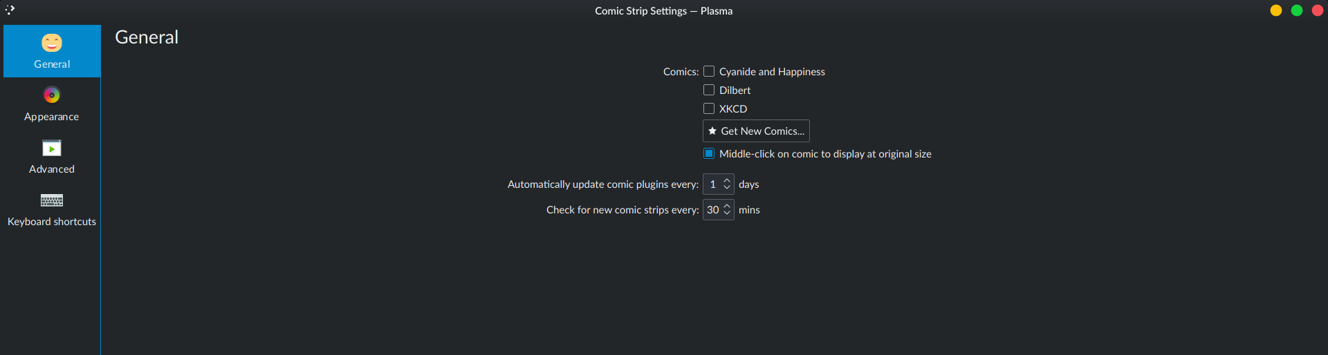
abetts added a comment to D19802: [comic] Modernize configuration windows.
You mean "General", "Appearance" etc. right? Yeah that happens when windows are stretched horizontally, but the window wouldn't be much narrower IRL tbh. Kirigami's FormLayout is center aligned and the category's title always remains left aligned. They're pretty far apart in full-screen:
abetts added a comment to D19802: [comic] Modernize configuration windows.
The title labels appear to be very far from the content. Is that just the size on the images or does it actually look very far when the config screen is full size?
abetts added a comment to T10628: Akademy 2019 sponsorship brochure.
I am currently working on updating graphics and layouts.
Mar 19 2019
Mar 19 2019
abetts added a comment to D19096: [Kicker] Fix "Tooltip can not be displayed".
Does this patch only concern itself with the icons and labels below them or also the categories on the right? If so, it feels like the category labels on the right are huge in comparison to the icon labels. Maybe those also need some touch up?
abetts added a comment to D19873: [image-wallpaper] Port to Kirigami.FormLayout and use twinFormLayouts.
+1 visually
Mar 17 2019
Mar 17 2019
abetts added a comment to D19825: Improve update states' UI.
Maybe the icon can be smaller, but in principle, yes!
Mar 16 2019
Mar 16 2019
abetts added a comment to T10628: Akademy 2019 sponsorship brochure.
I can take this and edit it to include the same data but different pictures. Let me know if that helps!
Mar 14 2019
Mar 14 2019
abetts added a comment to D19747: [fuzzy-clock] Port configuration window to QQC2 and Kirigami.FormLayout.
+1
Mar 13 2019
Mar 13 2019
abetts added a comment to D19664: [quickshare] Port configuration window to QQC2 and Kirigami.FormLayout.
While it makes sense to change it to the new form, the alignment feels odd because there are just a couple of items in the kcm. I wonder if having a title label would help ground the elements on the page.
abetts added a comment to D19669: [binary-clock] Port configuration window to QQC2 and Kirigami.FormLayout.
+1
Mar 12 2019
Mar 12 2019
abetts added a comment to D19687: Allow single images to be excluded from the slideshow.
abetts added a comment to D19687: Allow single images to be excluded from the slideshow.
Mar 11 2019
Mar 11 2019
abetts added a comment to D19687: Allow single images to be excluded from the slideshow.
How would the folders on the folder list on the left be removed as sources?
abetts added a comment to D19670: [appmenu] Port configuration window to QQC2 and Kirigami.FormLayout.
+1
abetts added a comment to D19651: Improve the look of the Application Style KCM UI.
Is there any way that we can make the preview window have more right and left margins? When presented like this, it seems like it is actually another module that users interact with.
Mar 10 2019
Mar 10 2019
abetts added a comment to D19646: Redesign config pages.
Could there be a checkmark box or some way to indicate what selection has been made?
Mar 8 2019
Mar 8 2019
abetts added a comment to D19606: [Task Manager] Reorganize and improve presentation of context menu.
Would it be possible for the header labels to be a bit different? Not sure what would look best, bold, italics, a lighter shade of gray
abetts added a comment to D19472: [Task Manager] Make sure "Alternatives..." context menu item is always available.
Can it be more descriptive? Using two words might help it be extra clear what the button is about.
abetts added a comment to D19605: Sharpen ApplicationMenu, Shade, ContextHelp icons.
+1
Mar 7 2019
Mar 7 2019
abetts added a comment to D19594: Purely cosmetic UI fixes.
I would probably remove the circle around the system messages and place it in the messages themselves.
abetts added a comment to D19557: Update design to look more similar to kde.org.
+1
Mar 6 2019
Mar 6 2019
abetts added a comment to D19566: [OSD] Fix animation stutter.
+1 on visuals
Mar 5 2019
Mar 5 2019
abetts added a comment to D19373: [RFC] [Splash Screen] Use current "Next" wallpaper as the background.
+1 on looks
Mar 4 2019
Mar 4 2019
abetts added a comment to D19315: Use ActionTextField to implement the searchField in system settings.
+1
abetts added a comment to D19515: Fix recangle-selection help-text positioning .
Love it! +1
abetts added a comment to D19478: [Login, Lock, and Logout Screen] Make the avatar background circle more subtle.
+1
abetts added a comment to D19214: [sddm-theme] Replace login button label with icon.
Mar 1 2019
Mar 1 2019
abetts added a comment to D19275: [ConfigCategoryDelegate] Add horizontal padding to the label.
+1
Feb 27 2019
Feb 27 2019
abetts added a comment to D19372: [sddm-theme] Enlarge user avatar in focus.
abetts added a comment to D19230: [Digital Clock] Replace 12/24hr tri-state checkbox in config UI with combobox.

abetts added a comment to D19230: [Digital Clock] Replace 12/24hr tri-state checkbox in config UI with combobox.

abetts added a comment to D19230: [Digital Clock] Replace 12/24hr tri-state checkbox in config UI with combobox.
Do you think that "locale" is a very specific term? Could it be different?
abetts added a comment to D19379: [sddm-theme] Add a bottom panel.
Back in the day, when I proposed changes to these elements, I put them on the center. People said that it looked crowded, boring, etc... However, my reasoning was because the selections are too far in the corners. It wasn't a problem with smaller older screens but it would become a problem with ultra-wide, 4K monitors, etc. The options would be too far from the center where the user is. I don't know that the bar at the bottom is a good solution overall. But it does bring attention to the area.
Feb 26 2019
Feb 26 2019
abetts added a comment to D19185: [KRunner, SDDM theme, Logout screen, Login widget] Use the word "Sleep" instead of "Suspend".
+1
abetts added a comment to D19372: [sddm-theme] Enlarge user avatar in focus.
+1
abetts added a comment to D19311: Add navigation history to forward/back buttons.
abetts added a comment to D19011: Thunderbolt KCM and KDED module.
Can the text to the right of the list, "Trusted" be a different color and maybe a smaller font? When using the same font, color and size as the device name, it seems that they are the same thing. One is device name and the other is device status. I am just wondering if we could differentiate them visually.
abetts added a comment to D19311: Add navigation history to forward/back buttons.

Feb 25 2019
Feb 25 2019
abetts added a comment to D19296: Allow to set quarter tiling separately.
How would the interaction be with this patch? Video?
Feb 24 2019
Feb 24 2019
Feb 21 2019
Feb 21 2019
abetts added a comment to D19186: [KCM & UI] Use the word "Sleep" instead of "Suspend".
+1
abetts added a comment to D19209: [sddm-kcm] Adjust Background label and button.
+1
abetts added a comment to D19183: Use logically correct icon for direction arrows.
+1
abetts added a comment to D19197: [File Tree] Add "Open Containing Folder" menu entry.
Should have been a default!
abetts added a comment to D19194: Adjust date string height to match time string with vertical panel.
I would probably add just a bit of left and right padding to the time as well. LGTM
Feb 20 2019
Feb 20 2019
abetts added a comment to T10500: Use the word "Sleep" instead of "Suspend".
abetts added a comment to D19096: [Kicker] Fix "Tooltip can not be displayed".
+1
abetts added a comment to D19173: [InlineMessage] Tint icon and text color.
Love the color change. More harmonious.
Feb 19 2019
Feb 19 2019

abetts added a comment to D19153: [WIP] Add option to configure what happens if the Print key is pressed while Spectacle is already running.
Awesome!
abetts added a comment to T10500: Use the word "Sleep" instead of "Suspend".
+1
abetts added a comment to D19153: [WIP] Add option to configure what happens if the Print key is pressed while Spectacle is already running.
Thanks Nate, my markup is awful.
abetts added a comment to D19153: [WIP] Add option to configure what happens if the Print key is pressed while Spectacle is already running.
I would change the first label that says
abetts added a comment to T10497: Clean up the default color scheme selection.
+1
Feb 18 2019
Feb 18 2019
abetts added a comment to D16886: [windowswitcher] Implement keyboard navigation.
+1
abetts added a comment to D19020: [breeze-icons] Revamp system.svgz.
Well, maybe it is time to call it and be done. I don't think we are going to please everyone right now. Maybe our best option is to have you, as the proponent of this idea, make the decision after long debate.
abetts added a comment to D19020: [breeze-icons] Revamp system.svgz.
I think the icon is pretty much there. Maybe the label can help the meaning come across. What about:
Feb 17 2019
Feb 17 2019
abetts added a comment to D19077: Redesign the theme preview window.
Just added some visual adjustments (mockup)
Feb 15 2019
Feb 15 2019
abetts added a comment to D19013: [plasma-pa] Increase minimum size of expanded plasmoid.
+1
abetts added a comment to D19047: [GridDelegate] Fix long labels blending into each other.
+1
abetts added a comment to D19044: [InlineMessage] Do not draw shadows around the message.
In fact, long ago, when we first launched the current version, I also suggested making them flatter and all the way across the window. That way it didn't seem like it was floating.
abetts updated subscribers of D19011: Thunderbolt KCM and KDED module.
abetts added a comment to D19036: [notifications] Lift up notification content if one line of body text droops.
+1
Feb 14 2019
Feb 14 2019
abetts added a comment to D19020: [breeze-icons] Revamp system.svgz.
abetts added a comment to D19020: [breeze-icons] Revamp system.svgz.
abetts added a comment to D19020: [breeze-icons] Revamp system.svgz.
Would an icon like this work?
abetts added a comment to D18893: [sddm-theme] Add buttons to username prompt to make it a full-fledged login screen alternative.
abetts added a comment to D18893: [sddm-theme] Add buttons to username prompt to make it a full-fledged login screen alternative.
Feb 13 2019
Feb 13 2019
Feb 12 2019
Feb 12 2019
abetts added a comment to D18963: Improve KoModeBox display in horizontal Mode.
abetts added a comment to D18963: Improve KoModeBox display in horizontal Mode.
It is pretty rough. It works, but needs better looks. The toolbar section now takes up almost half of the screen.
Feb 11 2019
Feb 11 2019
abetts added a comment to D18893: [sddm-theme] Add buttons to username prompt to make it a full-fledged login screen alternative.
+1
Feb 6 2019
Feb 6 2019
Feb 5 2019
Feb 5 2019
abetts added a comment to D18744: Add action in Edit menu to select the text on current page.
This idea is super interesting. Can you please make a gif or short video showing the new feature?
abetts added a comment to D18649: [GridViewKCM] improve contrast and legibility for delegates' inline hover buttons.

Feb 4 2019
Feb 4 2019
abetts added a comment to D18738: Add ebook thumbnailer.
+1
abetts added a comment to D18649: [GridViewKCM] improve contrast and legibility for delegates' inline hover buttons.
abetts added a comment to D18649: [GridViewKCM] improve contrast and legibility for delegates' inline hover buttons.

abetts added a comment to D18649: [GridViewKCM] improve contrast and legibility for delegates' inline hover buttons.
abetts added a comment to D18649: [GridViewKCM] improve contrast and legibility for delegates' inline hover buttons.
abetts added a comment to D18649: [GridViewKCM] improve contrast and legibility for delegates' inline hover buttons.
abetts added a comment to D18649: [GridViewKCM] improve contrast and legibility for delegates' inline hover buttons.
abetts added a comment to D18649: [GridViewKCM] improve contrast and legibility for delegates' inline hover buttons.
Just some variations on Nate's idea:
abetts added a comment to D18649: [GridViewKCM] improve contrast and legibility for delegates' inline hover buttons.
abetts added a comment to D18649: [GridViewKCM] improve contrast and legibility for delegates' inline hover buttons.
Feb 2 2019
Feb 2 2019
abetts added a comment to D18675: Use different "None" item icon in grid view KCMs.
Seems like a bit too much. BTW, this is the Plasma login splash and there is no text output when disabled.
abetts added a comment to D18675: Use different "None" item icon in grid view KCMs.
abetts added a comment to D18681: Update Breeze Look and Feel theme previews.
Maybe I am asking for a lot... but could these be animated and show what the splash screen does? Maybe a gif animation on hover?
Feb 1 2019
Feb 1 2019
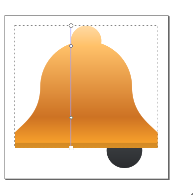
abetts added a comment to D18533: Improve the Notfication Bell Icon by using the KAlarm design.