New "Home" tab for Kickoff
Closed, WontfixPublic

Description

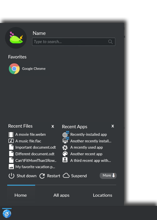
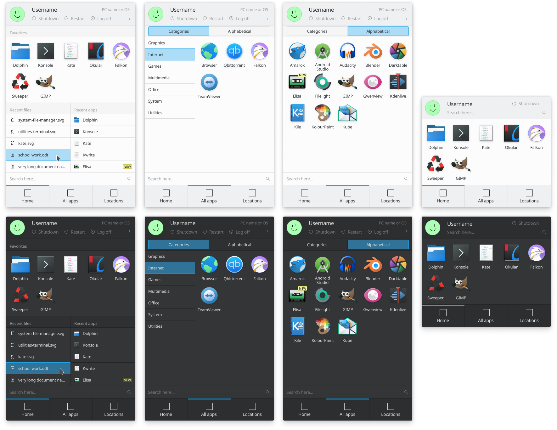
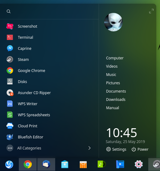
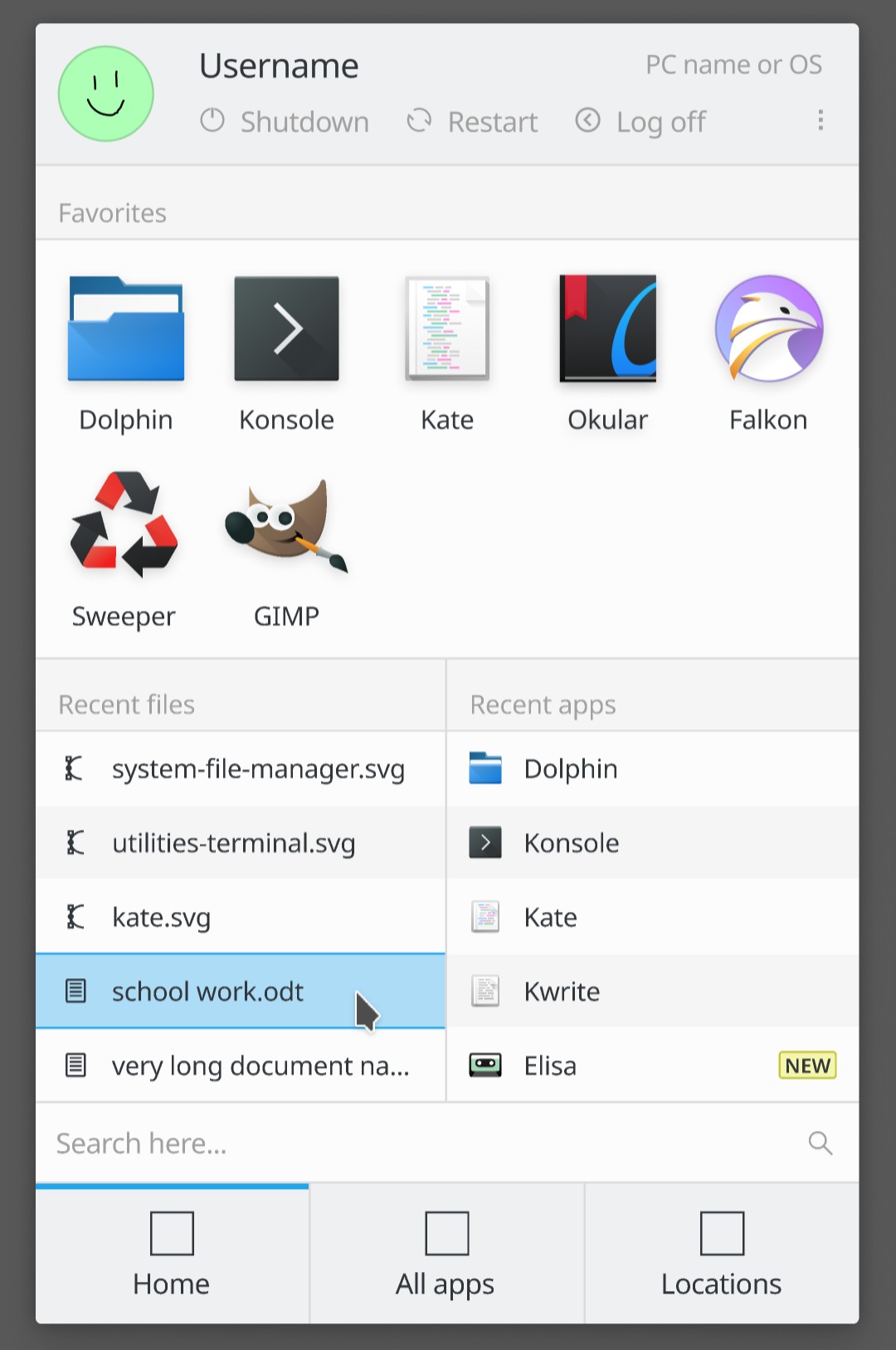
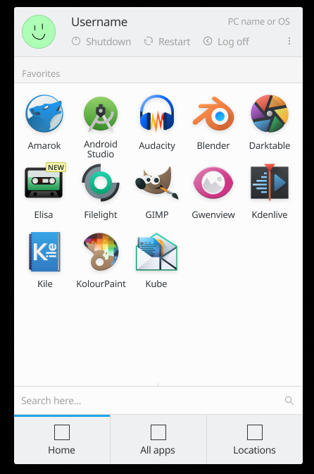
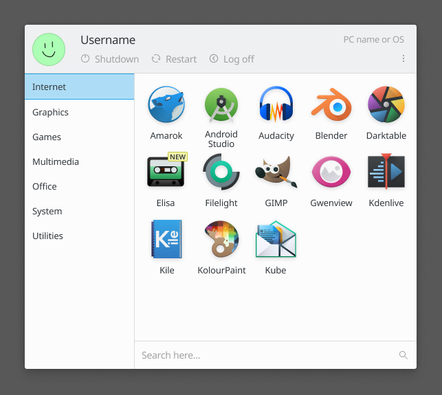
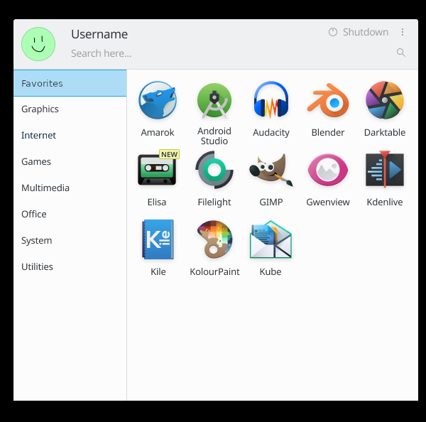
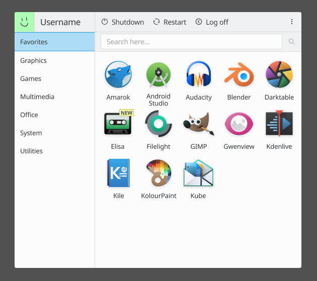
I'd like to propose a new tab for Kickoff: Home.

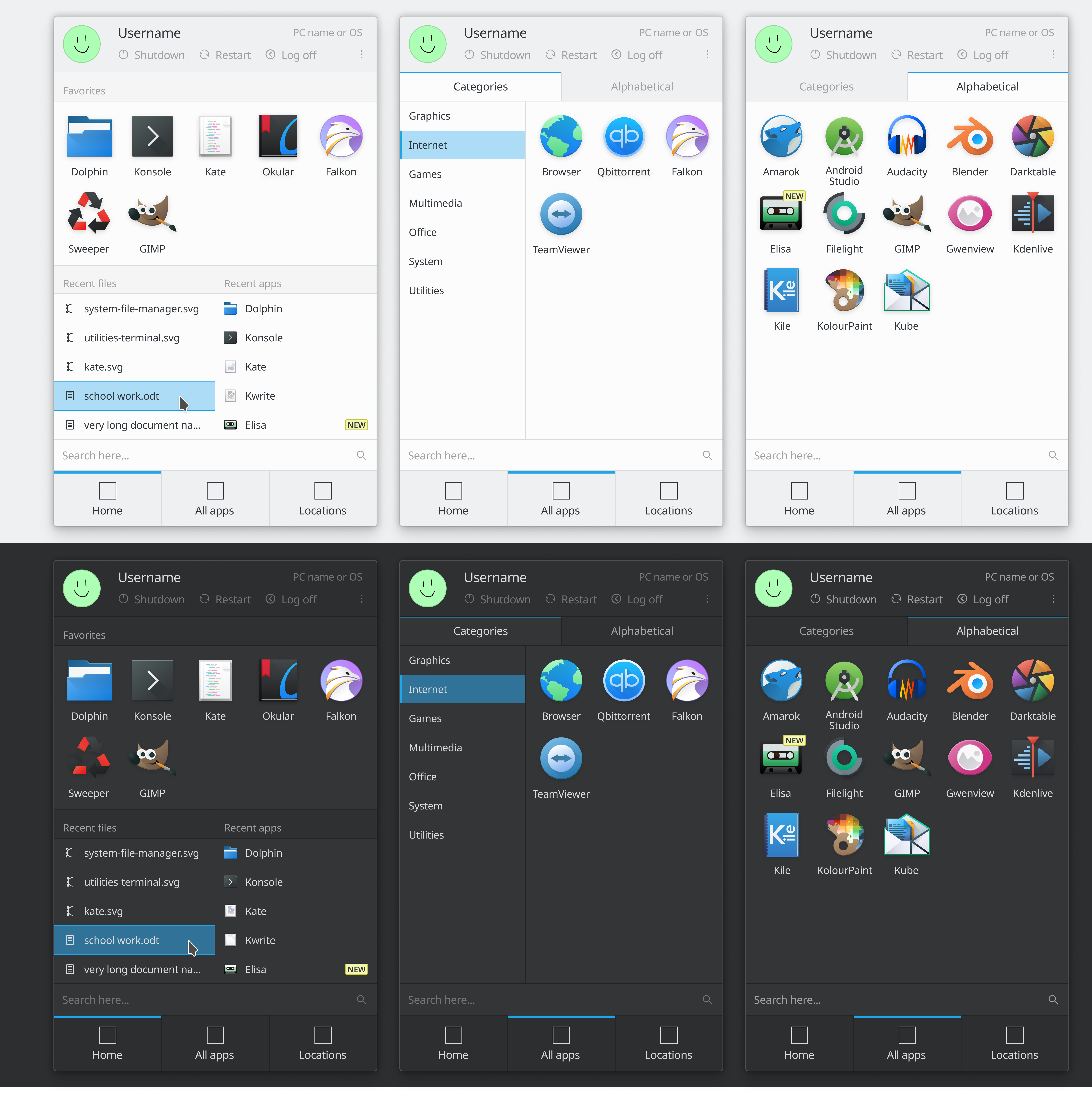
This tab would include miniature versions of the most useful entries from other pre-existing Kickoff tabs. The idea is for it to be the only tab a casual user should ever have to use to quickly launch their recently-used and favorite apps, access the files they were last working with, and turn off their computer. Full power and more features would always be available on Kickoff's other tabs.

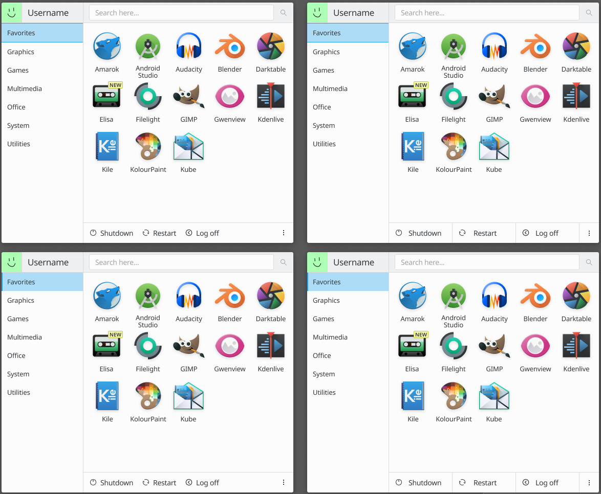
Here's an exceptionally crude low-fi mockup, followed by a textual explanation:

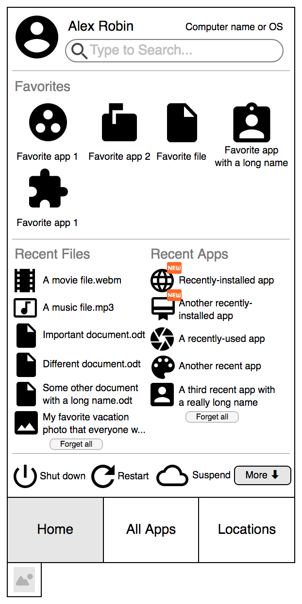
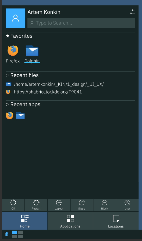
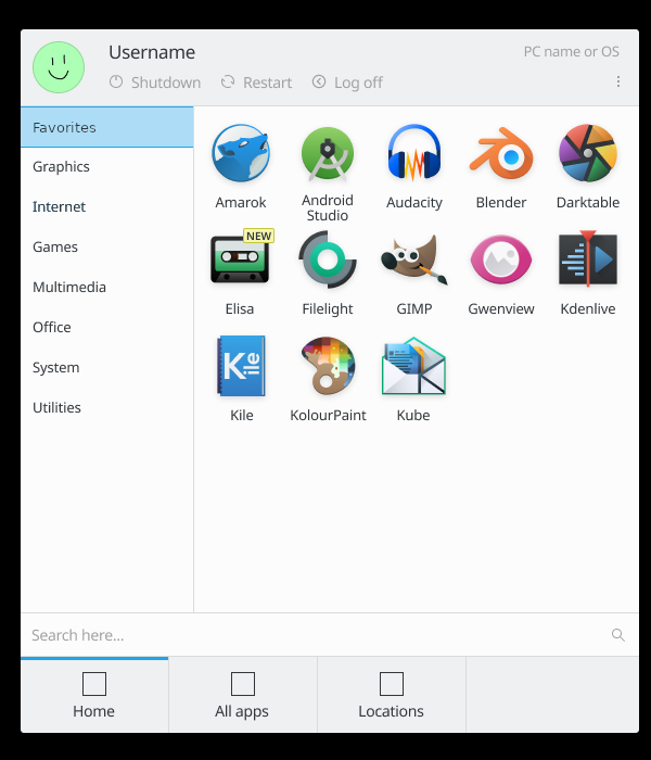
  • The Favorites section on top is just like a miniature version of Kicker's current Favorites tab--with the additional feature that you can make Documents favorites too. I think users would really love that.
  • The Power section displays the three power-related actions (with textual labels) at the bottom of the page. The More button on the right shows any additional options (Log out, switch user, etc). The settings page would provide a UI to allow users to choose which three buttons appear on the Home page (for example they might want to replace Suspend with Log Out or Switch User in the case of a laptop that's shared between family members).
There are a very large number of changes, so older changes are hidden. Show Older Changes

@filipf Blending the titles and separators seems like a great idea to me! The line should probably be as long as it needs to be based on the header text length, and not try to keep symmetry. I think it's okay.

@safaalfulaij Keep in mind that this new Home tab wouldn't replace anything; the existing History tab would still be there and would still have a ton of items in it. So there would be no regression in terms of the number of recently used items. I like @filipf's idea of creating a link at the bottom of each Recent <thing> section to a larger version of it. This could simply take you to the History tab, or even do something fancy like expand just that section to fill the whole content area.

I agree that long names are a problem when we use square icons tiles instead of horizontal list items. For that reason, I think we'd need to ensure adequate horizontal spacing and allow multi-line strings. This would entail giving that section a good amount of space, yes.

This is starting to look really really good. Thanks for your input, guys.

This would be my assessment too. Thinking visually only, I feel that we need to place more emphasis or real estate to the applications rather than the recent documents. We can tailor to this if we make the menu bigger horizontally. Right now only about 25% of the real estate is dedicated to applications. My feeling is that users will generally use Kickoff to launch applications more than anything else.

Making it a bit wider would leave more room for names in the two Recent [thing] sections, too.

rooty added a subscriber: rooty.EditedAug 27 2018, 3:42 PM

What about this?
I changed @filipf's design up a little bit:

  • no username@hostname (Distro) anywhere near the name (more spacious this way)
  • not sure about the separators, they're not present in this picture but i think it looks fine either way
  • the Favorites look better if the labels are right next to the icons rather than under them
  • smaller icons
  • Recent Files and Recent Apps are now flush with each other
  • no ellipses (I'm sure that a scrollbar can be integrated into the menu or someting but i don't like having buttons below the Recent panes)
  • Shut down, Restart and Suspend are smaller and take up less room
  • the tabs are a lot shorter (they don't need as much room as in the original screenshots)

Pardon the low quality though, I don't have much Photoshop Fu.
In addition I propose "Applications" be used in place of "All apps" ("apps" sound mobile) and "Places" instead of "Locations", much like in the original Kickoff.

I'd be open to trying horizontal list item-style Favorites in the interest of better supporting long names and captions. But in this case, I'd like it to remain multi-column the way the current icon tile mockups show, or else we'll end up with a huge amount of wasted space on the right the way we do now (which people not unreasonably complain about).

I think I'd like to keep the line separators though. I feel that they lend needed structure to the UI.

+1

rooty added a comment.Aug 28 2018, 1:10 AM

I'd be open to trying horizontal list item-style Favorites in the interest of better supporting long names and captions. But in this case, I'd like it to remain multi-column the way the current icon tile mockups show, or else we'll end up with a huge amount of wasted space on the right the way we do now (which people not unreasonably complain about).

I think I'd like to keep the line separators though. I feel that they lend needed structure to the UI.

ah but room to breathe wasted space does not always make hahaha

the long names and captions argument - yes, for sure, but i just thought it wouldn't be as aesthetically pleasing to cram it all into a single pane/section, so using horizontal names/captions would end up using up most of the space while still looking fairly roomy (giving off the impression of spaciousness), if arranged in two columns (instead of just one, the way kickoff's laid out right now)

yeah the separators sound good, preferably the ones you put in the screenshots in a comment on D15011, they're nice, subtle and aesthetically pleasing too

Yes, there's often a fine line between "wasted space" and "too crowded". I feel confident that we can hit the mark though.

I'd like to add my humble thoughts to this if you don't mind.
I personally really love this proposed start menu, especially the list of newly installed apps.

Here are some changes to a previously posted mockup I'd like if you considered:

  • I think it needs more space to accomodate all the other things added to this page, so an overall increas in size is needed
  • I work as local IT support for a company with hundreds of computers and I know KDE Plasma is targeted at office users, so I can tell you from personal experience that this is necessary: logging out and switching users is one of the most frequent actions. That's why I added these two actions to the page
  • I know I'm arguing over a mockup, but the page titles (Home, All apps, ...) buttons are way to big, they remind me of a smartphone interface, so I condensed the height. Also added a fourth page title, since we got room for one and there is (definitely) something useful that can be added there
  • Recent files and Recent apps needed more space, so I increased the height of these sections
  • Decreased the app icons under the Favirotes section, it was just (arguably) too big
  • Added System settings to this page. I believe it needs to be in a more discoverable place. Windows and OSX have been showing it on their start menus for a long time now, and for a good reason. If faced with a problem (or just annoyed with a setting) the user can quickly reach what they want, without looking it up in All apps or searching for it manually in the search bar every time
  • Removed the X from the Recent files and Recent apps section. I suppose these were a clear list action. These can go to the right click context menu. In my experience even less experienced users generally know to try to look for a rightclick menu when they can't find something on the screen. I believe these are not that necessary to show it by default.

Here is my personal mockup:

I'd like to add my humble thoughts to this if you don't mind.
I personally really love this proposed start menu, especially the list of newly installed apps.

Here are some changes to a previously posted mockup I'd like if you considered:

  • I think it needs more space to accomodate all the other things added to this page, so an overall increas in size is needed
  • I work as local IT support for a company with hundreds of computers and I know KDE Plasma is targeted at office users, so I can tell you from personal experience that this is necessary: logging out and switching users is one of the most frequent actions. That's why I added these two actions to the page
  • I know I'm arguing over a mockup, but the page titles (Home, All apps, ...) buttons are way to big, they remind me of a smartphone interface, so I condensed the height. Also added a fourth page title, since we got room for one and there is (definitely) something useful that can be added there
  • Recent files and Recent apps needed more space, so I increased the height of these sections
  • Decreased the app icons under the Favirotes section, it was just (arguably) too big
  • Added System settings to this page. I believe it needs to be in a more discoverable place. Windows and OSX have been showing it on their start menus for a long time now, and for a good reason. If faced with a problem (or just annoyed with a setting) the user can quickly reach what they want, without looking it up in All apps or searching for it manually in the search bar every time
  • Removed the X from the Recent files and Recent apps section. I suppose these were a clear list action. These can go to the right click context menu. In my experience even less experienced users generally know to try to look for a rightclick menu when they can't find something on the screen. I believe these are not that necessary to show it by default.

    Here is my personal mockup:

I can see you put a lot of thought into this. I like your conclusions. I think we should consider them. I also feel like that there could be more sizing work with the menu to allow for more space for the actual content that the user is looking for. In your mockup, do you want to make the power buttons always visible?

In your mockup, do you want to make the power buttons always visible?

When we moved from windows 7 to windows 10 the #1 user ticket was "how do I shut down the computer?" and "how do I log off?" because these actions are on a button with no label.
In my opinion shutdown, restart and logoff should be visible on the main page, opposed to the current Leave page, but suspend and hibernate could be tucked away for example in a little arrow next to Shut down.

Thanks for that very valuable information, @anemeth. It's great to hear from someone in the trenches, so to speak. Your reasoning is exactly why I wanted to put the power- and user-related buttons front and center. Sometimes we forget just how confusing it can be for normal users when something commonly-used isn't front-and-center, and how unlabeled icons-only ToolButtons can cause problems even when they use a nearly universal icon.

I'm hoping to carve out some time to work on this new tab in the Plasma 5.16 timeframe. I love your refinement of the mockup. Very nice.

ndavis added a subscriber: ndavis.Feb 21 2019, 3:47 AM

I think the design is visually overwhelming. There's a lot of stuff crammed into an area that's a bit too small to hold all of it. I like the favorites area at the top and I think it will do a better job of displaying more favorites at once than the favorites view. If you're going to have another section at the bottom, choose either Recent Files or Recent Apps, not both. Another option is to put everything in one scrollable list (Favorites, Recent Apps, Recent Files), rather than having Recent Files and Recent Apps side by side.

That looks very nice! Is this a mockup or a start at implementation?

That looks very nice! Is this a mockup or a start at implementation?

Is this a mockup)

I would be happy to participate in the project where my UI designer skills will be useful.

rooty added a comment.Mar 7 2019, 4:57 AM

This is really nice. Especially the buttons in the top right corner.
Have you given any thought to what the button on the right would do? (Open up a context menu? Show the logout screen? Use a default action for Leave (say, shut down)?)

In T9041#178105, @rooty wrote:

This is really nice. Especially the buttons in the top right corner.
Have you given any thought to what the button on the right would do? (Open up a context menu? Show the logout screen? Use a default action for Leave (say, shut down)?)

Good idea)

ngraham added a comment.EditedMar 7 2019, 2:39 PM

I'm of the opinion that having visible power buttons with labels on the home screen is a requirement. People have difficulty with this concept otherwise, and @anemeth's anercdote backs this up. We don't need to show all of them but at a minimum we need for restart, shut down, and log off to be visible by default with labels, not just icons.

abetts added a comment.Mar 7 2019, 3:16 PM

I'm of the opinion that having visible power buttons with labels on the home screen is a requirement. People have difficulty with this concept otherwise, and @anemeth's anercdote backs this up. We don't to shoa all of them but at a minimum we need for restart, shut down, and log off to be visible by default with labels, not just icons.

I would agree.

I'm of the opinion that having visible power buttons with labels on the home screen is a requirement. People have difficulty with this concept otherwise, and @anemeth's anercdote backs this up. We don't need to show all of them but at a minimum we need for restart, shut down, and log off to be visible by default with labels, not just icons.

New vresion/ Done )

I don't know about putting the shutdown button and the rest so close to the start button and having the search menu up to the top... maybe swapped around would be better to be safe from accidental clicks

I agree that it seems like that would just lead to accidental clicks on shutdown. I quite liked the version with the shutdown options on the right side, maybe make a version that simply always shows that sidebar?

I hadn't considered that but I think you guys are right. So the power/session items should be moved elsewhere then. I would really like to keep Shut Down and Restart visible with text though. Otherwise it can be tricky for novice users to figure out how to shut down and restart their computers.

I've tried to make it follow the padding and space from T10470, and swapped the shut down, restart, log off buttons and the search bar around.
It's a bit taller and thinner than the current kickoff design in 5.17

4x


1x

First of all, I think that the default Application Menu in Plasma is very wierd and uncomfortable.
I think we should look at the other aplication menus.
Plasma Default Application Menu:
I dont like this.


Simple Menu:
This is my favorite Application Menu, There's a Search, Categories (even "All"), Grid of Applications with big icons and Shotdown, Lock etc. buttons, it's all in one place :)

Windows 10 Menu:

Brand new Windows 10 Menu: (WIP)

Elementary OS Apps Menu:
It looks like Simple Menu for Plasma, but categories only on second button.

XFCE Menu:
It's simple and convenient, but it doesn't looks modern.

Linux Mint (Cinnamon) Menu:
Reminds me a XFCE Menu, but in the left have place for Favorites Applications and Shotdown.

Zorin OS Menu:

Deepin Menu:

I agree, and I also like SimpleMenu quite a bit. It seems that people are settling on having a the main page display list or grid of apps, with a category chooser to narrow down the set, and a subset of the power/session actions visible right there.

I would be quite in favor of simply using SimpleMenu instead, with a small number of tweaks to make it suitable as a general-purpose Kickoff replacement:

  • Use the sliding popups effect to show and hide
  • Scroll long grids rather than having discrete pages
  • Show favorite apps and recently-used apps and documents
  • Make the row of icons-only power/session buttons into a 2x2 grid with text beneath the icons

I actually started working on a fork of SimpleMenu with some of the above changes in an attempt to make something upstream friendly: https://cgit.kde.org/scratch/ngraham/supermenu.git/

But I kind of forgot about it and stopped work more than a year ago. :/

@manueljlin those are very beautiful mockups. I really, really like them. I think there are just a few things that need some tweaking:

  • The tab bar at the top should probably use the current Plasma tab style (visible in the Audio Volume systray popup for example), possibly with the proposed improvements in D25334 since I think that's going to land soon)
  • The recent documents/recent apps sections have too many lines, making it feel cramped. Maybe remove the horizontal lines in the lists and just keep the vertical line separating the recent documents section from the recent apps section
manueljlin added a comment.EditedNov 17 2019, 5:18 PM

maybe this approach is better?
btw, i'm uploading this from my phone, it might be a bit compressed

also, should the tabs have the line over the text like the other mockups or under the text like D25334?

edit: I typed both as over the text lol

ghost34 added a comment.EditedNov 17 2019, 5:55 PM

I agree, and I also like SimpleMenu quite a bit. It seems that people are settling on having a the main page display list or grid of apps, with a category chooser to narrow down the set, and a subset of the power/session actions visible right there.

I would be quite in favor of simply using SimpleMenu instead, with a small number of tweaks to make it suitable as a general-purpose Kickoff replacement:

  • Use the sliding popups effect to show and hide
  • Scroll long grids rather than having discrete pages
  • Show favorite apps and recently-used apps and documents
  • Make the row of icons-only power/session buttons into a 2x2 grid with text beneath the icons

    I actually started working on a fork of SimpleMenu with some of the above changes in an attempt to make something upstream friendly: https://cgit.kde.org/scratch/ngraham/supermenu.git/

    But I kind of forgot about it and stopped work more than a year ago. :/

I think that Simple Menu it's a good way of "breeze evolution", because it doesn't looks too bulky, also i totally agree with your tweaks.
It would also be nice to refresh the full screen application menu.

maybe this approach is better?
btw, i'm uploading this from my phone, it might be a bit compressed

alternating stripey backgrounds colors are only used for multi-column lists, because they help you visually align the data for a particular item in the other columns. For single-column lists, we don't need to use alternating background colors.

also, should the tabs have the line over the text like the other mockups or over the text like D25334?

Like in D25334. Thanks!

I understand that leaving (shutdown/logout) is an important option, but please consider that:

  • Currently, it's user intuitive to leave the system, as the user will quickly see the big "Leave" tab with the leave icon.
  • It's quick and very easy to leave, as it's enough to hover the leave tab with the mouse, and there's not even the necessity to click.
  • Having a tab dedicated to leaving gives much more options of what I see in your mocks: Lock/Logout/Switchuser/Sleep/Restart/Shutdown becomes just Shutdown/Restart/Logout
  • If the above is not enough for a user, it's possible to move leave options to favorites just by right-clicking them.
  • Seen the above, I could not find complaints about the position of leave options
  • Putting leave options in the "home" tab would necessarily make the "leave" tab turned off by default, as it would be highly redundant to have them both, and that would annoy the users
  • Putting all leave options in the "home tab" would occupy a lot of space, and putting just some of them would be a regression and visually noisy (keep it simple :-)

That said, I think that it's not necessary to put the leave options in the home page.

manueljlin added a comment.EditedNov 19 2019, 5:35 PM

maybe this approach is better?
btw, i'm uploading this from my phone, it might be a bit compressed

alternating stripey backgrounds colors are only used for multi-column lists, because they help you visually align the data for a particular item in the other columns. For single-column lists, we don't need to use alternating background colors.

also, should the tabs have the line over the text like the other mockups or over the text like D25334?

Like in D25334. Thanks!

edit: updated the all apps category highlight to the correct one and kept only one version
4x


1x

ghost34 added a comment.EditedNov 19 2019, 6:30 PM

maybe this approach is better?
btw, i'm uploading this from my phone, it might be a bit compressed

alternating stripey backgrounds colors are only used for multi-column lists, because they help you visually align the data for a particular item in the other columns. For single-column lists, we don't need to use alternating background colors.

also, should the tabs have the line over the text like the other mockups or over the text like D25334?

Like in D25334. Thanks!

1x only because the image is huge

I like the mini version, i think that "recent files" and "recent apps" places is needless, "recent files" is available in Dolphin, "recent apps" can do as a category in "All Apps" page.


Yeah I'd like if home was more simple like this, or at least have a option to activate and deactivate the "recent" ones.
Did a little change to Manuel's mockup.

ghost34 added a comment.EditedNov 19 2019, 7:41 PM


Yeah I'd like if home was more simple like this, or at least have a option to activate and deactivate the "recent" ones.
Did a little change to Manuel's mockup.

Maybe add a categories by default?


Mini Version:

In T9041#209009, @KonqiDragon wrote:


Yeah I'd like if home was more simple like this, or at least have a option to activate and deactivate the "recent" ones.
Did a little change to Manuel's mockup.

Maybe add a categories by default?

That's basically the "All Apps" page. If the home page looks like that, then we don't need the "All Apps" page.

This does make some sense though. If we add favorites as the default category on the apps page, then we can use that as the home page. Recent apps could simply be another category there too. And I happen to know that the model supports showing recent documents in yet another category.

So maybe we should just do that.

ghost34 added a comment.EditedNov 19 2019, 8:10 PM

That's basically the "All Apps" page. If the home page looks like that, then we don't need the "All Apps" page.

This does make some sense though. If we add favorites as the default category on the apps page, then we can use that as the home page. Recent apps could simply be another category there too. And I happen to know that the model supports showing recent documents in yet another category.

So maybe we should just do that.

In this variant i convey the idea, that you don't need always to click on "All Apps" to see Categories, it saves your time!

at that point you might as well get rid of the tabs, and place the locations option somewhere else

Aaaaand then you've almost 100% reinvented SimpleMenu. :)

at that point you might as well get rid of the tabs, and place the locations option somewhere else

Is a search of category?

I think, the search should be where the applications, in right.

To be honest, I would be fine replacing Kickoff with SimpleMenu if it got some polish, bugfixes, and a few of the features from Kickoff (recent documents, recent places, etc).

In T9041#209016, @KonqiDragon wrote:

I think, the search should be where the applications, in right.

I would move the search field back to the top and put the row of power/session buttons back at the bottom, now that there's no problem with a tab nar nearby to make the clicks risky.

In T9041#209016, @KonqiDragon wrote:

I think, the search should be where the applications, in right.

I would move the search field back to the top and put the row of power/session buttons back at the bottom, now that there's no problem with a tab nar nearby to make the clicks risky.

the second one is good, but let's use a real search field in the toolbar, not a fake invisible borderless one. :)

Also maybe the bottom bar with the power/session buttons should span the full width of the window.

Also, shall we maybe add a new task to discuss these proposed changes to SimpleMenu? Or are these proposals still for Kickoff?

ghost34 added a comment.EditedNov 19 2019, 9:09 PM

the second one is good, but let's use a real search field in the toolbar, not a fake invisible borderless one. :)

Also maybe the bottom bar with the power/session buttons should span the full width of the window.

Also, shall we maybe add a new task to discuss these proposed changes to SimpleMenu? Or are these proposals still for Kickoff?

I think it's better to move search field and the power/session on top. I'm afraid to accidentally shut down the PC.

I think it's still Kickoff, New generation of Kickoff.

the second one is good, but let's use a real search field in the toolbar, not a fake invisible borderless one. :)
Also maybe the bottom bar with the power/session buttons should span the full width of the window.

+1 for top-left version

Aren't the bottom ones the latest way of highlighting?

The power/session buttons aren't depicted in a highlighted state, so it's not relevant. Toolbuttons have no visible frame when not hovered/highlighted/clicked.

I like bottom left. I think that highlight effect is more appropriate as it indicates that some category has been selected. The one in the top left feels more like the effect when you hover over items in a list (but nothing is simultaneously open).

ghost34 added a comment.EditedNov 19 2019, 10:08 PM

the second one is good, but let's use a real search field in the toolbar, not a fake invisible borderless one. :)
Also maybe the bottom bar with the power/session buttons should span the full width of the window.

I very don't like that the power/session buttons in bottom.


Alt:

P.S.
It's favorite.

How about this?

This comment was removed by ghost34.

How about this?

Looks kool.


Made a little change, I think it gives it a cleaner look.


Made a little change, I think it gives it a cleaner look.

Little changes for little changes.

In T9041#209042, @KonqiDragon wrote:

Shipit! :)

Of course, this looks nothing like Kickoff anymore. It looks more like a set of tweaks to SimpleMenu.

So again, should we basically abandon the idea of improving kickoff and focus on improving SimpleMenu and then ship it by default?

I would be in favor of that, but maybe keeping kickoff too just in case might be a good idea too?

ghost34 added a comment.EditedNov 20 2019, 10:13 AM
In T9041#209042, @KonqiDragon wrote:

Shipit! :)

Of course, this looks nothing like Kickoff anymore. It looks more like a set of tweaks to SimpleMenu.

So again, should we basically abandon the idea of improving kickoff and focus on improving SimpleMenu and then ship it by default?

Add the option to customize, maybe somebody wants to change the grid size of the applications, move a categories to the right or add a Recent Documents and Recent Apps places.

Menu with categories on the right:

P.S. Recent Apps can be do as a category.

pedrogomes1698 added a comment.EditedNov 20 2019, 10:42 AM

I think we should keep the usual kickoff the way it is in terms of layout and just give it adjustments to fit the current design language breeze is going for in this next update.
And perhaps give it a option to change between lists and icons.
Though if we make the top part gray how would that work with transparency?

ognarb added a subscriber: ognarb.Nov 20 2019, 8:15 PM
In T9041#209042, @KonqiDragon wrote:

Little changes for little changes.

This is beautiful +1

Of course, this looks nothing like Kickoff anymore. It looks more like a set of tweaks to SimpleMenu.

So again, should we basically abandon the idea of improving kickoff and focus on improving SimpleMenu and then ship it by default?

I think it would make sense in term of simple by default, powerful when needed. We could still improve the design of Kickoff to follow the current design. But having a simpler menu per default is valuable.

manueljlin added a comment.EditedNov 22 2019, 11:20 PM

I tried to make it more Kickoff-like, while keeping the power buttons away from the panel and the search bar near to it (this also makes the username/power options as thick as the other new popups, so more consistency).
Re-added tabs as a way to see how to sort installed apps.

If the panel is used vertically, the layout would depend where the application launcher is set (upper left would use the second one so the power settings can't be clicked by accident, for example)

4x


1x

I'd be all for making something similar to Simple Menu the default menu.

Back to Kickoff:
I'm not sure if a Home page is really what's needed. It looks very cluttered too. Do people actually want to be able to look at favorite applications & files/folders, recent files/folders and recent applications all at once?

I think the main reason why people don't like Kickoff is there's just too much switching between tabs and categories.
When you're looking for an app in the Applications tab, you have to click into and back out of the different categories. This is where the biggest slowdown is. If you're in the Games or Education categories, there are subcategories that only contain a tiny number of programs each, sometimes with shared entries.

Rather than making a page that combines a bit of everything, I think it would be better to reduce the number of tabs and improve the speed of category navigation.

ndavis added a comment.EditedNov 23 2019, 4:36 AM

Rather than requiring a click to go back and then another click to go into another category, create a way for categories to be hovered through like the tabs. Those usually useless subcategories shouldn't appear by default. Favorites, History and Often Used can be split into optional categories under the Applications and Computer tabs. Then you're left with just Applications, Computer and Leave. We could probably also get rid of Leave by doing some of the things already shown in the mockups here.

ngraham added a comment.EditedNov 23 2019, 6:02 PM

Rather than requiring a click to go back and then another click to go into another category, create a way for categories to be hovered through like the tabs. Those usually useless subcategories shouldn't appear by default.

This is covered already by T9040.

1x

This feels quite cluttered to me.

To be honest, I kind of think we were on the right track with the discussion of just replacing Kickoff with SimpleMenu by default and adding some more features to it. With the addition of "Recent Documents" and "Places" as categories on the side, it's almost there feature-wise.

I agree. SimpleMenu + shutdown, restart, log off icons with labels + username with the user picture should be the way to go then, right?

That, plus a few extra categories on the right side: Recent Apps, Recent Documents, and Places at a minimum. We might also want to consider making Favorite apps always visible rather than putting them on the first page of the "All Applications" category, which I find rather confusing. Or they could just be another category I guess.

If we're going to move in that direction, could you open a new Phab Task that we can use for the discussion and to hold mockups?

Should I just tag vdg, or plasma too?

1x

This feels quite cluttered to me.

To be honest, I kind of think we were on the right track with the discussion of just replacing Kickoff with SimpleMenu by default and adding some more features to it. With the addition of "Recent Documents" and "Places" as categories on the side, it's almost there feature-wise.

I think this is fine as long as it's optional for those that like menus like the Linux Mint MATE Menu. By default it definitely should lack the Recent sections, but TBH we should also add the option for users to be able to add these panes back in later if they want to.

ngraham closed this task as Wontfix.Dec 28 2019, 8:43 PM
ngraham moved this task from Backlog/Planned to Postponed on the VDG board.
ngraham claimed this task.

We're going to move forward with T12192 instead.

ngraham moved this task from To Do to Abandoned on the Plasma board.Dec 28 2019, 8:43 PM