BUG: 400570
FIXED-IN: 5.55
Improve the preferences-desktop-notification-bell icon by using the design from the KAlarm app icon.
| ngraham |
| VDG |
BUG: 400570
FIXED-IN: 5.55
Improve the preferences-desktop-notification-bell icon by using the design from the KAlarm app icon.
| Automatic diff as part of commit; lint not applicable. |
| Automatic diff as part of commit; unit tests not applicable. |
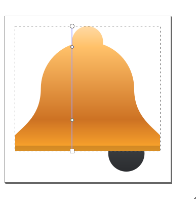
I have made some slight adjustments from the original KAlarm design, such as a shadow line at the bottom instead of orange, to better fit our style.
Should I make those changes in the original icon as well?
I think the original icon, and by extension this one, needs a bit of a redesign. It's too flat. I know it's hard to make an icon with no overlapping parts look 3D, but using more stops in the gradient to increase the complexity of it and give the curves more depth can help.
I actually think this new icon is pretty great as-is (at the minimum, it's much better than the existing icon) but I agree that it could benefit from a bit more depth.
Here's another idea: maybe tilt the bell a bit to make it looks like it's in the middle of ringing--say, 20 degrees clockwise.
I changed the shape a bit, but making it less flat is difficult: Linear gradients look off because of the curvature of the bell.
Other options are blurring a curved object or using mesh gradients, but I'm not sure how well, if it all, these will work in icons.
This is what I have:

The colors are not very good, but this is what I was talking about. It looks more 3D.
I would only add to this to lighten up the colors closer to yellow so that it retains the brightness that the flat icon had. You can achieve a 3D effect with brighter yellows. Orange tends to darken images.
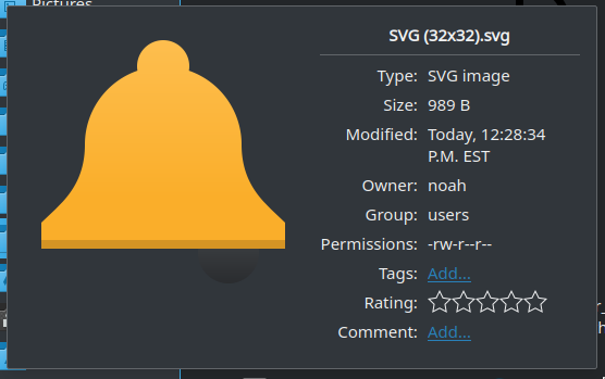
The ringer inside the bell has contrast issues with the standard Breeze Dark background color:
Or a different color. TBH, I don't remember seeing many bells with black ringers, but it does contrast nicely with the orangish-yellow of the bell.