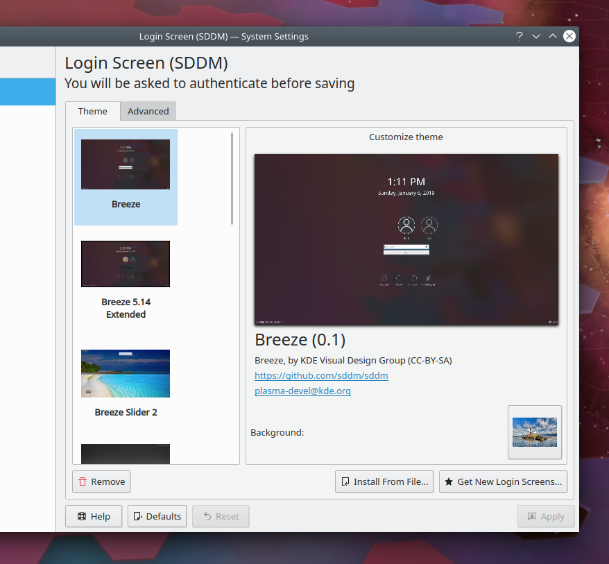
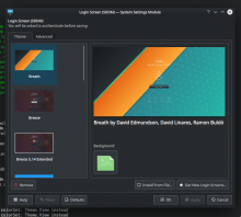
Redesign the theme preview window
ClosedPublic

Authored by filipf on Feb 16 2019, 11:50 AM.

Details

Summary

This patch:

  • makes the root element accommodate its content's dimensions so that information doesn't get cut off when using scaling or big fonts
  • matches the root element's color to that of the surrounding space
  • replaces the border around the image preview with a drop shadow
  • ports the GridLayout to ColumnLayout to make sure content doesn't get lost horizontally when using scaling or big fonts
  • ports Text elements to QQC2 Labels
  • adds the theme name as a Kirigami heading
  • constrains the labels within the layout's width, wrapping and eliding them if necessary
  • removes the hardcoding of font sizes
  • makes the email and website info clickable

BUG: 372844
FIXED-IN: 5.16
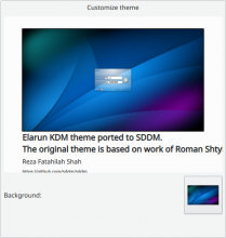
Test Plan

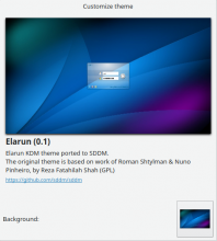
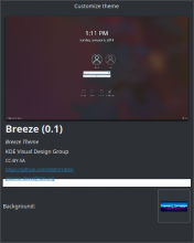
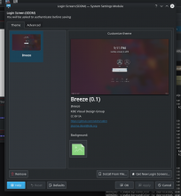
Before:


After:

Diff Detail

Repository
R123 SDDM Configuration Panel (KCM)
Lint
Automatic diff as part of commit; lint not applicable.
Unit
Automatic diff as part of commit; unit tests not applicable.
There are a very large number of changes, so older changes are hidden. Show Older Changes
filipf marked 12 inline comments as done.Feb 20 2019, 9:52 PM
filipf added inline comments.
src/qml/main.qml
27

I tested it with multiple color schemes and it worked with all of them. As for the reason why it doesn't just have the same color as the background naturally, I'm really not sure. I believe something is messed up in the non-QML code.

104

Keeping a track of that diff, will remove the hacks once it lands.

ngraham requested changes to this revision.Feb 20 2019, 10:11 PM
ngraham added a subscriber: davidedmundson.

With the default System Settings window size (and default font & size), the URLs now get cut off at the bottom nearly all the time. Also, having all the metadata in a stacked list of strings isn't as nice as I think it could be. We could save a lot of space by combining things, like this:

Heading
[Description] by [author, whose name is a clickable email address] ([license])

Also, I noticed a lot of whitespace issues in the raw diff (trailing spaces, indented newlines, etc). I find that it's helpful to do a final git diff before every submission. To see the diff of the current state against the last commit in the repo, you can do git diff HEAD^.

Finally, I hope you know that the color hack won't fly with @davidedmundson, no matter how well it works. :) David's rule is that any hack must be working around an understood and unavoidable bug, with a bug report in a comment to explain it. For this issue, I suspect that once you understand the problem in the C++ code file, the he solution will reveal itself. :)

With the default System Settings window size (and default font & size), the URLs now get cut off at the bottom nearly all the time.

I probably need to add bottom padding to the lowest label or add it to the rectangle's height.

Also, having all the metadata in a stacked list of strings isn't as nice as I think it could be. We could save a lot of space by combining things, like this:

Heading
[Description] by [author, whose name is a clickable email address] ([license])

Do we need to save space though? There is a lot more vertical space to be used here than horizontal space. And it's not like the preview image will get bigger if we save some vertical space.

Also, I noticed a lot of whitespace issues in the raw diff (trailing spaces, indented newlines, etc). I find that it's helpful to do a final git diff before every submission. To see the diff of the current state against the last commit in the repo, you can do git diff HEAD^.

True, will be fixed in the new diff update.

Finally, I hope you know that the color hack won't fly with @davidedmundson, no matter how well it works. :) David's rule is that any hack must be working around an understood and unavoidable bug, with a bug report in a comment to explain it. For this issue, I suspect that once you understand the problem in the C++ code file, the he solution will reveal itself. :)

Hopefully, although I'm seeing no color property for the QQuickWidget that seems to be responsible for the issue.

Thanks for all your help with this!

src/qml/main.qml
97

Needs to be bumped to 16 because it renders badly with 15.

filipf retitled this revision from Fix long labels not being wrapped to Redesign the theme preview window.Feb 21 2019, 12:25 AM
filipf edited the summary of this revision. (Show Details)
filipf edited the test plan for this revision. (Show Details)
src/qml/main.qml
40

can you explain this?

It's the size of root and the same colour

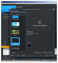
@davidedmundson yes, so without the hack I get this happening:

When using childrenRect, I believe the rectangle's height is properly adjusted for the tallest theme preview, but ends up being too short for the other ones, thereby exposing the white-backgrounded QQuickWidget that contains this QML file.

The hack unfortunately throws the root Rectangle's height property in a binding loop, but seems to be effective in both adjusting the height and not having the underlying widget exposed.

If I remove that extra rectangle (the hack) and add one unit of largeSpacing to line 24, everything works both on Arch and on Neon


(I changed the layout of Background to accommodate the qml label margins, still working on the wallpaper button tho)

src/qml/main.qml
40

i removed this extra rectangle and added large.Spacing to the height at line 24 and everything works fine both on my arch rig and on neon?

You have to install the Elarun theme because it's the only one that's considerably taller than the other themes. Elarun will then break the height for your other themes.

You have to install the Elarun theme because it's the only one that's considerably taller than the other themes. Elarun will then break the height for your other themes.

Still no problems.

filipf added a comment.EditedFeb 21 2019, 1:16 AM

You have to install the Elarun theme because it's the only one that's considerably taller than the other themes. Elarun will then break the height for your other themes.

Still no problems.

You have to try harder to reproduce it - more themes and long descriptions vs. themes with even some missing info. It's not just my install, this is from a fresh KDE Neon Dev Unstable install:

rooty added a comment.Feb 21 2019, 1:34 AM

You have to install the Elarun theme because it's the only one that's considerably taller than the other themes. Elarun will then break the height for your other themes.

Still no problems.

You have to try harder to reproduce it - more themes and long descriptions vs. themes with even some missing info. It's not just my install, this is from a fresh KDE Neon Dev Unstable install:

You're right, I can reproduce it now

rooty added a comment.EditedFeb 21 2019, 1:50 AM

The shadow's the culprit! If you add the height of the shadow (assign it an id beforehand), then there's no white bar at the bottom :D

(At least I think it is...)

rooty added a comment.Feb 21 2019, 3:01 PM

This color "hack" actually makes the rectangle's color match some kind of weird in-between color that's not in the color scheme:


It takes on a color like the Applications tab in this picture - a color that can't be found in the color scheme as far as I can tell.
The same thing happens in the SDDM KCM, so naturally none of the Kirigami theme colors fit.

Is this a bug, by the way? Or a feature?
Because it seems to, in a sense, override color scheme settings?

To be honest this kcm looks out of place when I compare it to the newer refurbished ones. The new look is quite an improvement compared to the current state but when I look at the color, window decoration kcm we have at first a big grid view and can then customize those themes by pressing the floating edit buttons which appear while hovering over them. Personally I would suggest to transfer those behavior to this kcm too to keep the uniefed design and workflow.

rooty added a comment.Feb 21 2019, 7:45 PM

To be honest this kcm looks out of place when I compare it to the newer refurbished ones. The new look is quite an improvement compared to the current state but when I look at the color, window decoration kcm we have at first a big grid view and can then customize those themes by pressing the floating edit buttons which appear while hovering over them. Personally I would suggest to transfer those behavior to this kcm too to keep the uniefed design and workflow.

I agree. But in the meantime this doesn't seem like a bad fix either. You should check out D19209 as well

To be honest this kcm looks out of place when I compare it to the newer refurbished ones. The new look is quite an improvement compared to the current state but when I look at the color, window decoration kcm we have at first a big grid view and can then customize those themes by pressing the floating edit buttons which appear while hovering over them. Personally I would suggest to transfer those behavior to this kcm too to keep the uniefed design and workflow.

I fully agree, but porting the whole KCM is outside the scope of my skills at this moment unfortunately.

P.S Pozdrav ako si naš sunarodnjak

filipf updated this revision to Diff 52249.Feb 21 2019, 10:26 PM

clean up whitespace, remove MouseArea hacks, remove the double Rectangle hack by defining height
with Units.gridUnit, add spacing below the last label, better samples value for the DropShadow

OK so down to only one hack now. If possible I'd really like to keep it because it works in 100% of the cases I tested it with and results in better visuals; don't know how to fix on the C++ side of things.

Couple of things that might be worthy of being discussed:

  1. changes to the layout of the text - @ngraham already had some suggestions, @abetts do you have some other ideas?
  2. add a dummy rectangle that would show up when there is no previewImage and that would say "Image preview not available"?
GB_2 added a subscriber: GB_2.Feb 21 2019, 10:37 PM

OK so down to only one hack now. If possible I'd really like to keep it because it works in 100% of the cases I tested it with and results in better visuals; don't know how to fix on the C++ side of things.

Couple of things that might be worthy of being discussed:

  1. changes to the layout of the text - @ngraham already had some suggestions, @abetts do you have some other ideas?
  2. add a dummy rectangle that would show up when there is no previewImage and that would say "Image preview not available"?

It could show a Kirigami Icon "view-preview" when there's no image.
Can you also change the description to not be italic?

This introduces a new warning:

WARNING: viewBackgroundColor is deprecated, use backgroundColor with colorSet: Theme.View instead

+1 on removing the italic styling. I also think bolding the title is unnecessary too while it's using its maximum size (level 1). Bolding it only seems necessary when it's closer to the size of the text below it.

I still don't like how the ColumnLayout of information causes the bottom-most items to get cut off with the default System Settings window height. I think we could consolidate some of the information, like moving the license onto one of the other lines.

Here's basically how it would look:

This introduces a new warning:
WARNING: viewBackgroundColor is deprecated, use backgroundColor with colorSet: Theme.View instead

I would use the new value, but it doesn't provide the same color as the old one. So that means it breaks the magical hack and I can't hit the sweet spot anymore by fiddling with opacity.

+1 on removing the italic styling. I also think bolding the title is unnecessary too while it's using its maximum size (level 1). Bolding it only seems necessary when it's closer to the size of the text below it.

Both of these points make sense to me, +1

I still don't like how the ColumnLayout of information causes the bottom-most items to get cut off with the default System Settings window height. I think we could consolidate some of the information, like moving the license onto one of the other lines.

It still gets cut off? Darn. Hmm OK, will have a better think about it myself as well.

filipf marked 7 inline comments as done.Feb 22 2019, 1:03 AM
filipf updated this revision to Diff 52351.Feb 23 2019, 12:34 AM

save some vertical space, don't use max line count and elision

filipf edited the test plan for this revision. (Show Details)Feb 23 2019, 12:35 AM

Getting there!

This introduces a new warning:
WARNING: viewBackgroundColor is deprecated, use backgroundColor with colorSet: Theme.View instead

I would use the new value, but it doesn't provide the same color as the old one. So that means it breaks the magical hack and I can't hit the sweet spot anymore by fiddling with opacity.

I'm not thrilled by the need to introduce new warnings in order to implement a hack. It's all a pretty stinky code smell, to be honest. :) Maybe @davidedmundson has some ideas.

Also, here are some more inline comments:

src/qml/main.qml
91

This could use a visible: website !== "" so it doesn't appear and look weird when that piece of metadata isn't available.

94

^^ Ditto

98

This is a word puzzle and will lead to bad translations because translators won't be able to figure out what ", by " refers to. The string should be like this instead:

i18n("%1, by %2 (%3)", description, authorName, license)

Of course if there's a chance any of those strings might be unset or empty, you'll need to handle that in the code or else the empty string will mess up the i18n() call.

rooty added a comment.EditedFeb 23 2019, 9:15 PM

I'm not thrilled by the need to introduce new warnings in order to implement a hack. It's all a pretty stinky code smell, to be honest. :) Maybe @davidedmundson has some ideas.

Sure. But in case he doesn't I don't think it should be dismissed - the code works (and is used elsewhere I think) and the warning's fairly innocuous.

filipf added inline comments.Feb 25 2019, 8:37 PM
src/qml/main.qml
98
you'll need to handle that in the code

How to do this? Sometimes some information really is missing so it could be an issue.

ngraham added inline comments.Feb 25 2019, 9:22 PM
src/qml/main.qml
98

Then you'll need to have separate strings based on what could be missing. For example if only the authorName could be missing, you do this:

text: if (authorname.length() === 0) {
        return i18n("%1 (%3)", description, license)
    } else {
        return i18n("%1, by %2 (%3)", description, authorName, license)
    }

If both authorName and license could be missing you'd need to add more conditions.

rooty added a comment.Feb 25 2019, 9:42 PM

Maybe we should switch tack - the other KCMs just state "Icon theme by Author" or "Cursor theme by Author" in their tooltips.
We could just do that here. "Theme by Author"

The license and email/web addresses of the author don't seem to be crucial information and we can just leave them out.
And this leaves us with Theme Name by Author, which is a simple if-else problem (if author then both else just name).
The Author's name could be made into a link (to their email address, provided they provided one).

rooty added a comment.EditedFeb 25 2019, 11:14 PM

P.S. I moved the background button to the bottom,


and I removed the vertical spacer so the label below the picture would never get cut off again (that glitch was fairly annoying and unpredictable...)

(Still working out the margins)

filipf added a subscriber: mart.Feb 28 2019, 4:29 PM

@mart could you help us out a bit please? I used code with "Kirigami.Theme.viewBackgroundColor.r", which throws out a warning that the value is deprecated. The one suggested for replacement (Theme.View) isn't the same as the deprecated one though. How bad would it be to leave the code with the deprecated value?

filipf added a comment.Apr 2 2019, 2:07 PM
In D19077#442281, @GB_2 wrote:

Ping

I've been putting this off because we couldn't quite reach consensus on the general layout. Putting it to a vote again:

A) simplistic

B) diff at its current state

FWIW I'm more in favor of B, but it needs to have the "Customize theme" heading removed (different patch).

On a minor note @GB_2 , since no senior dev has approved it, the color matching hack will probably have to go.

GB_2 added a comment.Apr 2 2019, 2:13 PM

I like B too.
BTW, can "Background:" and the background selection button be centered like in a form layout?

filipf added a comment.Apr 2 2019, 2:15 PM
In D19077#442288, @GB_2 wrote:

I like B too.
BTW, can "Background:" and the background selection button be centered like in a form layout?

Sure, we could see if that would look better. Since I know you've been doing this kind of UI work lately, would you want to continue work on D19209?

mart added a comment.Apr 2 2019, 3:04 PM

@mart could you help us out a bit please? I used code with "Kirigami.Theme.viewBackgroundColor.r", which throws out a warning that the value is deprecated. The one suggested for replacement (Theme.View) isn't the same as the deprecated one though. How bad would it be to leave the code with the deprecated value?

that rectangle should havethe attached property:
Rectangle {

Kirigami.Theme.inherit: false
Kirigami.Theme.colorSet: Kirigami.Theme.View

}

then, anywhere under this item you access Kirigami.Theme.backgroundColor and will be the background color of the view, because you defined it to use the color set for views.

GB_2 updated this revision to Diff 56266.Apr 15 2019, 4:39 AM

Prevent deprecation warning

GB_2 added a comment.Apr 15 2019, 4:40 AM
In D19077#442323, @mart wrote:

@mart could you help us out a bit please? I used code with "Kirigami.Theme.viewBackgroundColor.r", which throws out a warning that the value is deprecated. The one suggested for replacement (Theme.View) isn't the same as the deprecated one though. How bad would it be to leave the code with the deprecated value?

that rectangle should havethe attached property:
Rectangle {

Kirigami.Theme.inherit: false
Kirigami.Theme.colorSet: Kirigami.Theme.View

}

then, anywhere under this item you access Kirigami.Theme.backgroundColor and will be the background color of the view, because you defined it to use the color set for views.

This method doesn't work, I've used a different method with the correct result and no warnings now.

GB_2 accepted this revision.Apr 15 2019, 4:44 AM
ngraham accepted this revision.Apr 15 2019, 5:01 AM

All right, let's do it.

This revision is now accepted and ready to land.Apr 15 2019, 5:01 AM
GB_2 updated this revision to Diff 56268.Apr 15 2019, 5:18 AM

Try to fix diff

filipf updated this revision to Diff 56301.Apr 15 2019, 3:06 PM
  • add a dummy "No preview available" rectangle when there is no preview image
  • adjust shadows to mimick GridDelegate

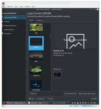
No preview thumbnail looks like this:

I think that looks great!

I think that looks great!

Thanks! Tiny problem though, the icon and the text get messed up when sddm-kcm is opened in System Settings, as opposed to standalone:

Would you happen to know what might be the cause?

filipf updated this revision to Diff 56309.Apr 15 2019, 4:14 PM

somewhat smarter code

Also the scaled down image quality isn't that great, can I use mipmap?

Also the scaled down image quality isn't that great, can I use mipmap?

No, instead set sourceSize to be the size you want it displayed at.

filipf updated this revision to Diff 56310.Apr 15 2019, 4:23 PM

set sourceSize width and height (wow that's even better than mipmap)

ngraham accepted this revision.Apr 15 2019, 5:19 PM

...And it saves memory too. :)

GB_2 updated this revision to Diff 56314.Apr 15 2019, 5:20 PM

Fix "No Preview" icon

GB_2 accepted this revision.Apr 15 2019, 5:20 PM

Now it's great.

In D19077#450746, @GB_2 wrote:

Fix "No Preview" icon

Thanks, that fixed it!

Should @GB_2 and I add ourselves as the file's authors? (never read up on how that works)

Yeah, go ahead. It's kind of a judgment call, but so much of the file is changed that I say do it. :)

filipf updated this revision to Diff 56329.Apr 15 2019, 9:39 PM

add authorship info, @GB_2 you can do the same

This revision was automatically updated to reflect the committed changes.