[GridViewKCM] improve contrast and legibility for delegates' inline hover buttons
ClosedPublic

Authored by ngraham on Feb 1 2019, 5:43 PM.

Details

Summary

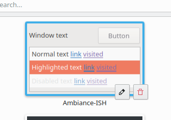
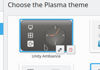
Right now the delegates' inline hover buttons can be very difficult to see, because they're
(mostly) white and don't get much background contrast. A gradient appears on the bottom of
the thumbnail on hover, which provides a bit of visual differentiation, but no real contrast.

This patch improves the situation by using real buttons (with a built-in background) instead
of toolbuttons.

BUG: 395510
FIXED-IN: 5.56

Test Plan

Diff Detail

Repository
R296 KDeclarative
Lint
Automatic diff as part of commit; lint not applicable.
Unit
Automatic diff as part of commit; unit tests not applicable.
There are a very large number of changes, so older changes are hidden. Show Older Changes

Here's 0.65 opacity instead:

GB_2 added a comment.Feb 1 2019, 5:55 PM

Here's 0.65 opacity instead:

Ok, the previous was better because you could see the red trash icon better.

Yeah, that was why I went with 0.8. :)

abetts added a subscriber: abetts.Feb 1 2019, 6:04 PM

I love that implementation. I bounced back ideas with Marco long ago about this. I think we should implement it in all other KCMs with similar representations.

I love that implementation. I bounced back ideas with Marco long ago about this. I think we should implement it in all other KCMs with similar representations.

Yep, if this patch lands, then it will apply to all of them automatically. The screenshots are just depictions of how it happens to look with the Colors KCM.

abetts added a comment.Feb 1 2019, 6:13 PM

I love that implementation. I bounced back ideas with Marco long ago about this. I think we should implement it in all other KCMs with similar representations.

Yep, if this patch lands, then it will apply to all of them automatically. The screenshots are just depictions of how it happens to look with the Colors KCM.

Looks great Nate, thanks!

ngraham edited the summary of this revision. (Show Details)Feb 1 2019, 8:56 PM
filipf added a subscriber: filipf.Feb 1 2019, 11:19 PM

There's definitely a legibility issue here. I do, however, think the gradient is a sleeker solution. The problem for me has actually been with the icons themselves. They're too scrawny and become more legible when thicker:

Especially when they're like this:

My fave solution would be to tweak the icons (maybe have special ones just for this use case) and to strengthen the gradient more. But this solution here works as well and it's not a big deal.

This is a variant of the issue we've seen with desktop icons and UI elements on the login screen: there is no way to ensure legibility against arbitrary backgrounds without a contrast-adding element of some sort, like a shadow or a flat color background There is no other way.

Now, that doesn't mean that the contrast element needs to be a horizontal bar at the bottom of the delegate like I've got it here. @andreask posted a mockup of something that looked pretty nice to me:

But there has to be some contrast-adding element, or else it is inevitable that the icon will be illegible with some backgrounds.

^ I agree, I really like that emblems solution now that I've seen it.

ndavis added a subscriber: ndavis.Feb 1 2019, 11:45 PM
ngraham planned changes to this revision.Feb 2 2019, 3:36 AM

I'll work on that.

ngraham updated this revision to Diff 50869.Feb 4 2019, 6:03 PM

Use round buttons in the corner rather than an inline toolbar

abetts added a comment.Feb 4 2019, 6:05 PM

Use round buttons in the corner rather than an inline toolbar

What does it look like now?

ngraham edited the test plan for this revision. (Show Details)EditedFeb 4 2019, 6:07 PM

Use round buttons in the corner rather than an inline toolbar

What does it look like now?

Test Plan section updated with new screenshots. :)

abetts added a comment.Feb 4 2019, 6:11 PM

Use round buttons in the corner rather than an inline toolbar

What does it look like now?

Test Plan section updates with new screenshots. :)

That looks very interesting. Very Android in the way that the buttons are laid out. I like them. I think it is a good direction. It may be a bit rough, I will propose some examples along this idea.

GB_2 added a comment.Feb 4 2019, 6:17 PM

What if the buttons just looked normal and not so big and not as circles?

abetts added a comment.Feb 4 2019, 6:20 PM

Just some variations on Nate's idea:

https://dribbble.com/shots/4981650-Floating-Button-Micro-Interaction

https://dribbble.com/shots/2619684-Expense-Floating-Button

The floating buttons is a very Android-unique feature. Not sure we are copying that if we utilize something similar. But I think it is very effective. It keeps the action buttons where the actions are happening. This also reminds me of the way that the mobile version of pinterest works.

In D18649#405091, @GB_2 wrote:

What if the buttons just looked normal and not so big and not as circles?

With regular-sized square buttons:

GB_2 added a comment.Feb 4 2019, 6:43 PM
In D18649#405091, @GB_2 wrote:

What if the buttons just looked normal and not so big and not as circles?

With regular-sized square buttons:

Maybe twice as big buttons on the bottom right?

Not sure I catch your meaning, sorry. How big should the square buttons be? I kinda like them at that size TBH. Gwenview also has inline square hover buttons like this and it's fine.

GB_2 added a comment.Feb 4 2019, 7:15 PM

Not sure I catch your meaning, sorry. How big should the square buttons be? I kinda like them at that size TBH. Gwenview also has inline square hover buttons like this and it's fine.

Ok, but can we put them on the bottom right?

Like this? Or fully contained within the thumbnail?

GB_2 added a comment.Feb 4 2019, 7:21 PM

Like this? Or fully contained within the thumbnail?

This is good!

GB_2 added a comment.EditedFeb 4 2019, 7:23 PM

Now that I think about it though, the buttons overlap the label if the label text is long...

Nah, it's actually fine:

GB_2 added a comment.Feb 4 2019, 7:26 PM

Nah, it's actually fine:

Oh, ok, then it's fine!

ngraham edited the summary of this revision. (Show Details)Feb 4 2019, 7:26 PM
ngraham updated this revision to Diff 50879.Feb 4 2019, 7:28 PM

Use square buttons and put them on the bottom right, not the top right

abetts added a comment.Feb 4 2019, 7:31 PM

Use square buttons and put them on the bottom right, not the top right

The functionality seems great! We might need to do more padding with labels. Is there any way we can style the buttons in different ways? Colors, shades, etc? I don't mind the square but doesn't look very good when it uses regular breeze colors.

ngraham edited the test plan for this revision. (Show Details)Feb 4 2019, 7:33 PM
GB_2 added a comment.Feb 4 2019, 7:34 PM

I think it looks good.

I like this version because it feels slightly more conventional with the square-ish KDE-style buttons. A blend of old and new, so to speak. It says, "I may be modern and sleek, but I'm still a powerful KDE app, not some garbage mobile UI inappropriately applied to the traditional desktop you know and love."

At least, that's what it says to me. :)

ngraham edited the summary of this revision. (Show Details)Feb 4 2019, 7:35 PM
abetts added a comment.Feb 4 2019, 7:39 PM
In D18649#405162, @GB_2 wrote:

I think it looks good.

I was thinking of dark buttons mostly. Something along these lines\

https://dribbble.com/shots/5204192-Buttons-Dark

I think the breeze default color is just too close to white, the contrast with regular buttons is pretty low IMHO.

I was thinking of dark buttons mostly. Something along these lines\

https://dribbble.com/shots/5204192-Buttons-Dark

I think the breeze default color is just too close to white, the contrast with regular buttons is pretty low IMHO.

  1. If there's a problem with Breeze colors, we should fix it there rather than working around this in downstream software
  2. If anything I think the gray color used for our button backgrounds is too dark, not too light. Right now it's the exact same color as the window background. Most other color schemes make buttons a bit lighter, and I think that looks better in general
  3. The only elements that use a dark background with the Breeze light theme are tooltips; making only these buttons dark would be inconsistent with every other button in every other piece of KDE software

Can we put the buttons at least fully inside the frame? With the boxes halfway outside it looks weird imho

abetts added a comment.Feb 4 2019, 7:50 PM

I was thinking of dark buttons mostly. Something along these lines\

https://dribbble.com/shots/5204192-Buttons-Dark

I think the breeze default color is just too close to white, the contrast with regular buttons is pretty low IMHO.

  1. If there's a problem with Breeze colors, we should fix it there rather than working around this in downstream software

I disagree on this point. I feel the problem we experience is the belief that breeze colors should be slapped on every element on the desktop. There is nothing wrong with Breeze colors, but we should allow for variations within without thinking that Breeze needs to change. I am suggesting that we can make these buttons show more contrast by "not" using the main gray breeze color as the background for them. Instead we use something a little more subtle and that can help our line-art icons stand out. You proposed a really good idea of floating buttons but we have bumped into the same problem we did before, that the contrast of these buttons is not great.

  1. If anything I think the gray color used for our button backgrounds is too dark, not too light. Right now it's the exact same color as the window background. Most other color schemes make buttons a bit lighter, and I think that looks better in general
  2. The only elements that use a dark background with the Breeze light theme are tooltips; making only these buttons dark would be inconsistent with every other button in every other piece of KDE software

And to the user, what does this mean? I think it means something to us, but not necessarily them. I don't see users saying, "OMG, this button is dark, not light, that color belongs in tooltips... KDE is so inconsistent..." To me, what works here is practicality. By trying to align the concepts to the rest of the desktop environment, we are limiting ourselves from providing good contrast and practical functionality.

Here's how the buttons look when placed fully inline and with the color scheme inverted:

I have to admit, it ain't half bad.

abetts added a comment.Feb 4 2019, 8:10 PM

Here's how the buttons look when placed fully inline and with the color scheme inverted:

I have to admit, it ain't half bad.

Thank you for trying it out Nate. I appreciate your willingness to take turns in our thinking.

I agree, it doesn't look bad. If it was placed the way you proposed, at the top right, or bottom right, a little over the image frame, it would stand out even more. Either way works for me.

GB_2 added a comment.Feb 4 2019, 8:11 PM

Here's how the buttons look when placed fully inline and with the color scheme inverted:

I have to admit, it ain't half bad.

I still think it looks better if it follows the color scheme.

abetts added a comment.Feb 4 2019, 8:12 PM
In D18649#405209, @GB_2 wrote:

Here's how the buttons look when placed fully inline and with the color scheme inverted:

I have to admit, it ain't half bad.

I still think it looks better if it follows the color scheme.

Why do you think that? Context?

GB_2 added a comment.Feb 4 2019, 8:15 PM
In D18649#405209, @GB_2 wrote:

Here's how the buttons look when placed fully inline and with the color scheme inverted:

I have to admit, it ain't half bad.

I still think it looks better if it follows the color scheme.

Why do you think that? Context?

For the reasons @ngraham gave.
It just doesn't look right IMO.

I want to point out that the original problem was not that the buttons lacked contrast, but that the icons were illegible with a variety of thumbnail contents. This problem is 100% solved by using a real button with background that uses the system color scheme in some capacity (theme-following or inverted). Whether the button backgrounds should be theme-following or inverted is an aesthetic judgment, not a usability one.

abetts added a comment.Feb 4 2019, 8:21 PM

I want to point out that the original problem was not that the buttons lacked contrast, but that the icons were illegible with a variety of thumbnail contents. This problem is 100% solved by using a real button with background that uses the system color scheme in some capacity (theme-following or inverted). Whether the button backgrounds should be theme-following or inverted is an aesthetic judgment, not a usability one.

Exactly. My argument is to support the direction for usability purposes and add an aesthetic element that helps contrast. I think others in the discussion want to stop at the usability fix, I want to push that a little more and add the aesthetic element.

The dark inline buttons entirely within the thumbnail are growing on me. I'll sleep on it.

Round buttons looked nice, but the square buttons fit in a lot more with Breeze.

As for the color, in a vacuum I think the dark buttons look better, but contextually they feel weird to me as well. We're used to everything following the color scheme.

Inline vs. vertical offset seems like a tomayto tomatoh thing. The offset does seem a bit snazzier a bit though, but I don't seem to able to articulate why exactly.

To me, having the buttons slightly escape the bounds of the thumbnail looks good with light buttons, but dark buttons look good when contained completely within the thumbnail. I can't quite put my finger on why it feels this way to me.

I think it looks better slightly off the edge of the item and I agree that if its on the item its looks much better with the shaded bar under it. To improve the contrast we could make the button our highlight color when hovered.

One thing I will not do in this patch is synthesize a fake button that has different behaviors from the standard button. If there's a problem with our buttons we need to fix it everywhere, not work around it here (and elsewhere).

Here are our two options:

Maybe we should just take a vote.

abetts added a comment.Feb 5 2019, 4:57 AM

One thing I will not do in this patch is synthesize a fake button that has different behaviors from the standard button. If there's a problem with our buttons we need to fix it everywhere, not work around it here (and elsewhere).

Here are our two options:

Maybe we should just take a vote.

Both are very compelling, I must say! I like version 1 better.

GB_2 added a comment.Feb 5 2019, 2:45 PM

One thing I will not do in this patch is synthesize a fake button that has different behaviors from the standard button. If there's a problem with our buttons we need to fix it everywhere, not work around it here (and elsewhere).

Here are our two options:

Maybe we should just take a vote.

I like version 2 best, I think the contrast is good enough.

bruns added a subscriber: bruns.Feb 5 2019, 5:41 PM

The inline version looks a little bit more polished, while the other one looks literally "just put on top". The "button" version though somewhat resembles the "selection" buttons/emblems in dolphin.

There is a very tiny issue with the button version, although the buttons do not overlap, they do touch the text, at least for any full height characters ("l,i,t,k, ...").

Yeah, the dark version has grown on me too. I'm going to go with that for now. The diff is smaller too.

ngraham updated this revision to Diff 50976.Feb 5 2019, 6:17 PM

Go with the dark version

ngraham edited the summary of this revision. (Show Details)Feb 5 2019, 6:19 PM
ngraham edited the test plan for this revision. (Show Details)
Codezela added a subscriber: Codezela.EditedFeb 5 2019, 6:22 PM

how about make it global under the view
beside add image button aligned left
two buttons disabled by default

how about make it global under
beside add image button aligned left
tow buttons disablef by default

No, that was the old design we moved away from. The new thing is inline buttons.

another option we put the delete button only
and align it to the corner of the thumbnail
make it circle button
and ditch the other one
no need for it here
what do u think

The buttons are dynamic and are chosen by the individual KCM; what you propose would be out of scope even if it were possible.

I think we're going to stay with this basic design.

GB_2 added a comment.EditedFeb 5 2019, 6:34 PM

Well, I really don't like that this is the only thing that has dark buttons. It is inconsistent and just looks out of place. We should probably do some more discussion elsewhere if we want do this in other places too. The contrast will probably be good enough anyways when we follow the color scheme.

Well, this view is used in a lot of different places, so it's not like only one thing does it this way now.

But we could do it in Gwenview too, which has the same basic UI but uses light buttons. Also maybe we could think about adjusting Dolphin's selection marker UI to match it.

Or we could just use frikkin' light buttons. :)

GB_2 added a comment.Feb 5 2019, 6:39 PM

Or we could just use frikkin' light buttons. :)

I think dark buttons just draw too much attention and doesn't really fit. When using the colorscheme the contrast of the button icons should still be good, since there is a solid background.

Now that I think about it, Elisa also has a variant of this UI that would be much better if it adopted this visual style, and i think that one would look good with dark buttons too.

Actually there is a real issue here. Disabled button icons are much less legible with the dark version. The enabled version of the delete button is less legible too (red-on-black vs red-on-gray) I think we need to go with the version that 100% follows the color scheme instead of always being dark.

ngraham updated this revision to Diff 50982.Feb 5 2019, 7:42 PM

Use theme-following version for various reasons

ngraham edited the summary of this revision. (Show Details)Feb 5 2019, 7:45 PM
ngraham edited the test plan for this revision. (Show Details)
GB_2 accepted this revision.Feb 5 2019, 8:24 PM

Very nice!

This revision is now accepted and ready to land.Feb 5 2019, 8:24 PM
ndavis accepted this revision.Feb 5 2019, 8:33 PM

+1 I think this is a fine tradeoff between aesthetics and usability

ngraham updated this revision to Diff 50990.Feb 5 2019, 8:37 PM

Reverse the order of clicking and triggering, since it looks a bit nicer this way

This revision was automatically updated to reflect the committed changes.
leinir added a subscriber: leinir.May 2 2019, 8:53 AM
leinir added inline comments.
src/qmlcontrols/kcmcontrols/qml/GridDelegate.qml
147

Just came across having both a function called on clicking the thumbnail (using the onClicked handler) and on actions being triggered, and both now get triggered at the same time. Was this a deliberate choice? I can of course work around it by not using the onClicked handler and just putting a click handler into the thumbnail delegate, but it seems like this is the sort of thing the GridDelegate is supposed to avoid :) (for my purposes: clicking the thumbnail opens a page with detailed information about the item represented by the thumbnail, and clicking the action causes things to be done to the item without opening that page).

ngraham added inline comments.May 2 2019, 3:57 PM
src/qmlcontrols/kcmcontrols/qml/GridDelegate.qml
147

This was a deliberate choice, to make sure that the delegate got selected when one of its buttons got clicked. But yeah selected may not necessarily require clicked, so maybe it wasn't the best way of doing it. If you can think of a better way to ensure that, then by all means, please don't hesitate to send a patch!

leinir added inline comments.May 2 2019, 6:43 PM
src/qmlcontrols/kcmcontrols/qml/GridDelegate.qml
147

Right! That makes sense, yes - i'll try and work out if we can't get that done with a few less side effects :)