Purely cosmetic UI fixes
ClosedPublic

Authored by mart on Mar 7 2019, 2:56 PM.

Details

Summary
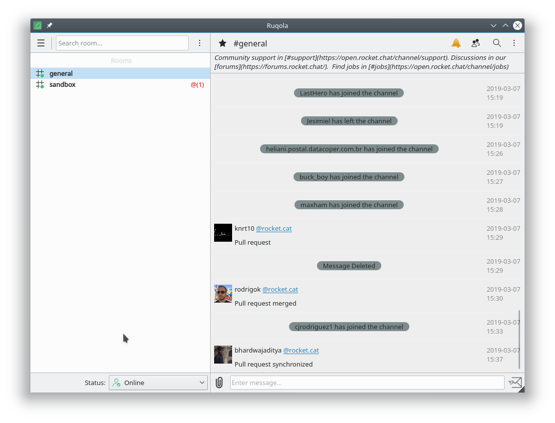
  • use the top automated toolbars, which will now be alwaysin toolbar mode, even in mobile mode
  • search field in the top toolbar
  • menu for adding rooms and channels on the channels list page, as is in the "global" context and not of the selected room
  • online combo in a bottom statusbar
  • channel title and favorite button on the top toolbar
  • all toolbar buttons, out of header, in the toolbar
  • the header component only has the topic and the optional user list
  • bottom of the channel page in a toolbar with the same height of the channels bottom toolbar byu default (if there are messages it will

grow vertically)

  • no padding for the channel page: so things get "cut" by toolbar separator lines rather than being cut into nothingness
Test Plan

Everything functions the same, all action that have been moved still trigger correctly

Diff Detail

Repository
R865 Ruqola
Lint
Automatic diff as part of commit; lint not applicable.
Unit
Automatic diff as part of commit; unit tests not applicable.
mart requested review of this revision.Mar 7 2019, 2:56 PM
mart created this revision.
mart added a comment.Mar 7 2019, 2:57 PM

Before:

After:

ngraham added a subscriber: ngraham.Mar 7 2019, 3:02 PM

Wow, this is a huge improvement for sure!

The only thing that I'm not sure about is the location and positioning of the status combobox. Something about it being right-aligned with a bunch of whitespace on the left just feels odd to me. Left aligned or wider might feel better.

rooty added a subscriber: rooty.Mar 7 2019, 3:05 PM

Way prettier with these changes, +1
Ditto on the Status box, alignment with the left window border seems preferable.

abetts added a subscriber: abetts.Mar 7 2019, 3:18 PM

I would probably remove the circle around the system messages and place it in the messages themselves.

ognarb added a subscriber: ognarb.Mar 7 2019, 3:33 PM
ognarb added inline comments.
src/apps/qml/RoomsComponent.qml
81

You could use an ActionTextField instead, with a clear action ;)

Very nice! I like it :) Thanks a lot :)

mart updated this revision to Diff 53374.Mar 7 2019, 4:24 PM
  • page titles
  • left align the combobox
mart added a comment.Mar 7 2019, 4:25 PM

combobox left aligned

mlaurent accepted this revision.Mar 7 2019, 4:35 PM

Thanks :)

This revision is now accepted and ready to land.Mar 7 2019, 4:35 PM

I would probably remove the circle around the system messages and place it in the messages themselves.

+1, I think this would be nice. Right now those are a bit distracting in the message list pane.

mart added a comment.Mar 7 2019, 5:35 PM

I would probably remove the circle around the system messages and place it in the messages themselves.

+1, I think this would be nice. Right now those are a bit distracting in the message list pane.

tough unrelated, will leave it to Laurent :)

btw for now, is this good to go?

ngraham accepted this revision.Mar 7 2019, 5:40 PM

I'd say so!

This revision was automatically updated to reflect the committed changes.