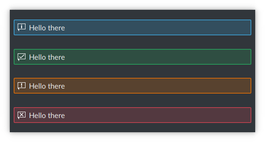
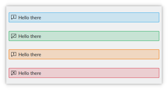
This patch tints both the icon and text colors of inline messages in order to achieve more appealing visuals.
Diff Detail
Diff Detail
- Repository
- R169 Kirigami
- Branch
- tinted-inline-message (branched from master)
- Lint
No Linters Available - Unit
No Unit Test Coverage - Build Status
Buildable 8570 Build 8588: arc lint + arc unit
Comment Actions
I'm not in favor of this at all in its current form. Any tinting of the text with the background color under it reduces legibility. I'm as in favor of aesthetically appealing user interfaces as anyone, but not at the expense of usability.
A smaller degree of tint for the text might work, but then it just becomes closer to the base color and what's the point? Alternatively, tinting just the icon might work though.
Comment Actions
Also as @mart pointed out in D19044, it might make sense to do all the styling in the qqc2 desktop style theme for this control, rather than here in Kirigami itself.
Finally, I'm requiring that any change to this control be mirrored in the QWidgets version too (KMessageWidget in KWidgetsAddons): https://cgit.kde.org/kwidgetsaddons.git/tree/src/kmessagewidget.cpp. I put a lot of work into harmonizing their visual styles and I don't want them to drift subtly out of sync again. :)
Comment Actions
You're right, let's not pursue this further at this point. Bit of more than I could chew anyway! But if anyone would be interested in doing something like this in the future, feel free to commandeer the revision.