Works for me, can't find any regressions, and the code looks clean.
Feed Advanced Search
Jul 9 2018
Jul 9 2018
Require out-of-source build
ngraham added a comment to D13988: Use subseq matching for service runner.
plasma-workspace does compile without D13670 and KRunner seems to work, but it gives me a whole lotta console spew:
ngraham updated the summary of D12872: ScalableTest, add "scalable" plasma-browser-integration.
ngraham requested review of D14003: Require out-of-source build.
This fixes B262837 (how do you show this in phab?) and relies on D13670
ngraham added a comment to D13967: Remove FileItemActionPlugin.
Is there/should there be any provision to remove it if it's already installed? Or is that something that distros should/would/will take care of for us? If not, I worry that people with KDE Connect already installed will see duplicates.
Jul 8 2018
Jul 8 2018
ngraham added a reviewer for D13937: Update formulas and add option to change grid thickness: Plasma.
ngraham added a comment to T9153: Global shortcuts.
I might recommend Ctrl+← and Ctrl+→ to go to the previous and next songs instead of or in addition to the PgUp and PgDn keys.
ngraham added reviewers for D13970: Handle empty preview lists: gregormi, nicolasfella, dhaumann, Frameworks.
ngraham updated the diff for D13768: Modernize View Properties window.
Use Dolphin::VERTICAL_SPACER_HEIGHT instead of a hardcoded value
Jul 7 2018
Jul 7 2018
Do you have commit access yet?
ngraham requested changes to D13930: [KdePlasma-addons][POTD]{SIOD} Added new provider SIOD to handle Images from Space.com.
No name shows up in the list:
ngraham added a comment to T9126: Breeze scrollbar look-and-feel unification.
Ok, that's fine. So our two scrollbar style options are basically:
ngraham added a comment to D13868: [KdePlasma-Addons/POTD/NOAA] Fixed the web address and fetched the picture from new address.
Nice, works for me!
ngraham added a comment to T8703: IDEA: Make warning messages wider. Place top/bottom.
There are three use cases for these kinds of inline messages:
- An error, warning, or informational message regarding user input for a specific control (e.g. the Konsole example you started out with)
- A transient or semi-transient message showing either general program status or the result of a command (e.g. number of results in a Kate search, URL of a shared image in Spectacle)
ngraham added reviewers for D13921: Don't show confirmation dialog for Trash action by default: Frameworks, Dolphin.
The actual code change looks sane and fixes the bug.
ngraham added a comment to D13921: Don't show confirmation dialog for Trash action by default.
There's a problem with the git setup on the computer you used to make this commit; the name field appears to be empty, so I get an error when I try to apply the patch:
ngraham added a comment to D13901: Touch support for Gwenview.
libinput debug-gui shows that my touchpad and touchscreen can both can see two, three, and four finger swipes, two-finger pinches, two-finger rotation, and two finger scrolling.
ngraham updated the test plan for D13768: Modernize View Properties window.
ngraham updated the diff for D13768: Modernize View Properties window.
Add a label to help people understand what the metadata list is for
ngraham added a comment to D13768: Modernize View Properties window.
Like this?
Jul 6 2018
Jul 6 2018
ngraham updated the diff for D13768: Modernize View Properties window.
Merge master and shorten a string
ngraham added a comment to D13880: [KMoreTools] Reduce menu hierarchy.
Sounds good to me! It sounds like we're all in agreement?
Yeah, I had to create a new account to get it to happen. If this happens in Neon too, it's not Kubuntu-specific, so let's track the upstream bug report instead. Thanks everyone!
ngraham accepted D12961: Updated alignment, keylines, messures to new radio button layout and the new qml formlayout.
Thanks for your patience on this!
ngraham added a comment to D13901: Touch support for Gwenview.
Sounds good. You don't need to post a new diff; just make your changes and update the current one with arc diff (Thanks for using arc, by the way!)
Modernize Settings window
ngraham added a comment to D12571: Modernize Settings window.
Thanks! If you're not totally sick of my UI changes yet, there's also D13768: Modernize View Properties window. ;-)
ngraham requested changes to D13901: Touch support for Gwenview.
Thanks for the patch! I've got touch hardware and am excited to test this out. I should be able to do that within the next day. In the meantime, I noticed some style issues with your code, which I've pointed out below. Here's some light reading on the subject: https://techbase.kde.org/Policies/Frameworks_Coding_Style
Jul 5 2018
Jul 5 2018
This was fixed upstream with https://cgit.kde.org/plasma-workspace.git/commit/?id=ee48796ec5561f540ed8b328a302e44b4364a234
ngraham added a comment to T8604: Double trash on desktop - 18.04 release.
Actually, cannot reproduce in Neon.
Adding a few others because I think this is something that if changed, should be changed in quite a few other places, so let's make sure relevant folks are aware and approve.
ngraham updated the diff for D12571: Modernize Settings window.
Preserve alphabetical sorting of local includes
ngraham committed R266:a3588fca59b2: Use the broom-style icon for edit-clear-all too (authored by ngraham).
Use the broom-style icon for edit-clear-all too
ngraham committed R266:0ec7404f82a0: Use a broom-style icon for edit-clear-history (authored by ngraham).
Use a broom-style icon for edit-clear-history
ngraham committed R266:e641628d90e8: Revert "BUG 391855 update clear icon with broom" (authored by ngraham).
Revert "BUG 391855 update clear icon with broom"
ngraham added a reverting change for R266:8786b5020599: BUG 391855 update clear icon with broom: R266:e641628d90e8: Revert "BUG 391855 update clear icon with broom".
Jul 4 2018
Jul 4 2018
Verified that the Information Panel still works. :)
ngraham added a comment to T9126: Breeze scrollbar look-and-feel unification.
Globally.
ngraham added a comment to D13880: [KMoreTools] Reduce menu hierarchy.
If it's important for uninstalled tools to be not always be visible, maybe what we should do is embed the content of the KNewStuff menu in Spectacle rather than exposing the whole thing as a sub-menu. Then we could make a few string changes, and it would be like this in Spectacle:
ngraham added a comment to D13834: Allow playlist to be hidden.
Yes, unfortunately Lollypop recently added a global playlist and I've struggled to adapt to it. :/ I'm addicted to its auto-fetching lyrics display though.
ngraham added a comment to T7523: Product Manager.
ngraham added a comment to T8608: Dummy download icons in Firefox - 18.04 release.
Thanks! Now we investigate the issue and try to find a fix. :)
Thanks, works as expected and I couldn't find any regressions. Code looks good.
ngraham added a comment to T7523: Product Manager.
ngraham added a comment to D13834: Allow playlist to be hidden.
Agreed. Whether you want the global playlist visible is probably a pretty good indication of your preferred style. Perhaps when the global playlist is hidden we could also hide the Enqueue button and make the Replace and Play button just say "Play."
ngraham updated subscribers of D11897: Expose group information to Dolphin's Information panel, tooltips, etc.
After investigating, it looks like this failure may be an installation issue on the build machine. The test is failing there because the new group property is inappropriately visible, but the approved change expressly covered this case by adding it to the baloofileinformationrc blacklist and bumping the version, which should have had the effect of not making the property visible. I suspect baloofileinformationrc did not get updated on the build machine the way it did on my local machine, where the test passes.
ngraham added a comment to D11897: Expose group information to Dolphin's Information panel, tooltips, etc.
Oooh darn, for some reason I've missed these test failures in baloo-widgets, sorry! Will fix.
ngraham added a comment to D13834: Allow playlist to be hidden.
Since global playlist vs non-global-playlist seems to be cardinal UI design decision in music players, let me explain why I personally prefer the non-global-playlist approach:
ngraham added a comment to D13582: ScrollBar overlay theme aware..
ngraham added a comment to D13880: [KMoreTools] Reduce menu hierarchy.
ngraham added a comment to D13880: [KMoreTools] Reduce menu hierarchy.
Or even this:
ngraham added a comment to D13880: [KMoreTools] Reduce menu hierarchy.
You are the most awesome person in the world today.
Jul 3 2018
Jul 3 2018
ngraham updated the task description for T9113: Decide how to implement pinning (and related) in taskmanager / plasma.
ngraham added a comment to D13860: Fix typos in docbook.
You learn something every day, I didn't even know about this &; trick!
ngraham added a comment to T8604: Double trash on desktop - 18.04 release.
Can confirm. :(
ngraham added a comment to D13777: KMessageWidget : revert to using highlight colour for Information style.
ngraham added inline comments to D12571: Modernize Settings window.
ngraham updated the diff for D12571: Modernize Settings window.
Keep #includes alphabetically ordered and use a global for the 18px spacer height
ngraham added a comment to D13745: Implement support for virtual desktops on Wayland.
ngraham added a comment to T8693: Make Kubuntu Compliant with KDE's Privacy Policies.
@raddison what is the actionable path forward here?
ngraham added a comment to D13766: fixed picture scaling issues in epub generator.
Regular DPI screen with no scaling for me.
ngraham requested changes to D13777: KMessageWidget : revert to using highlight colour for Information style.
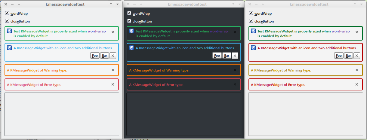
ngraham added a reviewer for D13777: KMessageWidget : revert to using highlight colour for Information style: VDG.
Jul 2 2018
Jul 2 2018
+1 visually. Sadly @hpereiradacosta stepped down as Breeze maintainer recently, but since he's already given his stamp of approval, I think this can go in.
ngraham added a comment to D12040: Add wallpaperplugin.knsrc + QML function to open GHNS dialog.
What's the status of this? Any progress toward resolving the outstanding TODO? Would be nice if we can get it in for 5.14 alongside the effort to clean up GHNS a bit.
ngraham added a comment to D13813: Make this test work again with new uds implementation.
FWIW, I'd be okay with bumping the minimum KIO version to 5.47 in master.
Jul 1 2018
Jul 1 2018
ngraham added a comment to D13834: Allow playlist to be hidden.
Very nice! You'll lure me away from Lollypop yet. :)
ngraham added a comment to T8607: Faulty text rendering on file drag - 18.04 release.
Too late, somebody else already filed it: https://bugs.kde.org/show_bug.cgi?id=395618
ngraham added a comment to D12162: Add support for touch scrolling in Dolphin.
It would be really nice to have eyes from some more Dolphin folks on this. :)
ngraham added a comment to D13643: Add LabPlot project file icon.
ngraham added a comment to D13826: Support activities when opening files.
Gotta remove the link, sorry. :) It just needs to be plain old FEATURE: 395954.
ngraham added reviewers for D13826: Support activities when opening files: KTextEditor, cullmann, dhaumann.
Thanks for the patch! Can you change Fixes #395954 to FEATURE: 395954? See https://community.kde.org/Infrastructure/Phabricator#Formatting_your_patch
Add AppStream metadata
Jun 30 2018
Jun 30 2018
ngraham accepted D13805: Present error dialog when user tries to create directory named "." or "..".
Nice, I think this is looking great. +1 on the latest wording. A lovely first patch!
ngraham added a comment to D13772: Add AppStream metadata.
Thanks! @pino?
ngraham added a reviewer for D13805: Present error dialog when user tries to create directory named "." or "..": Frameworks.
ngraham added a comment to D13804: [KRecentDocument] Consider duplicate entries only based on path, not launched app.
What you say theoretically makes sense, but try it out: the document appears in the Recent Documents menu for both Kate and KWrite, while multi-app aggregator UIs continue to not accumulate duplicates.
Thanks for the patch! Conceptually, this makes sense to me. Can you attach some before-and-after screenshots showing the impact of the change?
ngraham added reviewers for D13808: Fix KMainWindow saving incorrect widget settings: KDE Applications, dfaure, elvisangelaccio, broulik, cfeck.
The bug report indicates that this patch is for adapting to a change in Qt 5.11. Is this patch fully backwards-compatible with older Qt versions? If not, we'll need to guard this behind a Qt version check.
ngraham added a comment to D13766: fixed picture scaling issues in epub generator.
@aacid, can you offer any guidance here regarding how we might move forward?
ngraham added a comment to D13810: [effects] Rewrite the Dialog Parent effect.
Interesting! In your "after" video, I notice that the dialog still somewhat awkwardly moves behind its parent window for a moment after you click on the Discard button. Is there any way to improve upon that too?