Checkboxes in mixed-control layouts
Closed, ResolvedPublic

Description

Our new control layout style has labels on the left, and vertically-aligns all the controls:

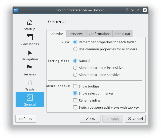
This generally works well for all controls except for checkboxes, because our checkboxes have their labels on the right. If we try to force checkboxes into this paradigm, we wind up with awkwardness like this (from D12571):

The problem with this style is that it puts an awkwardly large amount of whitespace on the left side of checkboxes--especially in layouts that have several checkbox controls together. We feel compelled to put something in that whitespace by giving the first checkbox a left-aligned label to act as a bastardized section header, which is kind of abusing the system. It's also a bit weird on pages that have nothing but checkboxes:

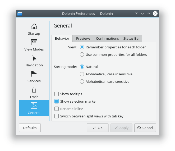
For pages that have nothing but checkboxes, I propose that we don't change anything, and we let the checkboxes span the full width of the page, as they currently do.

For mixed-control layouts, I see a few options--along with their disadvantages:

Option 1: Stop putting a fake section header on the left side of the first checkbox


Disadvantages:

  • Awkward amount of whitespace on the left side

Option 2: move the label to the left side


Disadvantages:

  • Very restrictive regarding label length
  • Hugely excessive amount of whitespace on the left side
  • Makes the layout look very right-side-heavy

Option 2 also shows us the challenges we'll face if we ever move to an "Instant Apply" paradigm and use Switches instead of Checkboxes, since Switches always have their labels on the left.

Option 3: abandon the style for checkboxes in mixed-control layouts


Disadvantages:

  • Just looks weird and awkward
  • Doesn't work well for checkboxes in the middle of a layout; there would be vertically aligned controls above and below them

Other options and thoughts?

ngraham created this task.Jun 17 2018, 2:30 PM
ngraham renamed this task from Checkboxes in midex-control layouts to Checkboxes in mixed-control layouts.

I'd like to suggest an alternative style, somewhat like what a lot of GTK apps do: Use bold heading labels and pad the widgets belonging to those. In fact, you could even just make breeze group boxes visually present itself like that without needing to adjust things for every application.

I think we are forgetting one thing that was present in the KCM redesign mockups and we are not applying to this discussion.

  1. Labels on the left need to be action verbs
  2. Descriptions on the right are a continuation of the sentence

We are sticking to what was already there and see if it works on the new design. My take is that the new design is fine, but we are not working on the labels as much.

For example:

Sorting Mode [X] Natural, Alphabetical, Case Sensitive

Can be:

Sort Files [X] Naturally, Alphabetically, Case Sensitive

General [X] Show tooltips, show selection marker, rename inline, switch between split view with tab key

Can be:

Show: [X] Tooltips, Selection Marker

Change file names: [X] Rename inline
Switch Split View: [X] Using Tab Key

I would also be in favor of using Bold font for the section headers, even split lines

I hope it makes sense, the rendering is not amazing here.

@medhefgo

I really like that! But how well does it work in layouts that don't have group boxes, or that have mixed controls within each section, or that doesn't really have distinct sections, or where the window is always very wide (e.g. in System Settings)?

@abetts

The problem with trying to form a sentence with the labels is that it often doesn't work once you localize it, because languages have different word ordering. Another issue is that if you're trying to give every checkbox a left label, what do you do when several of them would have the same label? If you only give the top one a label, it runs into a problem for any subsequent ones that don't re-use that label. For example I think this looks weird:

             Show: [X] Tooltips
                   [ ] Selection Marker

Change file names: [X] Rename inline
Switch Split View: [X] Using Tab Key

But if you give them all a label, then you get duplicated text on the left which also doesn't look great:

             Show: [X] Tooltips
             Show: [ ] Selection Marker

Change file names: [X] Rename inline
Switch Split View: [X] Using Tab Key

I see what you mean. I agree. The sentences don't always lend themselves to the layout. In this instance, let's not be afraid of having no label and leaving a set of hanging checkboxes, because in the end, the natural grouping will help the user understand what the settings are about. In this case I would suggest using something like:

General
Miscellaneous
More settings
Other settings

To add an emphasis that they are not belonging to the rest of the groupings, let's use a separator line.

Let's keep the current semantics around it, take David's suggestion to use bold font and use separator lines for each section.

@ngraham KWin's "Window Manager Settings" -> Actions (and some others) gives you an idea how it would look.

I have to say I kind of prefer that... I think it may be better than our current "labels always on the left" idea. I've run into a lot of trouble implementing it with Dolphin.

Jan, if I'm understanding correctly, the major differences between what we're already working towards and what you're proposing is:

  • We would never have left labels for radio buttons and checkboxes; instead, we would always use bold section headers above them
  • Everything would be slightly indented underneath the bold section headers

Is that correct?

Yes and no, I guess.

I think it is very much a per-case decision whether to try labels vs formlayout. There are situations where a formlayout looks better and other cases where it looks odd/forced. Though, I would say that labels ought to be preferred, but formlayouts be encouraged where it leads to a cleaner look (mostly where there is a heavy mix off different widgets, especially linedits).

zzag added a subscriber: zzag.Jun 17 2018, 8:29 PM

Here's Dolphin's Startup page (roughly) converted to that style:

I am of the opinion that the startup page doesn't really need any changes since the checkboxes and the groupbox already provide a nice visual separation. But the label headers style certainly looks way better than the proposed formlayout and has the nice side effect of getting rid of that extra "Location:" label.

On that note: I don't think these headers should have colons.

Here's Dolphin's Startup page (roughly) converted to that style:

While this one lends itself better for this format, let's strive to use left aligned labels with centered controls. This version can also be part of the overall design.

Proceeding with the labels-on-the-left approach. IMHO it's hugely improved by increasing the spacing between sections.

I still find myself somewhat attracted to the labels-on-top-with-controls-indented style for another reason: there's no visual inconsistency with views that include or exclusively contain controls like list boxes and checkboxes that generally resist or look bad with left labels. The alignment doesn't change at all based on the presence or absence of any left labels because there are always none.

ngraham closed this task as Resolved.Jul 6 2018, 11:32 AM