In D22359#536055, @ngraham wrote:Is there any way we can preserve the original goal of using a monochrome icon here for small sizes?
Feed Advanced Search
Sep 22 2019
Sep 22 2019
ndavis added a comment to D22359: Revert "[showdesktop][minimizeall] Reduce the maximum panel icon size".
ndavis added a comment to D22359: Revert "[showdesktop][minimizeall] Reduce the maximum panel icon size".
ndavis added a comment to D22359: Revert "[showdesktop][minimizeall] Reduce the maximum panel icon size".
ndavis added a comment to D22359: Revert "[showdesktop][minimizeall] Reduce the maximum panel icon size".
ndavis added a comment to D22359: Revert "[showdesktop][minimizeall] Reduce the maximum panel icon size".
Sep 21 2019
Sep 21 2019
ndavis edited projects for T11730: Move desktop effects out of the Desktop Effects KCM and into KCMs related to their functions, added: Plasma; removed KWin.
ndavis added a comment to D24127: Fix toggle button colours.
In the beginning of the video where it looks like I'm just hovering, I'm actually clicking once every half second.
ndavis requested changes to D24127: Fix toggle button colours.
ndavis added a comment to D24127: Fix toggle button colours.
@cblack Can you change the focus state to only have a blue outline? This behavior is really confusing, even though it seems consistent with Breeze:
ndavis added a comment to D24127: Fix toggle button colours.
Ah, I only tested Breeze Dark, which uses the same white text color for everything.
ndavis added a comment to D12992: New elisa icon.
icons/apps/22/elisa.svg does not apply cleanly. Not sure why.
ndavis added a comment to D24125: [GTK3] Scrollbars now have proper states.
Sliders look fixed, but the scrollbar still isn't right. The scrollbar should have the same groove color as the sliders.
ndavis added a comment to D24125: [GTK3] Scrollbars now have proper states.
Nothing changed
ndavis added a comment to D24126: [GTK3] CSD windows show handles on .solid-csd.
Looks fixed on my end
ndavis added a comment to D24125: [GTK3] Scrollbars now have proper states.
I think the alpha levels need to be swapped.
ndavis added a comment to D24125: [GTK3] Scrollbars now have proper states.
The slider backgrounds are too bright on Breeze Dark
ndavis added a comment to D24125: [GTK3] Scrollbars now have proper states.
Actually, not sure if this code works how I think it works. 0.2 should actually be less dark than 0.3 if I understand it correctly.
ndavis added inline comments to D24125: [GTK3] Scrollbars now have proper states.
Sep 20 2019
Sep 20 2019
ndavis added a comment to D24126: [GTK3] CSD windows show handles on .solid-csd.
What is that white dot in the corner?
ndavis added a comment to D24121: [GTK3] Assorted bugfixes.
Could you separate these into different patches? It's generally not good practice to land a bunch of unrelated changes in one commit.
Sep 19 2019
Sep 19 2019
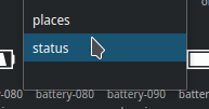
ndavis added a comment to D24070: [Applets/Battery] Don't use toolTipMainText to show info, rather use the second line.
Works just as well as it did before the patch for me.
ndavis added a comment to D24091: Move "Full Screen Mode" item from Settings menu to View menu.
I'm not sure what MergeLocal does or when it would be empty.
ndavis added a comment to D24070: [Applets/Battery] Don't use toolTipMainText to show info, rather use the second line.
I think it's redundant to say "charge level" since the percentage is always the charge level. I also think keeping the language consistent is a good idea. The volume tooltip says "Volume at %", which is why I originally suggested "Battery at %".
ndavis added a comment to D24070: [Applets/Battery] Don't use toolTipMainText to show info, rather use the second line.
ndavis added a comment to D24070: [Applets/Battery] Don't use toolTipMainText to show info, rather use the second line.
ndavis added a comment to T10243: Some KDE applications could use better icons.
ndavis added a comment to D24070: [Applets/Battery] Don't use toolTipMainText to show info, rather use the second line.
ndavis added a comment to T10243: Some KDE applications could use better icons.
Sep 18 2019
Sep 18 2019
It would be nice to have this for 5.17. Then I can add Cuttlefish to my workflow wiki.
Sep 17 2019
Sep 17 2019
ndavis updated the task description for T11713: Reorganize colorscheme colors and use them in a logical manner.
ndavis added a project to T11713: Reorganize colorscheme colors and use them in a logical manner: Plasma.
+1, but I'm curious what others have to say. I definitely agree that Meta should be for global shortcuts and global desktop shell related shortcuts in particular.
ndavis moved T11713: Reorganize colorscheme colors and use them in a logical manner from Reported to Apps Implementation on the Goal: Consistency board.
ndavis triaged T11713: Reorganize colorscheme colors and use them in a logical manner as Normal priority.
ndavis committed R31:8e63d4509267: Make renderDialGroove() area match the maximum renderDialContents() area (authored by ndavis).
Make renderDialGroove() area match the maximum renderDialContents() area
ndavis updated the diff for D24008: Make renderDialGroove() area match the maximum renderDialContents() area.
Remove extra declaration of first
Sep 16 2019
Sep 16 2019
ndavis added a comment to D23798: Polish Displays KCM UI.
The orientation toolbuttons seem oversized.
ndavis added a comment to D24008: Make renderDialGroove() area match the maximum renderDialContents() area.
ndavis added a comment to D21815: [sddm-theme] Start moving from QQC1 to QQC2.
Is this screenshot outdated? Why does the selected item extend outside the width of the list?
ndavis updated the test plan for D24008: Make renderDialGroove() area match the maximum renderDialContents() area.
ndavis requested review of D24008: Make renderDialGroove() area match the maximum renderDialContents() area.
Add document-share* icons
ndavis requested review of D23997: Add document-share* icons.
Sep 15 2019
Sep 15 2019
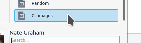
ndavis added a comment to D23712: [Cuttlefish] Overhaul program, use Kirigami.
There seems to be a blank entry at the bottom of the category list:
ndavis added a comment to D23712: [Cuttlefish] Overhaul program, use Kirigami.
The clickable area is significantly smaller than the highlight.
ndavis added a comment to D23712: [Cuttlefish] Overhaul program, use Kirigami.
Text still gets cut off on the left side:

ndavis added a comment to D23712: [Cuttlefish] Overhaul program, use Kirigami.
The sidebar seems a bit wide. Maybe remove the 128px view? As a Breeze icon designer, I don't really need it.
ndavis added a comment to D23712: [Cuttlefish] Overhaul program, use Kirigami.
The colorscheme selector does not work
Sep 14 2019
Sep 14 2019
ndavis added a comment to D23942: Add enablefont and disablefont icon for kfontinst KCM.
ndavis added a comment to D23942: Add enablefont and disablefont icon for kfontinst KCM.
ndavis added a comment to D23942: Add enablefont and disablefont icon for kfontinst KCM.
Oof, all of the font icons that contain an 'A' need to be cleaned up someday. The 'A's aren't even 16px tall in the 22px icons and the line thickness and alignment is all over the place. I guess that's something for another patch. For now, we should maintain consistency with the existing font icons.
ndavis requested changes to D23942: Add enablefont and disablefont icon for kfontinst KCM.
There's a bit too much space around the checkmark.
Sep 13 2019
Sep 13 2019
ndavis added a comment to D23932: WIP Implement backends as plugins.
Flexibility sounds good, but how am I supposed to know what I'm looking at or what options to pick? Perhaps it's better to handle the backends automatically, if possible?
Sep 12 2019
Sep 12 2019
ndavis added a project to T11192: Create a HIG entry for highlight effect: KDE Human Interface Guidelines.
ndavis moved T11192: Create a HIG entry for highlight effect from Reported to HIG Specification on the Goal: Consistency board.
ndavis moved T11124: Unify highlight effect style from Reported to VDG Discussion on the Goal: Consistency board.
Sep 11 2019
Sep 11 2019
ndavis requested changes to D23389: Use visible buttons to switch the default device.
ndavis added a comment to D23389: Use visible buttons to switch the default device.
I find the use of filled and empty stars visually odd. They're like Jerry-rigged radio buttons that look like PushButtons. We also can't guarantee that star-shape will be empty and favorite will be filled in 3rd party icon themes. It's not at all obvious from the names of the icons that one should be filled and one should be empty either.
ndavis added a comment to R98:523249683744: [GTK3] Make CSD window decorations 18px instead of 16px.

We should probably redo or completely remove the current Qt icons since they're very Qt4 and look outdated. Unless our Qt icons are updated, I don't think we should have this symlink.
ndavis added a comment to D23876: [applets/kickoff] Tweak padding for lists.
ndavis added a comment to D23876: [applets/kickoff] Tweak padding for lists.
Look at the top of the view in both screenshots and bottom of the view in the 2nd. Rather than cutting off the content of the items right at the separator as they go out of the visible area, they get cut off early. I think the way they were cut off before was better. I'm guessing that the area around the separator was extended.
ndavis requested changes to D23848: Add Breeze icons for Jupyter Notebook files.
The spheres around the planet need better pixel alignment, particularly on the 16, 22 and 32px versions. This will require remaking parts of the logo so that it fills pixels. Round to the nearest size in whole pixels. Half pixels can be tolerated sometimes when the area is greater than 2x2, but pick what looks good to you at 100% zoom in general. The planet itself could have better pixel alignment too, but it's not as critical.
Sep 10 2019
Sep 10 2019
ndavis added a comment to T11093: Improve Consistency across the Board.
ndavis added a comment to D23757: Clean up hamburger menu and viewport and single-folder context menus.
Fair enough.
ndavis added a comment to D23757: Clean up hamburger menu and viewport and single-folder context menus.
Why not just keep New Tab/Window in the Context menu? The hamburger is already a bit overfull, even if we remove Redisplay. The context menu isn't that long by comparison and it wouldn't be any longer than it is with a folder selected.
ndavis added a comment to T11526: Create an HIG for large colorful action icons.
Sep 9 2019
Sep 9 2019
ndavis added a comment to D23757: Clean up hamburger menu and viewport and single-folder context menus.
ndavis added a comment to D23757: Clean up hamburger menu and viewport and single-folder context menus.
Why is it that sometimes Create New is in its own section and sometimes it's grouped with Open With or New Tab/Window?
ndavis added a comment to D23798: Polish Displays KCM UI.
What are "Values of an output"? I don't understand what these 2 settings do.
ndavis added a comment to T11526: Create an HIG for large colorful action icons.
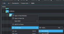
ndavis added a comment to D23757: Clean up hamburger menu and viewport and single-folder context menus.
- A user may wish to duplicate the current view in a new tab or window
- A user may wish to create a file inside of a folder while at the level of a higher folder in tree/details view. In case that's hard to visualize:

Sep 8 2019
Sep 8 2019
ndavis added a comment to D23757: Clean up hamburger menu and viewport and single-folder context menus.
It might make sense to put Add to Places next to Assign Tags. They're slightly related in that they're meant to make accessing some files or folders faster.