New elisa icon as discussed in the comment section of this reddit post: https://www.reddit.com/r/kde/comments/8jywca/news_about_elisa_music_player/

Can't get elisa to switch to the 22-size icon in KRunner though, even after restarting.
New elisa icon as discussed in the comment section of this reddit post: https://www.reddit.com/r/kde/comments/8jywca/news_about_elisa_music_player/
Can't get elisa to switch to the 22-size icon in KRunner though, even after restarting.
| Lint Skipped |
| Unit Tests Skipped |
Very nice in general! I feel like the "e" wrapping around the musical note is a nice concept, but it looks a bit busy to me. In particular, the musical note kinds of blends in and becomes indistinct. And the "e" reminds me of the one used in the Emacs icon.
Here's a different iteration

The e is "supposed" to double as a clef, but it might also be a little noisy
The suggestion above is too noisy. Its useless at low sizes.
This is another suggestion, but the drawback was that it has no relation to elisa itself.

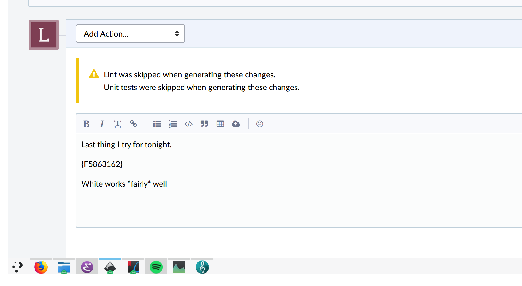
Last thing I try for tonight.

White works *fairly* well, but still not all that preferable
I also prefer this one without the quaver.
Is it possible to really simplify the background for the small size icon ? It would be probably much easier to read it.
@astippich and @januz what is your opinion ? You are also working on Elisa and should have the rights to speak ;)
^ or this one with white symbol
I agree on this one without the quaver, maybe it could also have a bit of a circle at the end of the (like the circles in the quaver). That said, we just changed icons a month or 2 ago. Are we sure about completely dropping the casette concept and changing again?
Without meaning to offend whoever made the cassette icon, I think any variant of the one proposed here is hugely better. If I recall, I wasn't overly fond of the cassette icon when it was first proposed and predicted that it would not be popular. Sure enough, that's exactly what happened, and this new one was borne of a Reddit thread that was full of people complaining about the cassette icon.
@lshoravi here's an idea for a slight modification to the original: keep the whole letter-E-wrapped-around-a-musical-note thing, but change the size of the note and the letter such that the bottom rounded part of the note isn't overlapping any part of the E. I really liked that original design, but the only thing I thought was slightly problematic was how so much of the letter was covered up.
TBH I like the concept of the cassette icon more than the current implementation of it. What was good about about is that it had personality, which is a big deal since usually icons also double as logos. IMO a solid icon should be 1) Memorable and 2) Descriptive. Imagine both icons amongst these google search results and consider which one would stand out, which one you would know it's elisa's. These icons are technically great, they are just not memorable.
I agree in that a circle doesn't have as much personality as maybe a
casette. I also agree in that the casette felt off when looking at it.
How would something like an LP player with the E on top feel? I won't have
time until Monday (finals coming up), but my gut says that a brown-ish
square with a dark circle (like seeing an LP player from above) with some
iconography on top could look good.
I completely agree.
I also still like the idea of having a cassette as an icon, but I also thought that the latest iteration showed in D10365 was merged, but apparently it wasn't. I think the current icon with the text is not optimal.
That said, having an icon like proposed here is probably much less controversial than a cassette.
@januz and @astippich I really understand your point of view about the current icon. I share your point of view the need to have an icon easy to differentiate from many other players. For example, I would like Elisa be easy to spot on this page: https://flathub.org/apps/category/AudioVideo .
At the same time, I had an ex colleague, aged 62 or something like that, saying that the old icons was bad for youngsters. That really made me hesitate about the current icon. I really doubt people under 20 could understand the current icon.
Anyway, the current icon seems to need some more work to really look finished as has been pointed out.
I will try to show the current icon and this one to another bunch of people to collect feedback (people around 22 and older one). My idea is definitely not to run a popularity contest here.
I do like the idea to have some sort of classical music notes in the icon while still being easy to associate to music. That would reflect on the fact that we made quite some work on supporting this use case.
@lshoravi I appreciate your offer to help like I appreciate the one @paullesur did.
Yeah, that could be interesting. Another idea to explore could be replacing the green background with a vinyl record, keeping the E on top in white.
Also, I think the E would read better if it was open on top (instead of curlying on itself). With that change you could also bring back the clef-like bottom and it'd still read fine.
@mgallien I'm not sure about youngsters not getting it. There are still bands putting out cassettes, and Guardians of the galaxy brought them back to the spotlight for a while too. And who knows, maybe in a few decades kids will look at cassettes and think they are 3D printed Elisa icons :)
I think we are trying hard to accommodate and the elements are not lending themselves to turn them into an E with some musical tones. I reviewed a few music sheets looking for commonalities. I feel also that the icon is busy, it is trying really hard to tell you that this app is about music. I feel we can simplify and provide other ideas.
Here is a proposal. Not final. I welcome feedback. The idea here is to show soundwaves instead.

@abetts Yes, I've been concepting a little on different ideas but not really coming anywhere I feel would fit in.
Looks great!
As for the background, when I think of soundwaves I think of something that would be produced by a visualizer, or a sine wave.
Did you make the letters yourself or is it a font? I'm asking just in case the font is licensed.
Could you using blue and teal for the accent colours? I'm thinking that's what Elisa uses by default.
(Speaking of that, I can't start Elisa. No error message in terminal or anything, it just doesnt start.)
The letters are from a font from Google Fonts. We should be OK to use it. We can also modify a bit if you want. Although I feel it looks good.
Could you using blue and teal for the accent colours? I'm thinking that's what Elisa uses by default.
I sure can! Can you give me a couple of reference colors so that I can start from there? I mean a teal and blue HEX numbers.
(Speaking of that, I can't start Elisa. No error message in terminal or anything, it just doesnt start.)
Your proposal is looking great and it should be easily recognizable. I really like it. It also looks quite modern.
Sorry for the delay for my answer. Thanks a lot for your help.
Could you using blue and teal for the accent colours? I'm thinking that's what Elisa uses by default.
I sure can! Can you give me a couple of reference colors so that I can start from there? I mean a teal and blue HEX numbers.
The blue used by Elisa is the following: #3daee9 .
The grey used by Elisa is the following: #c4c5c5 .
(Speaking of that, I can't start Elisa. No error message in terminal or anything, it just doesnt start.)
Do you have the possibility to test it from the flathub flatpak repository ? At least, the 0.1.1 bug fix version is there. I am not so sure about the status of the flatpak nightly builds hosted by KDE. In case, you would need them, we should ping people from the flatpak team.
You can also try to send me any log you may have to try to understand what happen.
There is no timeframe. :) I was just hoping this doesn't get abandoned, because it looks rally nice.
What are the remaining blockers, currently?
Using @abetts prototype: No blockers, incorporating the given teal and green colours given by mgallien is TODO.
Otherwise, the blocker would be to find what visual profile Elisa has so that we can work around that.
The colors must match to HIG? I don't understand why KDE Applications have a logos in different styles. We do not have complete unify KDE style.
For example:
In Homepage


There aren't enough colors in the HIG to really match the HIG exactly, it just needs to look similar to other icons in the breeze-icons repository.
The rest seems unrelated to the Elisa icon. Project home pages tend not to update their logos very often and Kdenlive's icons are fine as they are. The website version is just a simple style for branding and the breeze-icons version has a dark background behind the other parts to give it some contrast with different colorschemes. I don't think it's absolutely necessary that projects have their logos be exactly the same as their Breeze icons. They just need to be obviously similar.
Thanks for keeping this on your todo list. This is very much appreciated.
I am trying to move forward the process of having Elisa published on Windows Store. It would be nice to be able to have a more distinctive icon before doing that.
I have noticed that the current icon is very close to the icon of the Gnome podcast application.
Can I help this make progress ?
@abetts has been inactive recently; probably needs @lshoravi or @ndavis or @trickyricky26 to take over.

