onvitaik (Onvitai Kayan)
User

Projects

User does not belong to any projects.

Today

  • Clear sailing ahead.

Tomorrow

  • Clear sailing ahead.

Wednesday

  • Clear sailing ahead.

User Details

User Since
May 24 2019, 1:32 AM (259 w, 3 d)
Availability
Available

Recent Activity

Jun 24 2020

onvitaik added a comment to T10891: Breeze theme evolution.

+1/-1? Should I make a patch for it? Any alternative designs that don't require additional elements that link to the widget?

Jun 24 2020, 6:11 PM · Plasma, VDG, Breeze

May 29 2020

onvitaik added a comment to T12441: Consider using a vertical Icons-Only Task Manager populated with apps, and a thickened panel.
In T12441#230507, @KonqiDragon wrote:

In this task offers to fit everything in vertical panel, that looks ugly if compared it with Ubuntu, especially system tray and time/date.

May 29 2020, 3:29 PM · Goal: Consistency, VDG, Plasma

Mar 21 2020

onvitaik added a comment to T12842: Improving tab style in Breeze.

I'm not too keen on that mockup. It looks like the tab and the tab contents are no longer connected.

Mar 21 2020, 7:59 PM · VDG, Breeze
onvitaik added a comment to T12839: Fix sizing of first-party plasmoids in the panel.

While we're at it, it'd be good to finally have one text size for the panel overall. That includes the font size for Digital Clock (all modes), Task Manager, etc. (only the parts of those applets that have text on the panel itself)

Mar 21 2020, 3:08 AM · Plasma, VDG, Goal: Consistency

Feb 23 2020

onvitaik added a comment to D24009: RFC: Make Breeze Dark darker.

I'm incredibly late, but the problem, as I see it, with it looking "fairly light" is that all the button and frame borders are lighter than the background and almost as light as the text. These color changes just exacerbate this issue.

Feb 23 2020, 9:19 PM · Plasma

Jan 12 2020

onvitaik added a comment to T12308: Dolphin UI redesign.

So are we officially abandoning the idea of moving the Breadbcrumbs/URL Navigator into the toolbar? Shall we close T11663?

Jan 12 2020, 12:27 AM · Dolphin, Goal: All About the Apps, VDG

Oct 28 2019

onvitaik added a comment to T10470: Improve the visuals of tray popups.

On a related note, is it possible to also make the header/title font size smaller, matching the other text close to buttons? Right now, pretty much all the headers across Plasma/Breeze look very overbearing due to how big they are. It's like they want you to look at them more than the contents of the window.

Oct 28 2019, 3:14 AM · VDG

Oct 10 2019

onvitaik added a comment to T11665: Make adjacent mutually exclusive ToolButtons look like segmented controls.

Please feel free to open it! Or I can, if you'd prefer not to.

Oct 10 2019, 12:32 PM · Breeze, VDG
onvitaik added a comment to T11579: Unify navigation through sidebar categories/views.

Tooltips don't need to immediately pop up, of course, like most tooltips nowadays. They would not hide your stuff unless you kept hovering over an item for long enough.

Oct 10 2019, 11:39 AM · Goal: Consistency, KDE Human Interface Guidelines, VDG
onvitaik added a comment to T11579: Unify navigation through sidebar categories/views.

Would it be possible to drop the vertical text (both bottom-to-top and top-to-bottom) on the sidebar, and instead just use buttons with tooltips? From a UX standpoint, vertical text can be a big negative to users, as you're possibly making them tilt their heads to read the text better. It can also make the UI feel a bit inconsistent by being the only place(s) where text is not horizontal.

Oct 10 2019, 11:25 AM · Goal: Consistency, KDE Human Interface Guidelines, VDG

Sep 19 2019

onvitaik added a comment to T11665: Make adjacent mutually exclusive ToolButtons look like segmented controls.
In T11665#201377, @mglb wrote:

Adding border to all toolbar buttons will be super heavy in cases where there is more than a few buttons.
To do changes like this I think we should separate concept of classic toolbars (few toolbars, each with many buttons/controls) and modern "widgets row" (few controls visually aligned with window/content). Or just use QToolButtons with disabled autoRaise to get the border on them.

Yeah, I agree that this would be totally inappropriate for e.g. LibreOffice or FreeCAD with have huge toolbars stuffed to the gills with unlabeled toolbuttons (whether it's ever a good idea to do this in the first place is left for another discussion...). I was thinking about our apps, really.

Sep 19 2019, 2:42 AM · Breeze, VDG

Sep 18 2019

onvitaik added a comment to T11665: Make adjacent mutually exclusive ToolButtons look like segmented controls.

I'm afraid it might look out of place either way, though, as the other buttons have neither frames nor different background colors.

That's the whole point. :) Segmented controls should look different, because they are different. Different things should look different.

Sep 18 2019, 1:48 AM · Breeze, VDG

Sep 17 2019

onvitaik added a comment to T11665: Make adjacent mutually exclusive ToolButtons look like segmented controls.

Personally, I think the different background looks better than a frame. I'm afraid it might look out of place either way, though, as the other buttons have neither frames nor different background colors.

Sep 17 2019, 3:10 PM · Breeze, VDG

Sep 13 2019

onvitaik added a comment to T10891: Breeze theme evolution.

Actually, it is a fail for typical usage. AA Large (3:1) means it meets the minimum requirement for large text (at least 18pt or 14pt bold) like page headers, not small text like lists and labels. The minimum for small text is AA Contrast (4.5:1).

Sep 13 2019, 2:04 AM · Plasma, VDG, Breeze

Sep 10 2019

onvitaik added a comment to T11093: Improve Consistency across the Board.

In general, we use labels for everything that isn't a common control. Common controls are things like forward, back, undo, redo, etc. If a label isn't used, the function of the button needs to be pretty obvious.

I think it's more important to be consistent in logic than uniform in appearance. There is a lot of overlap between the two, but there are cases where aiming for a uniform appearance leads to inflexible designs that make some UIs less usable.

Sep 10 2019, 10:43 PM · Goal: Consistency, Goal Setting 2019
onvitaik added a comment to D23835: Add TabKCM.

Can I also suggest making the tabs occupy the full width of the area available (sort of like Kate)? It minimizes the unused space and keeps everything in a nice rectangle:

Sep 10 2019, 3:04 PM · Frameworks
onvitaik added a comment to T11093: Improve Consistency across the Board.

Here's my 2 cents:

Sep 10 2019, 1:42 PM · Goal: Consistency, Goal Setting 2019

Sep 6 2019

onvitaik added a comment to T10273: Make KCMs consistent and apply the KDE HIG to them as much as possible.

Might not be the most appropriate place or time to ask this, but considering how the KCM title is shown on the title bar and on the side bar, isn't it unnecessary to have a header that pretty much says the same thing a third time?

Sep 6 2019, 12:46 PM · Goal: Consistency, Plasma, VDG

Sep 4 2019

onvitaik added a comment to T10891: Breeze theme evolution.

I think Breeze in general could really use some separators as a way to indicate one area is not attached to the other. Take Dolphin for example: The address area's background color is the same color as the sidebar's background, and with no visual separator, it looks like the two areas are directly linked. It looks strange.

Sep 4 2019, 11:55 PM · Plasma, VDG, Breeze

Aug 16 2019

onvitaik added a comment to T11124: Unify highlight effect style.

I think I'm going to continue using the outline/sideline+fainter background style. With simple solid highlights, there is a contrast issue where the highlight color either doesn't contrast well with the text or doesn't contrast well with the window background. With a strong highlight outline/sideline and weaker highlight background, we can have good text contrast and good window background contrast.

While I'm not dismissing the possibility that the new style is more distracting, I don't understand what you mean by that. The new style draws more attention to the content surrounded by the outline or in the direction of the sideline.

Aug 16 2019, 8:22 PM · Plasma, Breeze, Goal: Consistency, VDG
onvitaik added a comment to T11124: Unify highlight effect style.

Just thought I'd drop my own thoughts here. Personally, I've never been a fan of how Highlights have a different border and a background color. I think that it should just be a solid color for all cases (except perhaps for buttons and the bigger elements), just so we don't have multiple types of highlights.

Aug 16 2019, 12:05 PM · Plasma, Breeze, Goal: Consistency, VDG

Aug 12 2019

onvitaik added a comment to T10891: Breeze theme evolution.

Sorry, you're correct, I meant readable. I can discern that it's a button but I can't read at a glance what the text says. Using your link it says fail for the text in the button: https://jxnblk.github.io/colorable/demos/text/?background=%233daee9&foreground=%23DAFFFF

I'm partial to noah's approach of using a lighter outline to help with discernment.

Aug 12 2019, 6:57 PM · Plasma, VDG, Breeze

Aug 10 2019

onvitaik added a comment to T10891: Breeze theme evolution.

The first highlighted pushbutton (where the cursor is) is less visible in your version than noah's due to the contrast. And the radiobuttons has weird artifacts but maybe that's a compression thing.

Aug 10 2019, 12:09 PM · Plasma, VDG, Breeze
onvitaik added a comment to T10891: Breeze theme evolution.

So what do you think about these highlight/selection/hover/focus colors? I chose them by taking Plasma Blue (#3daee9) from the KDE HIG and adjusting the brightness with HSLuv.org. The selection background color is 1/2 the brightness and the hover background is 2/3. I don't really know how to pick colors, so I'm taking a somewhat conservative approach where new colors are at least somewhat based on existing ones.
<image>

Aug 10 2019, 4:33 AM · Plasma, VDG, Breeze
onvitaik added a comment to T10891: Breeze theme evolution.

How/why did you pick those colors? Is there a method or formula that you follow?

Aug 10 2019, 1:09 AM · Plasma, VDG, Breeze

Aug 9 2019

onvitaik added a comment to T10891: Breeze theme evolution.

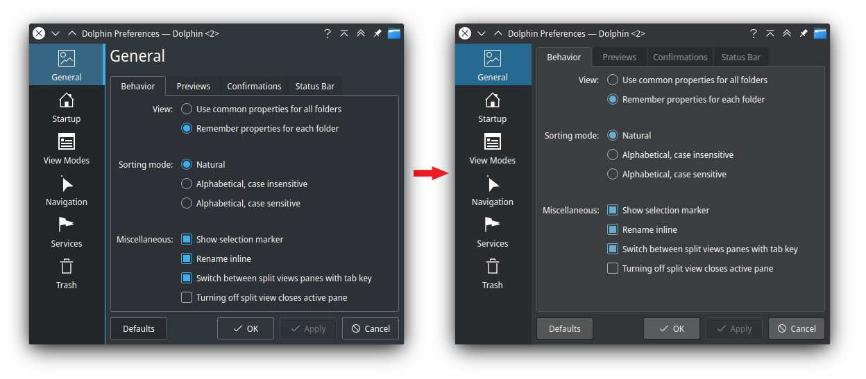
Here's another set of dark theme mockups (and some miscellaneous modifications to tabs, sidebars, title bars) :

Aug 9 2019, 9:13 PM · Plasma, VDG, Breeze

Jul 28 2019

onvitaik added a comment to T10891: Breeze theme evolution.

On the topic of the dark theme: I think it currently has too much contrast. Most elements you see have a dark background with light text and light borders, which makes you (or in this case, me?) focus almost as much on the borders as their content. Making the borders more subdued, giving the tab area a lighter color to make up for it, making the buttons lighter than their borders, and using more pastel colors could be a start. Here's a quick edit of @ndavis 's screenshot/mockup as an example:

Jul 28 2019, 8:06 PM · Plasma, VDG, Breeze

May 25 2019

onvitaik added a comment to T10891: Breeze theme evolution.
In T10891#186101, @mglb wrote:

Centered title is awesome!

However, I see two problems:

  • Non-editable combo boxes look like editable combo boxes. It is also possible to confuse buttons and line edits with centered text. The latter is really problematic - line edit can be clicked without any consequences, buttons can't.
  • Instantly applied settings:
    • Changing some settings is slow. Some have inconvenient side effects not easy to fix without hacks. E.g. window flags change causes the window to be hidden and shown, what resets some WM properties (desktop, minimized state under X with thumbnails turned on, etc).
    • Would need a lot of work - all applications would need to be adjusted for it. While not really a problem in itself, it would need its own task :)
    • There should be something to undo the changes.
May 25 2019, 4:09 AM · Plasma, VDG, Breeze

May 24 2019

onvitaik added a comment to T10891: Breeze theme evolution.

Nice to see it's well-received!

May 24 2019, 9:14 PM · Plasma, VDG, Breeze
onvitaik added a comment to T10891: Breeze theme evolution.

Since I saw those crude mockups, I've been changing it with the suggestions I wanted to make plus others. It takes some pages taken from how other DEs do their things and some of my own preferences, while at least still trying to not deviate too wildly from the Plasma look. I've also combined it with some suggested changes to the current system settings application.

May 24 2019, 2:07 AM · Plasma, VDG, Breeze