I think this could make sense if you are also able to change the kind of file that you want to create.
Feed Advanced Search
Nov 25 2018
Nov 25 2018
abetts added a comment to D16413: Add a keyboard shortcut to create file.
Nov 24 2018
Nov 24 2018
abetts added a comment to D16968: [Folder View] improve label contrast against challenging backgrounds.
Looking good guys! +1
Nov 21 2018
Nov 21 2018
abetts added a comment to D17073: [Task Manager] Do not crop album art in tooltip.
I know this patch doesn't deal with this, but I would suggest doing a background blur on the bottom bar that has the player buttons and the labels. It will improve readability
abetts added a comment to D17073: [Task Manager] Do not crop album art in tooltip.
Looks great. Thanks for the fix.
Nov 20 2018
Nov 20 2018
abetts added a comment to D17022: [Kickoff] Enable Esc to close Kickoff and Tab to switch to Search.
+1
abetts added a comment to D17050: Allow clicking of links in app descriptions.
+1
Nov 19 2018
Nov 19 2018
abetts added a comment to D16988: [Kickoff] Make the visible search field unfocused by default.
+1
Nov 18 2018
Nov 18 2018
abetts added a comment to D16951: Resolve merge conflict.
Looks good to me +1
Nov 16 2018
Nov 16 2018
abetts added a comment to T9780: Find/invent interaction pattern for window touch resizing.
abetts added a comment to T9780: Find/invent interaction pattern for window touch resizing.
What about multitouch? Using 2 fingers to pinch and zoom to the desired size? If you are using a tablet for example, the system could detect your pinch and zoon done vertically, diagonally, or horizontally and resize the window accordingly. It would only activate with two fingers on the screen and only in "empty" window areas.
abetts added a comment to T10047: Guerilla UX testing: a GNOME switcher.
Overall, these changes are sensitive and go with the times. I don't particularly like a dock on the left, but allowing this feature is good IMHO. Others like icons-only, I am all for.
Nov 15 2018
Nov 15 2018
abetts added a comment to D16901: [Folder View] implement a minimum width for icon view to ensure that labels are never rendered useless.
+1
abetts added a comment to D16897: Allow windows to be closed from the window switchers.
+1
Nov 13 2018
Nov 13 2018
abetts added a comment to T10028: Individual KScreen output data retention.
[] Save for this setup only.or
[X] Use for all setups with this display.
abetts added a comment to D16848: Revamp Icon Design and Emblem pages.
The new icon to show video, it reminds me heavily about VLC. Are we going with that design?
Nov 12 2018
Nov 12 2018
abetts added a comment to D16847: Fix a small color and shadow issue with Kdots icon.
+1
abetts added a comment to D16841: Mobile text selection controls.
Is the popup themable?
abetts added a comment to D16836: [effects] Split the Fade effect.
Maybe another group could be "Transitions", or "Appear"
Nov 6 2018
Nov 6 2018
abetts added a comment to T9996: Improve Thumbnail Aside effect.
I agree with all the changes. PIP naming is also much more recognizable.
Nov 4 2018
Nov 4 2018
Minor detail with great impact. Thank you for the work.
Oct 31 2018
Oct 31 2018
Oct 29 2018
Oct 29 2018
abetts added a comment to D16504: [KCMs] Use consistent text for GHNS buttons.
abetts added a comment to D12285: [RFC] Change drawer header image.
I would probably resize Konqui to be as tall as the two labels to the left. It will seem more balanced.
abetts added a comment to T7878: Create or find Icon.
I started working on a couple of images to offer for review. Stay tuned.
abetts added a comment to D15206: [Kickoff] Add a subtle separator line between the header and the content view.
abetts added a comment to D16448: [libkwineffects] Port AnimationEffect to TimeLine.
+1
abetts added a comment to D16449: [scripting] Introduce redirect function.
Would there be any visual change because of this new behavior?
abetts added a comment to D16504: [KCMs] Use consistent text for GHNS buttons.
I like the direction of the patch.
abetts added a comment to T9941: Make Get Hot New Stuff button wording consistent.
+1 from me.
Oct 28 2018
Oct 28 2018
abetts added a comment to D16485: Add button to dynamically resize virtual keyboard.
+1
Oct 27 2018
Oct 27 2018
Oct 26 2018
Oct 26 2018

abetts added a comment to D16408: Update KImageMapEditor icons.
My only comment is that the background for the globe has colors that are too close to each other, maybe a little too dull. I would recommend brightening them up a little bit.
Oct 24 2018
Oct 24 2018
abetts updated subscribers of D16286: Make separators in FindDevicesPage visually distinctive.
Looks great to me. I would probably follow closely what Discover is doing with their headers. @ngraham could give you some info on that. Or if you take a look at the sources page within Discover, you will see what I mean.
abetts added a comment to T9892: Come up with a lastname for the personas.
Byrne
Hicks
Steele
Hoffman
Thorne
abetts added a comment to D16395: Update the "About KDE" text.
KDE has created the friendly and powerful Plasma desktop environment
abetts added a comment to D15206: [Kickoff] Add a subtle separator line between the header and the content view.
Does the blue line from the selected content touch the divider line you are prosing? If it isn't, I would suggest no gap between those two lines.
Oct 22 2018
Oct 22 2018
abetts added a comment to T9910: Revisit user avatar gallery images.
If GPL is not an option readily available for images, images that are CC-BY-SA will work ok for us. (Correct me if I am wrong). Good repositories of images are flickr.com (you can sort images by license) and also unsplash.com. Please check images before taking them, let's not assume all images in those sites have the same license.
Oct 21 2018
Oct 21 2018
abetts added a comment to D16345: Create new "Zoom to 100%" action.
I think there "could' be variations of this like
Oct 20 2018
Oct 20 2018
abetts added a comment to T8871: Systematic KCM reorganisation.
Marco is of the mind that we should hold off on doing work on this at the moment. We should hold off until the KCMs have been completely ported. The reason is that we have redesigned each KCM, we have discovered, implemented, and corrected past behaviors that would categorize some KCMs in different ways. Because that work is not complete, I also agree that we should skip this task until later.
Oct 18 2018
Oct 18 2018
abetts added a comment to D16241: [Folder View] Improve layout, formatting, and wording of Icons and Locations pages.
abetts added a comment to T9878: Default application starter menu is missing a11y Labels.
Here i have a little naming confusion first. its the startmenu named "kicker" or "kickoff" and what is the difference?
Oct 17 2018
Oct 17 2018
abetts added a comment to D16219: [Lock Screen] Do not try to unlock when unvisible.
+1 for the idea!
abetts added a comment to D16270: [effects/diminactive] Fix false-triggering of the out animation.
+1
Oct 16 2018
Oct 16 2018
abetts added a comment to D16241: [Folder View] Improve layout, formatting, and wording of Icons and Locations pages.
+1
Oct 15 2018
Oct 15 2018
abetts added a comment to T7031: Panel focus on shortcut.
It is hard to imagine this just by text. Is there maybe a way that your comments can be represented graphically? Maybe wireframes?
abetts added a comment to D16219: [Lock Screen] Do not try to unlock when unvisible.
abetts added a comment to D16219: [Lock Screen] Do not try to unlock when unvisible.
abetts added a comment to D16219: [Lock Screen] Do not try to unlock when unvisible.
Could you please add a short video or gif showing this problem?
Oct 13 2018
Oct 13 2018
abetts added a comment to D16054: Show partial path in Tabswitcher Ctrl+Tab list to distinguish equally named files.
+1
Oct 10 2018
Oct 10 2018
abetts added a comment to D15278: Close Dolphin if last tab closed.
I am in favor of the patch. It helps understand that beyond the last tab there is no window to work with. This is sensible and other file managers do it. Seems pretty logical to me. I think we are mincing and dicing stuff that really doesn't happen. We can skip all those hypotheticals and go ahead with the patch.
Oct 9 2018
Oct 9 2018
+1
abetts retitled D15966: Started a glossary to explain commonly used terms in the HIG from Started a glossary to explain commenly used terms in the HIG to Started a glossary to explain commonly used terms in the HIG.
abetts added a comment to D16031: [SDDM theme] remove blur and increase UI contrast so that it's not required.
Is this patch also tweaking the shadows for the text or is it just concerned with the background for the icons?
Oct 8 2018
Oct 8 2018
abetts added a comment to T9817: Include some of the best prior Plasma wallpapers.
I would probably just keep the latest wallpaper and the prior one. Maybe not all the ones before.
Oct 7 2018
Oct 7 2018
abetts retitled D15973: Add a 'Properties' entry in the places panel context menu from Add a 'Propreties' entry in the places panel context menu to Add a 'Properties' entry in the places panel context menu.
Oct 6 2018
Oct 6 2018
abetts added a comment to D15961: [effects/wobblywindows] Fix visual artifacts caused by maximize effect.
+1 from the VDG
Oct 5 2018
Oct 5 2018
abetts added a comment to D15966: Started a glossary to explain commonly used terms in the HIG.
+1
abetts added a comment to D15942: Don't drag windows in empty areas from touch/pen events.
abetts added a comment to D15942: Don't drag windows in empty areas from touch/pen events.
Would this ensure that, at least, you can drag a window from the top area, like the toolbar, menu and the title bar empty areas?
abetts added a comment to D15961: [effects/wobblywindows] Fix visual artifacts caused by maximize effect.
Before and after?
Oct 4 2018
Oct 4 2018
abetts added a comment to D15933: Disable fade effect during fullscreen effects.
Can you please share some examples of what this will look like? video? :D
Oct 3 2018
Oct 3 2018
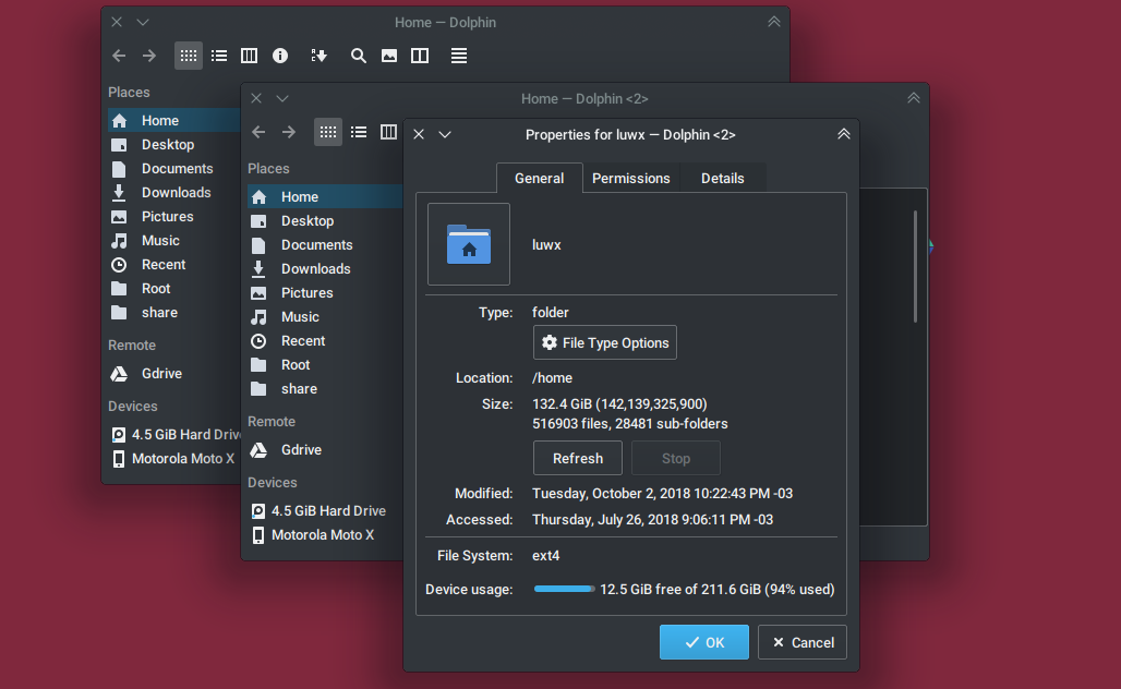
abetts added a comment to D15929: Add a 'Properties' entry in the Places panel context menu.
I would not be opposed to this change. Any other thoughts?
abetts added a comment to D15929: Add a 'Properties' entry in the Places panel context menu.
Can you please share a screenshot or before/after image that shows your changes?

Oct 2 2018
Oct 2 2018
abetts added a comment to D15823: [Folder View] In list view mode, fix home button disappearing every other subfolder entered.
abetts added a comment to D15823: [Folder View] In list view mode, fix home button disappearing every other subfolder entered.
Screenshot?
Sep 30 2018
Sep 30 2018
abetts added a comment to D14542: [kcmkwin/desktop] KCM using new virtual desktops DBus interface.
Suggestions from the VDG Channel
abetts updated the diff for D15395: Change Style, Add Clarity, Rephrase Sentences.
Address Word Choice
abetts added a comment to T9460: Consider a more user-friendly SpinBox control.
Ping?
abetts added a comment to D15361: Edit Language in Concept HIG.
Addressed comments.
abetts added a comment to D15695: [effects/snaphelper] Do massive overhaul.
+1
Sep 28 2018
Sep 28 2018
abetts added a comment to D15821: fix pop up positioning for !compositing mode.
+1
abetts added a comment to D15814: show all borders for pop up windows in a dock.

abetts added a comment to D15814: show all borders for pop up windows in a dock.
I like both ideas so far. Great improvement! Would it be too hard to create the pointer triangle? I think it make so much sense. That way the poppup doesn't feel like it is floating out of nowhere.
Sep 26 2018
Sep 26 2018
abetts added a comment to D15785: [Slideshow] increase default interval from 10 seconds to 15 minutes.
+1
abetts added a comment to D11880: Add firewall-config and firewall-applet icons.
Love it! Ship it! +100
Sep 25 2018
Sep 25 2018
abetts added a comment to T9736: Show Active Corner Graphics Only When Mouse Cursor Hits Screen Corner.
Interesting observations. I feel that the effect of showing the blue corner graphic is not a bad one. It is a good clue for the user. However, it shows up too early IMHO.
abetts added a comment to D15738: [Fonts KCM] remove filler words from anti-aliasing settings' labels.
+1
abetts added a comment to D15739: [Places panel] Don't show Root by default.
+1
Sep 24 2018
Sep 24 2018
abetts triaged T9736: Show Active Corner Graphics Only When Mouse Cursor Hits Screen Corner as Wishlist priority.
abetts added a comment to T8707: Window borders.
Can the effect be tweaked to do squared tiling?
abetts added a comment to D15494: Grammar and word corrections.
+1
abetts added a comment to D15721: Make lock on plasmavault icon visible with breeze-dark.
+1
Sep 22 2018
Sep 22 2018
abetts added a comment to D15589: Add proper labels to Trash Emptied notification.
If that's the case, do we have just a trash icon, without the folder?
abetts added a comment to D15589: Add proper labels to Trash Emptied notification.
Love it! +1
Sep 21 2018
Sep 21 2018
abetts added a comment to D15683: Add lock icon to desktop context menu.
+1
abetts added a comment to D11880: Add firewall-config and firewall-applet icons.
I solemnly approve! +1
abetts added a comment to D11880: Add firewall-config and firewall-applet icons.
Seems good to me. Guys?
abetts added a comment to D11880: Add firewall-config and firewall-applet icons.
If I understand right, there are three states of firewall security that you can be in. Maybe we could use the traffic lights metaphor and have green for low, yellow for medium and red for high?
Sep 20 2018
Sep 20 2018
abetts added a comment to D15626: [effects/slidingpopups] Fix jumpy transition between In and Out animations.
+1 for visual changes. Looks much more improved