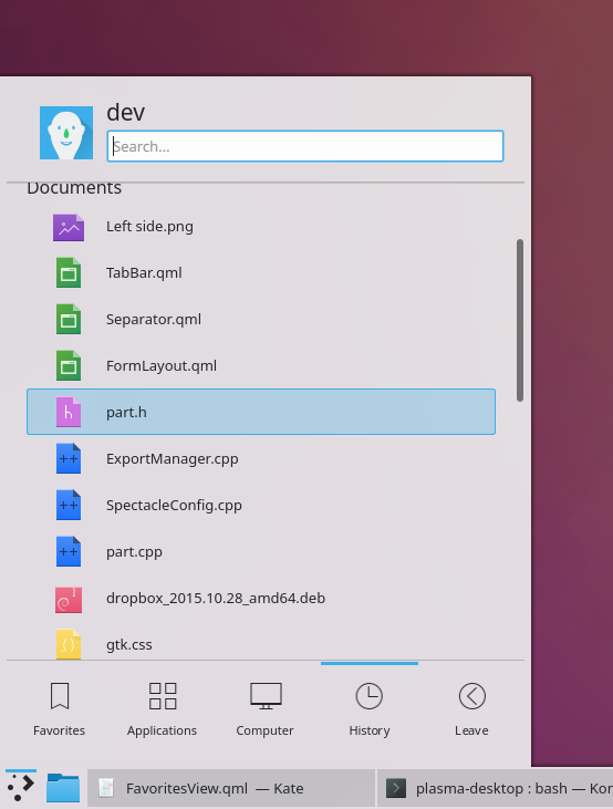
This is another idea that shook out of D15011: add subtle lines to separate the main content area from both the tab bar and the header, giving Kickoff some much-needed structure while still not overwhelming the user with lines and frames and chrome.
Details
Details
- Reviewers
- None
- Group Reviewers
Plasma VDG - Commits
- R119:7b26061fe052: [Kickoff] Add a subtle separator line between the header and the content view
Tested with Kickoff on a panel on all four different sides of the screen, and with Breeze light and Breeze dark themes.
Examples with the default panel:

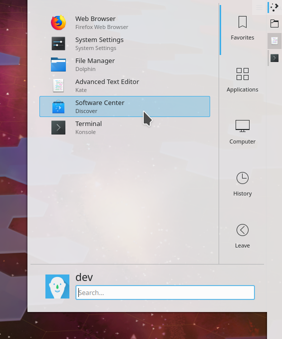
Example with the panel on the right side:
Diff Detail
Diff Detail
- Repository
- R119 Plasma Desktop
- Lint
Automatic diff as part of commit; lint not applicable. - Unit
Automatic diff as part of commit; unit tests not applicable.
Comment Actions
Personally I like it more without the separators but except of that the top-margin of the first element seems to be only 6px while the margin to the underneath elements is about 12px. I think we should use the same margin here to have a consistent look.
Comment Actions
Adjust top margin on Favorites view to make sure that the top item doesn't touch the new line
Comment Actions
Sorry it's taken me so long to get this right. Things have been crazy busy lately! This is ready for review.
Comment Actions
Does the blue line from the selected content touch the divider line you are prosing? If it isn't, I would suggest no gap between those two lines.
Comment Actions
No, the blue highlight doesn't touch, just like people requested. It looks just fine now. If we want to make the blue highlight touch the bounds of its whole view, that would be a significant design change that would need to be made elsewhere (if indeed it would be desirable).
Comment Actions
It's interesting how we all came up with opposite thoughts here. My main issue with the blue line not touching the vertical bar is that it will produce a visual effect where the user will perceive there are 3 lines instead of two. It is not the end of the world but it seemed big enough to mention. Maybe we go with what we have and then see if anyone mentions the issue.
Comment Actions
The thing is, it just doesn't look good if the selection highlight touches the line on top, but not on the sides:

If we want to change the selection highlight to always touch the bounds of the content view on all sides, that's a much larger change that will affect a ton of things in Plasma and can't be done just here. It would have to be a deliberate decision made everywhere at once. I'm just trying to follow the existing style here without making any dramatic design changes.