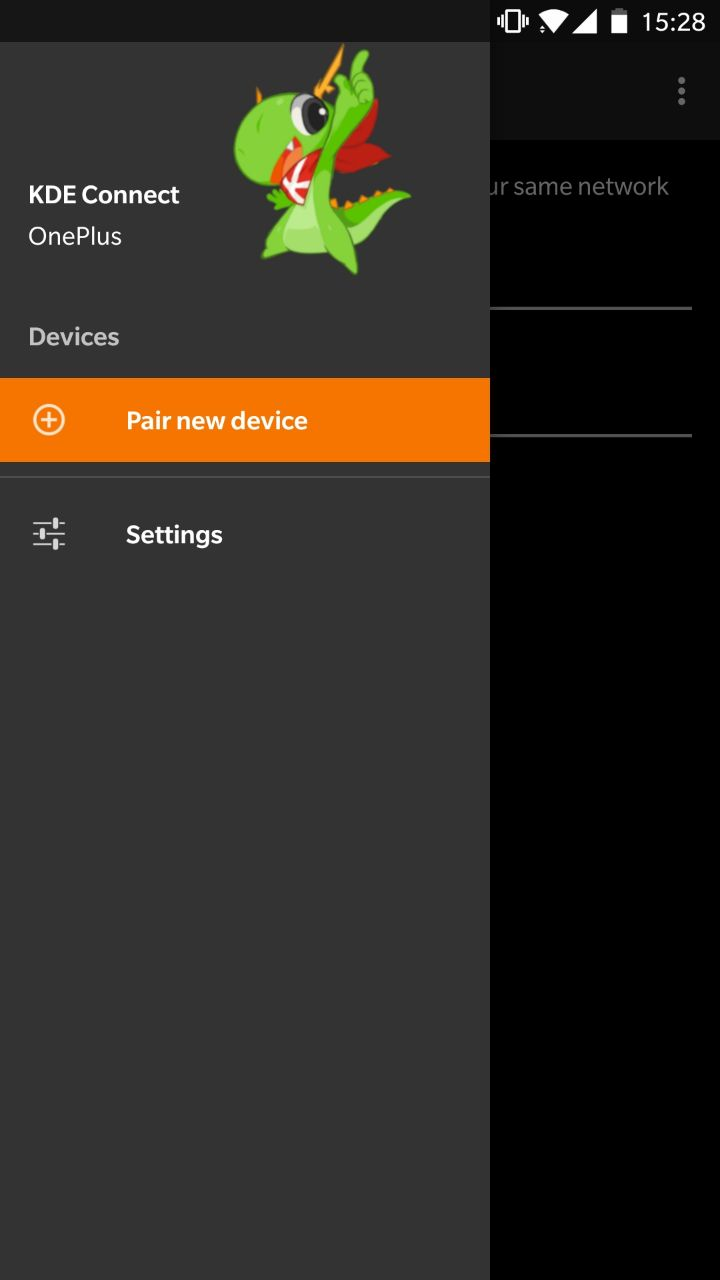
The current drawer header does not really fit into the proposed dark theme. Using Konqui gives some nice branding. However I'm open for input.
Details
Details
- Reviewers
- None
- Group Reviewers
KDE Connect VDG
Current:

Current with dark theme:

Proposed:

On dark theme:
Diff Detail
Diff Detail
- Repository
- R225 KDE Connect - Android application
- Branch
- arcpatch-D12285
- Lint
No Linters Available - Unit
No Unit Test Coverage - Build Status
Buildable 4325 Build 4343: arc lint + arc unit
Comment Actions
Maybe the images can be combined? Or a background color? It looks a bit empty with this change.
Comment Actions
I would probably resize Konqui to be as tall as the two labels to the left. It will seem more balanced.
Comment Actions
I'm not a big fan of having Konqui there (or anything that's not an abstract image or a solid color). I don't have any arguments other than personal preference.
If you want to change it because the current image is from an old Plasma wallpaper, I would be happy to update it to the latest wallpaper as long as it's still abstract. Actually, my original idea was to change it with each release of Plasma (which I never did). Maybe we can make updating it a GCI task?
Comment Actions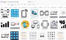
You put an image there for the sake of an image being there.
It is completely irrelevant to the menu.
How about putting there something relevant, like a png image of a phone and tablet and computer there showing connections?
I'm thinking on something loosely similar to these, maybe some KDE branding (a Konqi on the screen of the phone and pc display, etc.):

Comment Actions
Discover gets a lot of criticism for the header image too. Same complaint: it's a pointless waste of space, an image there for the sake of being there. I really don't think this pattern works at all and would advocate removing it from Kirigami entirely. These images are just wasted space, and no matter how pretty they are, that won't change.
Comment Actions
I love the new Konquis - all of them -- but this use is not good in my opinion. Distracting and somewhat pointless. I would rather see a solid color or gradient. Simple and elegant.
Comment Actions
How about removing the "drawer header" UI concept from Kirigami entirely? ;)
In this case it's not a Kirigami app but a native Android app that follows Material guidelines.