Revisit user avatar gallery images
Closed, ResolvedPublic

Description

Calling all artists!

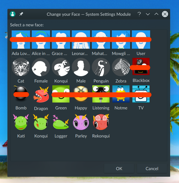
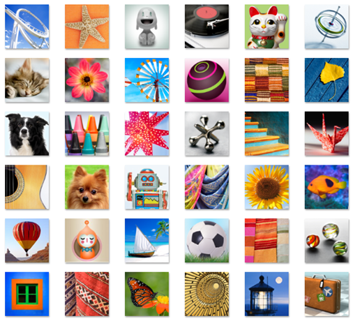
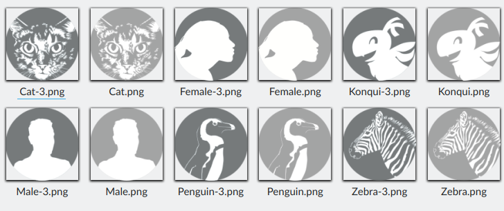
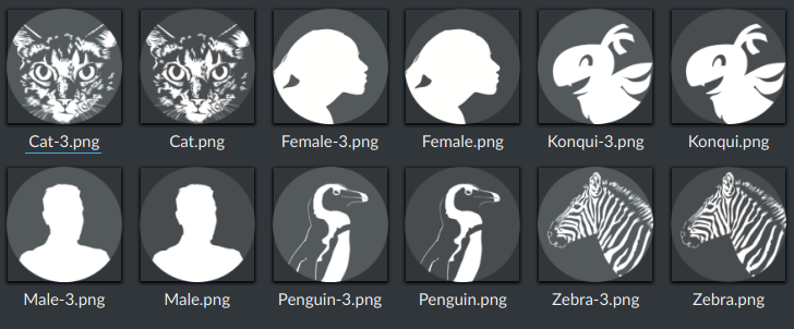
Many of the images available in the user avatar gallery are... a bit dated.

And also, there really aren't very many of them.

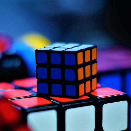
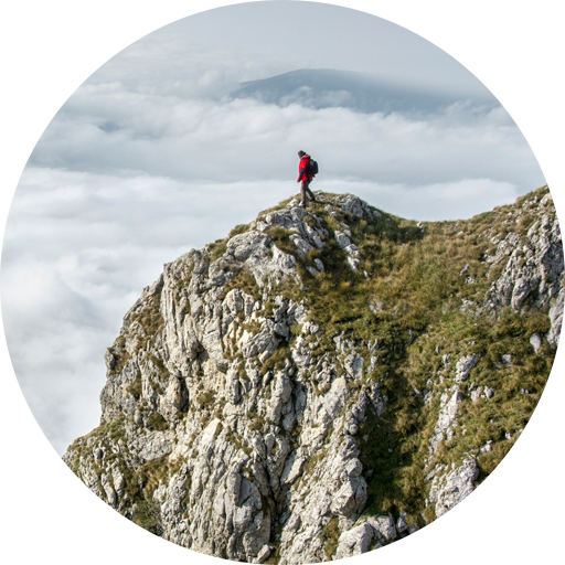
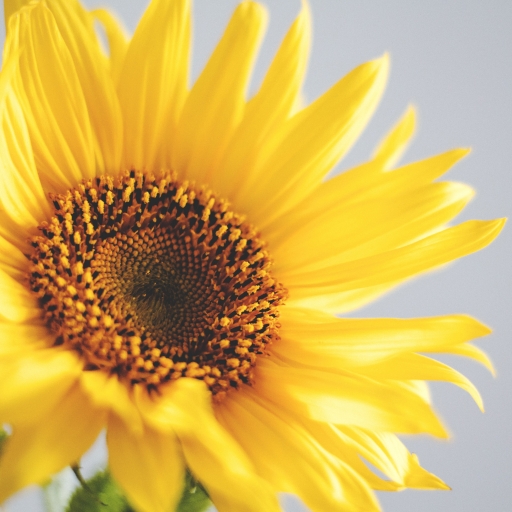
We should redesign or replace most of the really cartooney ones that have square backgrounds, and add more that are a bit better-looking. In particular, we should add more nature, animal, abstract, technology, vehicular, and sports imagery. Normal people love this stuff--two of the most popular user avatars on macOS are an owl and a basketball. They should look good.

Images are located at https://cgit.kde.org/user-manager.git/tree/src/pics and SVG sources (for the vector ones) are at https://cgit.kde.org/user-manager.git/tree/src/pics_sources

ngraham created this task.Oct 21 2018, 8:27 PM
ngraham triaged this task as Wishlist priority.
ngraham updated the task description. (Show Details)

hey hey, lets create!

filipf added a subscriber: filipf.Oct 21 2018, 10:41 PM

Oh, this could be a nice improvement. My opinions on the current ones:

  • I think the dragon ones are adorable and best executed
  • the monochrome ones are good for someone who wants a flat approach, although unfortunately they perform better in dark color schemes than in light ones.. design-wise maybe the female icon is a bit odd and it's strange that there's no dog!
  • the blue ones... well it seems to me like they were designed with the purpose of matching the 5.7 SDDM theme, but nowadays I don't find them appealing
  • the remaining squared ones plus the bomb and the happy face look most dated design-wise

So ideally I'd replace these:

Keep the remaining ones as more minimalist options, and just like Nate said, add some actual imagery. Maybe something like the cutesy icons Windows 7 had:

But say we have something like a basketball, would it preferable if it had transparency or it is fine if it's just a squared ie. that there is a background behind the ball?

As nowadays avatars or user mascots are circled I would prefer to have a second circled not flat section.

as the avatars in sddm and logout screen are bigger than in the past you can use also the origin konquies maybe. I'm thinking on the music konqui, hardware konqui, ... which could be also usefull for activities.

as the avatars in sddm and logout screen are bigger than in the past you can use also the origin konquies maybe. I'm thinking on the music konqui, hardware konqui, ... which could be also usefull for activities.

Those mascots are beautifully designed. I've tested out the painting Konqui just to see what it looks like:

It's somewhat on the smaller scale in Kickoff and does get cropped in the logout and SDDM screens, so maybe it's not ideal, but I think they could work.

Yeah, these images should be designed with the expectation of being cropped slightly and placed inside a circle. The login and lock screen already do that, and Kickoff will too if D13415 ever lands.

The assortment of Windows 7 icons is a great example. macOS has a similar set that all look good too. +1 to having some more Konquis as well (though not too many, we don't want to overwhelm the other options).

Here are some of the images I've found, I've got more for the different categories.
Let me know what you think.


I would choose no images and something that has a better contrast.

If we use actual photographic images, we need to make sure they are not copyrighted. But I have to lean towards @andreask on this; it might be better to create our own "Breeze-style" icons for these rather than using photos.

Ok, no probs, I've been working on making gray scale vectors similar to the circular zebra, penguin etc, as well.

the images themselves are free from attribution (though it's good to give credit) and available for personal and commercial use.
https://www.pexels.com/photo-license (if you want to use images for and other projects

Grayscale is OK, but how about full color? It should pop and be beautiful! Those gray and white animals we already have are kind of dull.

Basically this project does not need to concern itself with "following the pattern" of the original images since most of them are not as attractive as we'd like them to be. This is the time to be bold and do something exciting and new!

...As long as it looks good, of course. :)

Ok, no probs. :)

If GPL is not an option readily available for images, images that are CC-BY-SA will work ok for us. (Correct me if I am wrong). Good repositories of images are flickr.com (you can sort images by license) and also unsplash.com. Please check images before taking them, let's not assume all images in those sites have the same license.

filipf added a comment.EditedOct 22 2018, 4:38 PM

I am having trouble with testing because the User Manager module won't accept the new icon most of the time. Is this a known bug? The User Accounts module changes it properly but does not offer KDE's icons.

From I was able to try out, in the case of light schemes the monochrome circle icons benefit from an increase of opacity of the circle:

They are more legible now, but I don't like the color. It also creates a gooey regression in the dark so I will try to find a somewhat better solution for this:

EDIT: The gooey color I'm seeing may be Redshift, sorry.

EDIT 2: The icons are changed if I press Apply, but going for OK first seems to not work.

Here's my suggestion for how to balance out the monochrome circular icons' performance in light and dark color scheme scenarios:

With Breeze:

With Breeze Dark:

It's not much, but it can fix the issue of these icons looking too faint with light schemes.

I also fiddled a bit with adding real images, but think it would be better to take it slow and get something that would both look great and perhaps be Plasma-specific.

Those are some fantastic images. I could be convinced by images that good.

Codezela added a subscriber: Codezela.EditedOct 23 2018, 10:34 PM

Did u see the new Google code-in
We need something like that
The colors better than the monochrome
What do u think

Yes, those are great examples of the sort of Breeze-style flat-ish icons I was picturing.

neousr added a subscriber: neousr.Oct 31 2018, 12:41 AM

There are some neat ideas, just adding to the conversation. I agree that the old designs that filipf marked will either need to be removed or updated.
In my opinion we need more Konqi and friends they are in so little places on Plasma, like just in about KDE.

Just taking an image from the wiki, the current ones seem a little bit blurry.

Konqi being the KDE mascot it should be used a bit more that includes the other dragons as well. And i don't see another place were they can shine more than here in the avatar gallery.

GB_2 added a subscriber: GB_2.Jun 14 2019, 5:45 PM

I think this is another goal that's a strong candidate for 5.17. The proposal is to basically remove these:

So ideally I'd replace these:

As for replacement, we can make use of Konqi mascots or new work. Taking photographic images from the internet is tricky due to licensing, but doable if we email the authors for permission.

+1, I believe @ndavis wanted to work on the improved avatar-friendly Konquis?

GB_2 added a comment.Jun 23 2019, 4:01 PM


The Konqi name for this avatar needs to be corrected (remove the letter "u").

In T9910#189881, @GB_2 wrote:


The Konqi name for this avatar needs to be corrected (remove the letter "u").

Not anymore :)

Murz added a subscriber: Murz.Dec 15 2019, 5:06 PM
ngraham moved this task from Backlog/Planned to Sent to dev on the VDG board.Dec 28 2019, 8:50 PM

Here's a rough day 1 draft of potential icons:

SYMBOLS

  • Nature

  • Animals


  • Abstract (not really)

  • Technology

  • Cars

ACTIVITIES

  • Art

  • Sports

  • Food

  • Traveling

Cropping and pic quality to be improved, as well as the choices.

Looks like a good first draft!

For the flock of birds image, it might be good to zoom in a bit, or else the birds themselves could be indistinguishable at small sizes. Or maybe that image could be removed if if the parrot image makes it in, since I doubt it's necessary to have two bird images.

As for car images, I was thinking something more along the lines of this: https://unsplash.com/photos/PcbJL9CYSXs

Overall though, your proposals would be a huge improvement even as-is!

Instead of use something from the internet I would suggest to use images/drawings from other KDE/OpenSource projects like

https://krita-artists.org/
https://blenderartists.org/

Murz added a comment.Feb 11 2020, 7:52 AM

Maybe create category in KDE Store like this https://store.kde.org/browse/cat/299/order/latest/ for manage community-based list of avatars with one-click-download feature, like already implemented in KDE Wallpaper window?

Instead of use something from the internet I would suggest to use images/drawings from other KDE/OpenSource projects like

https://krita-artists.org/
https://blenderartists.org/

We want to use photographs though.

In T9910#220570, @Murz wrote:

Maybe create category in KDE Store like this https://store.kde.org/browse/cat/299/order/latest/ for manage community-based list of avatars with one-click-download feature, like already implemented in KDE Wallpaper window?

Sounds like something that would be a nice addition to the user manager rewrite.

Expanding the shortlist in order to have backup options if an author doesn't approve the use of their photo. Adding some commentary.

SYMBOLS

  • Nature & Architecture

This topic isn't related much to identity, but the avatars can look cool.
Matterhorn


Greek architecture

Sunflower - I like this photo but it might be shot too up close

`Note: the previously selected sunflower pic was removed because it gets cropped too much as a circle

  • Animals

Cat sitting on a branch and overlooking the moon - visually not the greatest, but thematically it's cool


Snail - nice colors but I don't think people like snails much

Photogenic parrot

Note: dropped the migrating birds because the birbs were too small

  • Abstract

Rubix cube

  • Technology

Controller

Backlit keyboard

Motherboard

  • Cars

Miata

Drifting

Coupe

Note: removed the old Miata pic
ACTIVITIES

  • Art

Brushes

Colorful Chalk

Painting

  • Sports

Hiking

Basketball - exactly the kind of shot I'm after, but "Spalding" on the ball is unfortunate

  • Food

Mom's spaghetti

Pho 1

Pho 2

Note: removed the previous Italian food pic because it looked too busy

  • Traveling

Shipwrecked and comatose, drinking fresh mango juice

Exploring the final frontier

Exploring the not so final frontier

Lovely images.

I've proposed some avatars in D29394.

Once we finalize the choices I will email the authors of all non-CC0 licenced photos.

ngraham moved this task from Sent to dev to Done on the VDG board.May 13 2020, 4:45 PM