jfyi that mockup used that type of tab only because rounded corners touching the toolbar and sidebar lines would look bad, not to actually change it. I'm not against this tab style but the blue highlight could be a bit more subtle (1-2px imo) and have rounded corners that still look round at 1x
Feed Advanced Search
Mar 24 2020
Mar 24 2020
manueljlin added a comment to T12842: Improving tab style in Breeze.
ognarb awarded T12717: Plasma Mobile Design a Love token.
tfella awarded T12717: Plasma Mobile Design a Love token.
divinae awarded T12717: Plasma Mobile Design a Love token.
Mar 23 2020
Mar 23 2020
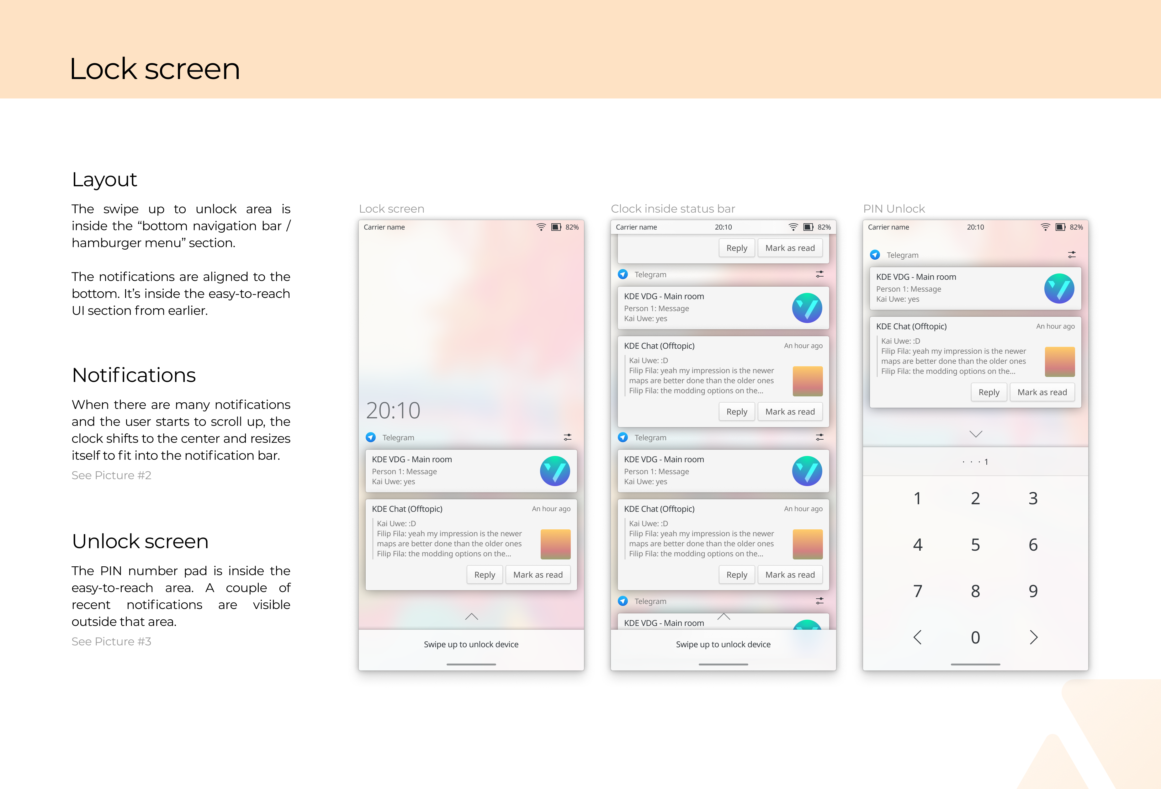
manueljlin added a comment to T12717: Plasma Mobile Design.
I've noticed a couple of errors (old version of the telegram icon in some places, missing app drawer text) already oof
I personally don't use it too often but it would be nice to have that as an option
Also having more space between the keys helps to not hit the wrong ones accidentally. Here's an example I personally find handy and convenient:
I don't really mind if it has more space between keys or not since it probably has the same touch area. (Let's see what the rest of the VDG thinks)
alexde awarded T12717: Plasma Mobile Design a Love token.
manueljlin added a comment to T12717: Plasma Mobile Design.
I was going to share this as a PDF but it's probably better to just share 2x PNG exports
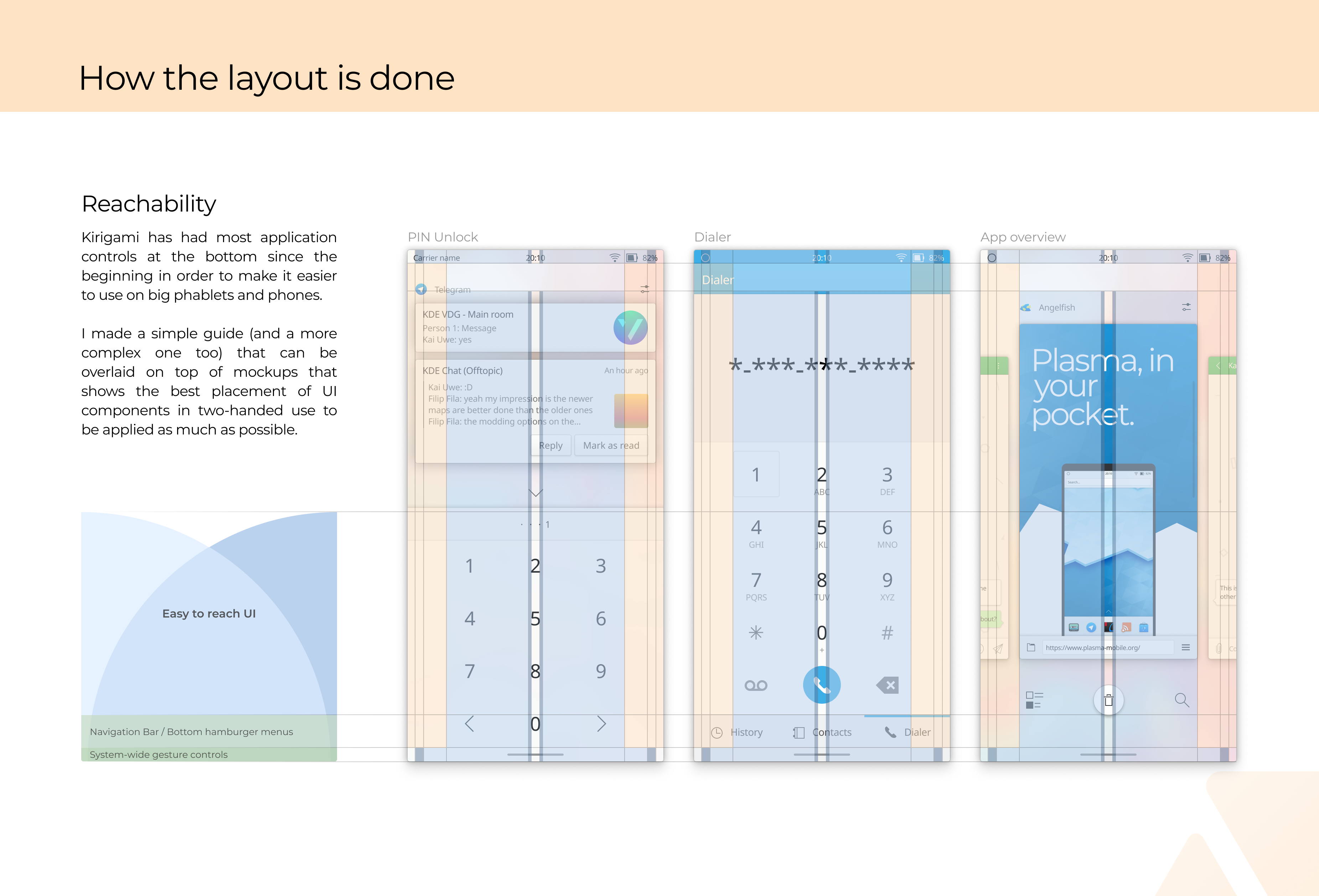
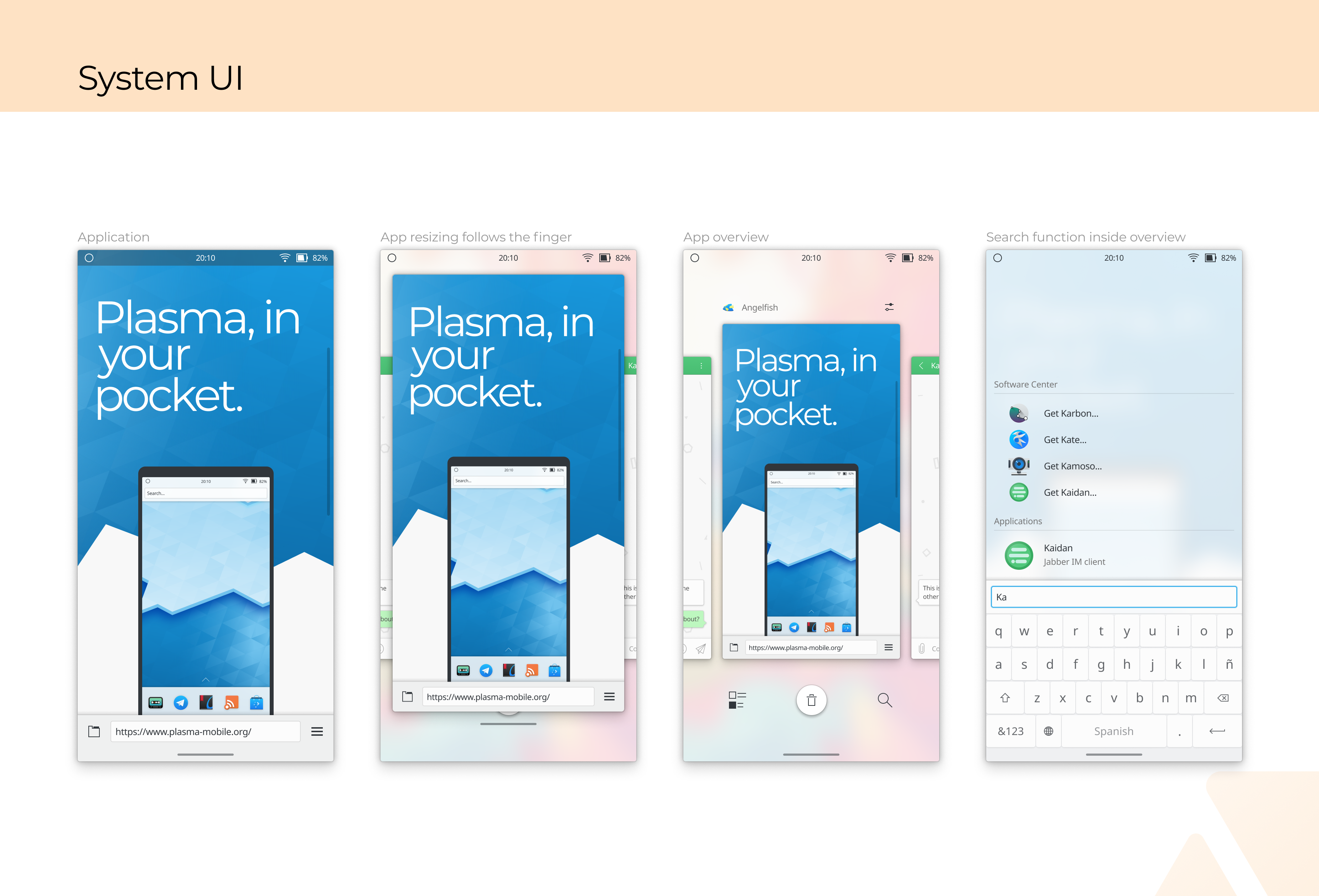
*it's inside the app overview, see the next image
Mar 18 2020
Mar 18 2020
manueljlin added a comment to D27199: [Applet]Update layout based on T10470.
Nice! Thanks
Mar 14 2020
Mar 14 2020
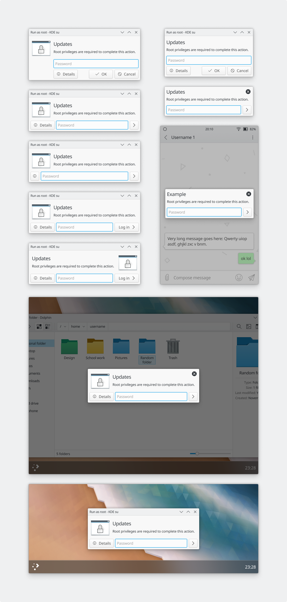
manueljlin added a comment to T8569: Redesign Policy Kit Authorization dialog.
What about something like this?
Mar 13 2020
Mar 13 2020
manueljlin added a comment to D27199: [Applet]Update layout based on T10470.
I know this is closed now, but some people from the VDG didn't like the text indicator replaced with a 1px divider and the differently sized networks. Is it a good idea to tweak it or is it better to leave it like it is?
Feb 29 2020
Feb 29 2020
manueljlin added a comment to T12372: Elisa UI Redesign.
Feb 27 2020
Feb 27 2020
Looks good, let's wait for ngraham so he accepts as vdg
Feb 25 2020
Feb 25 2020
manueljlin added a comment to D27523: [Moved to invent.kde.org]Add an option to use a KUrlNavigator on the toolbar instead.
Nice! It looks great, hope it gets added
Feb 19 2020
Feb 19 2020
manueljlin updated the task description for T10470: Improve the visuals of tray popups.
manueljlin updated the task description for T10470: Improve the visuals of tray popups.
Feb 17 2020
Feb 17 2020
Feb 16 2020
Feb 16 2020
manueljlin added a comment to T12640: Refine Task Manager tooltips.
Nice! Sorry for not reviewing some tasks btw, for some reason I didn't see it on my emails
Feb 15 2020
Feb 15 2020
manueljlin added a comment to T12308: Dolphin UI redesign.
Moved the mockups to the description
manueljlin added a comment to T12434: Kaidan UI tweaks.
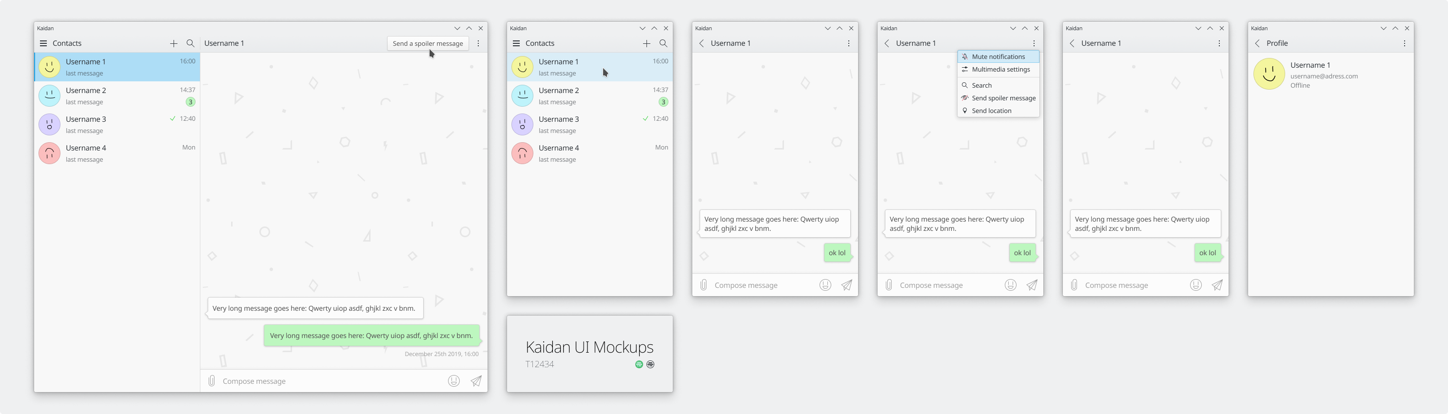
What do you think, @KonqiDragon?
Feb 14 2020
Feb 14 2020
manueljlin added a comment to T10470: Improve the visuals of tray popups.
Okay, I'm almost done with the mockups. Currently, it looks like this:

Feb 9 2020
Feb 9 2020
manueljlin added a comment to D26806: [Applets/Power Manager] Update layout based on T10470.
Thanks, and sorry for wasting your time :x
manueljlin added a comment to D27257: [Applet]Move toolbar to the bottom.
you can close this task if you want, after talking a bit over T10470 it's better to use headers instead of footers
manueljlin added a comment to T10470: Improve the visuals of tray popups.
I have no problem changing the footers back to headers, if you want I can make another version with these and go with them instead
Feb 7 2020
Feb 7 2020
manueljlin added a comment to D27199: [Applet]Update layout based on T10470.
I think that it should use a footer to be consistent with the other ones
Feb 6 2020
Feb 6 2020
manueljlin added a comment to D27198: [RFC] Reduce size of Level 1 headings and increase left padding on page titles.
Edit: actually, checking with a computer screen both look good, but I still prefer the screenshots from the Details section
manueljlin accepted D27198: [RFC] Reduce size of Level 1 headings and increase left padding on page titles.
Looks significantly better in my opinion
manueljlin added a comment to T10470: Improve the visuals of tray popups.
Reply from the VDG group about why it's changed to a footer:
Feb 5 2020
Feb 5 2020
manueljlin added a comment to D27160: [applets/mediacontroller] Visually refresh media controller plasmoid.
I love how it looks :D
The only thing I would change is the progress bar padding by either extending the bar to the left border to the album art or to the ~11px border from before
Feb 2 2020
Feb 2 2020
Feb 1 2020
Feb 1 2020
manueljlin added a comment to T12631: [RFC] Make Kirigami's headings smaller and set default top/left margins.
There's something off with the 1.0 scaling discover screenshots, the search bar is squashed and there seems to be extra vertical padding in the heading text
manueljlin added a comment to T12631: [RFC] Make Kirigami's headings smaller and set default top/left margins.
Looks much better imo, even the text seems to be vertically centered
Jan 30 2020
Jan 30 2020
manueljlin added a comment to T12308: Dolphin UI redesign.
Jan 29 2020
Jan 29 2020
manueljlin added a comment to T10470: Improve the visuals of tray popups.
These get reused in plasma mobile too (as far as I know) so we have to be extra careful with changes like these, especially size and click/tap targets. Also don't know about hiding stuff behind another click w10-style.
Jan 27 2020
Jan 27 2020
manueljlin added a comment to D26806: [Applets/Power Manager] Update layout based on T10470.
Might be better to be aligned to the left since it looks similar now to the battery percentage, but aside from that it's great! Also, sorry for replying late :P
Jan 26 2020
Jan 26 2020
manueljlin awarded T12599: Proposal: Deprecate WhatsThis functionality a Love token.
Jan 24 2020
Jan 24 2020
Nice, looks great! About the stream name, it doesn't look like it's useful most of the time so it might be better to remove it
Jan 22 2020
Jan 22 2020
manueljlin added a comment to T10470: Improve the visuals of tray popups.
I'd say it's fine that way
Jan 18 2020
Jan 18 2020
manueljlin added a comment to T10470: Improve the visuals of tray popups.
About the suppresion message, I feel like it'd be better if it was out of the bottom "toolbar".but I'll check what the rest of the vdg thinks in the chat later today. And about the icon, afaik there isn't any brightness icon for that size
Jan 13 2020
Jan 13 2020
Jan 6 2020
Jan 6 2020
manueljlin added a comment to T12308: Dolphin UI redesign.
not intentional
manueljlin added a comment to T12308: Dolphin UI redesign.
dolphin with breadcrumbs inside view

manueljlin added a comment to D26271: [Applet]Update layout based on T10470.
If it isn't possible that's okay (it looks really nice right now, great job btw :D), although it'd be nice to make it consistent with the kirigami style divider
Dec 29 2019
Dec 29 2019
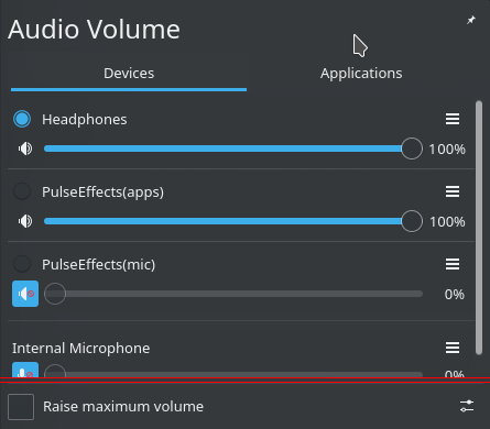
manueljlin added a comment to D26271: [Applet]Update layout based on T10470.
Looking at the screenshots, UI wise it's looking good already, only that the checkbox seems too big (should be the same size as the radio button, 16px) and there's a 5px sized padding after the divider that cuts off part of the Internal Microphone button and volume slider earlier than it's supposed to
manueljlin added a comment to T10470: Improve the visuals of tray popups.
The only changes would be the "[ ] Raise maximum volume" checkmark at the bottom and the different tab and header style
Dec 28 2019
Dec 28 2019
baberts awarded T12192: Redesign application launcher a Love token.
Dec 27 2019
Dec 27 2019
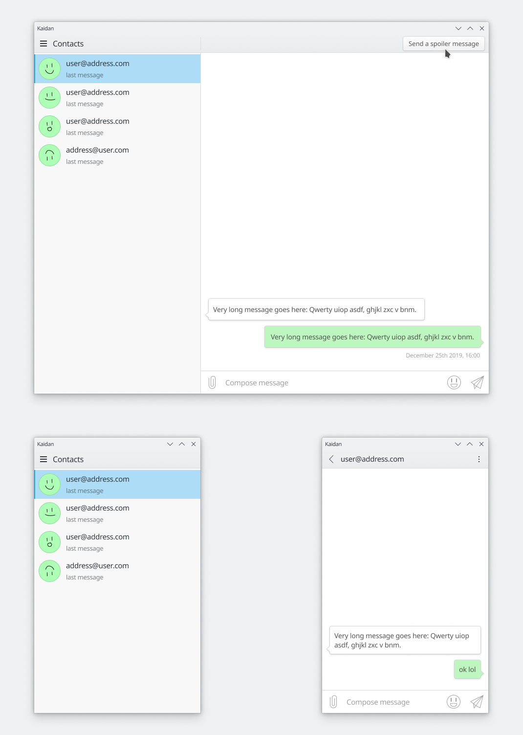
manueljlin updated subscribers of T12434: Kaidan UI tweaks.
What do you think about these changes?
- Removing the dividers between the accounts
That's why the SimpleMenu design mockups doesn't have any dividers and the Kaidan one from T12420 didn't have dividers either
manueljlin updated the name of F7845764: kaidan on android from "IMG_20191227_191507.jpg" to "kaidan on android".
manueljlin added a comment to T12420: Redesign/tweak applications.
It actually has a bg like in telegram but it doesn't seem to be customizable. Also, for some reason Kaidan's android builds have way more features than the KDE Neon (dev) version
manueljlin added a comment to T12192: Redesign application launcher.
Readded files tab as grid and apps tab as list, and tweaked the search padding
manueljlin updated the task description for T12192: Redesign application launcher.
Dec 26 2019
Dec 26 2019
manueljlin added a comment to T12420: Redesign/tweak applications.
manueljlin added a comment to T12427: Loading animation change.
The gear idea is quite interesting. By the way, have you seen T11227? Seems like a similar task
Dec 24 2019
Dec 24 2019
manueljlin added a comment to T12192: Redesign application launcher.
Dec 23 2019
Dec 23 2019
manueljlin added a comment to T12192: Redesign application launcher.
That makes sense
- I'm not sure what the status of the discussion is on what should be shown as icons and what as lists. My current plan is to default everything in "Apps" to icons except "All Applications" as list, default everything in "Files" to list, and have a context menu action to switch in every view that just remembers the choice. Search results are a list, too.
Nice, you can add the apps' descriptions and align them like this so it doesn't have unused space:
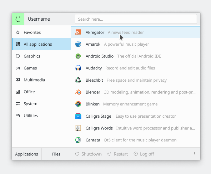
- I kind of still like the pagination that the original Simple Menu does. I'm considering having lists be vertically scrollable, but use the pages for the icon views.
Hmm, I don't know if it should be different for both the vertical list and the icon grid
- It's quite tricky to sort out what should be hover-activated and what should be click-activated in this UI design. I'm thinking the Apps and Files tabs need to be click-activated, hover there would be incredibly annoying.
Yup
alexde awarded T12192: Redesign application launcher a Love token.
manueljlin updated the task description for T10470: Improve the visuals of tray popups.
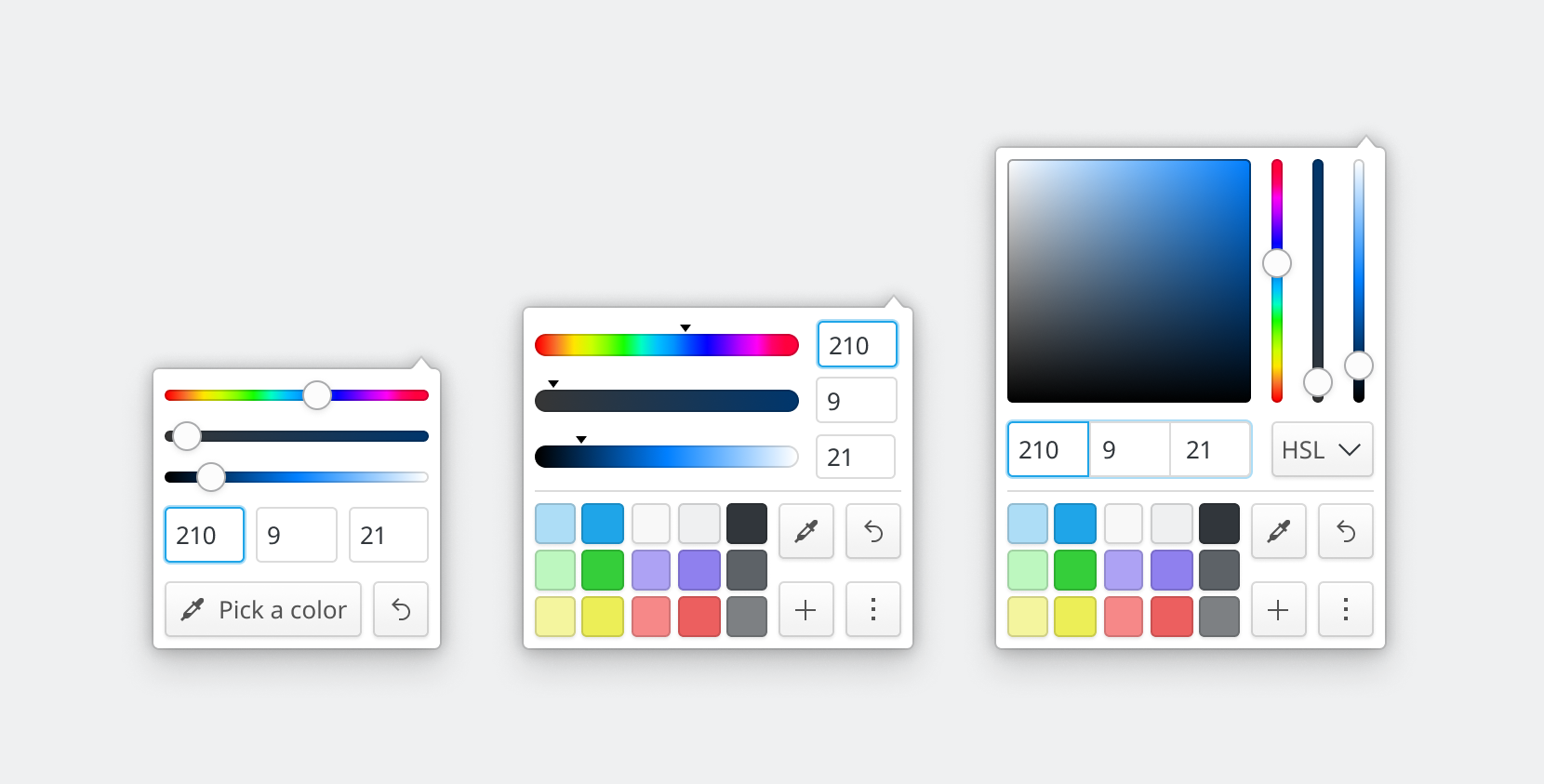
manueljlin added a comment to T12412: Tweak KColorSchemeEditor layout.
A load/save color pallete menu
Dec 22 2019
Dec 22 2019
manueljlin added a comment to T12412: Tweak KColorSchemeEditor layout.
Here's a couple of alternate color pickers in case it can be used somewhere else
manueljlin updated the task description for T12412: Tweak KColorSchemeEditor layout.
manueljlin added a comment to T12412: Tweak KColorSchemeEditor layout.
manueljlin added a comment to T12412: Tweak KColorSchemeEditor layout.
manueljlin updated the task description for T12412: Tweak KColorSchemeEditor layout.
manueljlin added a comment to T12372: Elisa UI Redesign.
yes, it has the same clickable area (30 px)
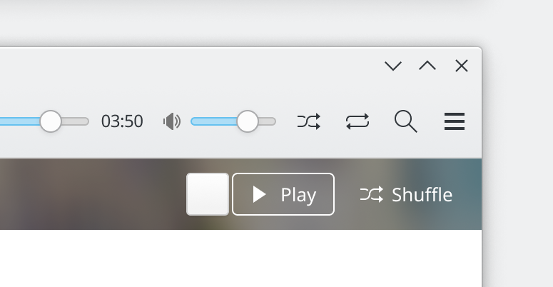
manueljlin added a comment to T12372: Elisa UI Redesign.
smaller version (maybe when you scroll down)
Dec 21 2019
Dec 21 2019
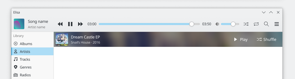
manueljlin added a comment to T12372: Elisa UI Redesign.
The current design from the app or the mockup from the description?
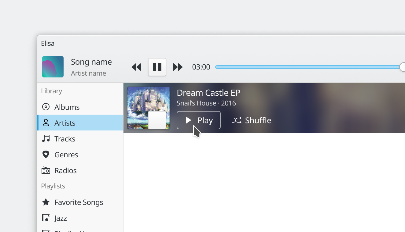
manueljlin added a comment to T12372: Elisa UI Redesign.
The artist category looks good but maybe make a bit thinner the banner:
manueljlin added a comment to T12372: Elisa UI Redesign.
Maybe something closer to the current design like this: (ignore the different progress bar and volume slider)
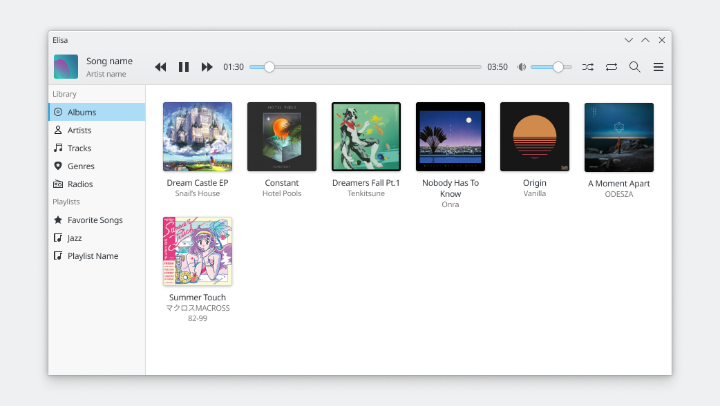
manueljlin added a comment to T12372: Elisa UI Redesign.
Thanks! This one works perfectly
manueljlin added a comment to T12372: Elisa UI Redesign.
Inkscape and figma
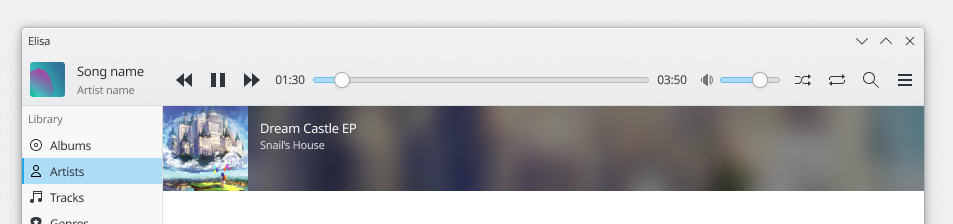
manueljlin added a comment to T12372: Elisa UI Redesign.
hmm, the svg seems to be just a png inserted with a bg
Dec 20 2019
Dec 20 2019
manueljlin added a comment to T12372: Elisa UI Redesign.

manueljlin added a comment to T12372: Elisa UI Redesign.
The only thing I would change to the mockup is the top toolbar, it looks a bit empty. Maybe you could do it like Kaku (electron based youtube player that happens to have a similar naming scheme to KDE apps), where the settings and search buttons are on the sidebar.
Dec 19 2019
Dec 19 2019
manueljlin awarded T12372: Elisa UI Redesign a Love token.
Dec 15 2019
Dec 15 2019
manueljlin updated the task description for T12192: Redesign application launcher.
Dec 14 2019
Dec 14 2019
manueljlin added a comment to T12192: Redesign application launcher.
Also, when the search bar is focused and the user has searched for something that has many options, pressing the left/right keys should change the category.
For example, in the lower right corner of every mockup there are multiple categories displayed (Applications/Pictures/Documents) so pressing right would directly select accesories-character-map.svg because it's the first option in the Pictures category.
Dec 11 2019
Dec 11 2019
manueljlin added a comment to T12192: Redesign application launcher.
Honestly, I'm against using categories on the right too, it just feels wrong tbh.
manueljlin added a comment to T12192: Redesign application launcher.
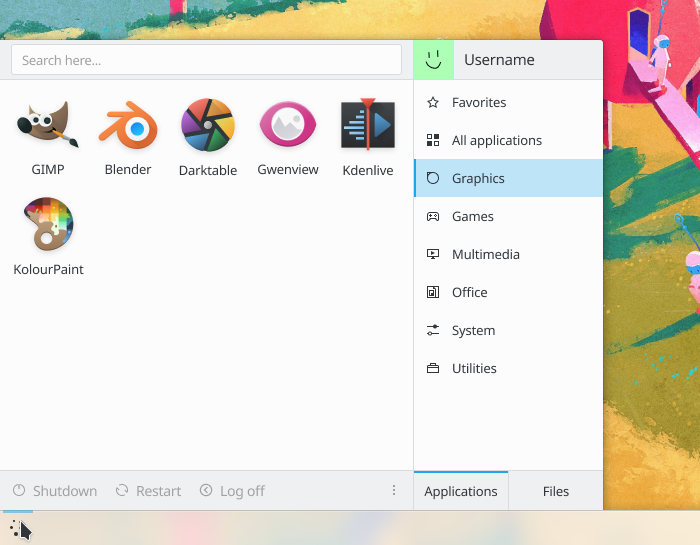
manueljlin added a comment to T12192: Redesign application launcher.
So something like this?
Dec 10 2019
Dec 10 2019
The-Feren-OS-Dev awarded T12192: Redesign application launcher a Love token.
manueljlin added a comment to T12192: Redesign application launcher.
It used to be like that in the other task and was swapped around to avoid accidental clicks but if no one complains I'll change it
Dec 9 2019
Dec 9 2019
manueljlin added a comment to T12192: Redesign application launcher.
manueljlin added a comment to T12192: Redesign application launcher.
manueljlin added a comment to T12192: Redesign application launcher.
Seems like the best way to do it, yeah. I will add a Recents category for files and change the image from the task. I only have one question, should the size change when the tabs are switched?

or not
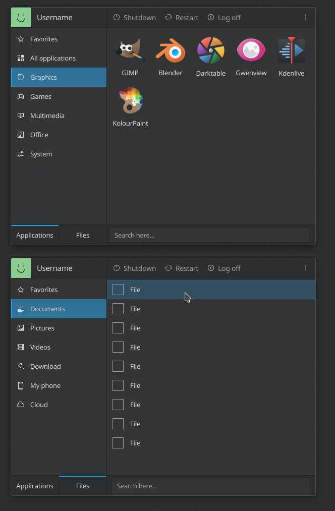
which would be easier to implement but, look at that unused space, oof.
manueljlin added a comment to T12192: Redesign application launcher.
Should I change the task image to this one then?

Dec 8 2019
Dec 8 2019
manueljlin added a comment to T11663: Move URL Navigator into toolbar.
+1 to tabs having a minimum width size
I kind of like that tab location but it probably shouldn't extend to the sidebar too.
romangg awarded T12192: Redesign application launcher a Love token.
manueljlin added a comment to T12192: Redesign application launcher.
Dec 7 2019
Dec 7 2019
manueljlin added a comment to T12192: Redesign application launcher.

Dec 6 2019
Dec 6 2019
manueljlin added a comment to T12192: Redesign application launcher.
Maybe A - Z with a vertical list could look like this, the only problem is where to put the favorites apps and files. Maybe at the top of the apps list could work?
1x
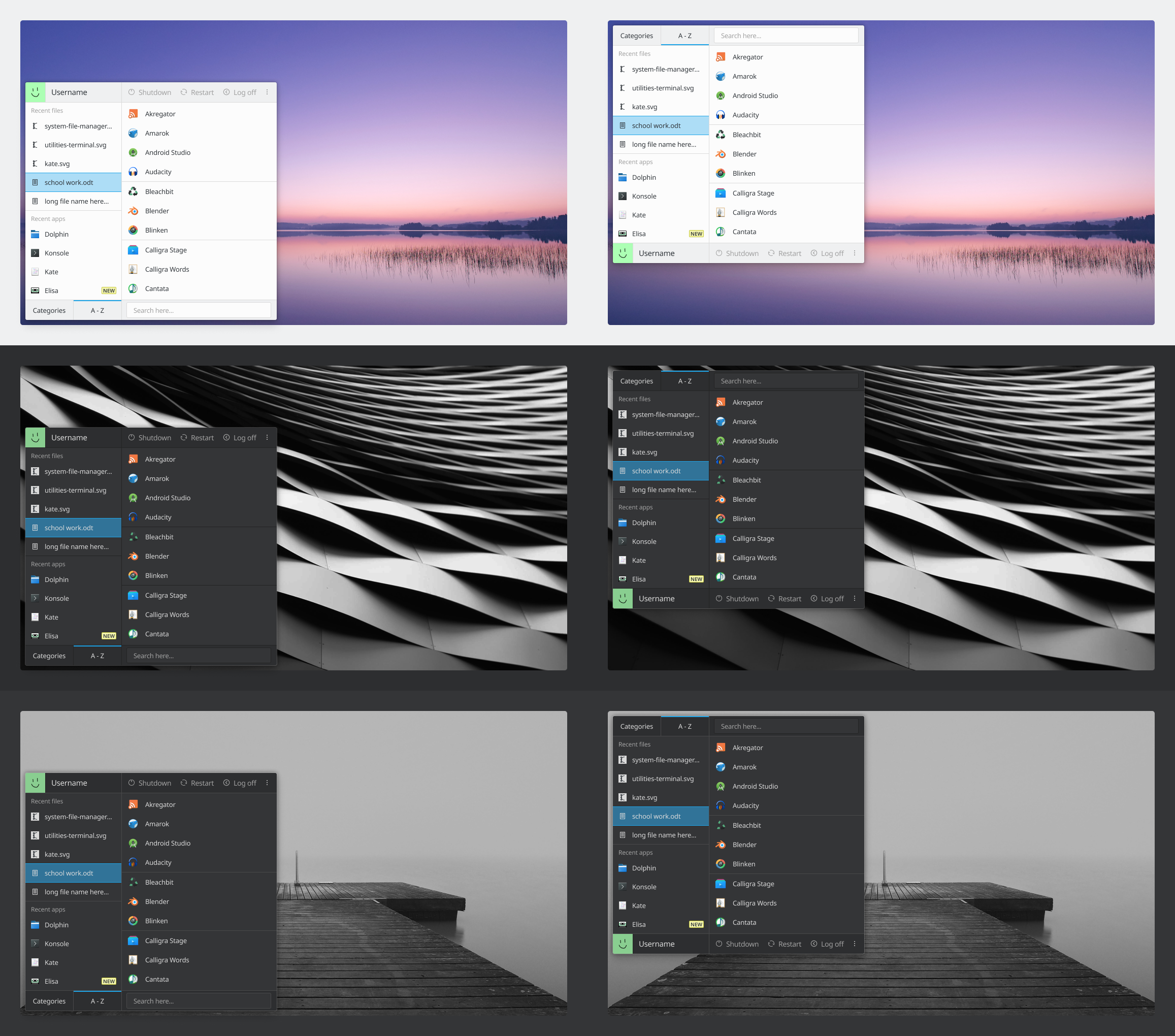
4x

Dec 4 2019
Dec 4 2019
manueljlin added a comment to D25728: [Applet Configuration] Don't draw a separator between the titlebar and window.
I though that would just affect every app's titlebar without actually checking if the app has a toolbar, etc etc and just add/remove the divider everywhere and be done with it. However, if the app can actually send a hint to Kwin to make it hide or show the divider depending if it has a toolbar or not (or maybe through a window / app rule), then it's great
manueljlin added a comment to D25728: [Applet Configuration] Don't draw a separator between the titlebar and window.
But that style of line / divider was going to be after the toolbars too, like kirigami apps, so removing it just would make that inconsistent later on. The divider needs to be inside the application itself to make this possible, instead of in the titlebar.