This is a task to discuss about how the recent design proposals should affect Dolphin itself, and what should be changed where.
Some mockups of what's been currently discussed:
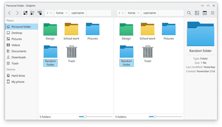
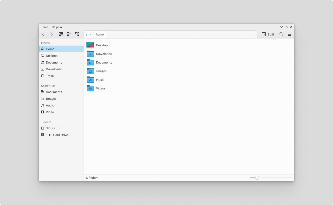
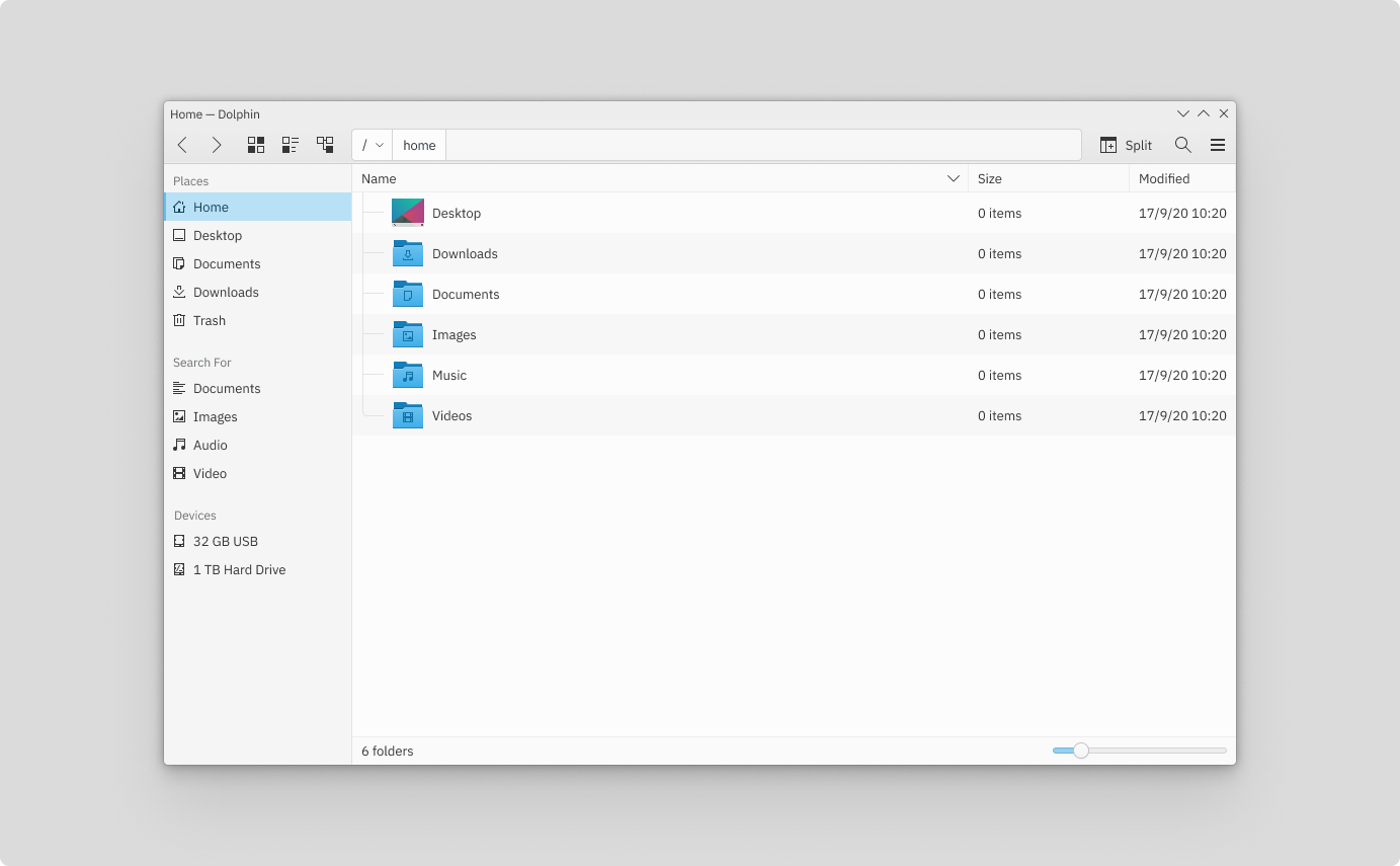
Breadcrumbs inside view
1x

2x F8105335
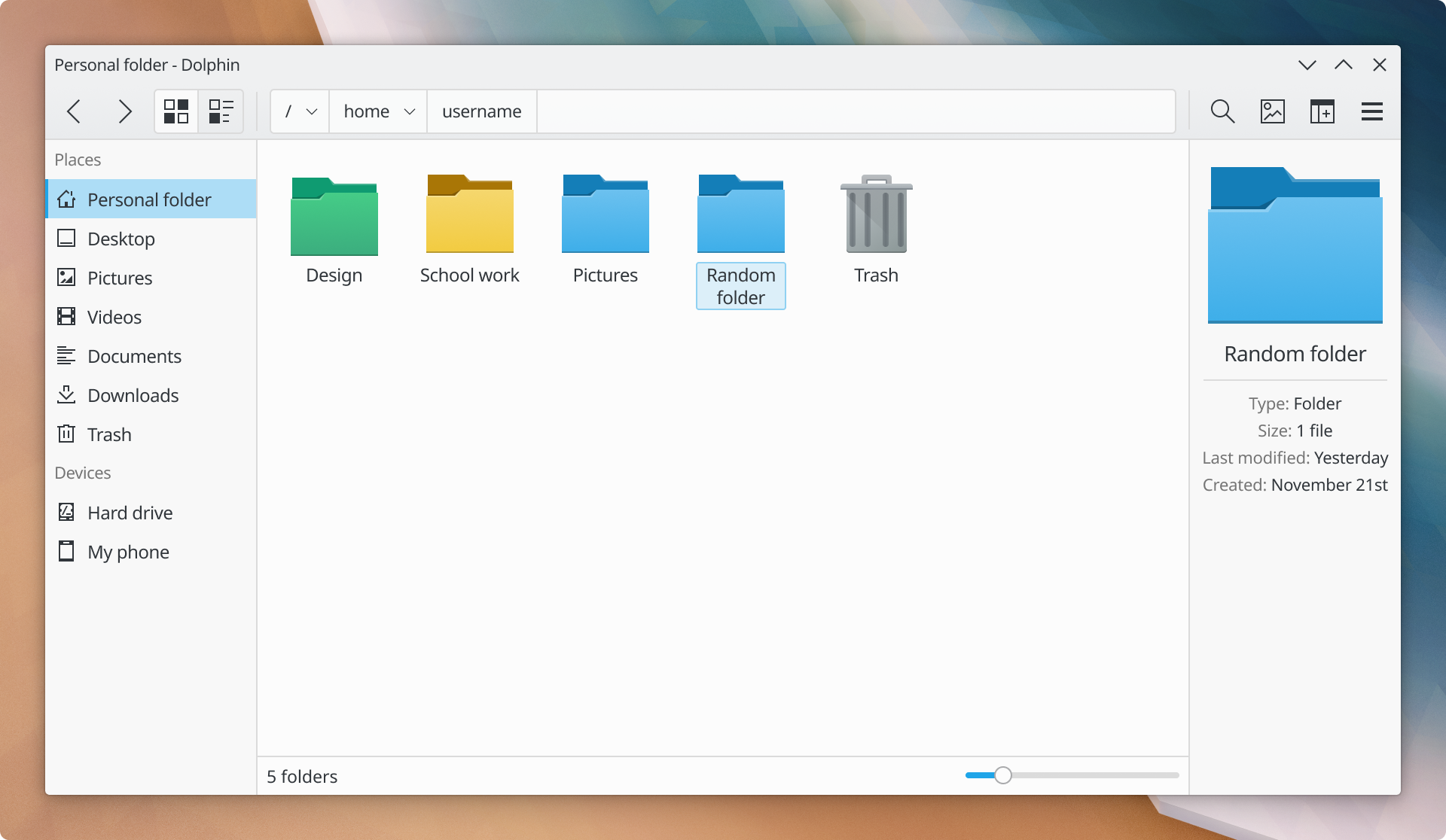
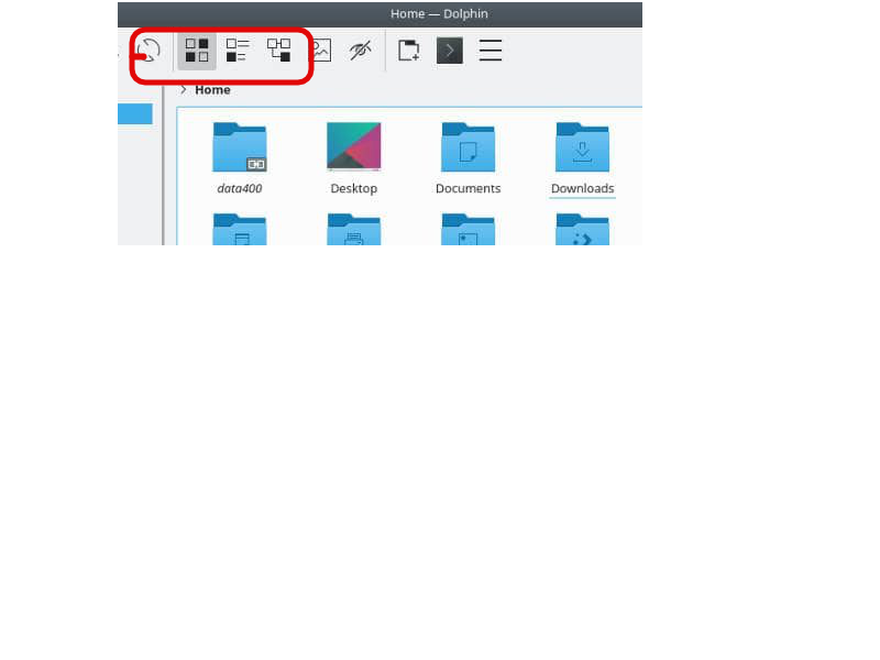
Breadcumbs inside the toolbar
1x
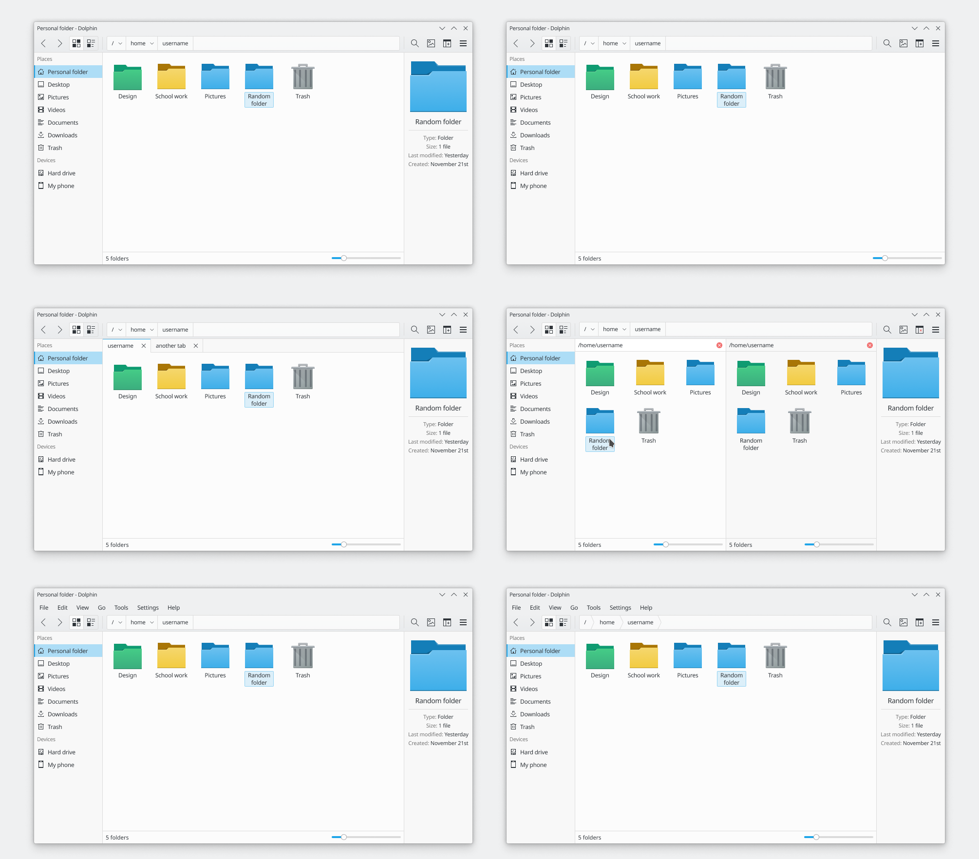
2x F8218239
Design changes
Breeze:
- T11661 - 1px divider instead of frames
- T10201 (with D27669 and D28317) - Tools Area (merges the look of the window decoration with menu bars and toolbars)
- T11124 - Unify highlight effect style
Dolphin:
- D27523 (KUrlNavigator on toolbar)
- Maybe add more padding between the tools area and the tabs to make them consistent with the normal ones? The ones used in the mockups are different because making the rounded tabs touch the 1px divider looks a bit blurry, not because the style is actually going to change.