Currently, loading is basically presented however the application developers of a given application decided to slap the loading bar in.
Some examples:
- Dolphin blanks the view while loading a directory
- Kate also remains blank, but sets the cursor to a loading animation
- Kirigami applications use a spinning view-refresh icon in their list views when loading
- KMail uses plain loading bars wherever it feels like it
- Systemsettings5 freezes the view and sets the cursor to a loading animation
- KDE Help uses freezes the view and shows a message in the bottom left corner, the icon selection dialog used in places such as editing application entries freezes the view, shows a loading bar, and sets the cursor to loading.
I feel like loading could be unified into two types: short form and long form loading.
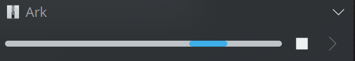
Short form
This should be used for loading that can occur frequently - i.e. clicking through directories in Dolphin in quick succession.
- Preserve view for a moment - if the next view loads within the timeframe before blanking, go straight to it
- If the next view doesn't load within a moment, blank the view and display an indicator that it's loading where a user is likely to see it
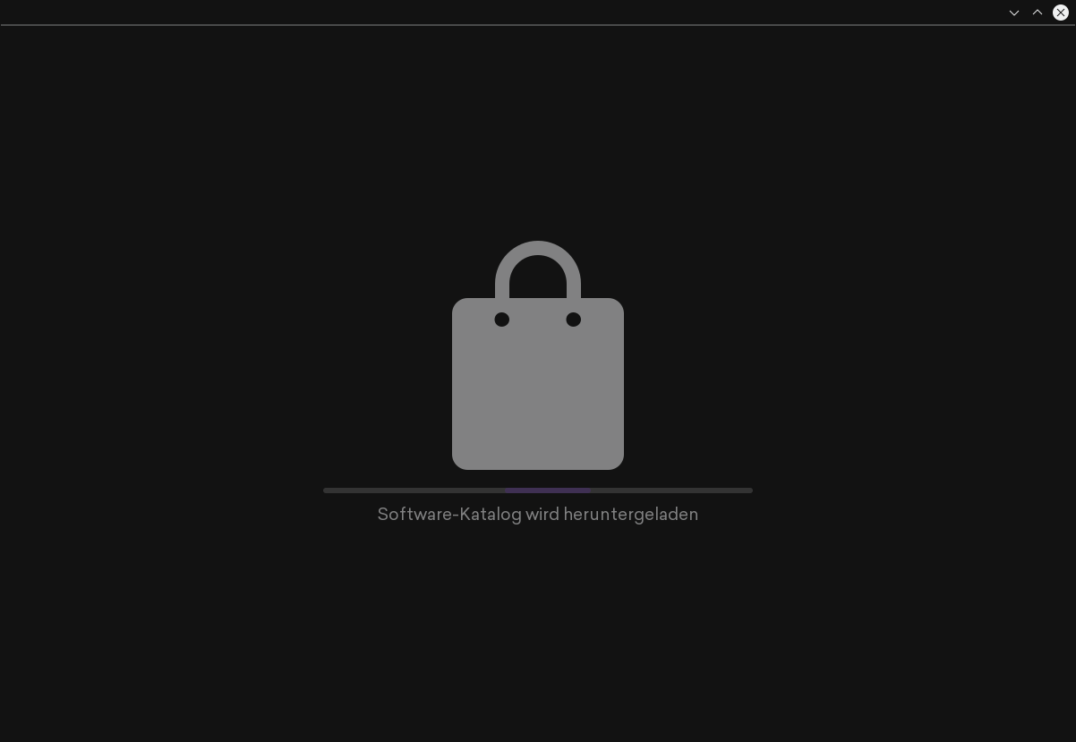
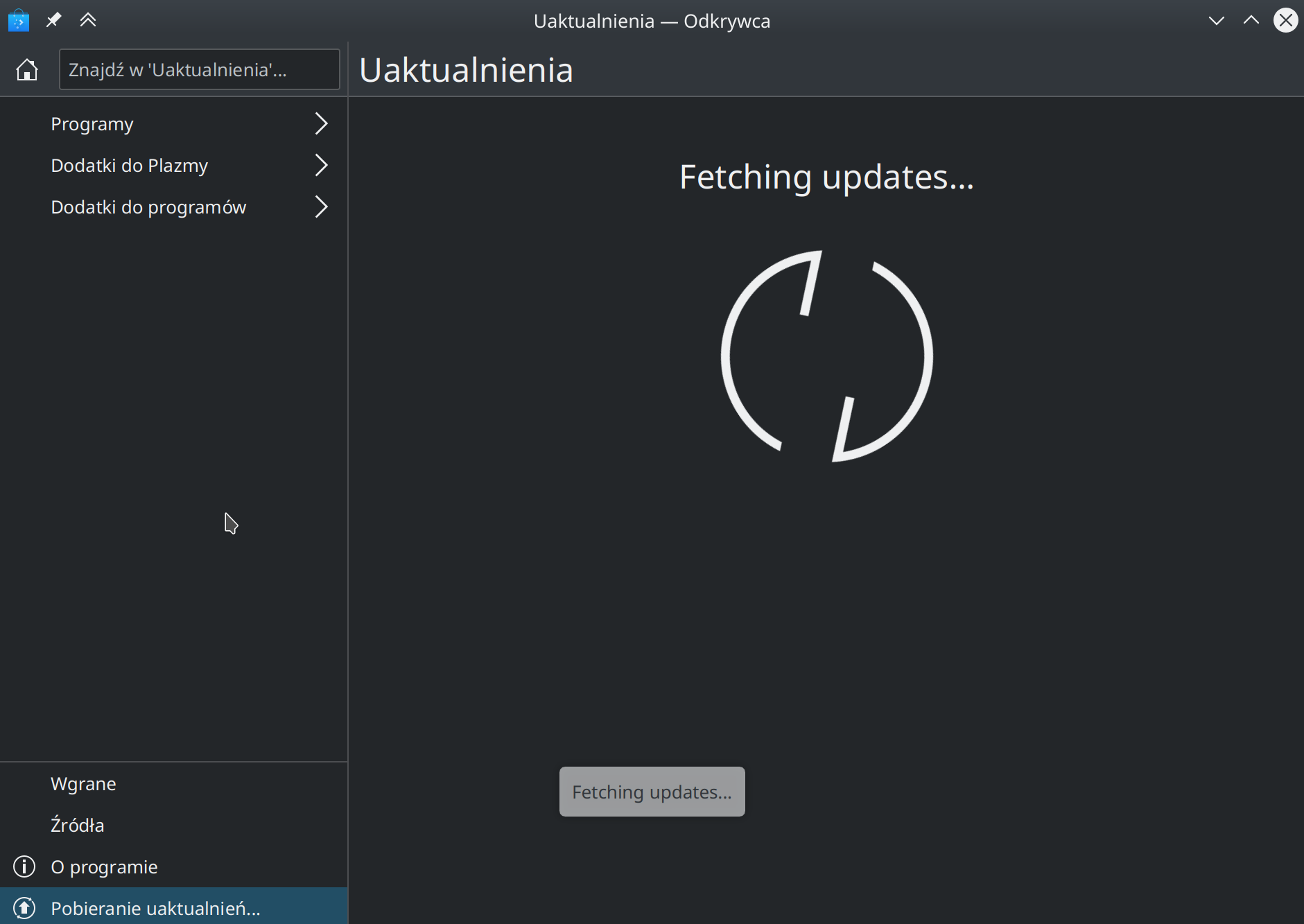
Long form
This should be used for loading that won't occur frequently - i.e. syncing KMail for the first time or launching Discover and it needs to refresh metadata.
A long form loader should be split into three parts:
- Large decorative component representative of what's being loaded (i.e. Discover could use a large shopping bag icon here)
- Loading bar to represent loading progress
- Text describing what's being done currently (i.e. Discover could list what repo it's currently refreshing)
Long form loaders should make sense as the only component on the screen, otherwise a short form loader would probably do better.