[Applet]Update layout based on T10470
ClosedPublic

Authored by gvgeo on Feb 6 2020, 7:34 PM.

Details

Summary

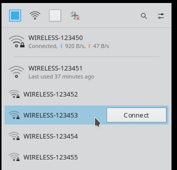
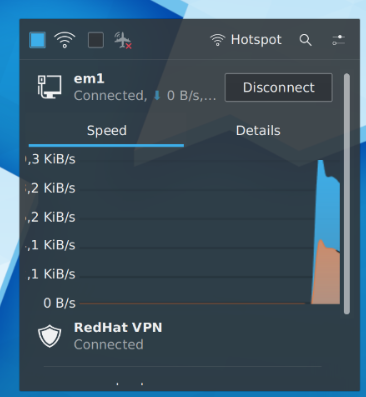
Decrease the Height of unknown connections.
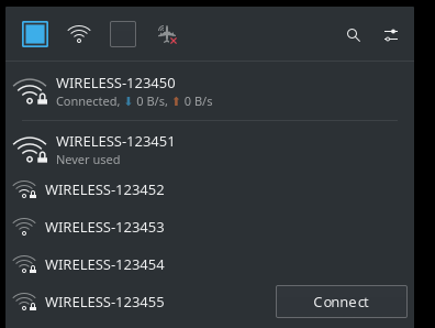
Remove sections as headings, but keep available connections section as
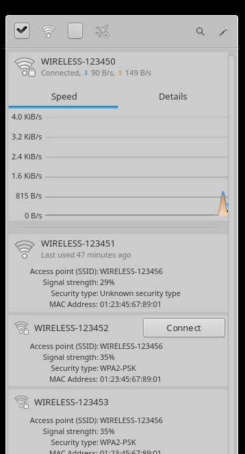
a separator. Now positioned below active/deactivating (instead of only
connected) connections from the rest.
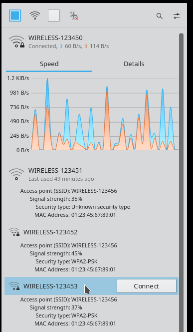
Readjust details expand/minimize area and highlight to the main row.
Set custom margins for ListItem's background.

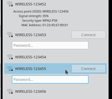
Remove info row for unknown connections.
Move security type in details.
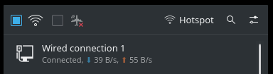
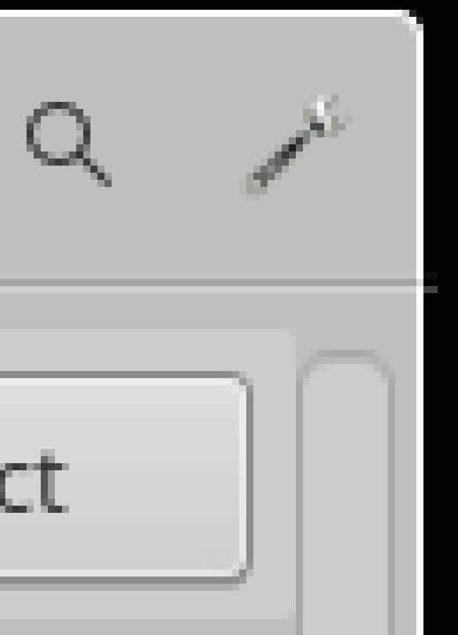
Add line between buttons and search field.
Change toolbar from GridLayout to ColumnLayout.
Add spacing between toolbuttons in toolbar.
Add opacity in details.

Test Plan

Toolbar view with up-to-date build

Breeze Dark

Breeze Light

Air

Diff Detail

Repository
R116 Plasma Network Management Applet
Lint
Automatic diff as part of commit; lint not applicable.
Unit
Automatic diff as part of commit; unit tests not applicable.
gvgeo created this revision.Feb 6 2020, 7:34 PM
Restricted Application added a project: Plasma. · View Herald TranscriptFeb 6 2020, 7:34 PM
Restricted Application added 1 blocking reviewer(s): jgrulich. · View Herald Transcript
Restricted Application added a subscriber: plasma-devel. · View Herald Transcript
gvgeo requested review of this revision.Feb 6 2020, 7:34 PM
gvgeo edited the test plan for this revision. (Show Details)Feb 6 2020, 7:37 PM
gvgeo edited the summary of this revision. (Show Details)
gvgeo edited the summary of this revision. (Show Details)Feb 7 2020, 6:23 AM
gvgeo updated this revision to Diff 75150.Feb 7 2020, 9:54 AM
gvgeo edited the summary of this revision. (Show Details)

Remove active connections section.

I had a typo in my script.

gvgeo edited the test plan for this revision. (Show Details)Feb 7 2020, 9:56 AM
gvgeo planned changes to this revision.Feb 7 2020, 7:49 PM

Found a better way to hide the separator.

I think that it should use a footer to be consistent with the other ones

gvgeo updated this revision to Diff 75280.Feb 8 2020, 7:16 PM

Fixed hiding function of the separator.

gvgeo edited the summary of this revision. (Show Details)Feb 8 2020, 7:20 PM
gvgeo planned changes to this revision.Feb 9 2020, 7:07 PM

Background margins and big connect button is a problem. Other themes break as it is now.
Also creates an awkward empty space between label and details. Which direction to take?

  1. Remove button and replace with a text. Bold when hover to click.
  2. Remove listitem background.
  3. Increase the available connections height, to match the other's height.
  4. Something else?
gvgeo edited the summary of this revision. (Show Details)Feb 9 2020, 7:09 PM
gvgeo updated this revision to Diff 75498.Feb 11 2020, 10:09 PM

Route no.2
Added line and Warning messages.

gvgeo retitled this revision from [WIP][Applet]Update layout based on T10470 to [Applet]Update layout based on T10470.Feb 11 2020, 10:10 PM
gvgeo edited the summary of this revision. (Show Details)
gvgeo edited the test plan for this revision. (Show Details)

Pretty nice. If the list items are no longer going to have a selection highlight but still open up/unfold when single-clicked, then the cursor should change to a pointing hand when hovering over them.

gvgeo planned changes to this revision.Feb 12 2020, 7:32 AM

Clicking and highlight only on the main row, and only when hover.

I like it. I didn't go through the code changes yet, I'll wait until you finish it completely.

Hmm, now I see my currently connected network twice:

gvgeo added a comment.Feb 13 2020, 5:27 PM

Added highlight as mention, and brought back background. To do that, had to ignore, theme's margins.
I need to clean code, before uploading.

I'm not so sure about this:
When a row is expanded, moving from bottom to top. Highlight disappears with button, But only the buttton appears on the row above, untill you reach the main row.


Alternative can restore highlight as it was. Higlight the whole item.
I'd like to avoid the hand pointer. Because it will be a hand most of the time.


I see my currently connected network twice

Is this onetime thing or can reproduce?
I wonder if it is a core problem. I don't believe I influenced the model. I'll take a look again of course.

Can reproduce; it's consistent.

gvgeo added a comment.Feb 14 2020, 7:41 AM

I made 3 smaller patches, to decrease this patch's size. D27391 D27392 D27393

@ngraham Before I make any change here, can you tell me if you can still reproduce the problem, with this diff on master?


It exludes changes in modelitem and C++ in general.

I made 3 smaller patches, to decrease this patch's size. D27391 D27392 D27393

@ngraham Before I make any change here, can you tell me if you can still reproduce the problem, with this diff on master?


It exludes changes in modelitem and C++ in general.

Yes, I can still reproduce the issue with this diff applied on top of master. HOWECVER! I just noticed that I can reproduce the issue on master right now, with no patches. I can't believe I missed this before, sorry!

This is probably not related to the UI, it might be issue in the internals. Can you open a bug for it? Ideally if you can restart plasmashell and enable plasma-nm debug and attach the log to your bug. Thanks.

gvgeo updated this revision to Diff 75831.EditedFeb 17 2020, 2:25 PM
gvgeo edited the summary of this revision. (Show Details)

Changes:
Removed some parts that were split into separate patches.
Reintroduce background.
Moved highlight in ListItem.
Removed heading and moved separator in ListItem.

TODO:
Add opacity: 0.6 for details after D27393 commit.
Remove 1 extra smallSpacing in switchbutton after D27453 commit.
Remove extra lines from ListItem.qml.

gvgeo planned changes to this revision.Feb 17 2020, 2:25 PM
gvgeo edited the test plan for this revision. (Show Details)Feb 17 2020, 2:48 PM
gvgeo edited the test plan for this revision. (Show Details)

This is probably not related to the UI, it might be issue in the internals. Can you open a bug for it? Ideally if you can restart plasmashell and enable plasma-nm debug

Will do. How do I do enable plasma-nm debug?

This is probably not related to the UI, it might be issue in the internals. Can you open a bug for it? Ideally if you can restart plasmashell and enable plasma-nm debug

Will do. How do I do enable plasma-nm debug?

Use export QT_LOGGING_RULES=plasma-nm*.debug=true

More details: https://techbase.kde.org/Projects/Solid/Plasma-nm

gvgeo updated this revision to Diff 75906.Feb 18 2020, 11:38 AM
gvgeo edited the test plan for this revision. (Show Details)

TODO from the last update.
Improved comments.
Removed fill anchor from listview.

gvgeo added a comment.EditedFeb 18 2020, 11:40 AM

1 picture, 1 problem, 2 issues.


I understand why margins exist. But this, is wrong.

1.Line outside of the panel (open the image to see). Fits perfect with Breeze, Air must have small margins.
2.Scrollbar offset.

gvgeo edited the summary of this revision. (Show Details)Feb 18 2020, 11:44 AM
gvgeo edited the test plan for this revision. (Show Details)

The worst problem I could found, by ignoring the margins.
Theme "Underworld".

jgrulich accepted this revision.Feb 27 2020, 7:03 AM

It will need rebase, there are some changes in master now which will be conflicting. Other than that I think it looks good, but I would like Nate to approve this from the UI point of view.

This revision is now accepted and ready to land.Feb 27 2020, 7:03 AM
manueljlin accepted this revision as: manueljlin.Feb 27 2020, 8:04 AM

Looks good, let's wait for ngraham so he accepts as vdg

gvgeo updated this revision to Diff 76526.Feb 27 2020, 9:39 AM
gvgeo edited the summary of this revision. (Show Details)

rebase

ngraham accepted this revision.Feb 27 2020, 3:05 PM

LGTM! Nice work.

This revision was automatically updated to reflect the committed changes.

Looks this changed introduced an issue. The traffic monitor doesn't fit into the applet.

See picture below:

I know this is closed now, but some people from the VDG didn't like the text indicator replaced with a 1px divider and the differently sized networks. Is it a good idea to tweak it or is it better to leave it like it is?

gvgeo added a comment.Mar 14 2020, 4:10 PM

Differently sized icons are about to be restored in D28034.

...text indicator replaced with a 1px divider... Is it a good idea to tweak it or is it better to leave it like it is?

The alternative is the first version from T10470 mocups, right? If VDG team doesn't like as it is, don't see a reason to keep it as it is.

Would be nice to hear about details labels too, which have 0.6 opacity now:

And of course any other change, to avoid changing the UI with every release.

Differently sized icons are about to be restored in D28034.

Nice! Thanks

...text indicator replaced with a 1px divider... Is it a good idea to tweak it or is it better to leave it like it is?

The alternative is the first version from T10470 mocups, right? If VDG team doesn't like as it is, don't see a reason to keep it as it is.

Yes, it would be like the first mockup

Would be nice to hear about details labels too, which have 0.6 opacity now:

LGTM

And of course any other change, to avoid changing the UI with every release.

If you could align the password field to the padding like this it would be great

gvgeo added a comment.Mar 18 2020, 2:28 PM

Differently sized icons are about to be restored in D28034.

Nice! Thanks

You should thank @ngraham. He is the one making these small changes, including the password field size, in that patch.