[applets/mediacontroller] Visually refresh media controller plasmoid
ClosedPublic

Authored by cblack on Feb 5 2020, 1:13 AM.

Details

Summary

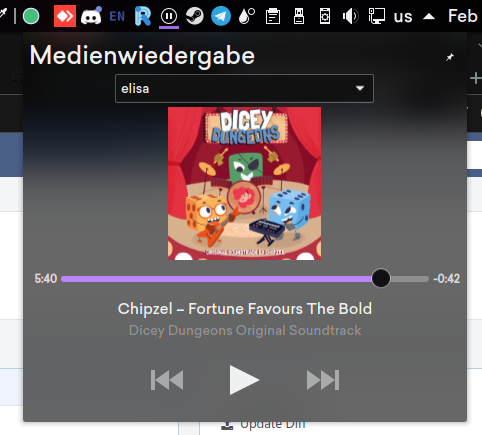
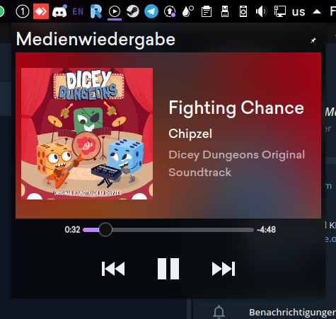
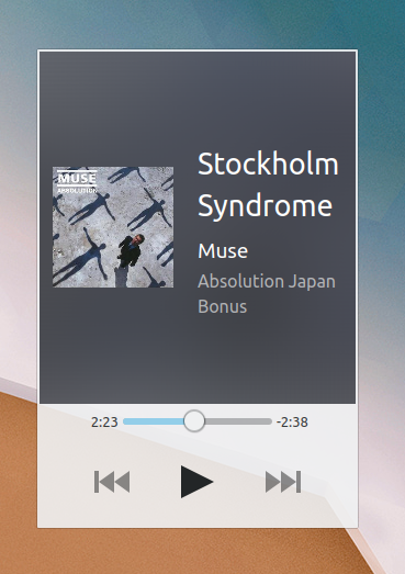
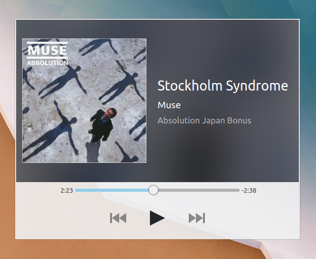
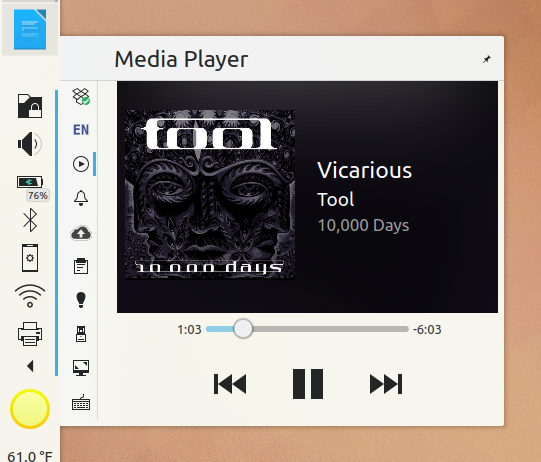
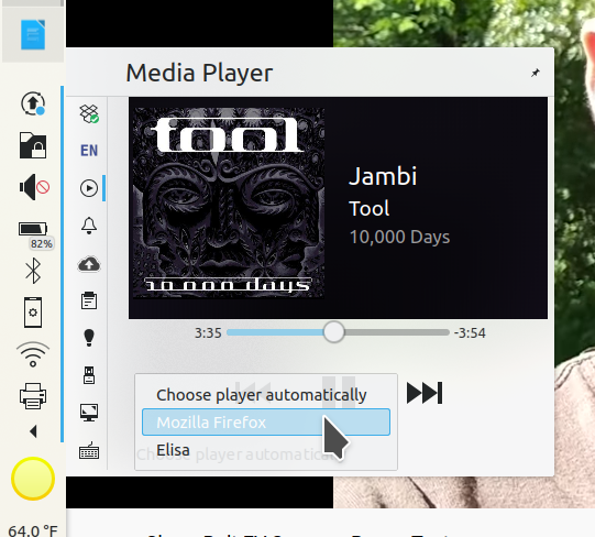
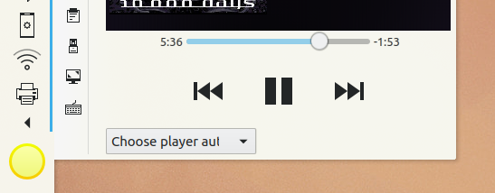
The media controller has been adjusted visually. Note that this is marked as WIP due to the fact that the system tray displays margins around the applet, which doesn't look too good.

Co-authored-by: Ismael Asensio <isma.af@gmail.com>

Depends on D28089

Test Plan

Before:


After:

Diff Detail

Repository
R120 Plasma Workspace
Lint
Automatic diff as part of commit; lint not applicable.
Unit
Automatic diff as part of commit; unit tests not applicable.
There are a very large number of changes, so older changes are hidden. Show Older Changes
cblack marked an inline comment as done.Feb 6 2020, 9:05 PM
cblack added inline comments.
cblack updated this revision to Diff 75140.Feb 6 2020, 9:09 PM
cblack marked 7 inline comments as done.

Address feedback

cblack updated this revision to Diff 75141.Feb 6 2020, 9:37 PM

Move source selector to bottom of column, hide by default

cblack updated this revision to Diff 75142.Feb 6 2020, 9:38 PM

Add license headers to two new QML files

cblack edited the test plan for this revision. (Show Details)Feb 6 2020, 9:40 PM
cblack updated this revision to Diff 75143.Feb 6 2020, 9:42 PM

Remove extraneous print

cblack updated this revision to Diff 75144.Feb 6 2020, 9:43 PM

Swap in gridUnit instead of largeSpacing

cblack retitled this revision from [mediacontroller] WIP: Visually refresh media controller plasmoid to [applets/mediacontroller] Visually refresh media controller plasmoid.Feb 6 2020, 9:55 PM

Overall looks much better I think! However the minimum height seems to be a bit tall now:

Also I have a hard time putting my finger on why, but somehow the scrubber not filling the full width feels odd to me, especially when the applet is wider than it is tall:

When the scrubber is the same width as the player controls below it, it seems fine. But when the window is wider and they no longer align vertically, it doesn't feel quite right to me.

ngraham requested changes to this revision.Feb 12 2020, 4:14 AM
ngraham added inline comments.
applets/mediacontroller/contents/ui/ExpandedRepresentation.qml
298

there's a massive binding loop somewhere here:

file:///home/nate/kde/usr/share/plasma/plasmoids/org.kde.plasma.mediacontroller/contents/ui/ExpandedRepresentation.qml:261:21: QML Heading: Binding loop detected for property "height"
This revision now requires changes to proceed.Feb 12 2020, 4:14 AM
davidedmundson added inline comments.Feb 12 2020, 7:03 AM
applets/mediacontroller/contents/ui/ExpandedRepresentation.qml
145–148

That says the opposite of what you want.

We want image's texture provider to be used directly. Only then will this sourcesize matter.

This is saying when layer effect is enabled it uses the base blitting path.

We don't want to use layer here, we want the image as a source to the blur directly

Ping. Would be nice to get this in.

cblack added inline comments.Mar 14 2020, 7:15 PM
applets/mediacontroller/contents/ui/ExpandedRepresentation.qml
298

I can't seem to reproduce a binding loop here.

kmaterka added inline comments.
applets/mediacontroller/contents/ui/ExpandedRepresentation.qml
298

I have not seen your code yet, I will check tomorrow. Probably because you have something like this:

Layout.preferredWidth: parent.width / 2
Layout.preferredHeight: parent.height / 2

Check the last answer from: How to design a multi-level fluid layout in QML. In short words: when possible, do not use Layout.preferredWidth, prefer implicitWidth instead. If you want to have 50-50 ratio between items, set implicitWidth in both items to the same value.

kmaterka added inline comments.Mar 14 2020, 8:52 PM
applets/mediacontroller/contents/ui/ExpandedRepresentation.qml
298

My last comment was not precise. Just check this for all details :)

kmaterka added inline comments.Mar 14 2020, 9:04 PM
applets/mediacontroller/contents/ui/ExpandedRepresentation.qml
298

As a general rule, you shouldn't refer to parents width in Layouts, including: Layout.maximumWidth: parent.width. It a (very) common mistake :)

cblack added inline comments.Mar 14 2020, 10:52 PM
applets/mediacontroller/contents/ui/ExpandedRepresentation.qml
298

This advice doesn't seem to be applicable here, as the implicitWidth of the ColumnLayout child isn't able to be mutated due to the fact that all of its child items (text) have fixed implicitWidths.

kmaterka added inline comments.Mar 15 2020, 9:49 PM
applets/mediacontroller/contents/ui/ExpandedRepresentation.qml
298

True, I didn't want to copy whole answer from Stack Overflow :) In this case Layout.preferredWidth should not be set to parent.width / 2, better to use Layout.preferredWidth = 50. I sometimes add % in a comment: Layout.preferredWidth = 50//%.

cblack updated this revision to Diff 77683.Mar 15 2020, 10:03 PM

Don't refer to parents' width

cblack updated this revision to Diff 77684.Mar 15 2020, 10:05 PM
cblack marked 7 inline comments as done.

Edit inaccurate comment.

cblack marked an inline comment as done.Mar 15 2020, 10:05 PM

I'm still seeing the binding loop. :(

I'm still seeing the binding loop. :(

Looks like this is a bug with Plasma's Label component, and not this patch. The Label component the height of the component based off of the height of the text, which varies based off of the height of the component, creating a binding loop.

Darn. Guess that's gotta get fixed first then. :/

cblack updated this revision to Diff 77763.Mar 16 2020, 6:21 PM

Replace PE.Heading with Kirigami.Heading

Nice, it's gone for me now.

However the margins are a bit funky with the new PlasmoidHeader design for the System Tray popups:

Detecting when more than one stream is playing seems broken too. If I play two at once, the UI never shows a combobox to let you select which one to control.

Detecting when more than one stream is playing seems broken too. If I play two at once, the UI never shows a combobox to let you select which one to control.

The combobox can be configured to show manually.

The usecase where a user is going to be playing two pieces of media at once isn't really common, so it's hidden by default to reduce unneeded visual elements.

ngraham requested changes to this revision.Mar 16 2020, 8:45 PM

That's a deal-breaker then. I quite commonly have the following use case:

  1. Play music in Elisa
  2. Pause the music using my keyboard's play/pause button
  3. Watch some YouTube video
  4. the YouTube video ends
  5. I want to play the music in Elisa again
  6. I hit the play.pause button on my keyboard and nothing happens, because it's still targeting the YouTube video

SInce this is a visual refresh, let's avoid adding or removing features. If you think that needs adjustment, let's discuss it and do it in a separate patch.

This revision now requires changes to proceed.Mar 16 2020, 8:45 PM
cblack updated this revision to Diff 77781.Mar 16 2020, 8:49 PM

Always show combobox

Hmm, something's kinda weird now. The combobox is flat so it doesn't look like a combobox, which IMO is a regression. Also its alignment feels a bit odd and the pop-up uses a nonstandard highlight style with an incorrect text color:

What was wrong with the original combobox?

Hmm, something's kinda weird now. The combobox is flat so it doesn't look like a combobox, which IMO is a regression. Also its alignment feels a bit odd and the pop-up uses a nonstandard highlight style with an incorrect text color:

What was wrong with the original combobox?

A raised combobox has too much visual prominence compared to its importance here.

I'm not sure I agree, but this flat version doesn't look like a combobox at all. TBH I don't like it.

cblack updated this revision to Diff 77794.Mar 17 2020, 12:52 AM

Unflatten combobox

cblack updated this revision to Diff 77796.Mar 17 2020, 1:45 AM

FillWidth the combobox

ngraham accepted this revision.Mar 17 2020, 2:38 AM
ngraham added a reviewer: broulik.

LGTM now. @broulik, are you good with this?

There are some funky margins that I think are the fault of the pop-up itself, due to the recent header patch. Will investigate that.

LGTM now. @broulik, are you good with this?

There are some funky margins that I think are the fault of the pop-up itself, due to the recent header patch. Will investigate that.

Should be fixed with D28089.

cblack updated this revision to Diff 79886.Apr 11 2020, 9:19 PM

Fallback to album cover icon without album art or desktop file name

cblack updated this revision to Diff 79944.Apr 12 2020, 5:52 PM

Wrap progressbar to prevent height filling

cblack updated this revision to Diff 79960.Apr 12 2020, 7:42 PM

Smaller fallback icon

cblack updated this revision to Diff 79961.Apr 12 2020, 7:57 PM

Address feedback

broulik accepted this revision.Apr 12 2020, 8:04 PM
This revision is now accepted and ready to land.Apr 12 2020, 8:04 PM
cblack updated this revision to Diff 79962.Apr 12 2020, 8:04 PM
cblack added 1 blocking reviewer(s): broulik.

Trim whitespace

This revision now requires review to proceed.Apr 12 2020, 8:04 PM
This revision was not accepted when it landed; it landed in state Needs Review.Apr 12 2020, 8:13 PM
This revision was automatically updated to reflect the committed changes.