Discussion about early VDG mockups of a possible UI/UX change to Plasma Mobile. What would work, what wouldn't, HIG compatibility, etc.

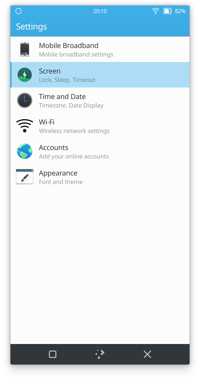
Discussion about early VDG mockups of a possible UI/UX change to Plasma Mobile. What would work, what wouldn't, HIG compatibility, etc.
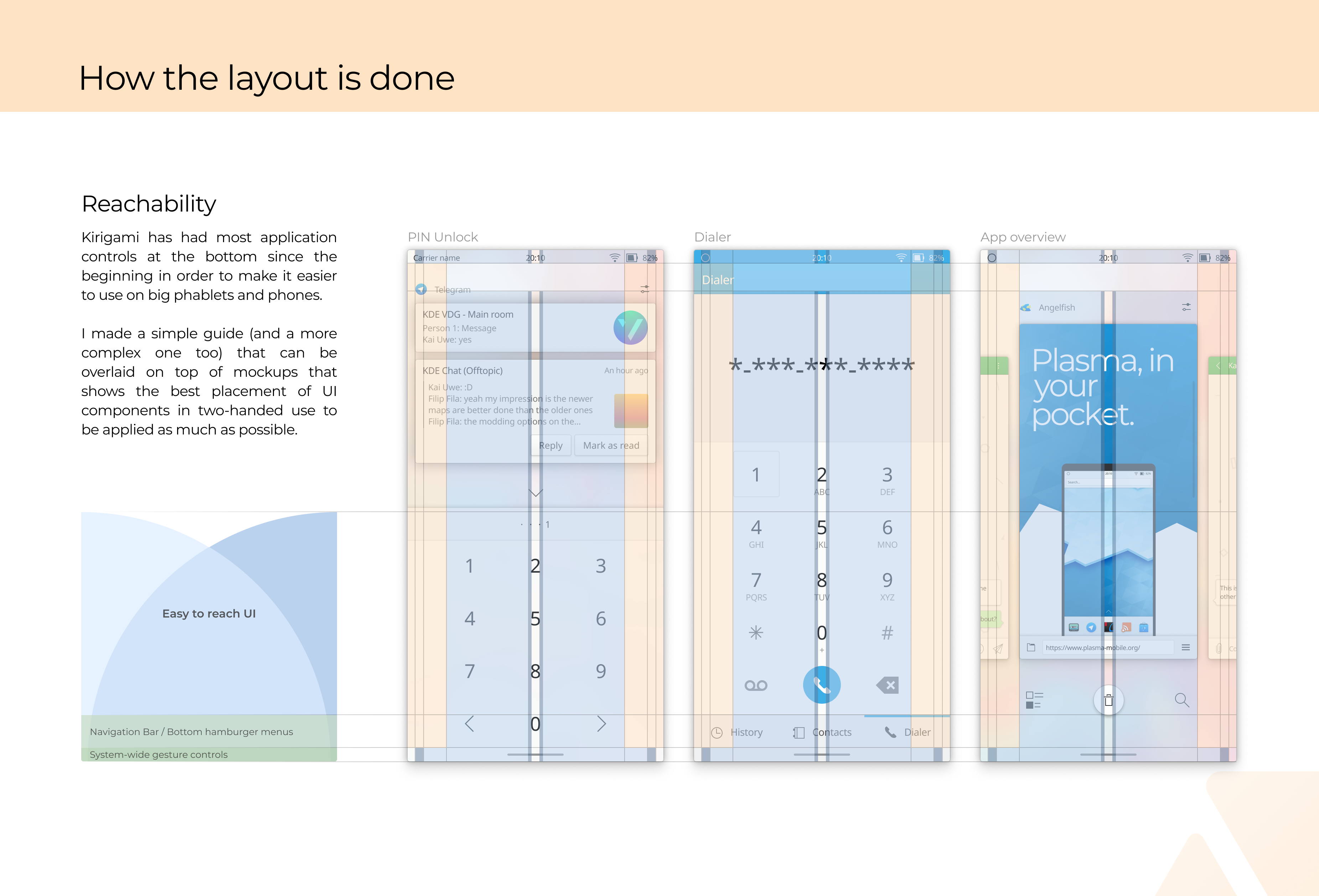
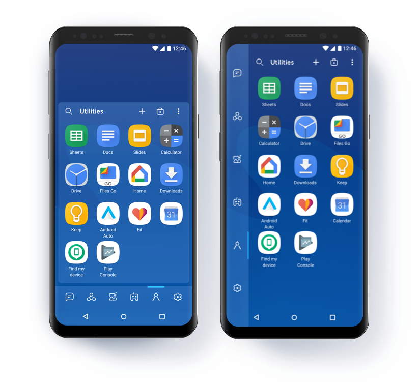
FWIW there seems to be general consensus among PlaMo developers that the bottom navigation buttons have to go.
At the last sprint, I fixed behavior in Marble that required the "Close" button, so closing apps can be done from the multitasking screen, like on other platforms.
Switching to the home screen is also available from there, and the multitasking screen itself can be opened by a swipe from the bottom panel.
So, in your mockups you likely want to propose a gesture-based multitasking screen instead.
Absolutely love this one! It would look pretty without the bottom buttons as well. But I did not understand completely, how would you get back to the home screen exactly from the multitasking screen if you remove the bottom buttons?
Just for reference, here's roughly how it would look like to use plasma desktop theme from https://phabricator.kde.org/D27122 for the bottom panel:
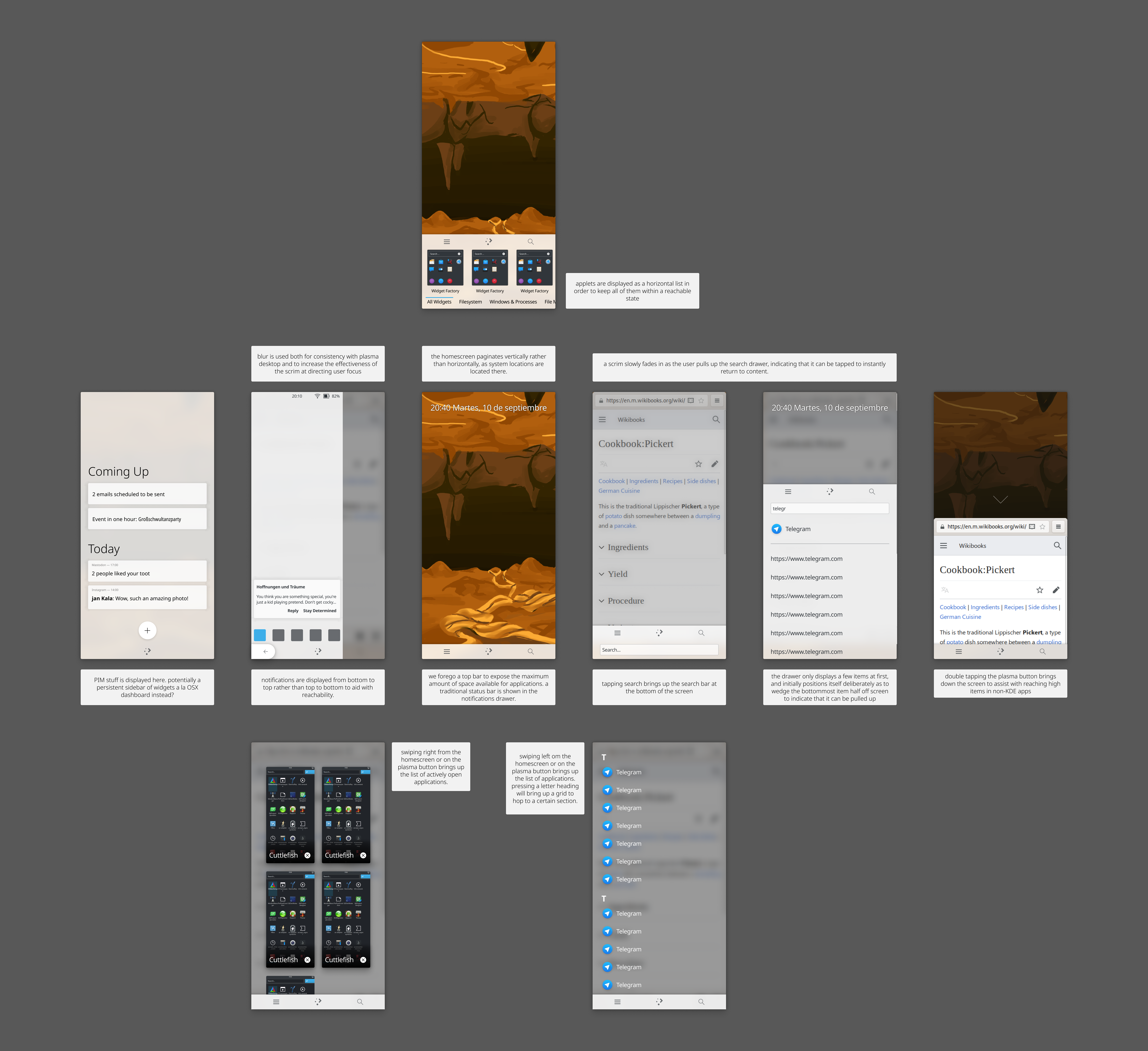
Falling back to opaque and simple translucent surfaces maintains most of the visual style while being friendlier for weaker hardware
I think that the best combo is:
Just as in: https://youtu.be/8V711Iordo4?t=58
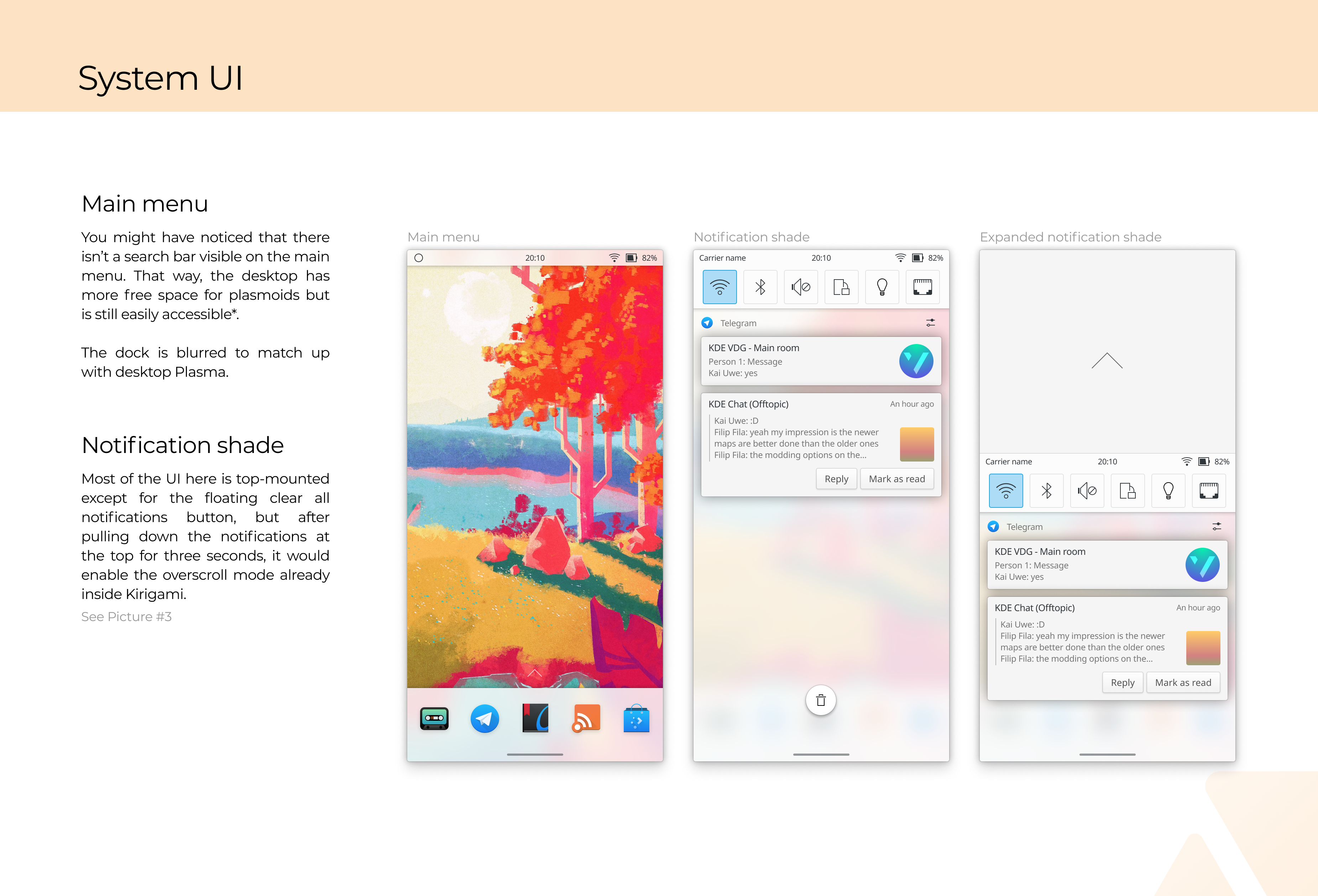
IMO a top-mounted search bar is somewhat bad design and inconsistent.
In order to access the top search bar, you need to move your hands out of their resting position at the bottom of the screen, which isn't good for navigating the home screen fluidly. iOS gets away with a top-mounted search bar because a swipe anywhere in the screen is able to trigger it, but that gesture is very hard to telegraph and would not be consistent with the rest of KDE's mobile design.
Additionally, KDE mobile apps place controls at the bottom—floating buttons are bottom mounted, drawer handles are bottom mounted, drawer actions are bottom mounted. It's a consistency break to place a
control as essential as a search bar on the top of the screen.
Just to be a miserable contrarian... are we sure that a global search actually is "essential" such that it needs to be accessible from bottom navigation? I actually never use my phone's search feature, ever. I didn't when I used iOS, and I still don't now on Android. Am I just atypical? Or is global search actually not a universally-used thing that needs to be accessible using one of the easiest gestures?
I use KISS launcher in Android and I often use the search bar since the search bar filters the apps available in the launcher (and display matching contact to call). It's quite powerful, but it's more targeted at power users.

I also used KISS until a couple of days ago and the search is great. It searches in contacts, web, etc. Just imagine what krunner could do, searching in files and doing math and conversions! It would be a killer feature.
Feel free to use my experiences and views as the "curmudgeonly old coot who hates smartphones"persona. :)
I'm certainly more of a stereotypical smartphone user than you are and I never use the search thing on my smartphone (since IIRC that's not much more powerful than a normal google search?). I did not even notice that mine is not working at all (probably because I've disabled some google thing). With the power of KRunner I can imagine things being different, at least for those that already know what it offers
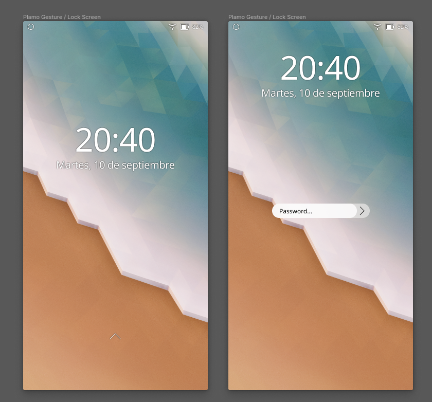
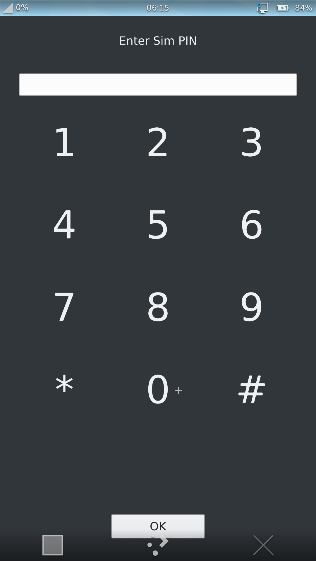
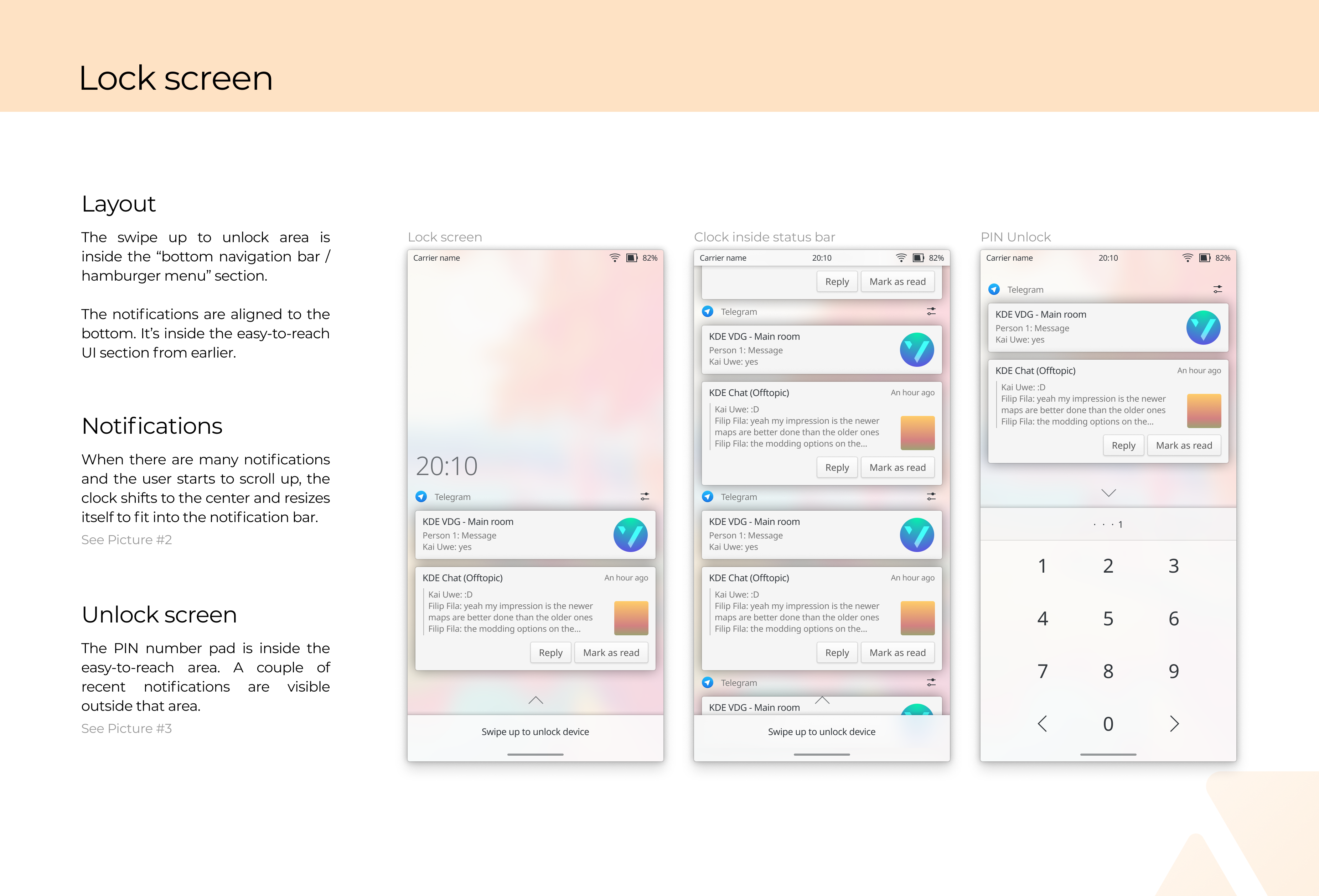
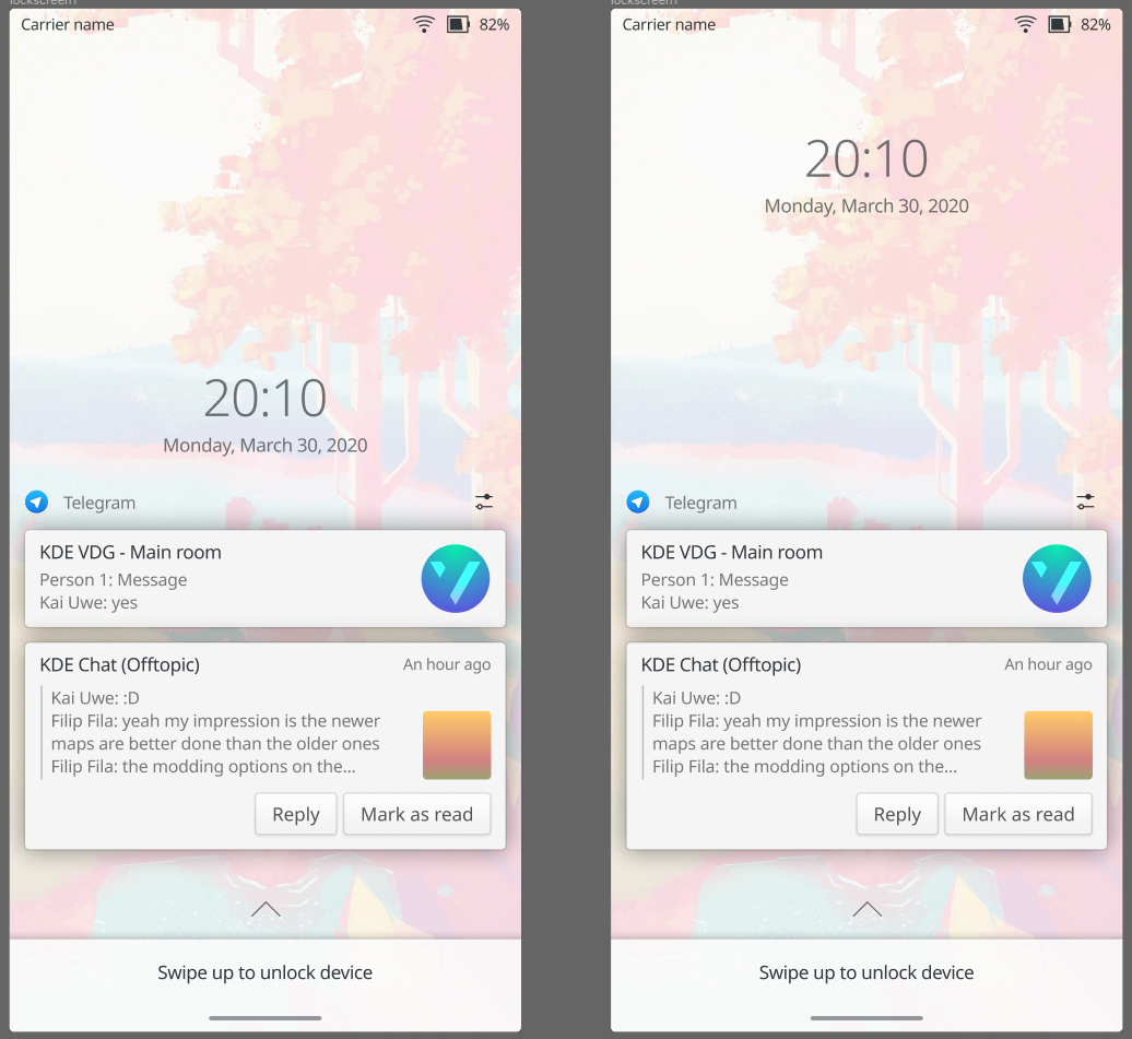
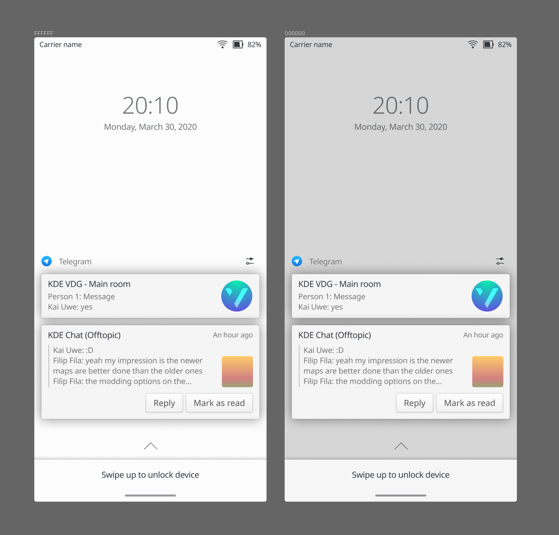
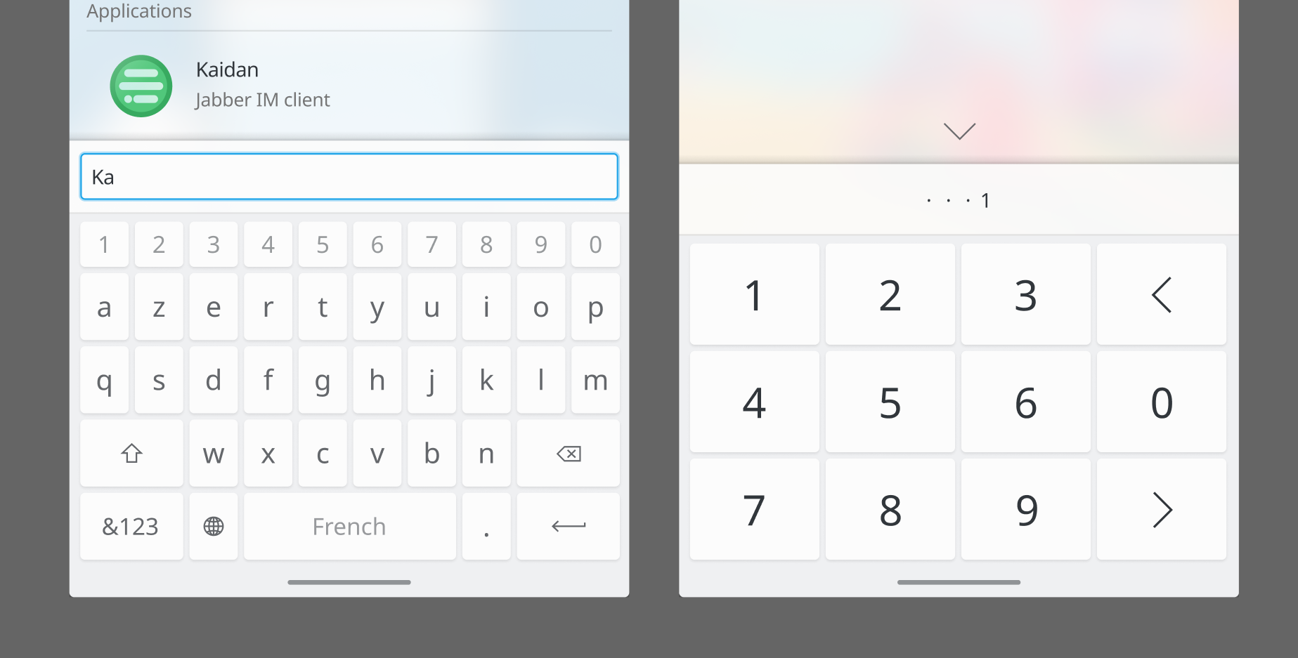
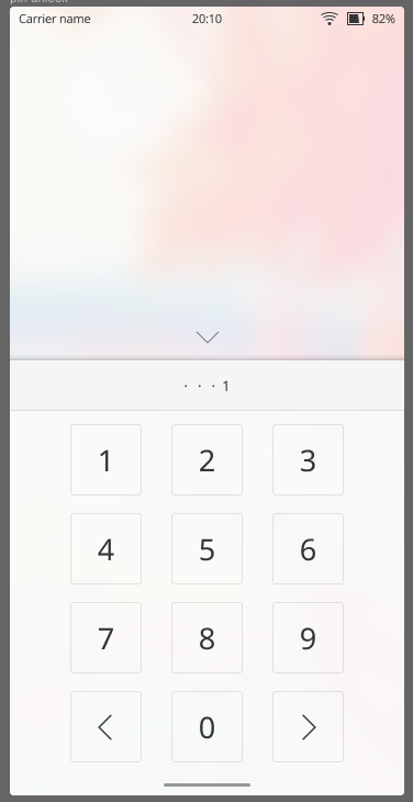
What I'd like to see is a matching design for the lock screen pin and SIM pin fields
Current SIM pin (no need to stress how bad it is):
Current lockscreen pin (ignore the top/bottom bars, they are just there because of the test mode):
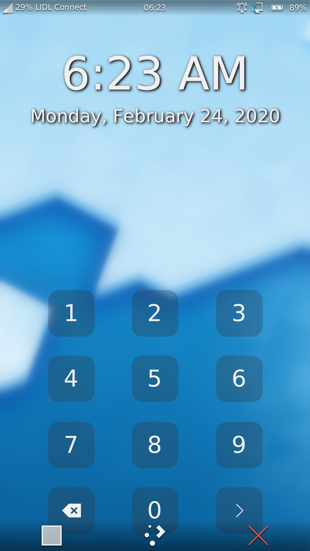
I was going to share this as a PDF but it's probably better to just share 2x PNG exports
An impressive job!
manueljlin, what do you think about placing the number row above the letters in the keyboard? I always find it cumbersome to switch back and forth.
Also having more space betwen the keys helps to not hit the wrong ones accidentially. Here's an example I personally find handy and convenient:
I've noticed a couple of errors (old version of the telegram icon in some places, missing app drawer text) already oof
I personally don't use it too often but it would be nice to have that as an option
Also having more space between the keys helps to not hit the wrong ones accidentally. Here's an example I personally find handy and convenient:
I don't really mind if it has more space between keys or not since it probably has the same touch area. (Let's see what the rest of the VDG thinks)
Thanks :D
@manueljlin Thank you for these excellent mockups!
A few comments/observations/questions, in no particular order:
Nice! The mockups use the same opacity that the plasma style has (85%), the color (FCFCFC) and also the shadow of a panel (dock, notification bar) so it could work with other themes like desktop plasma would.
The current phone lockscreen offers more consistency with the desktop lockscreen. It uses the same clock and shows the wallpaper unblurred until unlocking
That's true but the lockscreen uses a way too strong shadow for contrast (F8121291) and imho isn't too readable and looks a bit meh. What about removing the shadow by having the same opacity of the plasma theme?
The current free floating buttons would make less sense if we go with the solid background route elsewhere
Something that came up during the last lockscreen redesign was the wish for visible button/click target boundaries for usability reasons
Maybe it can use a keyboard-like layout?
I think it should either not have a button bg or use the same button style of the normal keyboard
I'd like to see what happens when unlocking fails, i.e. wrong passcode. I have a PoC animation that shakes the password cirlcles, but I'd like to see what you have in mind
I also thought the exact same thing, it would probably work great
I'd like to see a SIM pin field in the same style

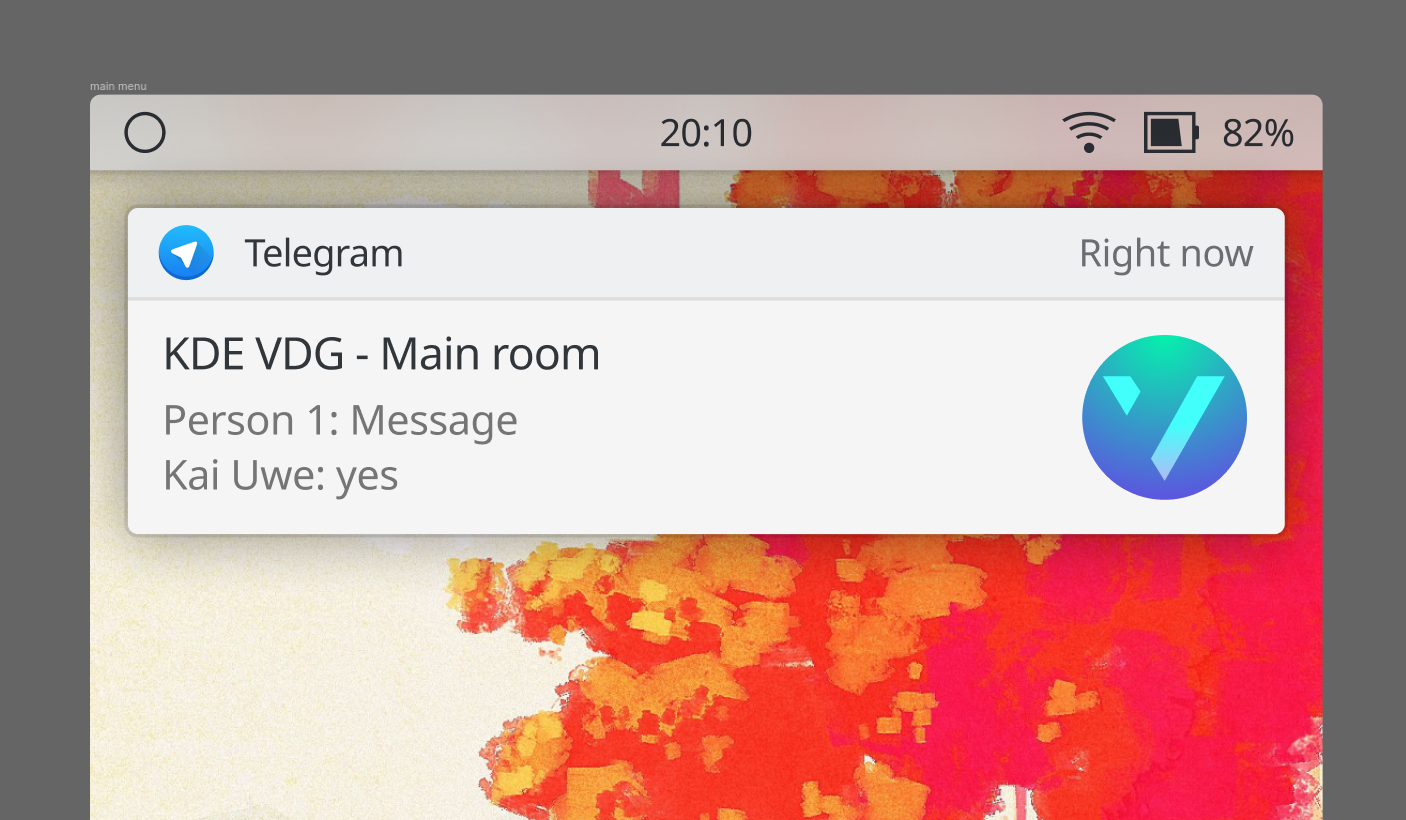
Your notification popup comes quite close to what we currently have, except for some minor things
They don't have the close button/timeout indicator. I guess we can live without the former and make them disappear on swipe. For the latter I'm unsure what to do
I think using a close button on notifications for a mobile UI isn't a good idea since swiping to remove it is easier than having to aim for the X button (I know you can swipe it right now even if it has the button but I would remove the button altogether)
They don't show the app name
Oh right, that's not good. It could either be done the way Android does it:
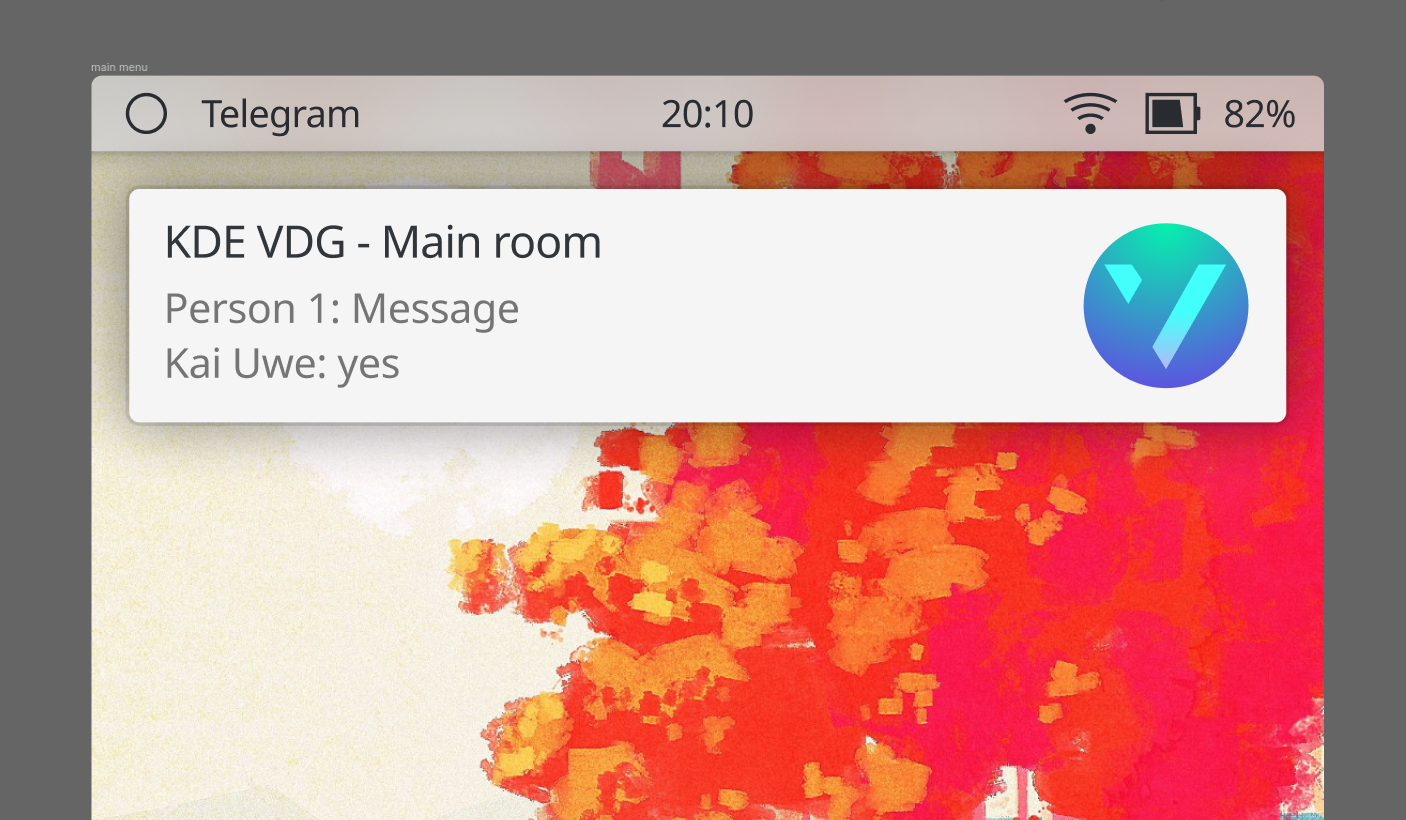
Your notification history/backlog looks quite a bit different than the current history applet, but I quite like it
:D
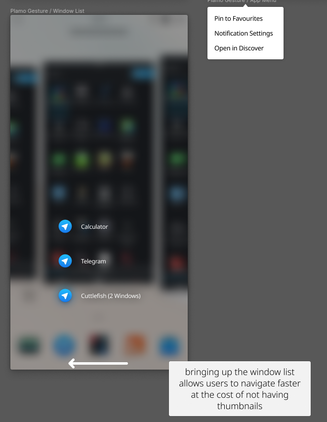
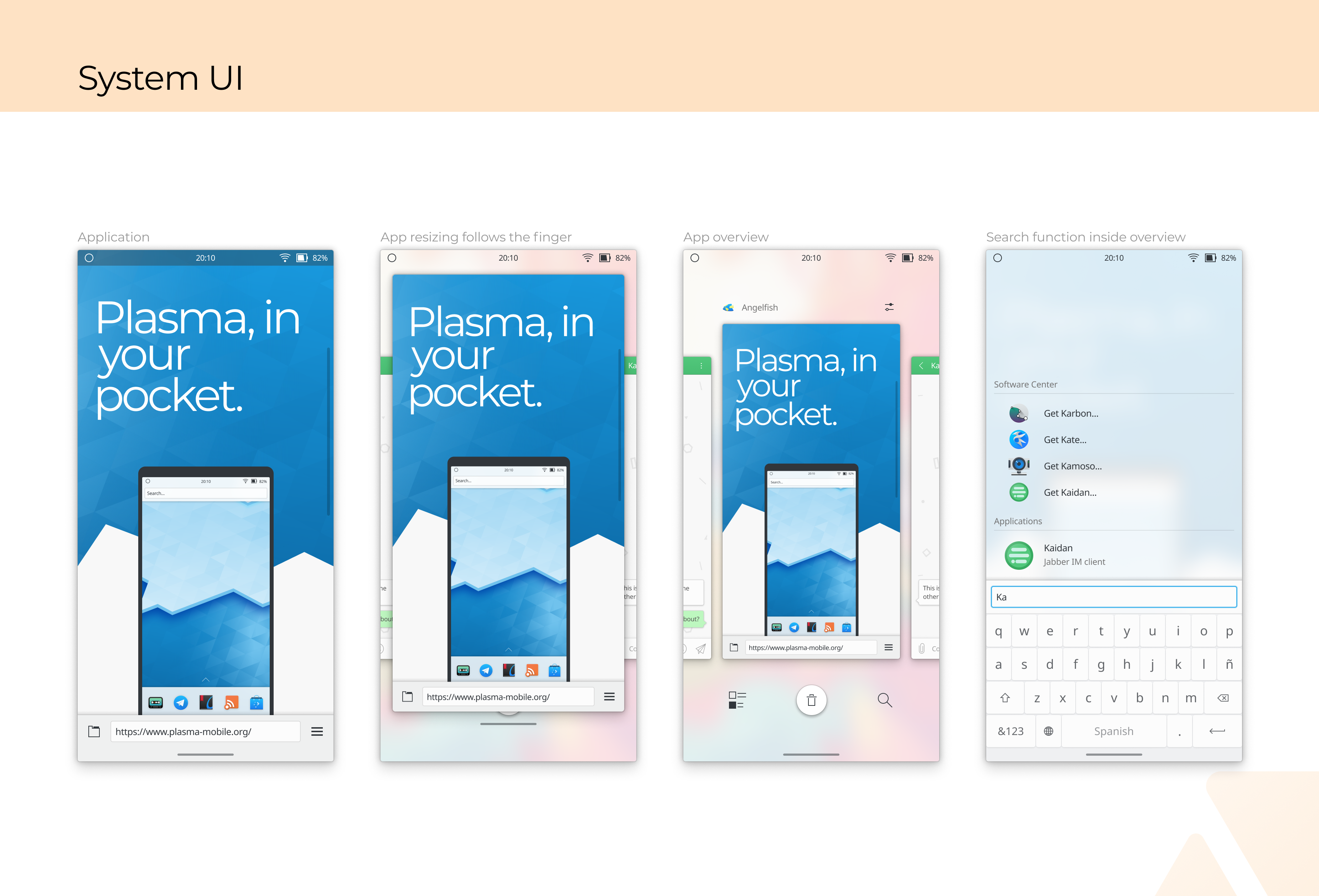
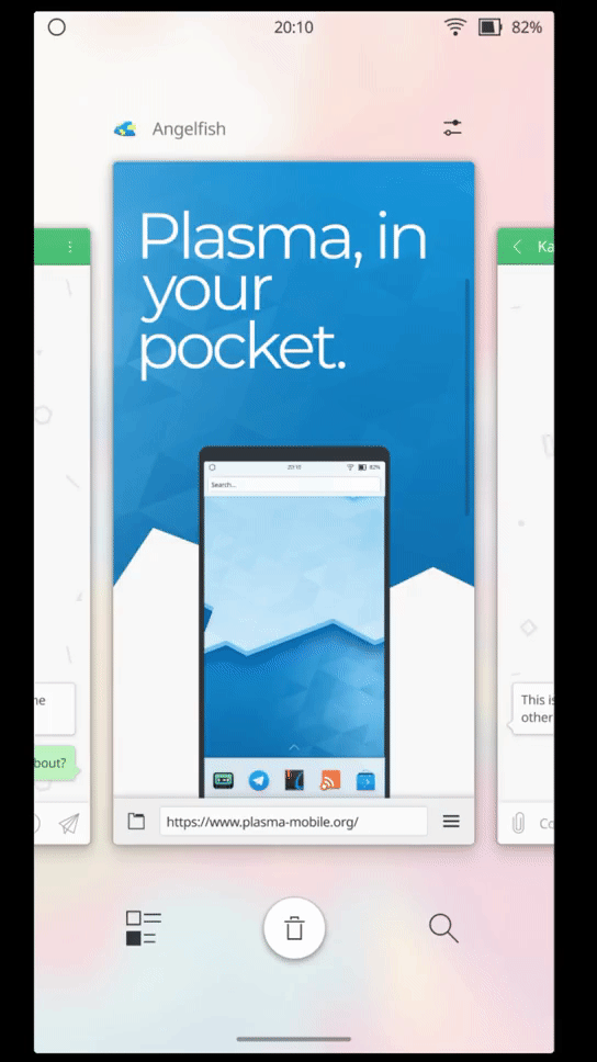
Do we still have the pull-up app drawer? If not, how does one get a list of all apps?
Yes, I just wasn't sure what was better to do: to keep the dock at the bottom and open the list like a sheet below it or to make the dock be on top of the app drawer.
I've done a couple of
How do I get to the home screen from the app overview?
By swiping up on the gesture bar or tapping the empty area
What does the left button in the app overview do?
The gif only plays when you click it
I have a set of designs that leans more to a bb10/windows 10 mobile aesthetic with some original elements thrown in:
From Thursday to Saturday this week, there is the online Mini Plasma Mobile sprint (https://phabricator.kde.org/T12906).
If the main contributors of this task join, Plasma Mobile design could be discussed there and maybe there's the chance to come to some decisions in this topic and implement the first things.
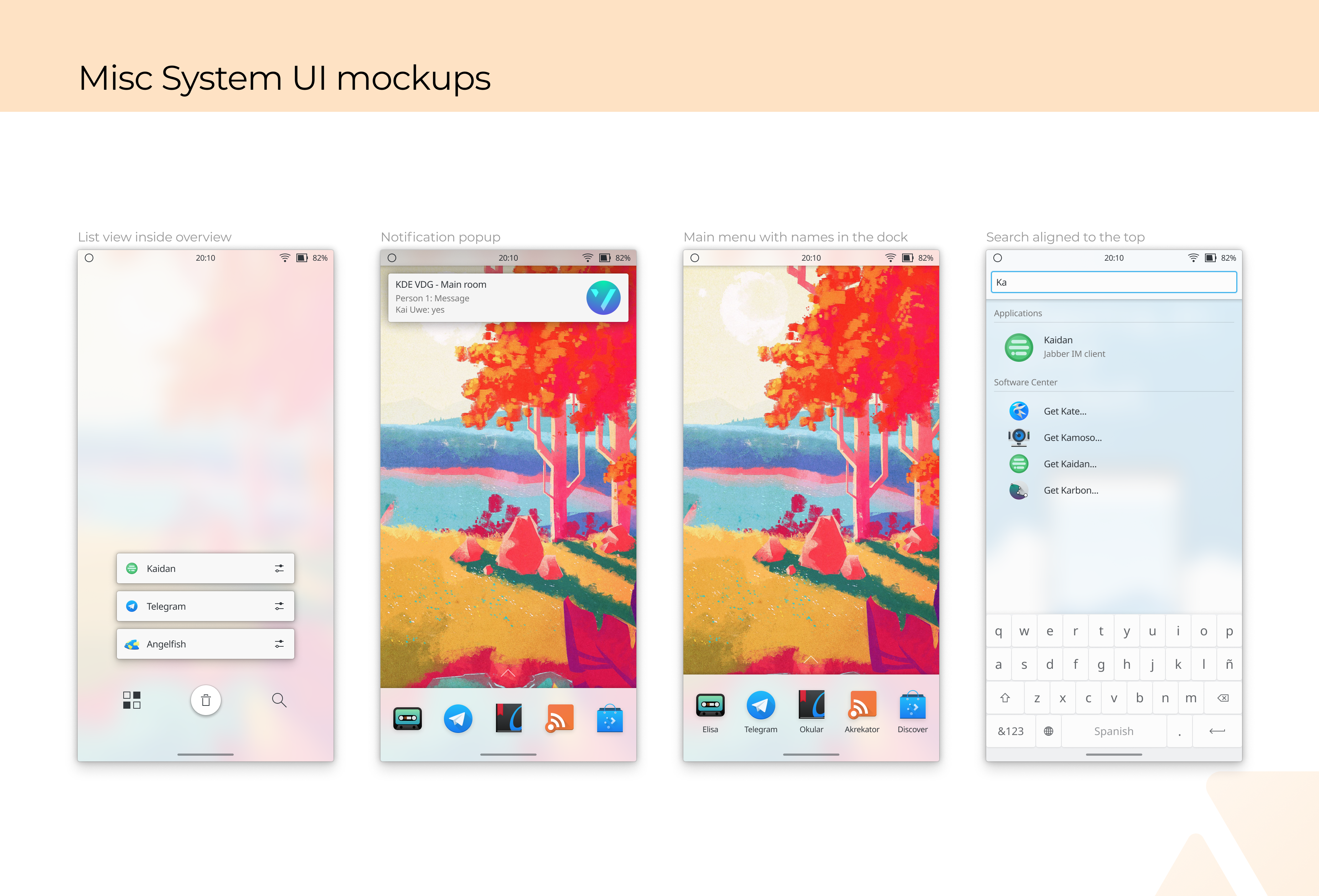
Here's another inspiration for the app drawer: Instead of text, optionally symbols could be displayed for the app categories:
Weird, just noticed that my previous image has a broken thumbnail. Clicking it reveals the proper image, though.
What do you think of devices with this (screenshot taken on a real device Xiaomi Poco F1, so it's a real problem already):
https://wiki.postmarketos.org/images/8/8c/Plasmamobile-beryllium-mainline.jpg
Should there be some design options for those things (notches and rounded screen corners)? Or should we just limit active area of screen and draw everything below the notch? This still needs something for rounded corners though
Toolkits native to such devices offer components that allow developers to ensure that they stay within usable screen areas. QQC2 or Kirigami should probably offer similar metrics and components for developers.
The mockups look very nice :)
there are some things that i don't think are implementable right now, either due to kwin architecture or due to the general shittiness of the hardware (for instance, the blur effectseems pretty much a no go on anything arm at the moment.. the lockscreen is kinda blurrable because is done in the qml scene and is of a static image, but blurring in the compositor in a "live" way, given to quality of hardware,drivers, and kwin compositor, is not really doable at the moment)
The main menu seems to be missing from the screenshots, but there should be a way to reach a list of all apps that is not searching.
Personally, i reimplemented almost from scratch the main screen menu *several times*, that I don't have much interest of redoing that part any time soon again, mostly because i know that if is redone again, it will have to be redone another time way before is even finished, and because there are so many other things to do, that keeping redoing the same thing over and over doesn't make much sense.
Once we have those damn window thumbnails we may perhaps start doing something on the task switcher and see how much the shown mockups are doable